Alteryx Designer Desktop Discussions
Find answers, ask questions, and share expertise about Alteryx Designer Desktop and Intelligence Suite.- Community
- :
- Community
- :
- Participate
- :
- Discussions
- :
- Designer Desktop
- :
- Counting Completed Date and Use Graph
Counting Completed Date and Use Graph
- Subscribe to RSS Feed
- Mark Topic as New
- Mark Topic as Read
- Float this Topic for Current User
- Bookmark
- Subscribe
- Mute
- Printer Friendly Page
- Mark as New
- Bookmark
- Subscribe
- Mute
- Subscribe to RSS Feed
- Permalink
- Notify Moderator
Good day guys,
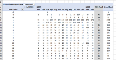
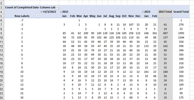
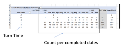
I have an illustration attached and I wonder how I can automate it with graph in Alteryx. The illustration show below counting the completed date per month since 2022.
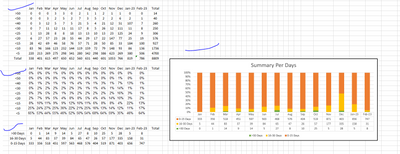
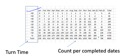
There are other results that I wanted to be showed which is being represented below
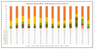
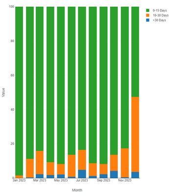
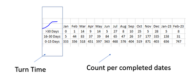
Below is another graph which I wanted Alteryx to create.
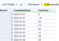
Below is the sample excel raw data for your reference.
I do hope someone could help me how to do it although it is very complicated.
Thanks and hoping to hear from someone.
Kamen
Solved! Go to Solution.
- Mark as New
- Bookmark
- Subscribe
- Mute
- Subscribe to RSS Feed
- Permalink
- Notify Moderator
Hi @KamenRider
Please see if you can create the chart using the below links.
Best,
Hammad
https://help.alteryx.com/20223/designer/interactive-chart-tool
- Mark as New
- Bookmark
- Subscribe
- Mute
- Subscribe to RSS Feed
- Permalink
- Notify Moderator
Hi @KamenRider ,
I created a sample workflow.
You may want to play around the parameters of Interactive Chart.
Good luck.
Input
Interactive Chart
Create / Layer
Create / Transforms
↓↓↓↓↓
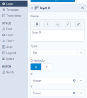
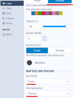
Style / Layer
↓↓↓↓↓
Output
- Mark as New
- Bookmark
- Subscribe
- Mute
- Subscribe to RSS Feed
- Permalink
- Notify Moderator
Can you please how I am going to start the workflow? I find it complicated.
Thanks and looking forward.
Kamen
- Mark as New
- Bookmark
- Subscribe
- Mute
- Subscribe to RSS Feed
- Permalink
- Notify Moderator
Thank you for the response. Appreciate how you demonstrate how to create a graph. However can you also help how to derived those data before the start of graphing like below using my raw file. It will allow me to understand more how my data works to create the graph.
Appreciate so much your response. Thanks,
Kamen
- Mark as New
- Bookmark
- Subscribe
- Mute
- Subscribe to RSS Feed
- Permalink
- Notify Moderator
Hi @KamenRider ,
It is difficult to find the relationship between the raw data and the pivot table you provided.
For example, the raw data has only 14 rows,
while the output table has a new field "Row Labels" without definition with 19 rows.
I would say you need to provide more information.
- Mark as New
- Bookmark
- Subscribe
- Mute
- Subscribe to RSS Feed
- Permalink
- Notify Moderator
What we would like to do is that using the field "Turn Time" vs the field "Completed date" we will be able to create a similar result as found below.
Raw file
Sample Result
Same also with the other screenshots, the left side refers to the "Turn Time" wherein below "Turn Time" is hoping to get all turn time less than 5 (<5) vs the completed dates and so on.
After we get those into Alteryx Conversion, we convert it to graph.
Please help me how I can translate this to Alteryx Conversion so I could also learn from it.
Thanks and looking forward for your assistance. Please let me know if you have inquiries.
Kamen
- Mark as New
- Bookmark
- Subscribe
- Mute
- Subscribe to RSS Feed
- Permalink
- Notify Moderator
Hi @KamenRider ,
For more effective communication, please consider sharing a real Excel sheet dealing with real data and pivot table.
Meantime I generated a psudo data with random number of rows and random "Turn Time".
Input Data
(You can ignore the fields other than CompleteDate and TurnTime)
Workflow
Tile tool is the key to count the rows at arbitrary range.
Output 1 - count by TurnTime
Output 2 - count by Range
Adding grand total is a different issue and you can find some useful tips on the community with keywords like "excel grand total".
Good luck.
- Mark as New
- Bookmark
- Subscribe
- Mute
- Subscribe to RSS Feed
- Permalink
- Notify Moderator
Thanks for the guidance. I think we are nearing the solve it. I was able to combined the workflow and the graph you have send and I have some more questions.
First, is it possible to have a uniform date. Instead of Jan, Feb and March, have it Jan-23, Feb-23 and so on?
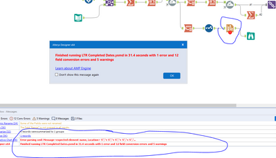
I have an error in line to the graph portion. I am trying to locate in the net but I am not able to locate a solution. Please advise how can we fix it.
Thanks and looking forward for your response.
Kamen
- Mark as New
- Bookmark
- Subscribe
- Mute
- Subscribe to RSS Feed
- Permalink
- Notify Moderator
You can tweak the column names by the function in Dynamic Rename tool.
In the original workflow, I added IF statement to follow your sample output.
If you don't need it, just remove it as below and then you'll get what you want.
IF StartsWith([_CurrentField_], "2023")THEN DateTimeFormat( DateTimeParse([_CurrentField_], "%Y_%m_%d"),"%b")ELSE DateTimeFormat(
DateTimeParse([_CurrentField_], "%Y_%m_%d"),
"%b-%y")ENDIF
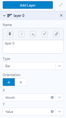
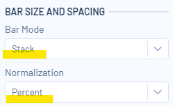
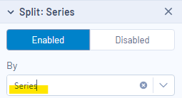
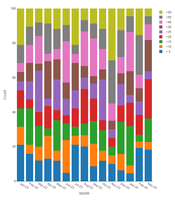
For the graph, I cannot recreate your issue, but the setting is as below.
Output
I know Reporting tools are tricky and you need trial & errors to be familiar with it.
Good luck.
-
Academy
6 -
ADAPT
2 -
Adobe
204 -
Advent of Code
3 -
Alias Manager
78 -
Alteryx Copilot
26 -
Alteryx Designer
7 -
Alteryx Editions
95 -
Alteryx Practice
20 -
Amazon S3
149 -
AMP Engine
252 -
Announcement
1 -
API
1,209 -
App Builder
116 -
Apps
1,360 -
Assets | Wealth Management
1 -
Basic Creator
15 -
Batch Macro
1,559 -
Behavior Analysis
246 -
Best Practices
2,695 -
Bug
719 -
Bugs & Issues
1 -
Calgary
67 -
CASS
53 -
Chained App
268 -
Common Use Cases
3,825 -
Community
26 -
Computer Vision
86 -
Connectors
1,426 -
Conversation Starter
3 -
COVID-19
1 -
Custom Formula Function
1 -
Custom Tools
1,939 -
Data
1 -
Data Challenge
10 -
Data Investigation
3,488 -
Data Science
3 -
Database Connection
2,221 -
Datasets
5,223 -
Date Time
3,229 -
Demographic Analysis
186 -
Designer Cloud
742 -
Developer
4,373 -
Developer Tools
3,531 -
Documentation
528 -
Download
1,037 -
Dynamic Processing
2,940 -
Email
928 -
Engine
145 -
Enterprise (Edition)
1 -
Error Message
2,259 -
Events
198 -
Expression
1,868 -
Financial Services
1 -
Full Creator
2 -
Fun
2 -
Fuzzy Match
713 -
Gallery
666 -
GenAI Tools
3 -
General
2 -
Google Analytics
155 -
Help
4,710 -
In Database
966 -
Input
4,295 -
Installation
361 -
Interface Tools
1,901 -
Iterative Macro
1,095 -
Join
1,959 -
Licensing
252 -
Location Optimizer
60 -
Machine Learning
260 -
Macros
2,864 -
Marketo
12 -
Marketplace
23 -
MongoDB
82 -
Off-Topic
5 -
Optimization
751 -
Output
5,258 -
Parse
2,328 -
Power BI
228 -
Predictive Analysis
937 -
Preparation
5,171 -
Prescriptive Analytics
206 -
Professional (Edition)
4 -
Publish
257 -
Python
855 -
Qlik
39 -
Question
1 -
Questions
2 -
R Tool
476 -
Regex
2,339 -
Reporting
2,434 -
Resource
1 -
Run Command
575 -
Salesforce
277 -
Scheduler
411 -
Search Feedback
3 -
Server
631 -
Settings
936 -
Setup & Configuration
3 -
Sharepoint
628 -
Spatial Analysis
599 -
Starter (Edition)
1 -
Tableau
512 -
Tax & Audit
1 -
Text Mining
468 -
Thursday Thought
4 -
Time Series
432 -
Tips and Tricks
4,187 -
Topic of Interest
1,126 -
Transformation
3,731 -
Twitter
23 -
Udacity
84 -
Updates
1 -
Viewer
3 -
Workflow
9,982
- « Previous
- Next »
