Weekly Challenges
Solve the challenge, share your solution and summit the ranks of our Community!Also available in | Français | Português | Español | 日本語
IDEAS WANTED
Want to get involved? We're always looking for ideas and content for Weekly Challenges.
SUBMIT YOUR IDEA- Community
- :
- Community
- :
- Learn
- :
- Academy
- :
- Challenges & Quests
- :
- Weekly Challenges
- :
- Challenge #95: Draw 1000 Apples in Under 60 Second...
Challenge #95: Draw 1000 Apples in Under 60 Seconds
- Subscribe to RSS Feed
- Mark Topic as New
- Mark Topic as Read
- Float this Topic for Current User
- Bookmark
- Subscribe
- Mute
- Printer Friendly Page
- Mark as New
- Bookmark
- Subscribe
- Mute
- Subscribe to RSS Feed
- Permalink
- Notify Moderator
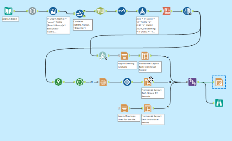
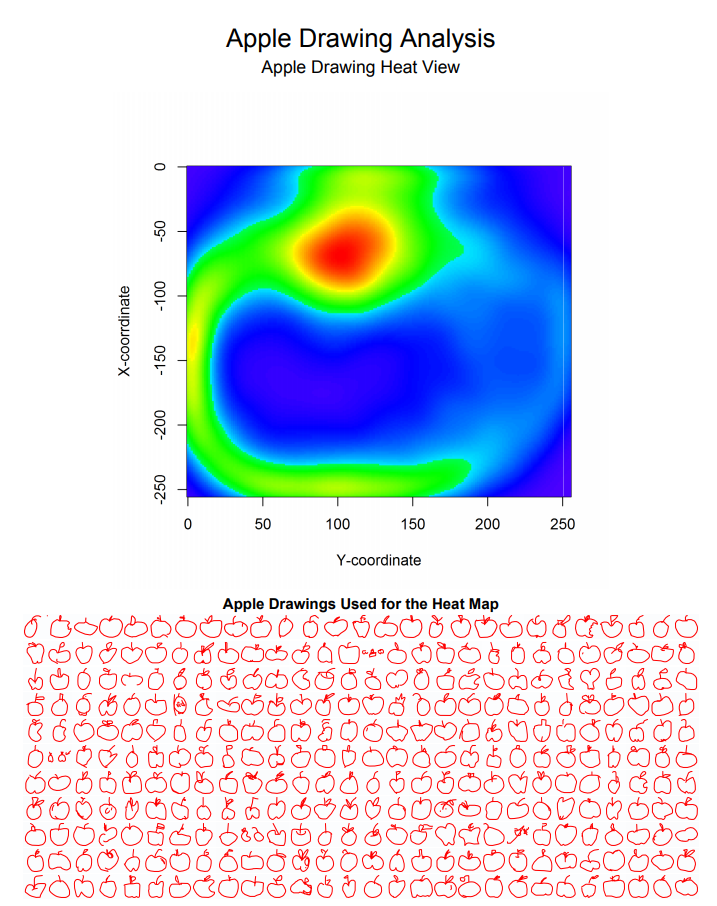
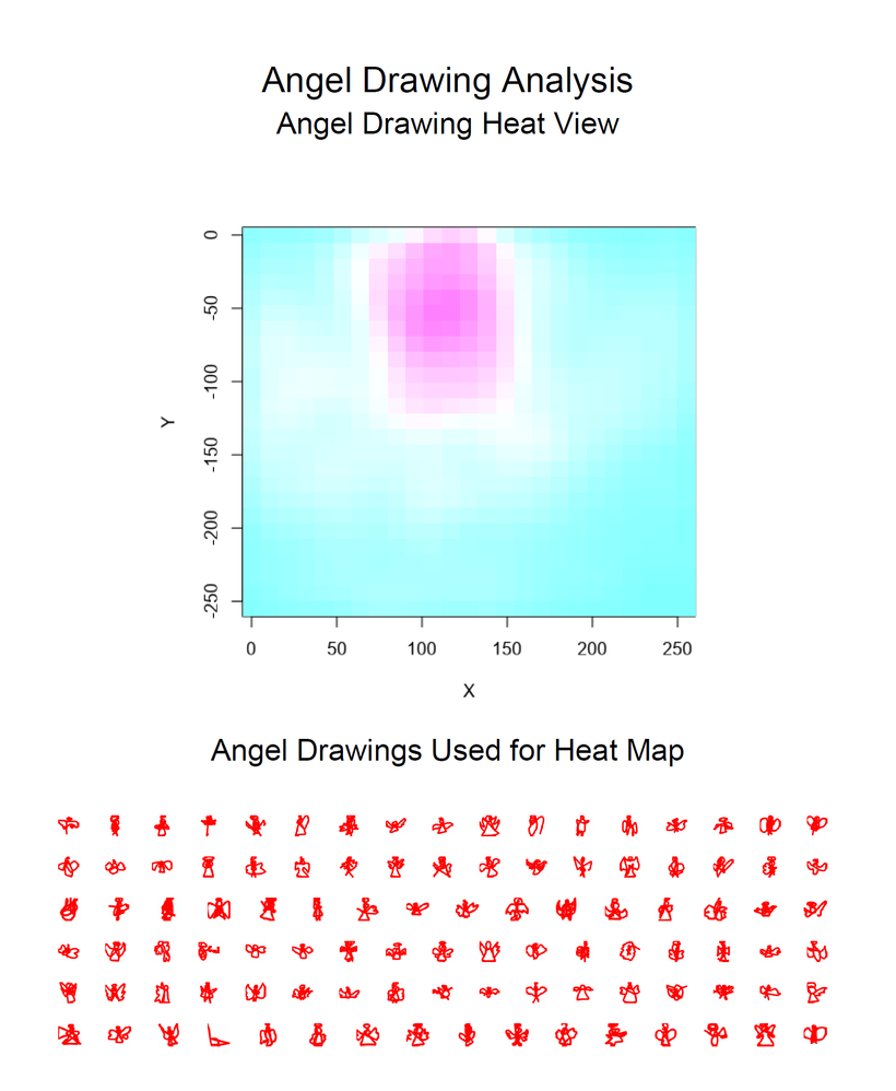
I've had this on my list to complete for awhile. I had the data, but it was rendering poorly. Picked back up and relooked at the settings in and configuration of the reporting tools. Now happy with the results and feel like I understand the reporting tools better.
- Mark as New
- Bookmark
- Subscribe
- Mute
- Subscribe to RSS Feed
- Permalink
- Notify Moderator
- Mark as New
- Bookmark
- Subscribe
- Mute
- Subscribe to RSS Feed
- Permalink
- Notify Moderator
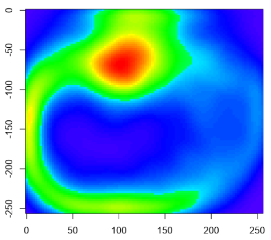
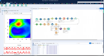
 Filtered for the first 100 images so Designer would run faster
 Looks like a granny smith to me
 Angel drawing variation
 - Mark as New
- Bookmark
- Subscribe
- Mute
- Subscribe to RSS Feed
- Permalink
- Notify Moderator
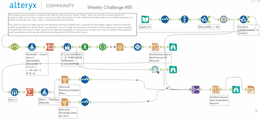
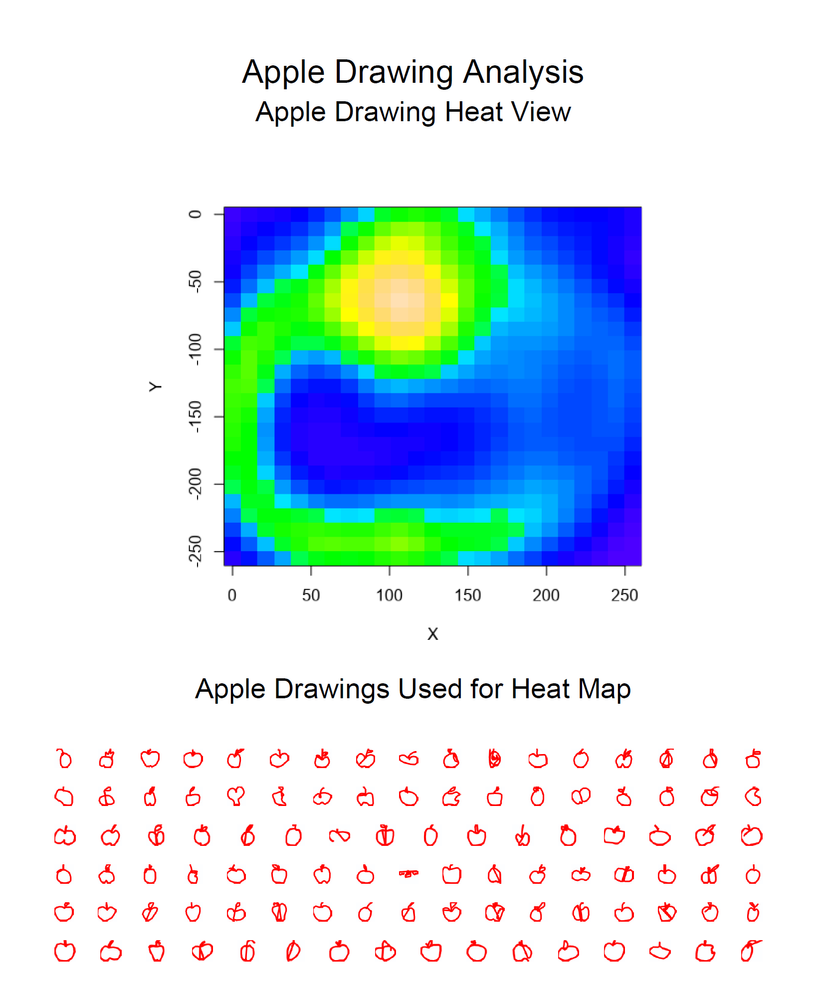
It took me more time than I'm willing to admit to get the report formatted correctly. I also added some logic in the workflow to smooth out the poly-line sequence to avoid the line jumping around (I didn't use a batch macro like some of the solutions posted here). I also increased the number of grid points on the Heat Plot to smooth out the image.
- Mark as New
- Bookmark
- Subscribe
- Mute
- Subscribe to RSS Feed
- Permalink
- Notify Moderator
- Mark as New
- Bookmark
- Subscribe
- Mute
- Subscribe to RSS Feed
- Permalink
- Notify Moderator
- Mark as New
- Bookmark
- Subscribe
- Mute
- Subscribe to RSS Feed
- Permalink
- Notify Moderator
This was a tough one!
- Mark as New
- Bookmark
- Subscribe
- Mute
- Subscribe to RSS Feed
- Permalink
- Notify Moderator
- Mark as New
- Bookmark
- Subscribe
- Mute
- Subscribe to RSS Feed
- Permalink
- Notify Moderator
Definitely had to peek at other's solutions but learnt a lot with this challenge!
- Mark as New
- Bookmark
- Subscribe
- Mute
- Subscribe to RSS Feed
- Permalink
- Notify Moderator
On a spree to binge complete weekly challenges
I had to follow someone elses approach for this. Need to revisit this again later. But a great exercise 🙂

-
Advanced
299 -
Apps
27 -
Basic
156 -
Calgary
1 -
Core
155 -
Data Analysis
186 -
Data Cleansing
6 -
Data Investigation
7 -
Data Parsing
15 -
Data Preparation
234 -
Developer
35 -
Difficult
85 -
Expert
16 -
Foundation
13 -
Interface
39 -
Intermediate
266 -
Join
211 -
Macros
61 -
Parse
141 -
Predictive
20 -
Predictive Analysis
14 -
Preparation
272 -
Reporting
55 -
Reporting and Visualization
17 -
Spatial
60 -
Spatial Analysis
53 -
Time Series
1 -
Transform
225
- « Previous
- Next »
