Weekly Challenges
Solve the challenge, share your solution and summit the ranks of our Community!Also available in | Français | Português | Español | 日本語
IDEAS WANTED
Want to get involved? We're always looking for ideas and content for Weekly Challenges.
SUBMIT YOUR IDEA- Community
- :
- Community
- :
- Learn
- :
- Academy
- :
- Challenges & Quests
- :
- Weekly Challenges
- :
- Challenge #95: Draw 1000 Apples in Under 60 Second...
Challenge #95: Draw 1000 Apples in Under 60 Seconds
- Subscribe to RSS Feed
- Mark Topic as New
- Mark Topic as Read
- Float this Topic for Current User
- Bookmark
- Subscribe
- Mute
- Printer Friendly Page
- Mark as New
- Bookmark
- Subscribe
- Mute
- Subscribe to RSS Feed
- Permalink
- Notify Moderator
Last week’s solution can be found here!
This week is Thanksgiving week in the USA and I was thinking of two ways we could take these challenges: 1) Make it super easy to match the short week or 2) Or long... long enough to give those of you balancing in-laws, distant relatives, and chaos this week a temporary escape. I hope the Weekly Challenge can be that one work thing you really 'need to do today or my boss isn't going to be happy'. I went for the latter. Weekly Challenge has got your back.
This week we are focused on working with data from the game of "Quick, Draw!". Here you can play a game where the computer asks you to draw a picture, and as you draw the picture live, the machine will guess what you are drawing based on a wealth of pictures from other users – machine learning at it’s finest!
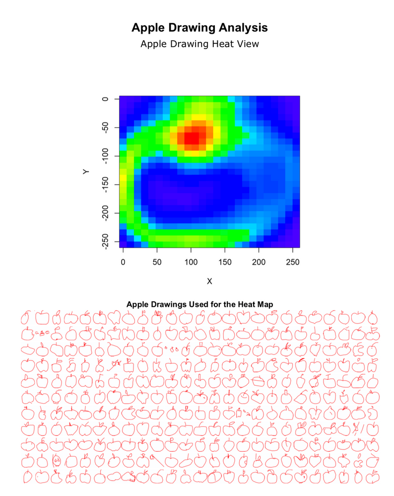
This week we will try to take around one thousand pictures of apples from a special file type called .ndjson (new-line delimited JSON) generated from "Quick, Draw", reconstruct it into an image, and develop a heat plot of all the apples and some samples of apples that were drawn. Each record in the data set represents on drawing and contains an array of numbers that represent pixel coordinates on the canvas of the picture ranging from 0-255 for both x and y. The syntax of arrays are as follows:
[
[ // First stroke
[x0, x1, x2, x3, ...],
[y0, y1, y2, y3, ...]
],
[ // Second stroke
[x0, x1, x2, x3, ...],
[y0, y1, y2, y3, ...]
],
... // Additional strokes
]
For additional documentation on the simplified .ndjson file, see here.
The file we have provided contains 1000 apple drawings, but if you are interested in drawing 150K of them or something else entirely check out all the full library of data here.
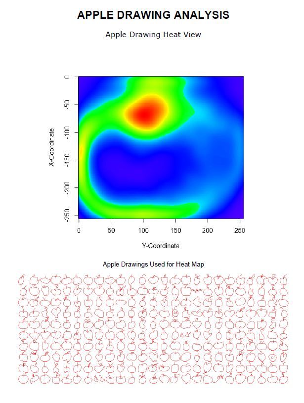
As an output, try emulate the output that we made here in PDF:
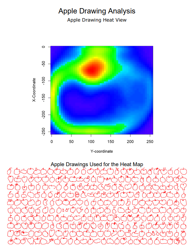
A tool from the predictive tool install was used in this solution. If you’d like to generate the visual shown in this sample PDF, please go to downloads.alteryx.com and download our predictive package. If not, just try drawing all the apples with a workflow!
This week there will be no start file! Instead we have attached two things - 1) The .ndjson file from which the drawing are constructed (we are not providing a start file because connecting to the data is a big part of the challenge) and 2) the PDF of the desired output.
- Mark as New
- Bookmark
- Subscribe
- Mute
- Subscribe to RSS Feed
- Permalink
- Notify Moderator
Finally got there (or close enough for me)! I managed to get the heat map pretty quickly, the drawings took a little longer because the settings I needed were buried deep within some config settings. But compiling all of this into a report was a nightmare! A real nightmare! These reporting tools are awful, lets hope Plot.ly brings some usability to Alteryx reporting. I look forward to seeing the solution so I can see where I was going wrong.
- Mark as New
- Bookmark
- Subscribe
- Mute
- Subscribe to RSS Feed
- Permalink
- Notify Moderator
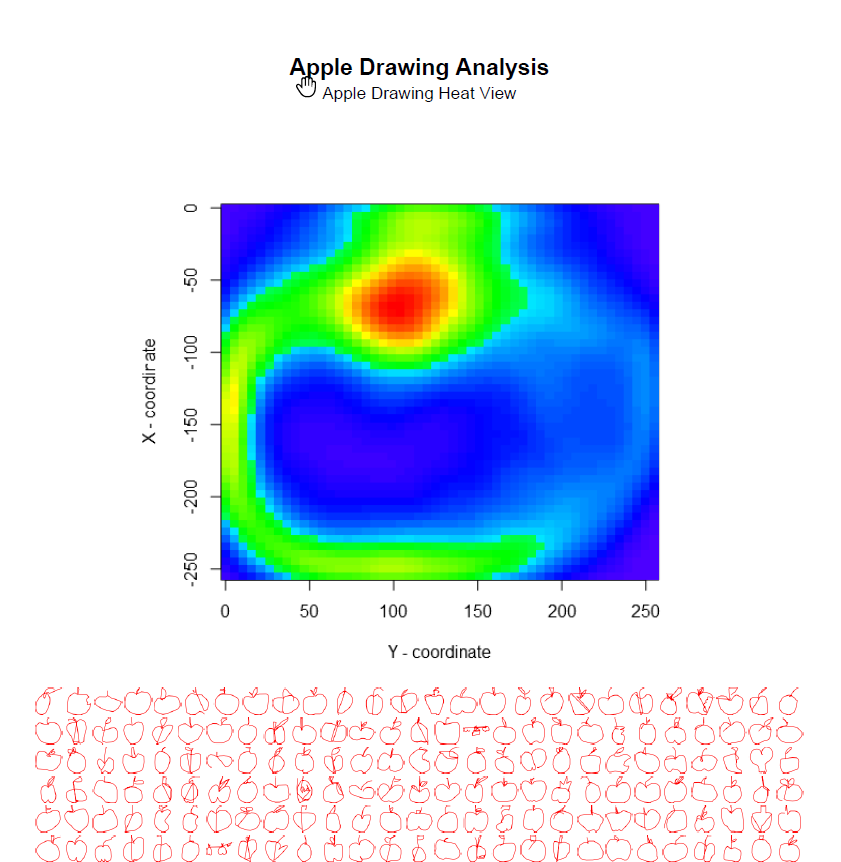
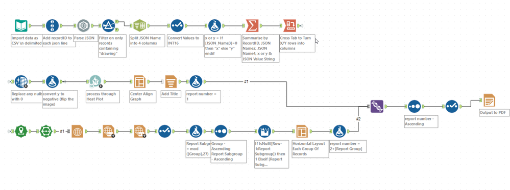
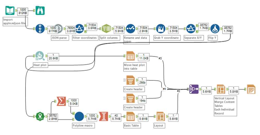
I found this task was both interesting and frustrating. The spatial part of the work was really interesting and intuitive. It stretched my knowledge and ability in the spatial tool set, I really enjoyed that portion. The Reporting portion of the task was just frustrating. The reporting tools are not intuitive, they not easy to use and they require far too many individual tools to achieve the final goal. The Visual Layout Tool is the first step on that path and hopefully D3 will add more to the visualising capabilities but there is a long way to go.
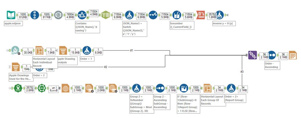 Completed workflow
Output
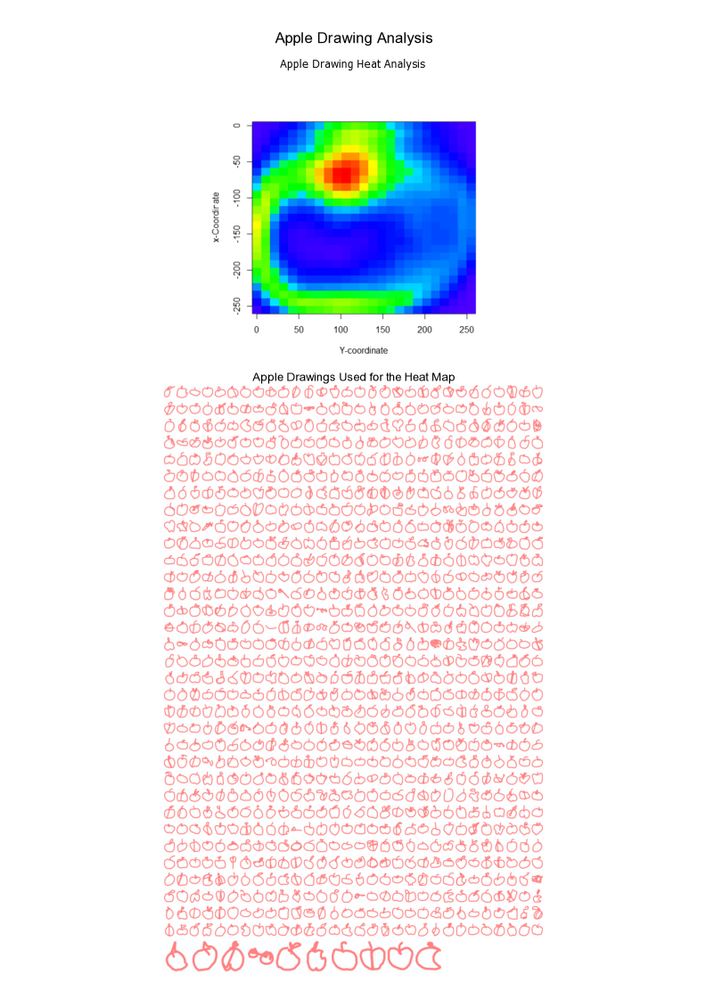 Full Output Image
- Mark as New
- Bookmark
- Subscribe
- Mute
- Subscribe to RSS Feed
- Permalink
- Notify Moderator
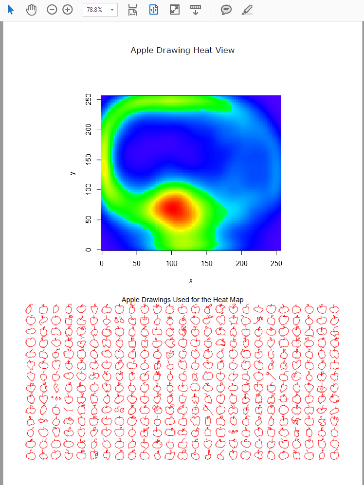
The crowd-sourced drawings are too cool, and I thought this was an interesting application of the heat map and spatial tools. Definitely had to play around with the reporting tools, and unfortunately everything got laggy once I brought in the report map tool. I couldn't get the apple drawings to appear as unconnected polylines without adding the macro, so I'm interested to see what others come up with!
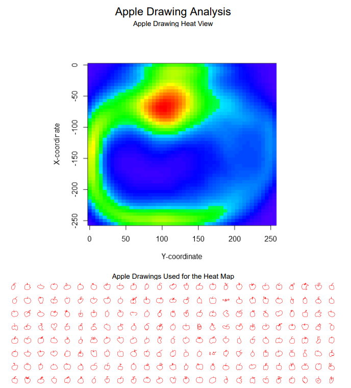 Output
- Mark as New
- Bookmark
- Subscribe
- Mute
- Subscribe to RSS Feed
- Permalink
- Notify Moderator
What a cool challenge!! Who knew Alteryx could draw?!? Very fun way to spend my Black Friday morning rather than battling the crowds at the mall...

I tried it just for fun with one of the other NDJSON files too, the one for airplane drawings... pretty cool to see it work for a different drawing type as well!
Thanks for the awesome Thanksgiving week challenge, @JoeM!
Cheers,
NJ
- Mark as New
- Bookmark
- Subscribe
- Mute
- Subscribe to RSS Feed
- Permalink
- Notify Moderator
- Mark as New
- Bookmark
- Subscribe
- Mute
- Subscribe to RSS Feed
- Permalink
- Notify Moderator
- Mark as New
- Bookmark
- Subscribe
- Mute
- Subscribe to RSS Feed
- Permalink
- Notify Moderator
- Mark as New
- Bookmark
- Subscribe
- Mute
- Subscribe to RSS Feed
- Permalink
- Notify Moderator
It took me quite some time to create points, but most of my time was spent on figuring out how to zoom to the drawing. I am getting used to charting tools more as a lot of challenges recently involved creating charts, but otherwise I am a happy Tableau user.
Fun challenge overall
- Mark as New
- Bookmark
- Subscribe
- Mute
- Subscribe to RSS Feed
- Permalink
- Notify Moderator
-
Advanced
299 -
Apps
27 -
Basic
156 -
Calgary
1 -
Core
155 -
Data Analysis
186 -
Data Cleansing
6 -
Data Investigation
7 -
Data Parsing
15 -
Data Preparation
234 -
Developer
35 -
Difficult
85 -
Expert
16 -
Foundation
13 -
Interface
39 -
Intermediate
266 -
Join
211 -
Macros
61 -
Parse
141 -
Predictive
20 -
Predictive Analysis
14 -
Preparation
272 -
Reporting
55 -
Reporting and Visualization
17 -
Spatial
60 -
Spatial Analysis
53 -
Time Series
1 -
Transform
225
- « Previous
- Next »
