Weekly Challenges
Solve the challenge, share your solution and summit the ranks of our Community!Also available in | Français | Português | Español | 日本語
IDEAS WANTED
Want to get involved? We're always looking for ideas and content for Weekly Challenges.
SUBMIT YOUR IDEA- Community
- :
- Community
- :
- Learn
- :
- Academy
- :
- Challenges & Quests
- :
- Weekly Challenges
- :
- Challenge #90: Analyzing Social Data (Part 2)
Challenge #90: Analyzing Social Data (Part 2)
- Subscribe to RSS Feed
- Mark Topic as New
- Mark Topic as Read
- Float this Topic for Current User
- Bookmark
- Subscribe
- Mute
- Printer Friendly Page
- Mark as New
- Bookmark
- Subscribe
- Mute
- Subscribe to RSS Feed
- Permalink
- Notify Moderator
This week’s Challenge is a continuation of last week’s analytic adventure!
Now that you’ve analyzed the Twitter data containing hashtags related to the most recent assembly of the United Nations, you’re ready for your next Challenge: visualizing the data to tell a compelling story about the insights you’ve found. You may choose to communicate your findings through a Tableau dashboard (and you want to try that new cool thing you learned at last week’s TC!), or you may find that your findings are best explained with a viz you can whip up in Plotly. As for me, I’ll be spending some time playing with the Visual Layout Tool in Designer to create a report that’s part of an output from the app I created.
How will you Challenge yourself to visually tell the story behind your insightful analysis? Share your completed viz below to complete this week’s Challenge!
Not caught up on the Challenges yet? Take a look at Challenge 89 where our analytics adventure begins! Use the data from the start file to analyze the Twitter data in any way you choose, then create a visualization of your analysis!
- Mark as New
- Bookmark
- Subscribe
- Mute
- Subscribe to RSS Feed
- Permalink
- Notify Moderator
Hey @ChristineB,
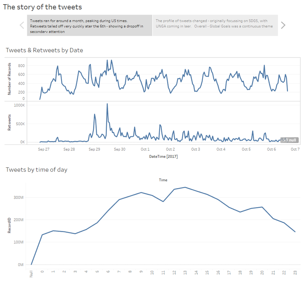
:-) seems I can re-use last week's submission!
This was done using a Tableau Story, so then notes on-top are self-descriptive.
- Mark as New
- Bookmark
- Subscribe
- Mute
- Subscribe to RSS Feed
- Permalink
- Notify Moderator
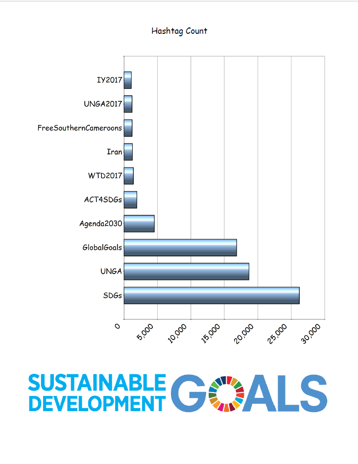
- Mark as New
- Bookmark
- Subscribe
- Mute
- Subscribe to RSS Feed
- Permalink
- Notify Moderator
- Mark as New
- Bookmark
- Subscribe
- Mute
- Subscribe to RSS Feed
- Permalink
- Notify Moderator
Hi!
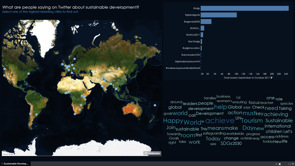
This is my first Alteryx challenge, so I hope I've done a decent job! My viz is here on Tableau Public. Feedback is very welcome, as I'd like to improve it.
It looks like this:
- Mark as New
- Bookmark
- Subscribe
- Mute
- Subscribe to RSS Feed
- Permalink
- Notify Moderator
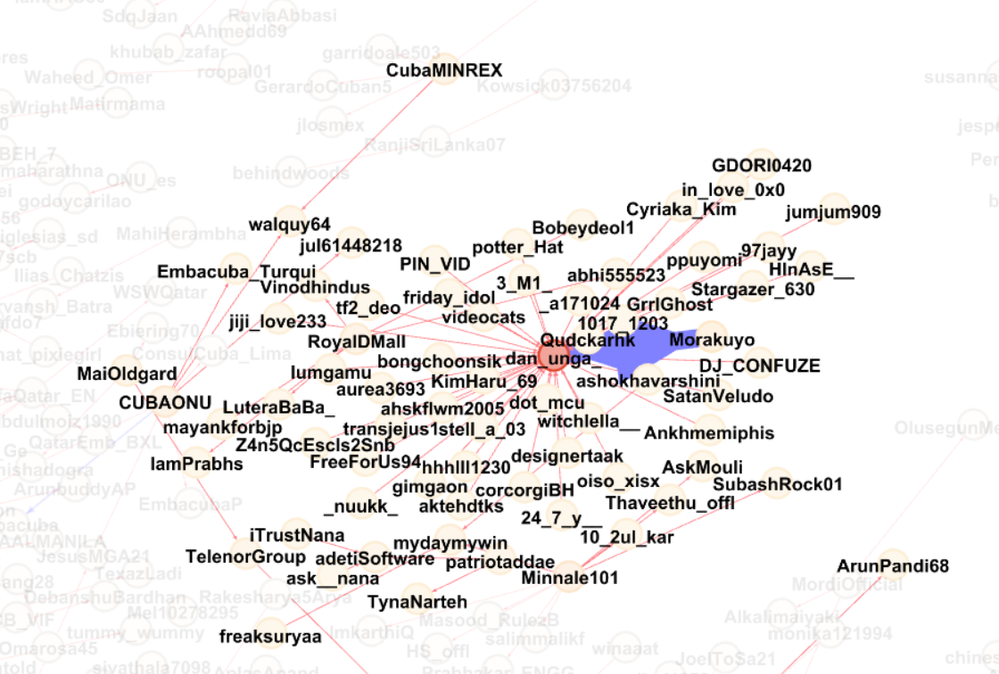
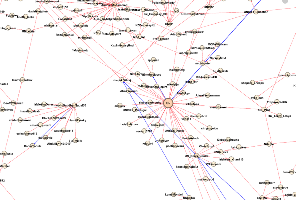
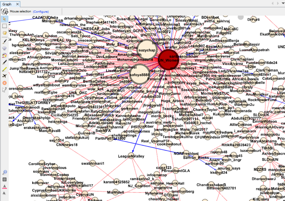
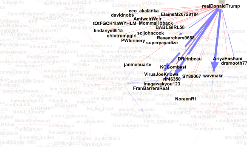
I threw it into Gephi, and came to this beauty, a little rough around the edges, it's my first time using Gephi,
This is 5K tweets instead of 1.5K, too many connections makes my laptop sweat, going to give it a try on the bog machine tomorrow.
This is fun!
As for the story behind it: Just follow the little arrows down the rabit hole...
I've been exploring this map for 20 min now, and nowhere near done, I swear Bill Gates is in there somewhere!
- Mark as New
- Bookmark
- Subscribe
- Mute
- Subscribe to RSS Feed
- Permalink
- Notify Moderator
Catching back up! Gotta make sure I'm nice & limber for that 100th Challenge summit...
Did my visuals playing around in PowerBI. Fun exercise to see some pretty results from all this fun data crunching! Included a date range filter, Top 10 Hashtag Count, # of Tweets & Retweets by Date, Top 5 Favorite Tweets, and a display of Tweets & Retweets based on users with the most followers.
NJ
- Mark as New
- Bookmark
- Subscribe
- Mute
- Subscribe to RSS Feed
- Permalink
- Notify Moderator
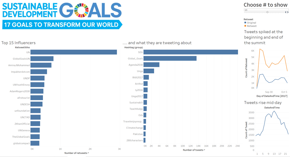
Worked quickly on this, so not 100% satisfied with the organization of the page. On the Tableau dashboard, you can click on an influencer to see what they are tweeting about. You can control the # of influencers to show using the slider on the right.
If you don't have Tableau, you can grab the free reader from Tableau dot com, and play around with the dashboard. Except that I'm unable to upload my workbook, which is saved as a twbx. Any ideas/suggestions?
- Mark as New
- Bookmark
- Subscribe
- Mute
- Subscribe to RSS Feed
- Permalink
- Notify Moderator
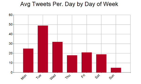
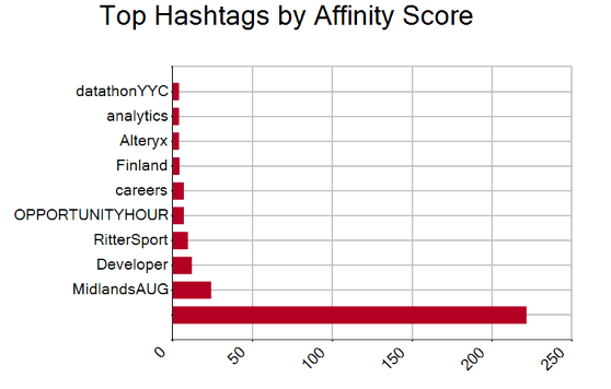
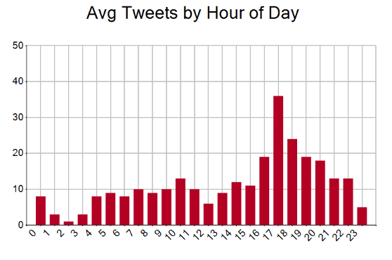
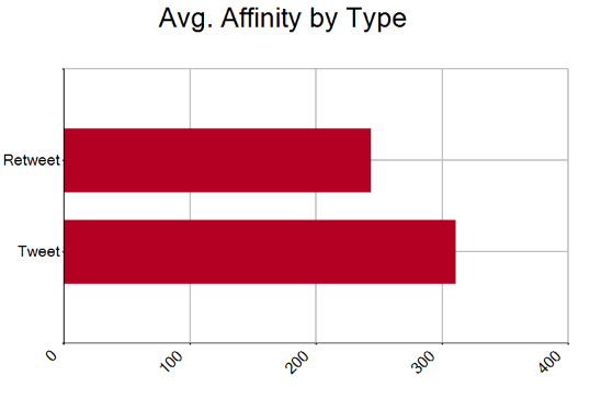
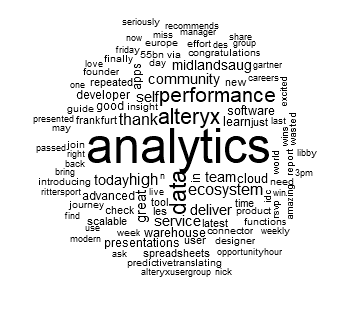
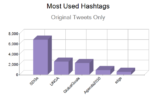
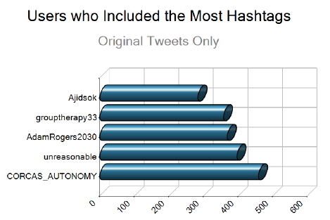
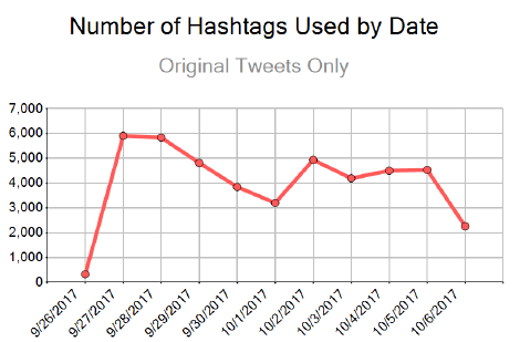
I analyzed the last 10 days of Twitter data for Alteryx -- workflow below:
Most of the metrics relied on a calculated affinity score -- a weighting of both retweets and favorites (combined into a single metric):
Output graphics below:
- Mark as New
- Bookmark
- Subscribe
- Mute
- Subscribe to RSS Feed
- Permalink
- Notify Moderator
-
Advanced
283 -
Apps
25 -
Basic
141 -
Calgary
1 -
Core
134 -
Data Analysis
184 -
Data Cleansing
6 -
Data Investigation
7 -
Data Parsing
12 -
Data Preparation
211 -
Developer
35 -
Difficult
77 -
Expert
16 -
Foundation
13 -
Interface
39 -
Intermediate
250 -
Join
206 -
Macros
53 -
Parse
139 -
Predictive
20 -
Predictive Analysis
14 -
Preparation
271 -
Reporting
54 -
Reporting and Visualization
17 -
Spatial
60 -
Spatial Analysis
52 -
Time Series
1 -
Transform
216
- « Previous
- Next »
