In honor of the new roll-out of the Women of Analytics group, we decided to theme this week's challenge!
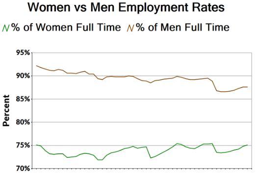
This women's history month, let's analyze employment rates of men and women in the United states with data from the Bureau of Labor statistics. One of the challenges will be navigating the difficult excel file structure of merged headers, and the other will be reporting on the overall percent of men and women in the workforce. Try to replicate the chart pictured in the output.

For more advanced users, try to calculate the slope of the employment rate and around what year the slopes are set to intersect assuming linear growth. Plot the trend lines on the report chart as well!