ACT NOW: The Alteryx team will be retiring support for Community account recovery and Community email-change requests Early 2026. Make sure to check your account preferences in my.alteryx.com to make sure you have filled out your security questions.
Learn more here
Search
Close
Start Free Trial
Turn on suggestions
Auto-suggest helps you quickly narrow down your search results by suggesting possible matches as you type.
Showing results for
Alteryx Designer Desktop Discussions
Find answers, ask questions, and share expertise about Alteryx Designer Desktop and Intelligence Suite.- Community
- :
- Community
- :
- Participate
- :
- Discussions
- :
- Designer Desktop
- :
- Need help creating multi line chart with points
SOLVED
Need help creating multi line chart with points
Options
- Subscribe to RSS Feed
- Mark Topic as New
- Mark Topic as Read
- Float this Topic for Current User
- Bookmark
- Subscribe
- Mute
- Printer Friendly Page
kajals
6 - Meteoroid
10-19-2020
01:20 PM
- Mark as New
- Bookmark
- Subscribe
- Mute
- Subscribe to RSS Feed
- Permalink
- Notify Moderator
Hi
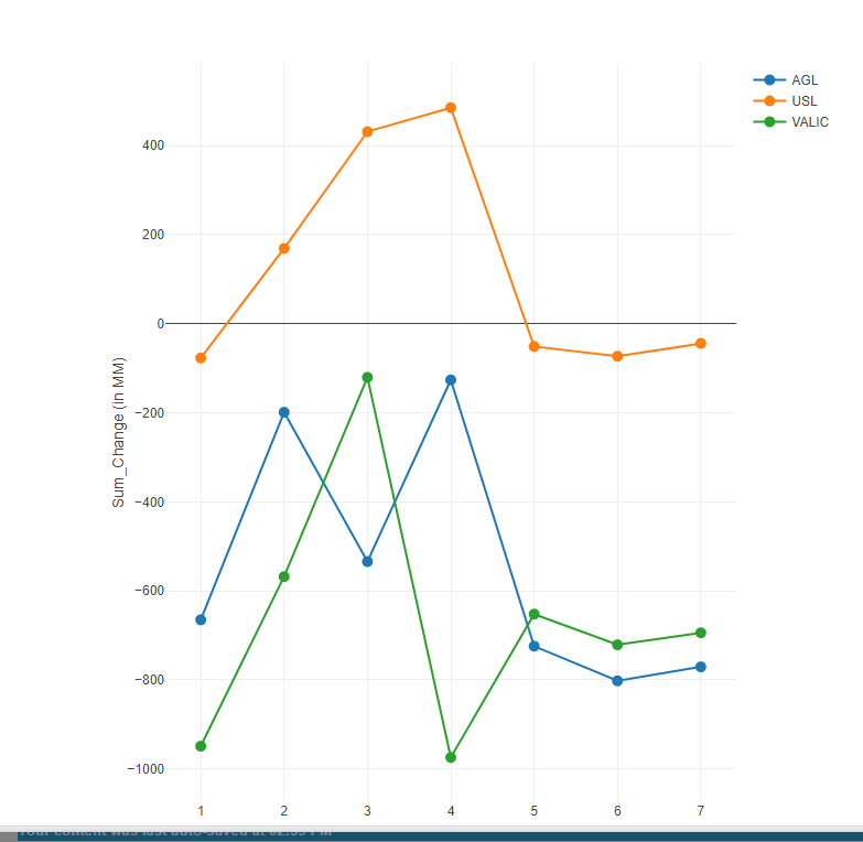
I have a dataset for which I need to create multi line charts (see attached). I tried using the Interactive Chart but unable to get the 'Scenario' field as points on the line chart. Please help.
Solved! Go to Solution.
Labels:
- Labels:
-
Workflow
2 REPLIES 2
Blake
12 - Quasar
10-19-2020
03:05 PM
- Mark as New
- Bookmark
- Subscribe
- Mute
- Subscribe to RSS Feed
- Permalink
- Notify Moderator
Hi @kajals
You can use an interactive chart tool to accomplish this. I threw together a simple example but you can definitely include more on your view. It looked like your Excel chart was only considering the Annuity LOB so I filtered to that on my chart.
Good luck!
10-21-2020
02:28 PM
- Mark as New
- Bookmark
- Subscribe
- Mute
- Subscribe to RSS Feed
- Permalink
- Notify Moderator
Thanks much. It resolved the confusion I had.
Labels
-
Academy
6 -
ADAPT
2 -
Adobe
204 -
Advent of Code
3 -
Alias Manager
78 -
Alteryx Copilot
25 -
Alteryx Designer
7 -
Alteryx Editions
94 -
Alteryx Practice
20 -
Amazon S3
149 -
AMP Engine
252 -
Announcement
1 -
API
1,208 -
App Builder
116 -
Apps
1,360 -
Assets | Wealth Management
1 -
Basic Creator
15 -
Batch Macro
1,558 -
Behavior Analysis
246 -
Best Practices
2,693 -
Bug
719 -
Bugs & Issues
1 -
Calgary
67 -
CASS
53 -
Chained App
268 -
Common Use Cases
3,823 -
Community
26 -
Computer Vision
85 -
Connectors
1,426 -
Conversation Starter
3 -
COVID-19
1 -
Custom Formula Function
1 -
Custom Tools
1,936 -
Data
1 -
Data Challenge
10 -
Data Investigation
3,486 -
Data Science
3 -
Database Connection
2,220 -
Datasets
5,221 -
Date Time
3,227 -
Demographic Analysis
186 -
Designer Cloud
740 -
Developer
4,368 -
Developer Tools
3,528 -
Documentation
526 -
Download
1,037 -
Dynamic Processing
2,937 -
Email
927 -
Engine
145 -
Enterprise (Edition)
1 -
Error Message
2,256 -
Events
198 -
Expression
1,868 -
Financial Services
1 -
Full Creator
2 -
Fun
2 -
Fuzzy Match
711 -
Gallery
666 -
GenAI Tools
3 -
General
2 -
Google Analytics
155 -
Help
4,706 -
In Database
966 -
Input
4,291 -
Installation
360 -
Interface Tools
1,900 -
Iterative Macro
1,094 -
Join
1,957 -
Licensing
252 -
Location Optimizer
60 -
Machine Learning
259 -
Macros
2,862 -
Marketo
12 -
Marketplace
23 -
MongoDB
82 -
Off-Topic
5 -
Optimization
750 -
Output
5,252 -
Parse
2,327 -
Power BI
228 -
Predictive Analysis
936 -
Preparation
5,167 -
Prescriptive Analytics
205 -
Professional (Edition)
4 -
Publish
257 -
Python
855 -
Qlik
39 -
Question
1 -
Questions
2 -
R Tool
476 -
Regex
2,339 -
Reporting
2,431 -
Resource
1 -
Run Command
575 -
Salesforce
277 -
Scheduler
411 -
Search Feedback
3 -
Server
629 -
Settings
933 -
Setup & Configuration
3 -
Sharepoint
626 -
Spatial Analysis
599 -
Starter (Edition)
1 -
Tableau
512 -
Tax & Audit
1 -
Text Mining
468 -
Thursday Thought
4 -
Time Series
431 -
Tips and Tricks
4,187 -
Topic of Interest
1,126 -
Transformation
3,726 -
Twitter
23 -
Udacity
84 -
Updates
1 -
Viewer
3 -
Workflow
9,975
- « Previous
- Next »

