Alteryx Designer Desktop Discussions
Find answers, ask questions, and share expertise about Alteryx Designer Desktop and Intelligence Suite.- Community
- :
- Community
- :
- Participate
- :
- Discussions
- :
- Designer Desktop
- :
- Interactive Chart - Line Chart format different th...
Interactive Chart - Line Chart format different than Area Chart using DateTime on X-Axis
- Subscribe to RSS Feed
- Mark Topic as New
- Mark Topic as Read
- Float this Topic for Current User
- Bookmark
- Subscribe
- Mute
- Printer Friendly Page
- Mark as New
- Bookmark
- Subscribe
- Mute
- Subscribe to RSS Feed
- Permalink
- Notify Moderator
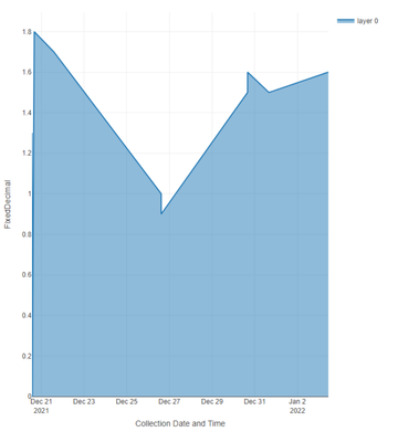
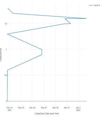
I am getting different results in the Interactive Chart tool between Line and Area formatting. Area seems to work as intended but the Line chart doesn't format the path of the line correctly.
This is what I get when using the Area chart:
And when I switch to the Line chart, the path of the line changes:
Below is a sampled dataset that I'm using in this example. The first column is a FixedDecimal while the second column is DateTime
| FixedDecimal | Collection Date and Time |
| 0 | 2021-12-20 13:55 |
| 0 | 2021-12-20 13:57 |
| 0.6 | 2021-12-20 14:33 |
| 0.9 | 2021-12-26 14:53 |
| 1 | 2021-12-26 14:52 |
| 1.3 | 2021-12-20 13:38 |
| 1.5 | 2021-12-30 15:58 |
| 1.5 | 2021-12-31 16:01 |
| 1.5 | 2021-12-31 16:02 |
| 1.6 | 2021-12-30 16:00 |
| 1.6 | 2022-01-03 10:49 |
| 1.6 | 2022-01-03 10:52 |
| 1.7 | 2021-12-21 14:09 |
| 1.7 | 2021-12-21 14:11 |
| 1.8 | 2021-12-20 16:05 |
| 1.8 | 2021-12-20 16:07 |
Does anyone have an idea why I'm experiencing this behavior? Or if there is a workaround with data types or etc,?
I would prefer to go with the line chart since I plan on adding on multiple layers and other details.
- Labels:
-
Reporting
- Mark as New
- Bookmark
- Subscribe
- Mute
- Subscribe to RSS Feed
- Permalink
- Notify Moderator
hi @Anthony_A2
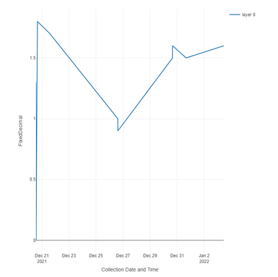
I was able to hack around this by converting collection date to a datetime field, sorting the data by collection date, adding the area layer, adding a second line layer and then deleting the the area layer.
Leaving out any of the steps results in the inverted line that you found
It's an ugly hack and you should probably open a ticked
Dan
-
Academy
6 -
ADAPT
2 -
Adobe
204 -
Advent of Code
3 -
Alias Manager
78 -
Alteryx Copilot
25 -
Alteryx Designer
7 -
Alteryx Editions
94 -
Alteryx Practice
20 -
Amazon S3
149 -
AMP Engine
252 -
Announcement
1 -
API
1,208 -
App Builder
116 -
Apps
1,360 -
Assets | Wealth Management
1 -
Basic Creator
14 -
Batch Macro
1,558 -
Behavior Analysis
246 -
Best Practices
2,693 -
Bug
719 -
Bugs & Issues
1 -
Calgary
67 -
CASS
53 -
Chained App
267 -
Common Use Cases
3,822 -
Community
26 -
Computer Vision
85 -
Connectors
1,425 -
Conversation Starter
3 -
COVID-19
1 -
Custom Formula Function
1 -
Custom Tools
1,936 -
Data
1 -
Data Challenge
10 -
Data Investigation
3,486 -
Data Science
3 -
Database Connection
2,220 -
Datasets
5,220 -
Date Time
3,227 -
Demographic Analysis
186 -
Designer Cloud
740 -
Developer
4,367 -
Developer Tools
3,528 -
Documentation
526 -
Download
1,036 -
Dynamic Processing
2,937 -
Email
927 -
Engine
145 -
Enterprise (Edition)
1 -
Error Message
2,256 -
Events
198 -
Expression
1,868 -
Financial Services
1 -
Full Creator
2 -
Fun
2 -
Fuzzy Match
711 -
Gallery
666 -
GenAI Tools
3 -
General
2 -
Google Analytics
155 -
Help
4,705 -
In Database
966 -
Input
4,291 -
Installation
360 -
Interface Tools
1,900 -
Iterative Macro
1,094 -
Join
1,957 -
Licensing
252 -
Location Optimizer
60 -
Machine Learning
259 -
Macros
2,862 -
Marketo
12 -
Marketplace
23 -
MongoDB
82 -
Off-Topic
5 -
Optimization
750 -
Output
5,252 -
Parse
2,327 -
Power BI
228 -
Predictive Analysis
936 -
Preparation
5,166 -
Prescriptive Analytics
205 -
Professional (Edition)
4 -
Publish
257 -
Python
854 -
Qlik
39 -
Question
1 -
Questions
2 -
R Tool
476 -
Regex
2,339 -
Reporting
2,430 -
Resource
1 -
Run Command
575 -
Salesforce
276 -
Scheduler
411 -
Search Feedback
3 -
Server
629 -
Settings
933 -
Setup & Configuration
3 -
Sharepoint
626 -
Spatial Analysis
599 -
Starter (Edition)
1 -
Tableau
512 -
Tax & Audit
1 -
Text Mining
468 -
Thursday Thought
4 -
Time Series
431 -
Tips and Tricks
4,187 -
Topic of Interest
1,126 -
Transformation
3,726 -
Twitter
23 -
Udacity
84 -
Updates
1 -
Viewer
3 -
Workflow
9,973
- « Previous
- Next »


