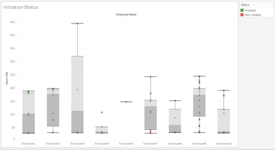
I'm seeking information on how to configure the Charting Tool to create a Box and Whisker Plot. Currently I take a product of one of my Alteryx Apps and run it through Tableau to create this type of visualization:

For my use case, the individual employees (labeled as 'assignee' in my data below) are represented on the x axis and the 'hours old' are represented on the y axis.
I'm not expecting Alteryx to be as "fancy" but I'd like to include this type of chart so the recipients of this report can see a visual preview of the data. In other words: I want to include a box and whisker plot in the email body of the email render tool, in addition to linking the user to the Tableau view with more details - such as the status (red/green).
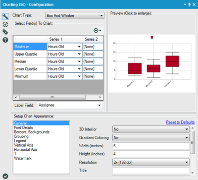
This configuration...

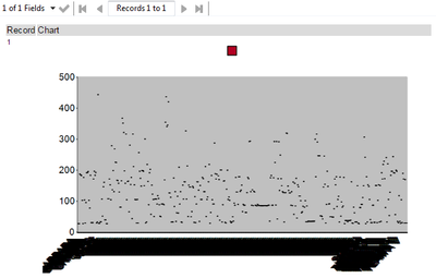
... produces this view:

I can't find any information on how to configure this tool. What is possible?