Search
Close
Free Trial
Turn on suggestions
Auto-suggest helps you quickly narrow down your search results by suggesting possible matches as you type.
Showing results for
Weekly Challenges
Solve the challenge, share your solution and summit the ranks of our Community!Also available in | Français | Português | Español | 日本語
IDEAS WANTED
Want to get involved? We're always looking for ideas and content for Weekly Challenges.
SUBMIT YOUR IDEA- Community
- :
- Community
- :
- Learn
- :
- Academy
- :
- Challenges & Quests
- :
- Weekly Challenges
- :
- Challenge #90: Analyzing Social Data (Part 2)
Challenge #90: Analyzing Social Data (Part 2)
Options
- Subscribe to RSS Feed
- Mark Topic as New
- Mark Topic as Read
- Float this Topic for Current User
- Bookmark
- Subscribe
- Mute
- Printer Friendly Page
17 - Castor
02-26-2018
07:41 AM
- Mark as New
- Bookmark
- Subscribe
- Mute
- Subscribe to RSS Feed
- Permalink
- Notify Moderator
kelly_gilbert
13 - Pulsar
04-12-2018
10:34 AM
- Mark as New
- Bookmark
- Subscribe
- Mute
- Subscribe to RSS Feed
- Permalink
- Notify Moderator
19 - Altair
08-12-2018
07:12 AM
- Mark as New
- Bookmark
- Subscribe
- Mute
- Subscribe to RSS Feed
- Permalink
- Notify Moderator
kat
12 - Quasar
08-22-2018
05:19 AM
- Mark as New
- Bookmark
- Subscribe
- Mute
- Subscribe to RSS Feed
- Permalink
- Notify Moderator
Spoiler
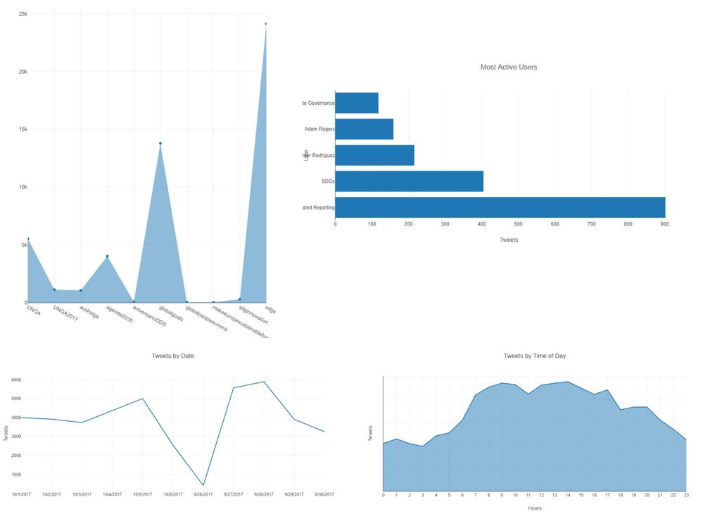
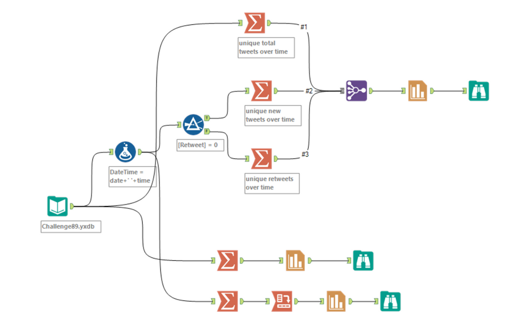
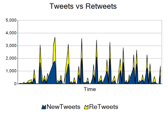
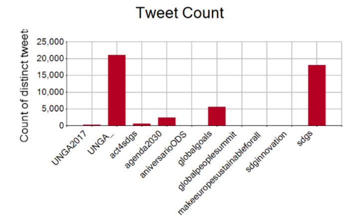
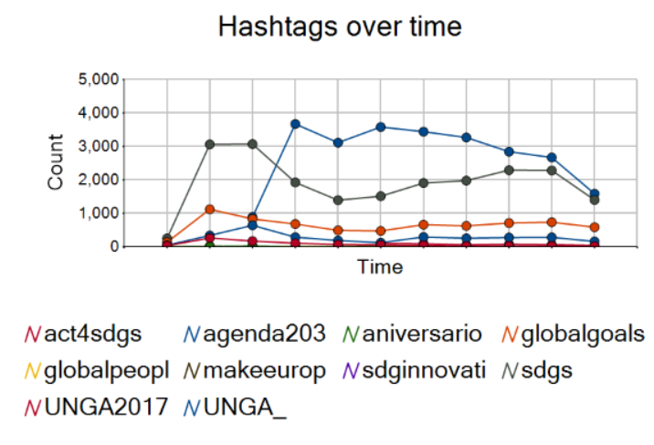
I chose to venture a little into Alteryx charting. Can't wait for 2018.3 visualizations!


JoBen
11 - Bolide
11-08-2018
01:24 PM
- Mark as New
- Bookmark
- Subscribe
- Mute
- Subscribe to RSS Feed
- Permalink
- Notify Moderator
Cheers! I think I jumped the gun on the previous challenge, so I came up with a few new things.
Spoiler
These are two Tableau graphs that show a time phased map that corresponds to the number of times a particular country or continent is mentioned in a tweet (according to the English spelling of the country). In first one, the larger the bubble, the greater the number of times that country is mentioned. In the second one, the redder the color, the more times a country in the continent is mentioned.
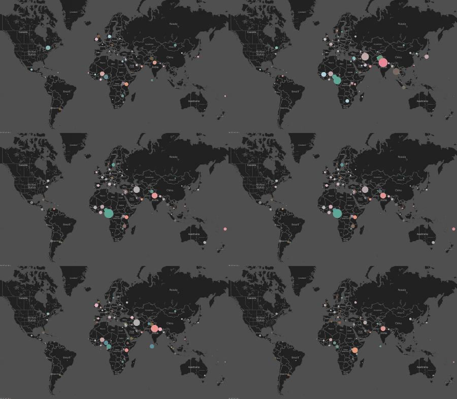 Times a country is mentioned in a tweet per day
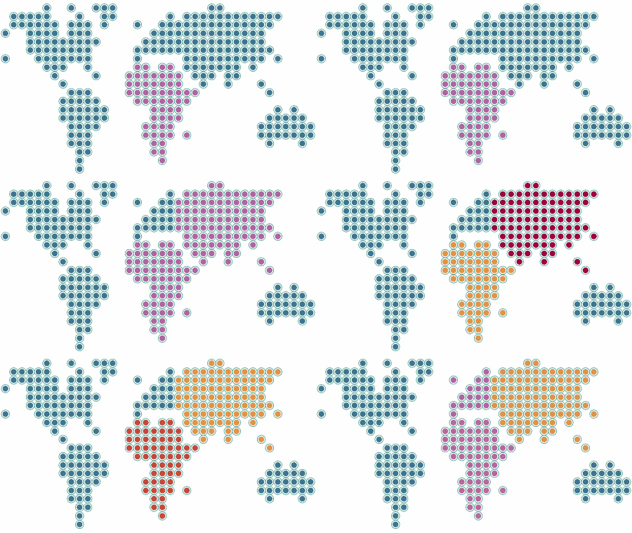 Continental view of previous graph
 Times a country is mentioned in a tweet per day
 Continental view of previous graph
jssandom
8 - Asteroid
11-19-2018
07:29 AM
- Mark as New
- Bookmark
- Subscribe
- Mute
- Subscribe to RSS Feed
- Permalink
- Notify Moderator
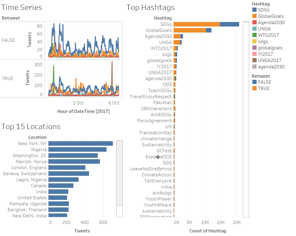
A simple dashboard :)
pasccout
8 - Asteroid
11-29-2018
05:43 AM
- Mark as New
- Bookmark
- Subscribe
- Mute
- Subscribe to RSS Feed
- Permalink
- Notify Moderator
AJauniskis
8 - Asteroid
01-24-2019
03:41 AM
- Mark as New
- Bookmark
- Subscribe
- Mute
- Subscribe to RSS Feed
- Permalink
- Notify Moderator
ipeng
8 - Asteroid
01-28-2019
06:42 AM
- Mark as New
- Bookmark
- Subscribe
- Mute
- Subscribe to RSS Feed
- Permalink
- Notify Moderator
RichoBsJ
11 - Bolide
02-08-2019
09:54 AM
- Mark as New
- Bookmark
- Subscribe
- Mute
- Subscribe to RSS Feed
- Permalink
- Notify Moderator
Labels
-
Advanced
283 -
Apps
25 -
Basic
141 -
Calgary
1 -
Core
134 -
Data Analysis
184 -
Data Cleansing
6 -
Data Investigation
7 -
Data Parsing
12 -
Data Preparation
211 -
Developer
35 -
Difficult
77 -
Expert
16 -
Foundation
13 -
Interface
39 -
Intermediate
250 -
Join
206 -
Macros
53 -
Parse
139 -
Predictive
20 -
Predictive Analysis
14 -
Preparation
271 -
Reporting
54 -
Reporting and Visualization
17 -
Spatial
60 -
Spatial Analysis
52 -
Time Series
1 -
Transform
216
- « Previous
- Next »
