Weekly Challenges
Solve the challenge, share your solution and summit the ranks of our Community!Also available in | Français | Português | Español | 日本語
IDEAS WANTED
Want to get involved? We're always looking for ideas and content for Weekly Challenges.
SUBMIT YOUR IDEA- Community
- :
- Community
- :
- Learn
- :
- Academy
- :
- Challenges & Quests
- :
- Weekly Challenges
- :
- Challenge #76: Strava Export Parse and Report
Challenge #76: Strava Export Parse and Report
- Subscribe to RSS Feed
- Mark Topic as New
- Mark Topic as Read
- Float this Topic for Current User
- Bookmark
- Subscribe
- Mute
- Printer Friendly Page
- Mark as New
- Bookmark
- Subscribe
- Mute
- Subscribe to RSS Feed
- Permalink
- Notify Moderator
Strava is a popular app that serves a social network for all athletes. In particular, the app is popular with runner and cyclists. However, sometimes we want to see the data differently from what is served to us. Below is a GPX file containing a mountain bike ride I completed a few weeks ago. The challenge is to parse it and create report snippets like these:
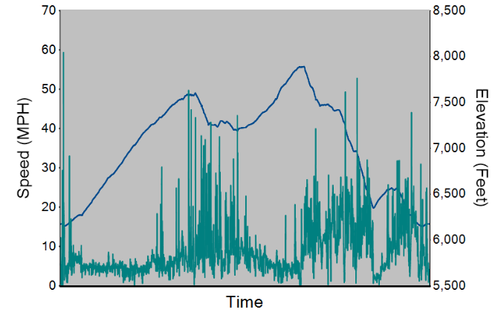
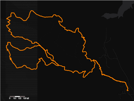
Feel free to try anything else on top of these! I will not be providing a starting workflow since the results are pictured above, and connecting to the .gpx file is part of the challenge!
- Mark as New
- Bookmark
- Subscribe
- Mute
- Subscribe to RSS Feed
- Permalink
- Notify Moderator
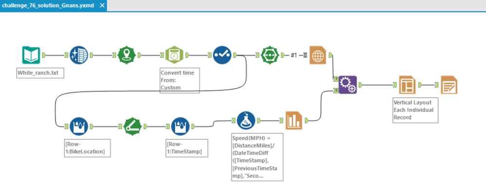
My solution!
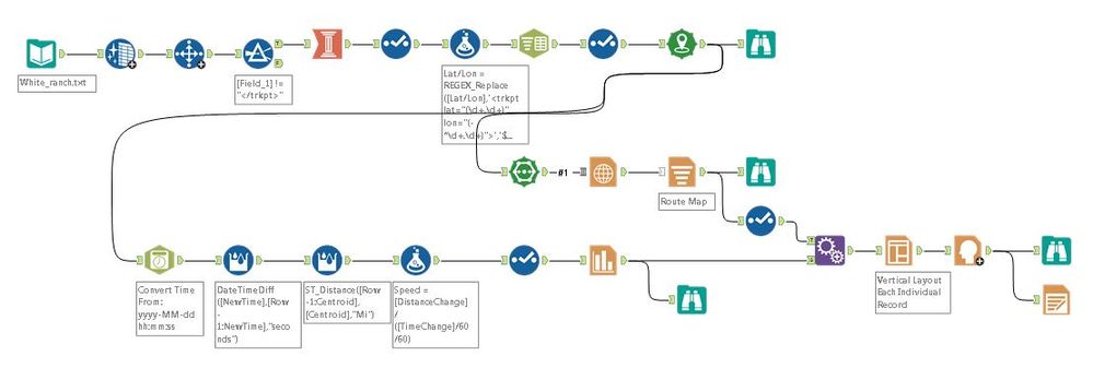
- Mark as New
- Bookmark
- Subscribe
- Mute
- Subscribe to RSS Feed
- Permalink
- Notify Moderator
- Mark as New
- Bookmark
- Subscribe
- Mute
- Subscribe to RSS Feed
- Permalink
- Notify Moderator
- Mark as New
- Bookmark
- Subscribe
- Mute
- Subscribe to RSS Feed
- Permalink
- Notify Moderator
- Mark as New
- Bookmark
- Subscribe
- Mute
- Subscribe to RSS Feed
- Permalink
- Notify Moderator
Hi @JoeM how did you convert the gpx file to text? I am a avid strava user and wanted to convert all of my gpx files.
Thank you
- Mark as New
- Bookmark
- Subscribe
- Mute
- Subscribe to RSS Feed
- Permalink
- Notify Moderator
@pvara - when I downloaded it, it simply saved it with a .txt extension since .gpx is not an accepted Community file type. You can keep it as .gpx for Alteryx and process it as if it was a text file.
- Mark as New
- Bookmark
- Subscribe
- Mute
- Subscribe to RSS Feed
- Permalink
- Notify Moderator
- Mark as New
- Bookmark
- Subscribe
- Mute
- Subscribe to RSS Feed
- Permalink
- Notify Moderator
The distance between lat/long observations divided by the time elapsed results in some pretty phenomenal speeds!
Or perhaps Joe can really climb Belcher Hill at 60mph? What's your secret Joe? Newfangled e-bike? Secret high speed chair lift?
- Mark as New
- Bookmark
- Subscribe
- Mute
- Subscribe to RSS Feed
- Permalink
- Notify Moderator
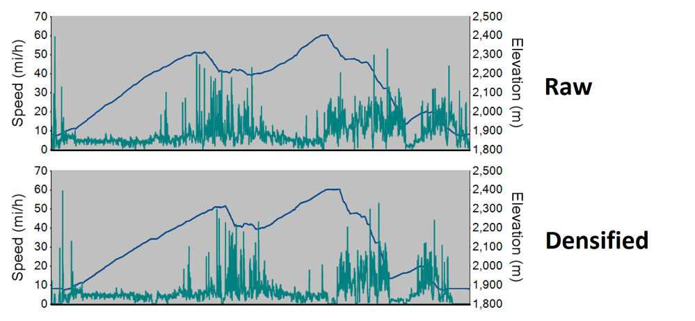
My first draft is attached (named minimal), and upon looking at the data, I learned that in the Charting tool, the Chart Type of Line does not allow us to set an X-Axis, so what it uses is the record sequence. This means if we want to use Time as the X-Axis, each record should represent the same interval if we want an accurate representation of the data. In the data provided one record only represents one second for about half the records, the visualization in the thread question does not take these factors into account. Without taking them into account, the resulting chart is distorted.
Here is an example of the difference between Raw and Densified (note that with the Densified version we can see the moments when there was no movement, speed stays at 0 for a bit of time, and elevation is flat):
Attached is my complex route with a way to densify the data with respect to each second of time, and then interpolate the coordinates and elevation. An additional chart with distance as the X-Axis was also created.
Side note, instead of using a Multi-Row Formula tool twice, one option is we can use a Join Multiple on record position keeping only records that join from all inputs, with one data stream skipping the first record. I am not sure if it is more efficient than multiple Multi-Row Formula tools.
-
Advanced
299 -
Apps
26 -
Basic
158 -
Calgary
1 -
Core
157 -
Data Analysis
185 -
Data Cleansing
5 -
Data Investigation
7 -
Data Parsing
14 -
Data Preparation
237 -
Developer
35 -
Difficult
86 -
Expert
16 -
Foundation
13 -
Interface
39 -
Intermediate
266 -
Join
211 -
Macros
61 -
Parse
141 -
Predictive
20 -
Predictive Analysis
14 -
Preparation
272 -
Reporting
55 -
Reporting and Visualization
16 -
Spatial
60 -
Spatial Analysis
52 -
Time Series
1 -
Transform
226
- « Previous
- Next »

