Weekly Challenges
Solve the challenge, share your solution and summit the ranks of our Community!Also available in | Français | Português | Español | 日本語
IDEAS WANTED
Want to get involved? We're always looking for ideas and content for Weekly Challenges.
SUBMIT YOUR IDEA- Community
- :
- Community
- :
- Learn
- :
- Academy
- :
- Challenges & Quests
- :
- Weekly Challenges
- :
- Challenge #201: Wage Ain't Nothin' but a Number
Challenge #201: Wage Ain't Nothin' but a Number
- Subscribe to RSS Feed
- Mark Topic as New
- Mark Topic as Read
- Float this Topic for Current User
- Bookmark
- Subscribe
- Mute
- Printer Friendly Page
- Mark as New
- Bookmark
- Subscribe
- Mute
- Subscribe to RSS Feed
- Permalink
- Notify Moderator
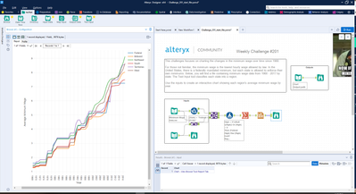
I replaced nulls and zeros with the federal rate.
- Mark as New
- Bookmark
- Subscribe
- Mute
- Subscribe to RSS Feed
- Permalink
- Notify Moderator
- Mark as New
- Bookmark
- Subscribe
- Mute
- Subscribe to RSS Feed
- Permalink
- Notify Moderator
Wage is more than a number though 🙂
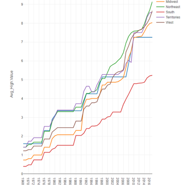
I am unsure about those 2018 values in the separate column, and perhaps I should have added the federal values as well... Anyways, here's my take on whats asked:
- Mark as New
- Bookmark
- Subscribe
- Mute
- Subscribe to RSS Feed
- Permalink
- Notify Moderator
- Mark as New
- Bookmark
- Subscribe
- Mute
- Subscribe to RSS Feed
- Permalink
- Notify Moderator
- Mark as New
- Bookmark
- Subscribe
- Mute
- Subscribe to RSS Feed
- Permalink
- Notify Moderator
- Mark as New
- Bookmark
- Subscribe
- Mute
- Subscribe to RSS Feed
- Permalink
- Notify Moderator
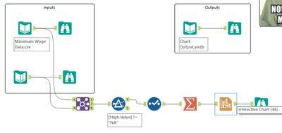
This was the first time that I have used the interactive charting tool.
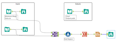
First time through I thought I needed to transform the data so I had distinct columns for each layer, and was thinking that was very clunky. So went through it again and realized that can use the normalized data for the layer and then the transform within iChart creates the distinct series. That was not intuitive for me using the tool, but definitely makes it much more useful now that I know it is there.
- Mark as New
- Bookmark
- Subscribe
- Mute
- Subscribe to RSS Feed
- Permalink
- Notify Moderator
- Mark as New
- Bookmark
- Subscribe
- Mute
- Subscribe to RSS Feed
- Permalink
- Notify Moderator
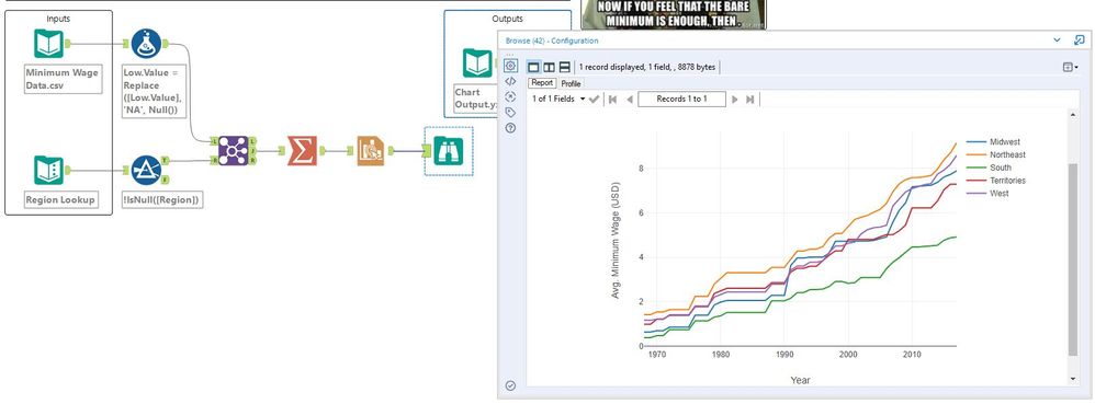
My Solution:
- Mark as New
- Bookmark
- Subscribe
- Mute
- Subscribe to RSS Feed
- Permalink
- Notify Moderator
Wasn't too difficult, but fun working with the interactive graphics.
-
Advanced
299 -
Apps
27 -
Basic
156 -
Calgary
1 -
Core
155 -
Data Analysis
186 -
Data Cleansing
6 -
Data Investigation
7 -
Data Parsing
15 -
Data Preparation
234 -
Developer
35 -
Difficult
85 -
Expert
16 -
Foundation
13 -
Interface
39 -
Intermediate
266 -
Join
211 -
Macros
61 -
Parse
141 -
Predictive
20 -
Predictive Analysis
14 -
Preparation
272 -
Reporting
55 -
Reporting and Visualization
17 -
Spatial
60 -
Spatial Analysis
53 -
Time Series
1 -
Transform
225
- « Previous
- Next »
