The Alteryx Community is a finalist in three 2026 CMX Awards! Help us win Customer Support Community, Most Engaged Community, and User Group Program of the Year - vote now! (it only takes about 2 minutes) before January 9.
ACT NOW: The Alteryx team will be retiring support for Community account recovery and Community email-change requests Early 2026. Make sure to check your account preferences in my.alteryx.com to make sure you have filled out your security questions.
Learn more here
Search
Close
Start Free Trial
Turn on suggestions
Auto-suggest helps you quickly narrow down your search results by suggesting possible matches as you type.
Showing results for
Weekly Challenges
Solve the challenge, share your solution and summit the ranks of our Community!Also available in | Français | Português | Español | 日本語
IDEAS WANTED
Want to get involved? We're always looking for ideas and content for Weekly Challenges.
SUBMIT YOUR IDEA- Community
- :
- Community
- :
- Learn
- :
- Academy
- :
- Challenges & Quests
- :
- Weekly Challenges
- :
- Challenge #107: Plot Employment Rates by Gender in...
Challenge #107: Plot Employment Rates by Gender in the US
Options
- Subscribe to RSS Feed
- Mark Topic as New
- Mark Topic as Read
- Float this Topic for Current User
- Bookmark
- Subscribe
- Mute
- Printer Friendly Page
13 - Pulsar
03-29-2023
03:33 PM
- Mark as New
- Bookmark
- Subscribe
- Mute
- Subscribe to RSS Feed
- Permalink
- Notify Moderator
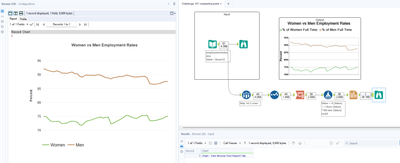
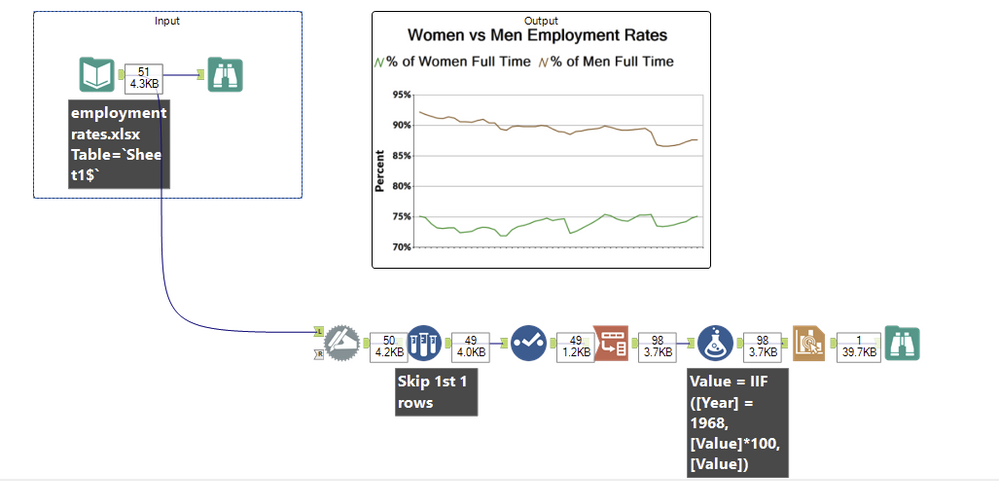
Pretty happy with this result:
bkclaw113
10 - Fireball
04-11-2023
04:08 AM
- Mark as New
- Bookmark
- Subscribe
- Mute
- Subscribe to RSS Feed
- Permalink
- Notify Moderator
Not sure if it is just me, but the Interactive Chart Tool is about the most unintuitive thing in Alteryx.
17 - Castor
04-23-2023
04:30 AM
- Mark as New
- Bookmark
- Subscribe
- Mute
- Subscribe to RSS Feed
- Permalink
- Notify Moderator
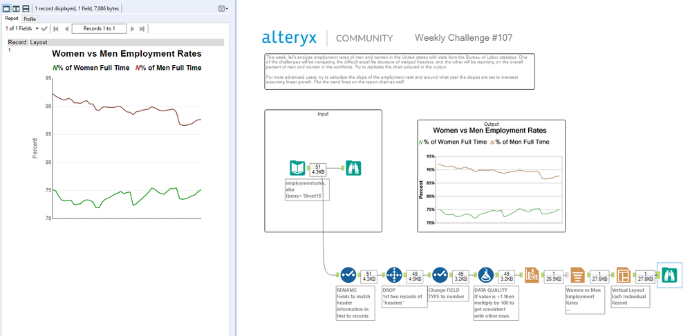
My solution to #107 - not perfect but think it's a decent attempt given the difference in configurability from the original Charting tool.
Alteryx
05-27-2023
06:40 PM
- Mark as New
- Bookmark
- Subscribe
- Mute
- Subscribe to RSS Feed
- Permalink
- Notify Moderator
Alteryx
06-01-2023
01:27 PM
- Mark as New
- Bookmark
- Subscribe
- Mute
- Subscribe to RSS Feed
- Permalink
- Notify Moderator
SBezella
7 - Meteor
07-12-2023
07:26 AM
- Mark as New
- Bookmark
- Subscribe
- Mute
- Subscribe to RSS Feed
- Permalink
- Notify Moderator
Spoiler
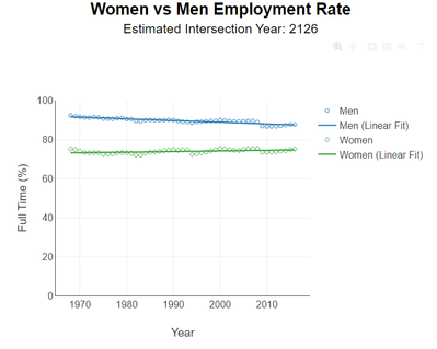
I came as close as I could using the current Interactive Chart Tool (vs. deprecated Charting Tool). My goal was to mirror the provided solution, but I would have made enhancements if I was providing this chart to a client.
bo_peng2022
8 - Asteroid
08-11-2023
05:04 PM
- Mark as New
- Bookmark
- Subscribe
- Mute
- Subscribe to RSS Feed
- Permalink
- Notify Moderator
ed_hayter
13 - Pulsar
09-04-2023
08:20 AM
- Mark as New
- Bookmark
- Subscribe
- Mute
- Subscribe to RSS Feed
- Permalink
- Notify Moderator
Spoiler
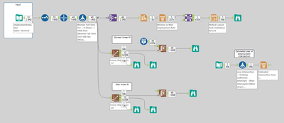
Want to come back to the linear regression aspect of the question - thinking about adding interaction effects for varying slopes and calculate when they intersect.

16 - Nebula
09-05-2023
10:57 PM
- Mark as New
- Bookmark
- Subscribe
- Mute
- Subscribe to RSS Feed
- Permalink
- Notify Moderator
TonyK
8 - Asteroid
09-28-2023
06:32 AM
- Mark as New
- Bookmark
- Subscribe
- Mute
- Subscribe to RSS Feed
- Permalink
- Notify Moderator
Labels
-
Advanced
302 -
Apps
27 -
Basic
158 -
Calgary
1 -
Core
157 -
Data Analysis
185 -
Data Cleansing
5 -
Data Investigation
7 -
Data Parsing
14 -
Data Preparation
238 -
Developer
36 -
Difficult
87 -
Expert
16 -
Foundation
13 -
Interface
39 -
Intermediate
268 -
Join
211 -
Macros
62 -
Parse
141 -
Predictive
20 -
Predictive Analysis
14 -
Preparation
272 -
Reporting
55 -
Reporting and Visualization
16 -
Spatial
60 -
Spatial Analysis
52 -
Time Series
1 -
Transform
227
- « Previous
- Next »


