Alteryx Success Stories
Learn how Alteryx customers transform their organizations using data and analytics.STORIES WANTED
Showcase your achievements in the Maveryx Community by submitting a Success Story now!
SUBMISSION INSTRUCTIONS- Community
- :
- Community
- :
- Learn
- :
- Success Stories
- :
- Automated Alteryx Reports
Automated Alteryx Reports
- Subscribe to RSS Feed
- Mark as New
- Mark as Read
- Bookmark
- Subscribe
- Printer Friendly Page
- Notify Moderator
Overview of Use Case
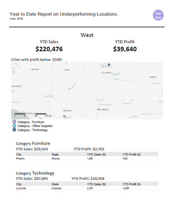
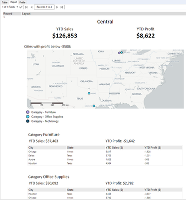
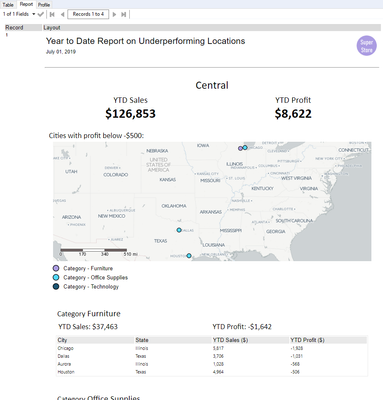
This is the report I built for one of the Regions using Alteryx:
The process
The general, high-level overview of the process is as follows:
Intro to reporting in Alteryx. Any element in the report will most likely need its own reporting tool [step 3 in the process above]. On top of that, the outputs of these reporting tools will need to be combined using layout tools [step 4]. I think of the instances of layout tools as containers, either horizontal or vertical (no other options available). The output of a layout tool can also be an input into another layout tool, creating nested containers. When building an Alteryx report, try to identify the building blocks and break them down to basic elements. This will help you figure out how to combine these elements using layout tools. Once the report is put together, you can save it as a file (render tool) or email it (email tool) [step 5].
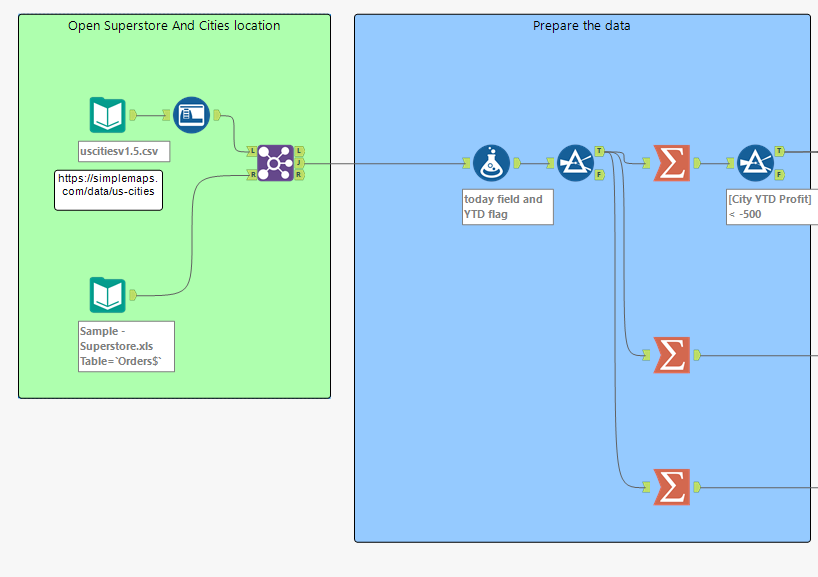
The first two steps will strongly depend on the task you are dealing with. In the case of the outlined scenario, I'm connecting to two files: one with all of the data (Sample - Superstore, users of Tableau should be quite familiar with this one) and one that has information on the city locations in the USA. (The latter can be accessed from https://simplemaps.com/data/us-cities.) I joined the files so that I can plot the underperforming cities' locations on a map.
In order to prepare the data, I created a YTD flag - a field that checks if the date is from the same year as today and before today. (If the data is only available up until today then you may not need to check the latter. I would, however, recommend it. It's an extra step but will prove helpful in the testing phase, at least the numbers should make more sense.) As for today, the data in Sample -Superstore I'm using goes only up to 30-12-2018 so I created a today field where I hard-code what I want to use as 'today'. This technique might be useful during the development of the workflow. When the workflow goes live, change the hard-coded date into DateTimeToday():
ToDate('2018-11-01')

//Use the below instead when the workflow goes live:
//DateTimeToday()
Make sure that the data type is set to Date.
After filtering out rows that don't meet YTD requirement I just used basic tools to get the values we were asked for. Here are my steps 1 and 2:
Important thing to remember is that you will need to have your data ready for the reports, so all calculation need to be performed before creating reporting fields.
Build the Report Fields
Step 3 is to build a reporting field for every element you want to have in the report. Looking back at the report, we have:
- Report header with a photo
- Region header
- YTD Sales
- YTD Profit
- Map header
- Map with a legend for underperforming cities
- Within each category:
- Category header
- YTD Sales
- YTD Profit
- Table with information on underperforming cities
Each of the above will need its own report field. When I was building my workflow, I split this part into four sections: Table by City; Map with its header; Category Level and Region Level Headers.
Table by City

This is the easiest section and it uses only a single reporting tool.
First, I'm using a Select Tool to rename the fields I want to include in the table so that the headings on the report are formatted correctly (title case, correct spelling). This can be also done in the Table Tool itself.
As the data will be presented as it is, I used the sort tool to make sure the profit is in ascending order. (The report is on underperforming cities, so it makes sense to show those with the lowest profit first. In other situations, alphabetical order could be more appropriate and this is something to discuss with the stakeholders: what are they interested in the most.)
Table
Once the data is in the right order, we can drag in the Table Tool.
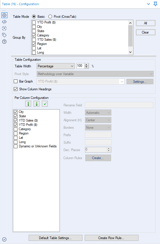
Keep the Table Mode as Basic. In the Group By section, check the Category and Region boxes - we want to have separate reports for each Region and within those reports, separate tables for each Category.
In Table Configuration, I didn't change anything. You can build an in-table Bar Graph, should you want to add more visualisation to the report. The bar graph will be added at the end of the table, so it might make sense to move the field used for building the bars to be at the end s that the values are next to the bars. The graph will have axis range instead of a heading.
In the Per Column Configuration, check only boxes next to fields you want to include in the table. You can also reorder the fields by highlighting them and using green arrows to move them closer to the beginning (↑) or the end (↓) of the table. Highlighting the field will allow you change field-specific parameters, including the name of the field, alignment, decimal places for numeric fields, etc.
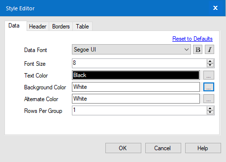
Default Table Settings... will open a pop-up window with formatting settings:
Row Rules and Column Rules can be used, for example, for highlighting cells with profit below -$1K.
You can find the configuration I used below:
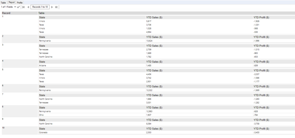
If you add a browse tool afterwards, you should see something similar to the following:
The results are showing that we have separate Tables for each Region-Category combination:
The first section of the report is thus finished!
Map and Heading
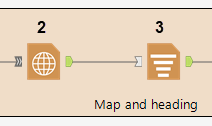
The next section would be the map with the heading and the legend. This part of the workflow consists of three reporting reporting tools: Report Map [2], Text [3], Layout [4]:
Map
The first step in building a map is creating a spatial object field. In this situation, we only want points so I used the Create Points tool [1] and connected it to Report Map tool [2]. The configuration of the latter is a bit fiddly. The good news is that there is a preview of the map that will be created, so you don't have to run the workflow every time to see minor formatting changes to the map.
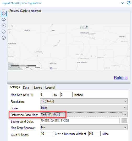
The first tab in the configuration is Settings, where you can specify the size of the map, resolution, scale, base map and more. If you haven't changed your user settings for maps, you may not have a background - just pick a Reference Base Map other than [None] (I have it set to Carto (Positron)):
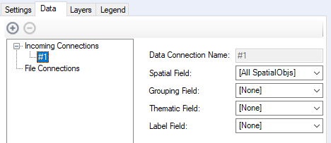
The next tab, Data, allows you to select which spatial fields you want to plot on the map, whether you want to group by any of the fields and whether you want to apply conditional formatting based on a field.
 |
 |
There is only one spatial field in the data set I'm using, so the choice is quite easy. (Alternatively, you can keep it on default [All SpatialObjs]).
We know we want to build the reports separately for each of the Regions. This is where Grouping Field comes in. The unique values of the field you select from the drop-down will become the rows in Group field of the Report Map output and each map will use only relevant data points.
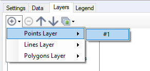
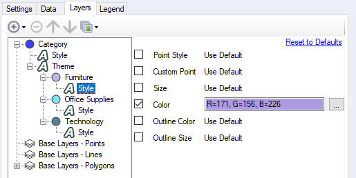
Thematic Field allows changing the formatting of map objects based on the selected field's values. The formatting can be changed in the Layers tab. When you first open it, it has only base layers. We need to add a new layer to customise the map. Click on the plus sign -> Points Layer (or whichever option you need) -> #1 (identifies the connection to the tool, compare with what you have in the Data tab):
Once added, you can change the name of the layer should you want to. Expand the menu for the newly created layer by clicking on the + sign next to its name. There will be Style and Theme (only if you have a field selected for Thematic Field the Data tab). Style will apply changes to all marks, I used it to change the opacity and mark type to circle instead of diamond. (The list of mark types is quite extensive and you can also pick house as an option! It was a highlight of my day when I've found out. It's the little things, you know?)
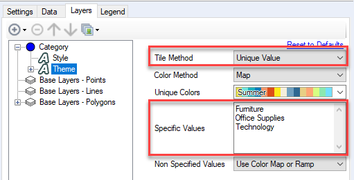
In Theme, I set the Tile Method to Unique Values which allows you to manually specify the groups. I think it's weird it won't just take the unique values within the selected field, instead, you need to list them in Specific Values. And I mean manually type those values there:
To make sure the values are exactly the same as in data, you can copy and paste values from cells in Results pane.
Color Method can vary between discrete and continuous colour palette (Map and Ramp respectively). In our situation, Map makes more sense. I couldn't find a colour palette that I liked, so I decided to manually assign specific colours to each of the Categories. To do so, expand the Theme in the menu. You should see now the same options as what was typed in Specific Values. You will need to expand each of the values separately, then go to Style to update it:
As you can see, I have only changed the Color. Tick the Color box and click on '...' box. Sadly, there is no place to type in the hex code of the colour, so you'll need to type in the Red, Green and Blue boxes or play around with the Color Picker. Do the same for the remaining values.
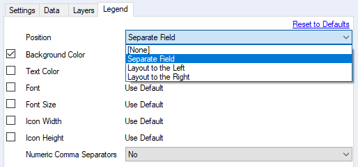
Finally, let's move on to the Legend tab. I wanted to have a legend below the map and since there is no such option in the Position, I chose Separate Field:
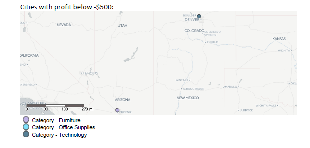
This means, that the legend is returned as a separate field in the tool output and I can place it where I want using a layout tool (more on that later on). I have also changed the background colour to white to match the page sheet. This is the output of the Report Map Tool:
Map Heading
Now that we have the maps ready, let's prepare the headings. For the map heading, we want to have a static text. Connect Report Map tool [2] to the Report Text tool [3]. Set the Text Mode to Create new field for this text and in the Text Data, type in 'Cities with profit below -$500:'.
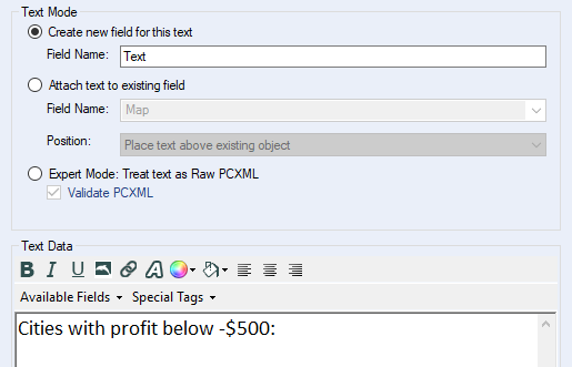
If you want to change the formatting of the text, particularly the font, highlight the text you want to change and click on A. This will open a pop-up window where you'll be able to adjust the font to your liking. A word of caution: the font style (including the bold, cursive and size) will be applied to the entire highlighted text, in other words, you can't change just the typeface. At least not to my knowledge. If you want fonts of different sizes in the heading, make sure everything else is as you want it to be. Otherwise, you'll have to re-do the whole formatting.
Layout
Ok, now that we have the map, the legend and the heading, we can put this section together. To do that, we'll need a Layout Tool [4].
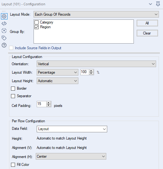
Keep the Layout Mode as Each Individual Record, this will allow for combining different fields at a row level as opposed to combining one field for all records. I checked the Include Source Fields Output but in this case it doesn't make a difference.
In Layout Configuration, change the Orientation to Vertical. I didn't change anything else, but you can play around with the layout dimensions, separators between elements being put together and cell padding.
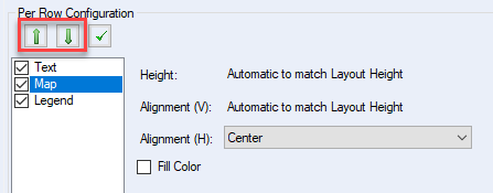
In the Per Row Configuration, make sure the Text, Map and Legend are all checked and are in this specific order - this is the order they will laid out. You can move the position of a field by highlighting it and using the green arrows. Highlighting a field will also give you the option of changing certain field-specific parameters:
Here is the whole configuration for reference:
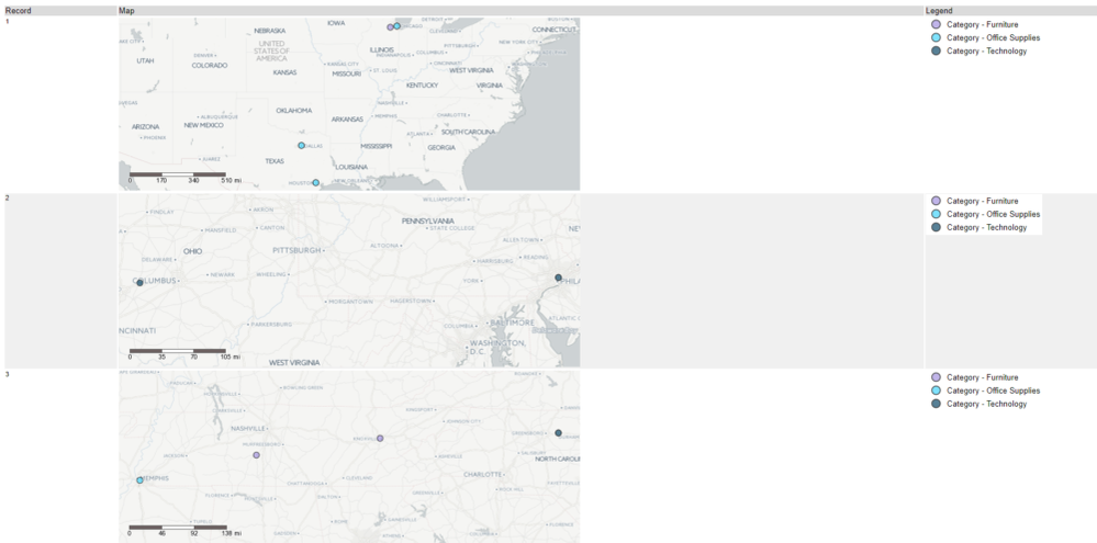
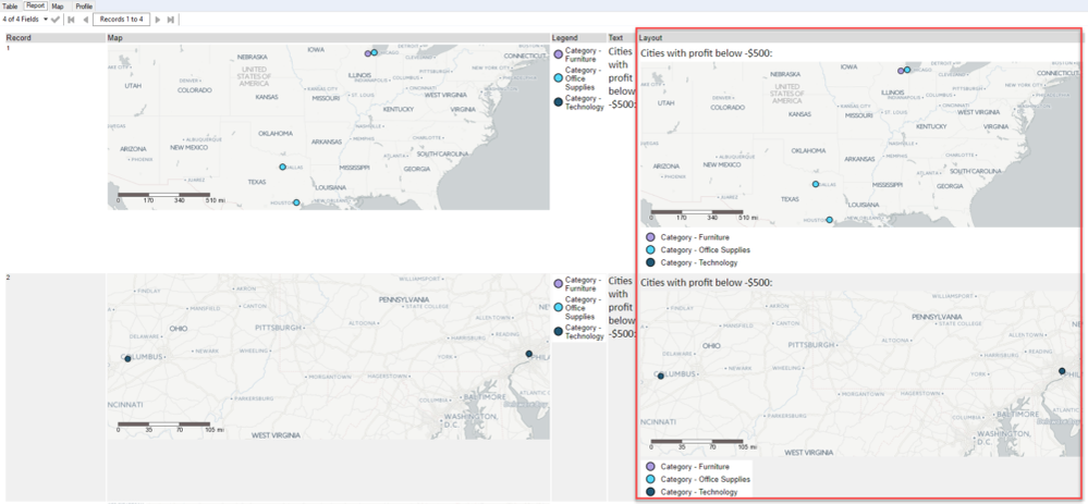
And here is the output of the layout tool:
There are four rows, one per Region (Group) and the next part of the report is ready: the map with the heading and legend.
Category Level Headers
For this section, we need three Text tools and two Layout tools:
Unlike in the map heading, we want the text objects in this section to by dynamic and change based on the data values.
For YTD Sales, keep Text Mode as Create new field for this text, I named the new field 'YTD Category Sales Text'. In the Text Data, I have:
YTD Sales: $[Category YTD Sales:0]The square brackets indicate the field I want to get the value of and :0 indicates no decimal format. To include a field from the data, click on Available Fields -> Field of choice -> Format option (if available):
See below my configuration for reference:
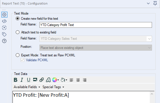
Because Sales cannot be negative, I just used dollar sign before the field. In case of profit, however, this is not the case. At the level of category, the value can be positive or negative and I needed to built a formula to make sure the formatting is correct. I created a new string field, called New Profit with following expression:
If [Category YTD Profit] < 0
then '-$'+ToString(ABS([Category YTD Profit]),0,1)
else '$'+ToString([Category YTD Profit],0,1)
endif
The above checks whether the profit is negative. If it is, then it returns the profit value with dollar sign between the minus sign and the numbers. Otherwise, it adds the dollar sign before the profit value. ToString function transforms a number into text and it allows you to format the number as you wish: the second argument is the number of decimal places (0 - off above), thousands separator (1 - on above) and decimal separator (not present above, default value is 0 - off).
Text Tool for YTD Profit is very similar to that of YTD Sales. The difference is the field included is a string and not a number:
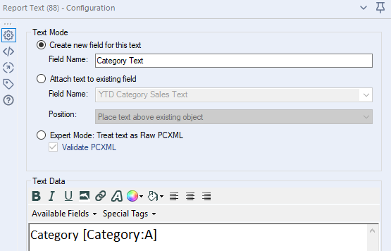
Very similar settings for Category Heading (Category Text) as well:
Now that we have all the text fields that we need for this section, it's time for the Layout tools. In this case, we'll need two of them: first to join YTD Sales and YTD Profit side by side and second to the Category Heading with the joined Sales and Profit.
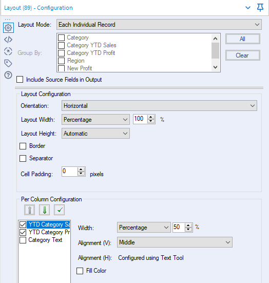
Let's drag in a Layout tool. Keep the Layout Mode as Each Individual Record. In the Layout Configuration, I didn't change anything (the orientation should be set to Horizontal). In Per Column Configuration, keep only YTD Sales and YTD Profit checked. To make sure the Sales and Profit sections are distributed evenly, highlight YTD Sales, change Width to Percentage and set it to 50%. (You can repeat it for YTD Profit, but it's not necessary). Here's the full configuration:
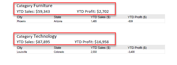
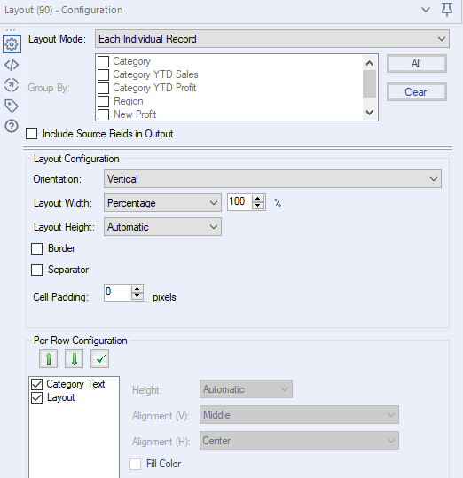
Drag another Layout Tool. I haven't changed anything in the top section. In Layout Configuration, however, make sure to change Orientation to Vertical. In Per Row Configuration, there should be only two fields available: the Category Heading and Layout (the result of the previous layout tool). Keep both fields checked, with Category Heading first:
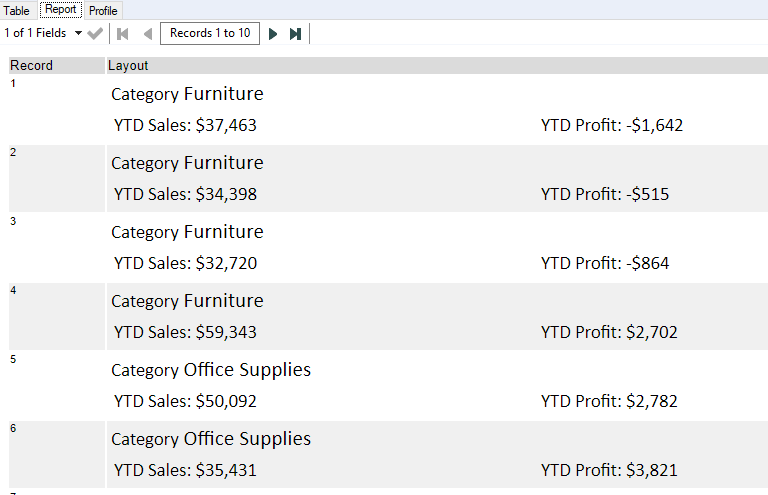
This is the result presented by a Browse Tool:
Region Level Headers
The setup here is very similar to that of category level headers. The only differences are: the formatting and the data which is at a regional level.
As the tools used and the configuration is so similar to the previous one, I'll cover the differences here.
In the YTD Sales (and YTD Profit), I used central alignment and made the font for the number bigger and bold. To have different formatting within a single Report Text, highlight only a part of the text and then click on A to change the font style:
The Region Report Text, only has [Region:A] centered in the text input.
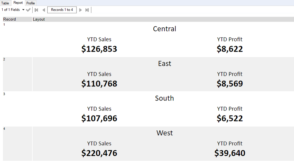
After the vertical Layout Tool, you should get something similar to this:
Put the Report Together
Now that we have all sections and almost all elements ready (we are only missing a header at the moment), we need to combine the sections to form a full report. This task will require a few Joins, a few more Layout Tools and a Header Tool:
First, let's join the Table and the Category Heading by Category and Region. Feel free to get rid of some of the field, but keep Category, Region, Table and Layout.
Then, in the Layout Tool, change Orientation to Vertical, make sure both Layout and Table are checked and that Layout is first. This will create Category sections, each with it's heading and a table with details.
Now we can put all Categories together for a single Region. In the next Layout Tool, change Layout Mode to Each Group of Records and group by Region. Change Orientation to Vertical. I also added cell padding of 15 to separate visually the Categories. Leave Per Row Configuration as is:
See below an example of the output:
Let's join now the Categories sections with the Region-level elements. You can use a multi-join tool, but a multiple joins approach is a safer option and it's easier to check everything is joining correctly. First, join the output of the most recent Layout tool with the Region Level Headers by Region. Then join the inner join (anchor J) with the map also by Region. From the Map section, I only kept the Layout field and renamed it Map.
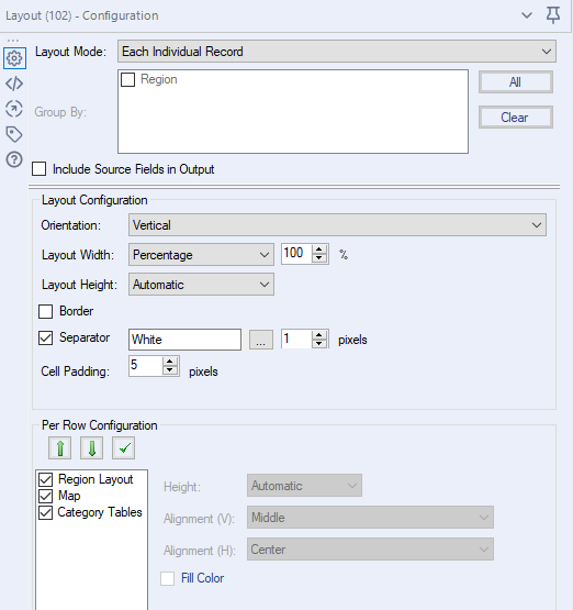
Now, add another Layout Tool. Change Orientation to Vertical, add white separator of 1 pixel and cell padding of 5 pixels. In Per Row Configuration, keep Region Layout, Map and Category Tables checked and in that order (the field were renamed in the joins, you can also do that before the joins so it's not confusing).
This is the setting:
And this is the result at this stage:
Header
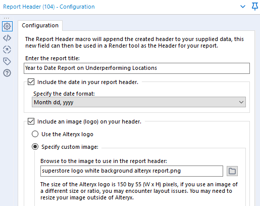
The report is nearly ready, we only need a header. Drag in a Header Tool. In its configuration, you can type in the title of the report. I decided to include the date as well (pick whichever date format you prefer). Additionally, you can add more branding to the report by using an image (logo) in the header. By default, it will be an Alteryx logo, but you can also upload your own image.
There are two ways to combine the header with the rest of the report. You can either use a Layout Tool or a Render Tool. Render Tool will also render and save the report into a file. However, as I wanted to send the report in the email, I used the Layout method.
Let's take yet another Layout Tool, change the Orientation to Vertical and check Header and Layout (and keep them in this order) in the Per Row Configuration. And here's the report:
Awesome! The report is pretty much ready, we need to store it somewhere now. We can either save it into a file or send it in an email.
Save the report
To save the report, grab a Render Tool. In Render Configuration, change Output Mode to Choose a Specific Output File. In the output file, I typed in
report.pdfThe name of the file is not really that important as we will change it. The extension, however, needs to match one of the supported file types. Check Group Data Into Separate Reports, choose Region as Field to Group On and for Modify Filename By select Replacing Filename With Group.
In Report Data, change Separator to Insert Whitespace Between Records.
In Report Style, change Paper Size to A4 and adjust margins if you want to.
Now every time you run the workflow, the reports will be created and saved to the specified files. Make sure the files are not open when running the workflow as this will result in an error. If you don't want to overwrite files and want to keep history of the reports, you can use a formula tool and combine the Region with today's date - this will also allow for quick identification of the report without opening it.
Email the Report
Alternatively, if you want your colleagues to receive the reports directly, you can do it by sending the report in an email. The workflow here is not a single tool, but that allows you to make the emails dynamic:
The mailing list input (here as a text input but you can use a file stored somewhere in your database) should contain two columns: Region and Email address. The email addresses might be of specific people or subscription lists:
Once you have the mailing list with assigned Region, join it with the Layout tool that combined the report with the header. Then drag in an Email Tool and let the magic begin.
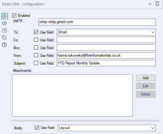
Keep the Enabled box checked, this will send out the emails. If the box is unchecked, the Email Tool is disabled but it keeps all the settings (pretty much has the same effect as adding the tool t a container and disabling the container).
SMTP will depend on your company IT infrastructure. If you're using Gmail as your email provider, then type in
smtp-relay.gmail.comotherwise, I would suggest checking with IT. Consult Alteryx help page for more information.
For the next section (To, Cc, Bcc, From, Subject), you can either type in the values or use a field if you want to make them dynamic. The necessary fields are To, From and Subject.
In the Body of the email, I used Use Field and selected Layout from the drop-down. Alternatively, you could send the report as an Attachment but that makes things much more complex and I would advise against it unless it's absolutely necessary (if there's a need for it, I might write a blog post on how to do that as well). In case of sending the report in the body of the email, the workflow can be uploaded to Alteryx Server Gallery and scheduled there so that the reports are built as frequent as need in an automated manner. (If you want to keep the history of the reports, include the Render Tool as described above, but make sure the file is saved on a drive the server has access to.)
Here's the tool configuration:
The whole workflow, in all its glory:
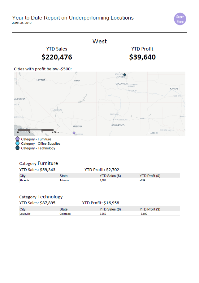
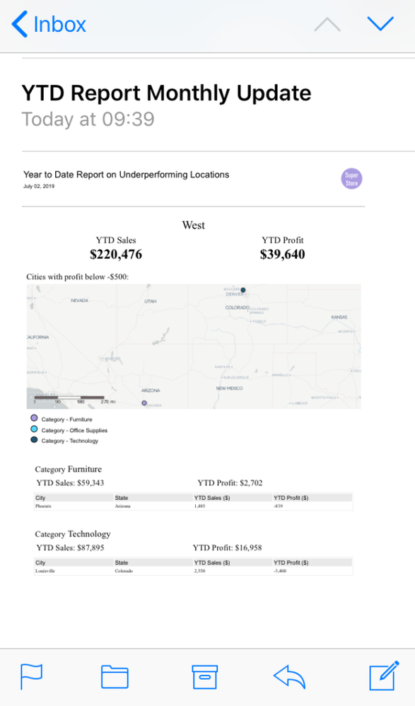
And, finally, the reports. The PDF and email screenshot from my phone:
 |
 |
- The emails with reports work as alerts. When the data suggests there is an actionable situation (eg. some cities are underperforming) the relevant data is sent out to people involved.
- The solution requires some implementation time but once it's up and running the process is fully automated - the data is processed and delivered to the right hands without any extra work.
- Mark as Read
- Mark as New
- Bookmark
- Permalink
- Notify Moderator
Hi I have given email as output and given some emails.. I am getting on port number 25 is not a valid. pls help me
-
Adobe
2 -
Alteryx Connect
5 -
Alteryx Designer
202 -
Alteryx for Good
1 -
Alteryx Promote
2 -
Alteryx Server
66 -
Alteryx using Alteryx
29 -
Americas
158 -
Analyst
108 -
Analytics Leader
54 -
Asia Pacific
29 -
AWS
9 -
BI + Analytics + Data Science
100 -
Business Leader
37 -
C-Leader
18 -
Data Prep + Analytics
230 -
Data Science + Machine Learning
113 -
Data Scientist
14 -
Department: Other
14 -
Education
18 -
Energy + Utilities
5 -
Europe + Middle East + Africa
58 -
Experian
2 -
finance
29 -
Financial Services
33 -
Healthcare + Insurance
21 -
Human Resources
19 -
Information Technology
25 -
IT
31 -
Life Sciences + Pharmaceuticals
3 -
Manufacturing
20 -
Marketing
16 -
Media + Entertainment
12 -
Microsoft
52 -
Operations
38 -
Other
10 -
Process Automation
60 -
Professional Services
69 -
Public Sector
15 -
Qlik
1 -
Retail + CPG
32 -
Sales and Service
24 -
Salesforce
9 -
SAP
11 -
Snowflake
6 -
Tableau
71 -
Tech Partner: Other
86 -
Technology
34 -
Telecommunications
5 -
Teradata
5 -
Thomson Reuters
1 -
Transportation + Logistics
25 -
Travel + Hospitality
4 -
UiPath
1
- « Previous
- Next »
