Forum - Deutsch
Suchen Sie nach Antworten, stellen Sie Fragen und teilen Sie Ihr Alteryx-Wissen.- Community
- :
- Community
- :
- Teilnehmen
- :
- Forum
- :
- Betreff: Interactive Chart daily add ons
Interactive Chart daily add ons
- RSS-Feed abonnieren
- Thema als neu kennzeichnen
- Thema als gelesen kennzeichnen
- Diesen Thema für aktuellen Benutzer floaten
- Lesezeichen
- Abonnieren
- Stummschalten
- Drucker-Anzeigeseite
- Als neu kennzeichnen
- Lesezeichen
- Abonnieren
- Stummschalten
- RSS-Feed abonnieren
- Kennzeichnen
- Moderator informieren
Hi Form Team,
Does anyone know what is needed to have a Chart which Shows on the "Y" axis the date of each day and Shows the sales numbers as a line?
Please see attached data.
Regards,
Pascal
Gelöst! Gehe zu Lösung.

- Als neu kennzeichnen
- Lesezeichen
- Abonnieren
- Stummschalten
- RSS-Feed abonnieren
- Kennzeichnen
- Moderator informieren
Hi @Pascal_R
I hope you are looking for something like this:

Here is a picture of the workflow:

What happens:
1) transposing the columns
2) renaming the column
3) filtering empty rows
4) building a chart
The process is also attached. Feel free to drop another question or accept it as solution if it helped.
(You have to pick the location of your excel file in the 'input data' tool to make it run)
- Als neu kennzeichnen
- Lesezeichen
- Abonnieren
- Stummschalten
- RSS-Feed abonnieren
- Kennzeichnen
- Moderator informieren
Thank you grossal,
Can you also let me know what Parameters you choosed for having bleow Chart in the interactive Chart?
- Als neu kennzeichnen
- Lesezeichen
- Abonnieren
- Stummschalten
- RSS-Feed abonnieren
- Kennzeichnen
- Moderator informieren
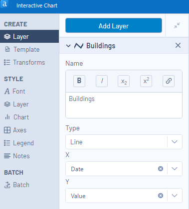
Hi @Pascal_R
There are two critical steps:
1) Add a Layer:
- Choose X axis
- Choose Y axis
- Choose (diagram) type

The second option is to split the values based on their ResourceGroup. You do this on the transform option.

(you can see it yourself when you run the workflow and go into the configuration of the interactive chart)
- Als neu kennzeichnen
- Lesezeichen
- Abonnieren
- Stummschalten
- RSS-Feed abonnieren
- Kennzeichnen
- Moderator informieren
Hallo @Pascal_R Vielen Dank für Ihre Frage!
War diese Antwort von @grossal für Sie hilfreich? Wenn Ihnen die Antwort geholfen hat, können Sie diese als „Lösung akzeptieren“. Sie wird sicherlich auch anderen Benutzern helfen!
So können auch andere in der Community nützliche Antworten finden.
Nur dieses Forum ist jedoch in deutscher Sprache und ich lade Sie herzlich ein auf Deutsch zu schreiben.
Wenn Sie Englisch bevorzugen, keine Sorge, können Sie Ihre Frage gerne im englischen Forum posten 😉
Vielen Dank!
- Als neu kennzeichnen
- Lesezeichen
- Abonnieren
- Stummschalten
- RSS-Feed abonnieren
- Kennzeichnen
- Moderator informieren
-
2020
1 -
ABB
1 -
ACE
5 -
ACE Program
1 -
ACE Programm
1 -
ADAPT
1 -
AGCO
1 -
Agenda
3 -
ALTER.NEXT
1 -
Alteryx
1 -
Alteryx Designer Expert
1 -
Alteryx User Groups
1 -
Alteryx: Inhalt einer Zelle leeren und mit neuem Datensatz füllen
1 -
Analytics
1 -
Ask me anything
1 -
Ausgabedaten
1 -
Auswählen
1 -
Beiträge
1 -
Big Data
1 -
blog
2 -
cachen
1 -
Community Manager
1 -
COVID-19
1 -
Customer
1 -
Data Analyse
1 -
Data Cleansing
1 -
Data Festival
1 -
Data Science Portal
1 -
Data Scientist
1 -
Data Women
1 -
Datenvorbereitung
1 -
Datum Uhrzeit
1 -
Dean Stoecker
1 -
Designer
7 -
deutsche user group
1 -
Dynamische Eingabe
1 -
Eingabedaten
1 -
Einmalig
1 -
encoding
1 -
Error
1 -
Event
4 -
Events
3 -
Excel-Tabelle
1 -
Fachtagung
1 -
Felderanhängen
1 -
Filter
1 -
Formel
1 -
Formula Tool
1 -
forum
1 -
Frage
1 -
future of Data Analytics
1 -
Fuzzy Übereinstimmung
1 -
Herunterladen
1 -
Ideen
1 -
Input
1 -
Inserting New Rows
1 -
Inspire
2 -
Inspire EMEA
1 -
Interaktive Lektionen
1 -
IT
1 -
Jahrzehnt
1 -
JUNI
1 -
Kreuztabellen
1 -
Kundendaten
1 -
lernen
1 -
Libby Duane Adams
1 -
live
1 -
Machine Learning
1 -
Macro
1 -
Mehrzeilige Formel
1 -
normalizing
1 -
On-demand
2 -
Output
1 -
Output Data
1 -
post schreiben
1 -
Python
2 -
Rename and standardise
1 -
Reporting
3 -
Reporting in Designer
1 -
reporting tools
1 -
Retail
1 -
Run Command
1 -
SANTALYTICS 2020
1 -
Scheduler
2 -
Self Service Analytics
1 -
Sharepoint
1 -
Siemens
1 -
Sortierung
1 -
split values to columns
1 -
StephJ
1 -
Steueranalyse
1 -
Steuerprozesse
1 -
Stichproben
1 -
Suchen Ersetzen
1 -
Summarize
1 -
Supply Chain
1 -
Swiss
1 -
Switzerland
1 -
Tax Processes
1 -
Tax Transformation
1 -
Text in Spalten aufteilen
1 -
Texteingabe
1 -
Time Series
1 -
Tipps Tuesday
1 -
Tipps und Tricks
2 -
Tips + Tricks
2 -
Tips and Tricks
4 -
Tool Mastery Serie
2 -
Top Autoren
2 -
Umstellung
1 -
Update
1 -
User Group
3 -
user group meeting
3 -
Virtual Solution Center
1 -
Virtual Solutions Center
1 -
Webinar
6 -
Webinare
1 -
Willkommen
1 -
Workflow
2 -
Workflows
1 -
Wöchentliche Challenges
1 -
XML
1 -
Zeitreihe
1 -
Zertifizierung
1 -
Zusammenfassen
1 -
Zusammenfassung
1 -
Zusammenführung
1 -
Zürich
1 -
übergeordneten Daten
1
- « Vorherige
- Nächste »
| Betreff | Kudos |
|---|---|
| 1 |