Typically, when analyzing the average of any metric, you are trying to create a benchmark to contextualize your data. It is another level of analysis that you might deep dive into after understanding the running totals of your data.
Take, for example, a KPI of revenue – you might have a spike in revenue, but is that coming from an increase in purchases? An increase in purchase size or an increase in customers?
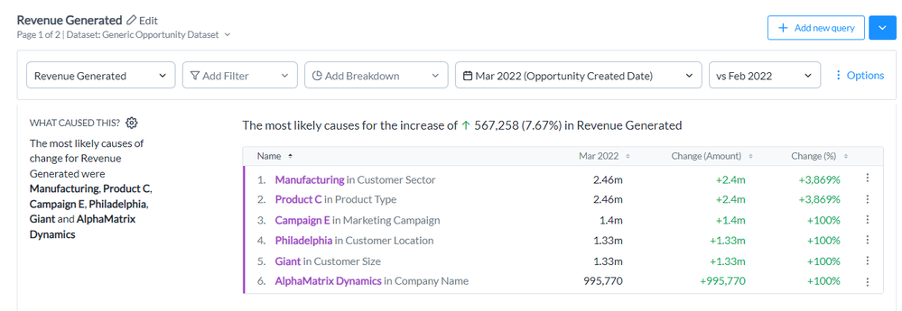
Auto Insights will point us to what segments may be drivers of the change (the Manufacturing Sector is the most likely driver of the increase here), but it doesn't automatically tell us the magnitude of where that change came from. To understand it further, you need to look at other metrics to follow up and find where the real activity is happening. By looking at averages, you’re able to streamline that framework of thinking and, in fewer steps, find where the "aha” moment lies.
Auto Insights is a great tool for analyzing averages within your data, and it even automatically calculates them for you! So, all you need to do is select the average metrics as your measure within your query bar.
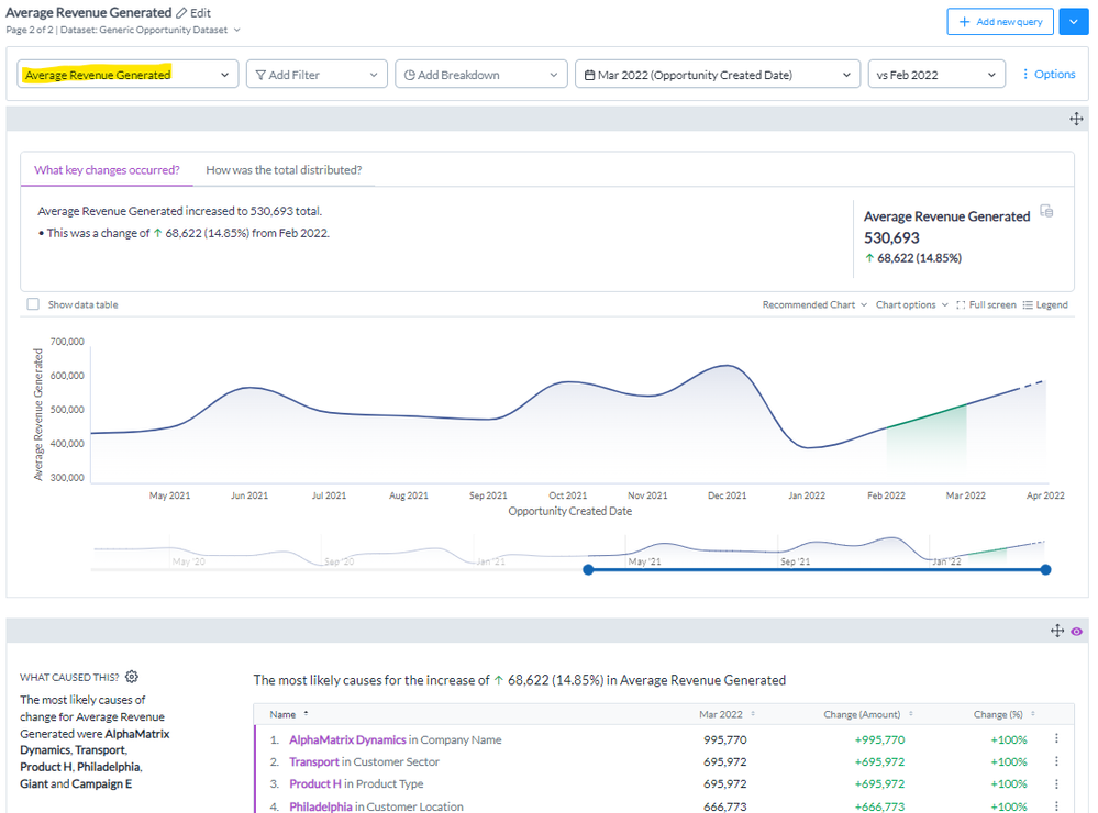
You’re able to see how it trends over time and have views similar to those before looking at the potential key drivers. But what if I told you an even more insightful view is possible if you can simply “reverse engineer” the average that you are analyzing?
What I mean by that is instead of using the calculated average as your metric, you can use the ‘Common Causes’ ability to analyze the two metrics that are used for that particular average. This might not always be possible based on how your data is structured, but when possible, it can be powerful.
Sticking with the revenue data example, let’s say your dataset is the company’s revenue transactions, at the transaction level, meaning one line item record in the dataset corresponds to one revenue transaction. If you want to understand the average revenue per transaction, you will want to analyze (1) the revenue sum but also a measure to track the (2) number of transactions. This is where you may need to modify (feature engineer) your dataset. If you have a unique identifier like ‘transaction_id’ or, in our dataset, ‘opportunity id’, no additional work is required! You can use the ‘Number of’ transaction id as your second query measure, and now you’re able to see the relationship between Revenue and Transactions over time.
(hint: if you don’t have a unique identifier, you could always feature engineer a dummy column to reference! For example, a column called ‘Count’ that is just a value of ‘1’ can easily fit into this dataset and the sum of this column is just as good of a proxy to understand how many transactions there are.)
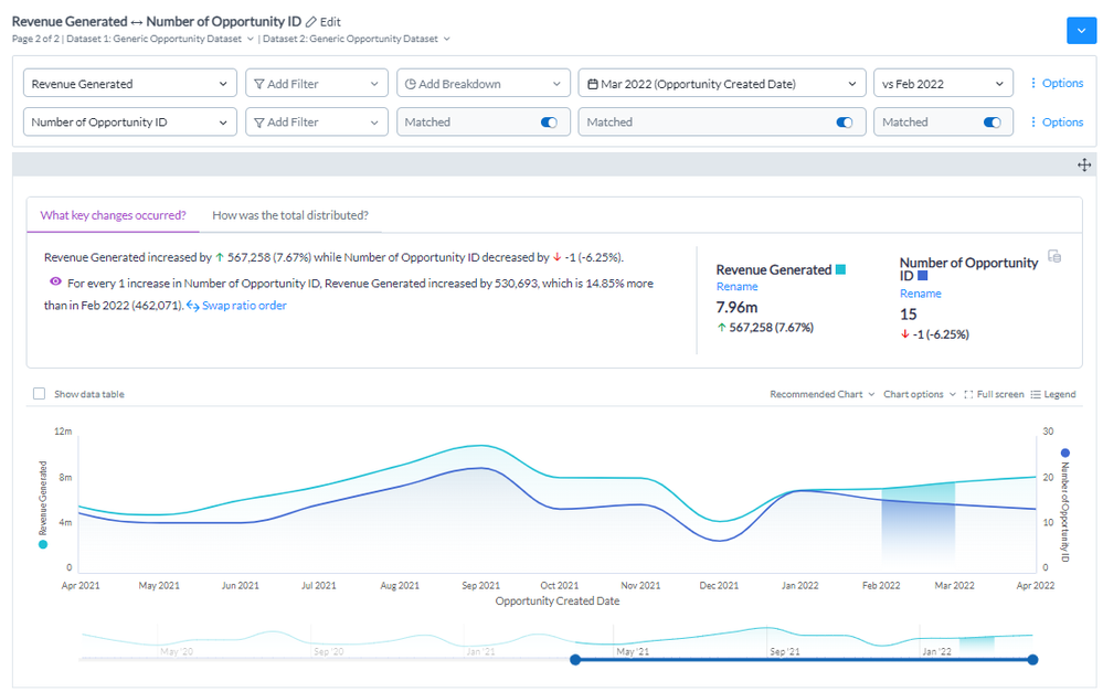
At first, you might think this view is more confusing – without a clear indicator of the average revenue per transaction. But if you scroll down to the first insight, you will quickly be able to see that average and the insights you were expecting but in an even more narrative format. And that is in addition to being able to see the total sum or revenue and count of transactions across periods, too. It essentially becomes 3 separate views combined into one and allows you to answer multiple questions that might come from your data--instantly!
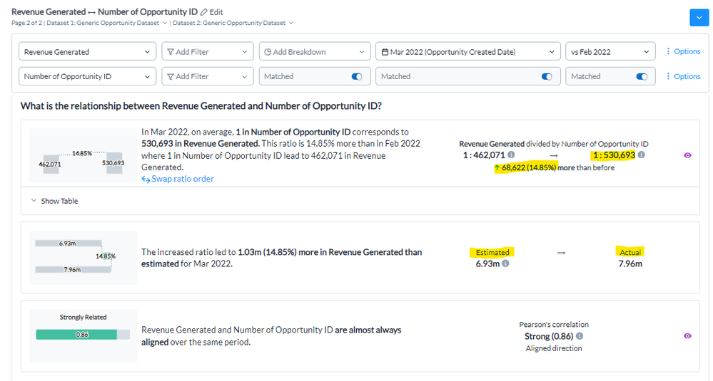
If there's enough data to find a relationship between the two metrics, it will even provide some simplified variance analysis for your current period. For example, “based on last period’s [average], there is X more/less revenue than estimated for this period.” Providing so much more insight and context for you to share across your organization and action on top of!
The same concepts can be applied to any specific averages that you want to do. If you want to look at average revenue per customer, you can look at revenue and number of customers. The only challenge to this will be understanding if your dataset is a transactional dataset or a summary/snapshot dataset. This will dictate if some granular analysis is possible (in a snapshot dataset, because each record is an aggregate of a certain segment, we can never explore the data down to the granular event, but the lowest level we can examine is by the segment it is aggregated at).
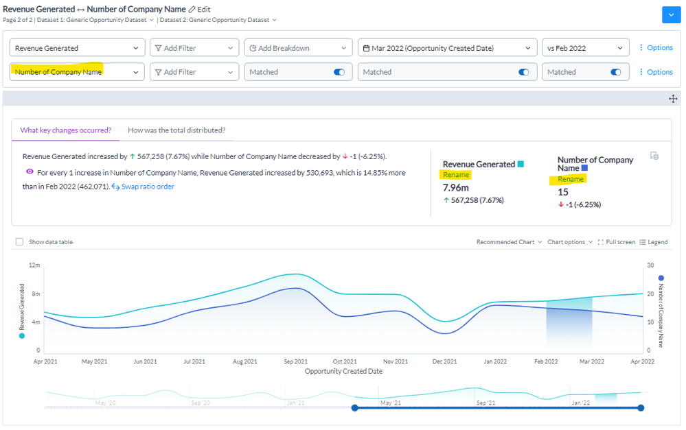
Lastly, to make your insights even better, make sure to build this out in a Mission so you can properly rename your selected metrics to your business terminology to be more applicable to your end users.
So, to wrap up, if you are analyzing your KPI averages, I suggest you take a good look at your data and see whether you can apply this and common causes to enhance your experience. Leave a comment to share what you think or how you applied this to your use case!