Working at Alteryx for the last 1.5 years has taught me a lot of things, but most of all it has taught me how easy analytics insights can be – for anyone really.
Let's rewind—a little about me (it’s important to the plot I promise): I hail from a robust marketing background, think flashy ads and colossal event booths. Transitioning into product marketing stemmed from my thirst for understanding the more technical side of things, which aids in storytelling and conveying true value. But diving into “product” and all its intricacies has also meant grappling with how to learn and use said products for analytical outcomes, and sometimes this can be a real challenge - especially for someone with a background in non-technical marketing.
Flash forward, it’s a random weekday a few months ago and I decided it was well past time for me to learn how to use Alteryx App Builder – OR my hand was forced and I needed to learn it quickly because I had to record a webinar teaching OTHER people how to use it the very next week (you decide 😊). If you've used analytic apps in Designer Desktop, know that App Builder has a different design process and capabilities--but don't worry, it's easy to learn!
Pro tip #1: Snag a free 30-day cloud trial for App Builder and additional Alteryx cloud products here to follow along.
Setting the Scene for my App
It’s November (well, now it’s January, but let’s time-travel back to enjoy those pre-holiday vibes): Imagine you’re receiving an alma mater email, urging you, a distinguished alum, to contribute. Here's the puzzle: How do our old universities, often with analytics newcomers in roles like student coordinators, decide which alumni to reach out to for things like donations?
Here's where my app building journey begins— Today I’m going to teach you all about how to craft a user-friendly app with Alteryx App Builder to crack the code on potential donors: their likelihood to contribute, their whereabouts, which campus location they went to (i.e. some campuses like the University of Colorado have multiple locations across the state) and how to make it so your non-technical team members could fetch these insights (or your own data for your own use case)…rapidly.
A heads-up: While I used other Alteryx tools to clean and prep my data prior to diving into building my app, this guide’s focus is solely on App Builder. For a comprehensive overview of additional Alteryx cloud products, check out Alteryx Analytics Cloud and Designer Cloud.
Building an App – for Beginners
Let’s take a step back...what is Alteryx App Builder? It’s an easy-to-use, true no-code, cloud-based analytic app builder that enables business users to answer their own questions from sometimes complicated data, reducing previously heavy dependencies on analytics teams.
Now that the marketing talk is out of the way... just HOW “easy-to-use” is it? And how did I get started and build my first app with App Builder?
Orienting Myself Around the Interface
Upon launching App Builder, I was quickly greeted with an interface that closely resembled Designer Cloud’s. It has a blank canvas workspace with tools on the left and a blank interactive results grid on the bottom (boxed in green below).
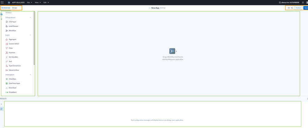
Pro tip #2: A few other items to take note of here (boxed in orange above): The “orchestrate” and “design” tabs, the eye icon, the share icon and the “publish” and “save” buttons.
Orchestrate Tab: This is your starting point where you will build out your app functions and features to include i.e. drag in / load your data set, add logic like filters or sorting, add interactive elements such as checkboxes, drop downs and or add display elements like tables and bar charts.
Design Tab: This is step number two where you will create the actual look and feel of your app using the UI building blocks and interactive and display tools you selected to include during the orchestrate phase (we’ll get into this more below, but you’ve got some great creative freedom here).
Eye-shaped Icon (AKA the “Preview” button): This first button icon on the upper right side of the canvas allows you to preview the most recently saved version of your app how other users will see it, in real-time, to see where you need to adjust, make changes or edit the style of your app.
The share icon: The share button allows you to easily share your app with other users in your workspace who can then make their own duplicate version as a starting point if they want to use it to make edits too, or make their own app.
Publish Button: Different from “save”, the publish button allows app creators to add a custom URL path and publish once the app is ready for public use. For more information on App Publishing read what’s new from the App Builder November blog or reference the App Builder User Interface documentation.
Save: Saving an app saves edits being made to a “Sandbox” version without impacting the Published version of the app. Once all changes are made and considered ready for users, saved changes can be Published and will appear in the Published app.
First, We Orchestrate
As I mentioned in Pro tip #2 – it’s necessary to start your app building journey on the orchestrate tab (the tab you’re placed on when you launch a new app to build). The first step I took was loading my data into App Builder by dragging in a “workflow” tool from the left side panel, (I had previously added my data .xml files into Designer Cloud to clean and prepare it), you could also use the CSV input or Load Dataset tools if you had data that was already ready from a different source.
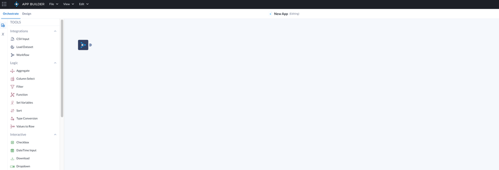
If you are following along and want a fake dataset to work with and to upload as a CSV input, I recommend mockaroo to get you started with a dummy data set.
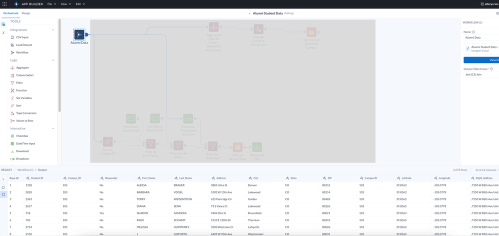
Once I added in my data set (Campus alumni data including Alumni names, campus ID, phone numbers, previous donation history and more), I could check and see the data displayed in the results grid below the canvas when I clicked on the output triangle as seen in the screenshot below:
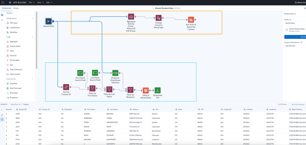
Next, I began building out the functions I wanted my app to have. Thinking about the alumni example, if I’m a data analyst creating an app for my student coordinator to call on alumni to donate, I’d want to include the ability for them to search and sort by likelihood to donate via a table. Then, it might be helpful if they could download that table to use as a reference. I'd also want to include the ability for them to see a visual display on where the alumni most likely to donate were coming from in our various campus locations.
So I got to work building out these scenarios, first using a pattern of filter and text field tools which would allow me to build out the “table” searching functionality I was looking for as well as inputting a table tool at the end of this pattern to arrange them into the format I was looking for (shown in the blue box of the screenshot below).
Pro tip #3: This is a very useful “pattern” to remember in App Builder (using filter and text field tools to create searchable boxes for your data in your apps).
Next, I built out a bar chart. I also needed to aggregate some of my data to the right “type” first to allow it to populate correctly in the chart on the design side (shown in the orange box within the screenshot below).
Next, It’s Design Time!
I’m a bit biased here with my heavy Marketing background, but dare I say... it was now time for the REAL fun to begin – designing my app UI.
On the “Design” tab, you’re once again staring down a blank canvas – but this time it looks more like an empty Word document. On the left side, you’ve still got “tools,” but they are a bit different. There are four categories of tools to create your app design with (icons outlined in the orange box in the screenshot below and icons corresponding in order with the following): “Building Blocks,” “Workflow tools,” “Themes,” and “Variables.”
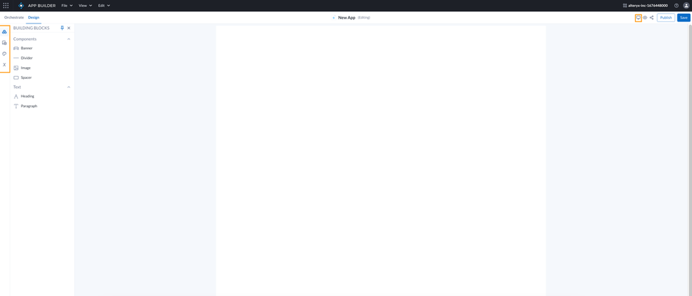
There’s also a new icon on the upper right side of the canvas in the header bar (the computer screen outlined in orange in the screenshot above) ... This icon allows you to select the screen size (i.e. mobile, tablet or desktop) in which you’d then like to preview your app using the preview button (the eye icon) which transferred over from the orchestrate tab.
Pro tip #4: You can drag and drop all the elements onto the canvas and freely adjust their size and position. Plus, if you make a mistake or want to undo/redo, rejoice—it's simple! Head to the edit menu or use standard keyboard shortcuts for Mac or Windows. This feature saved me a few times when I went a bit overboard with sizing.
The first thing I did was add a Header, image, spacer and divider to the top of my app using the “building blocks” tool set options...You can start really playing around with the sizes, colors, and formatting of these with additional design options that show up on the right-hand side once you select and add a design tool to the canvas.

Next, I wanted to pull in that visual of the bar chart I created on the orchestrate tab – but where the heck was it!? I clicked on the “Workflow” tool (second tool icon down on the left) and I could see all the interactive and display components I “built” out on the orchestrate tab to add to my app including the bar chart, but also the table, and the search fields I created.
Again, I simply clicked and dragged the “bar chart” tool over from the left side into the canvas and began editing the look and feel of it, dragging it around the canvas to make it larger, adding spacers under and changing the colors and axis labels using the panel that populated to the right. Once you add the component to the canvas it greys out and can’t be selected to add again (as you can see in the screenshot below).

Finally, I wanted to add my remaining components to the app interface including my table, search fields and download button... so I grabbed the remaining components out of the workflow tool selection items and dragged them into place on my canvas.
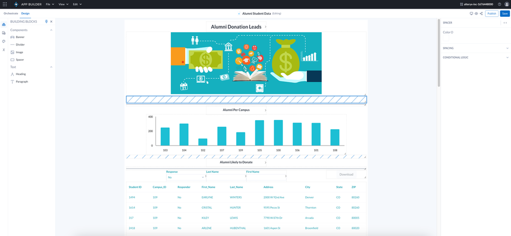
Before we get to the final app – Quickly a little bit about the two other tools:
“Theme” (the paint pallet icon): useful for setting color and text format for the entire app, i.e. I wanted to use the same color teal throughout and the same style of text.
“Variables” (the x icon): allows users to define variables to be used to drive filters or overwrite values in various places in an app. Variables managed here can be used with or without the Set Variables tool.
Candidly – I think I spent the majority of the last hour of my app building creation process on the design tab – I really wanted to mess around with colors and the format and test all of the options to get a good feel for what was possible interface-wise (spoiler alert – it’s quite a lot!) but if you were a seasoned pro and in App Builder for even the second or third time the app building and designing process could go extremely fast.
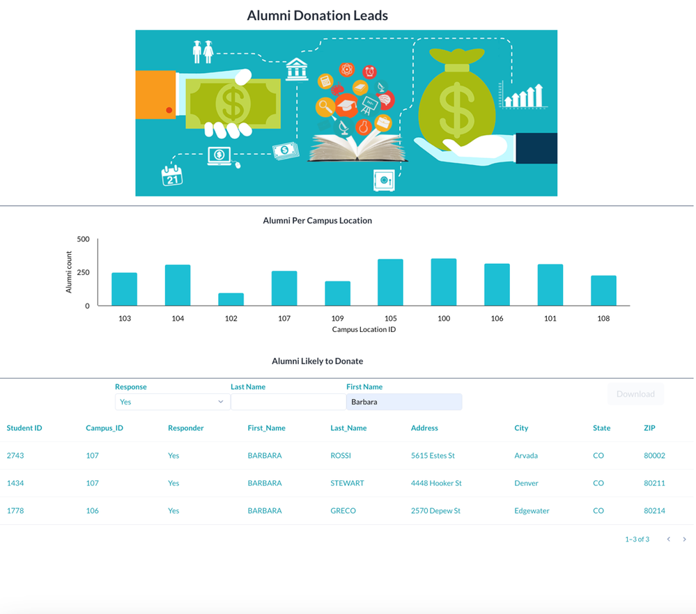
Finally, I had an app that I was pretty happy with, and I wanted to preview what my “end user” or the student coordinator (back to our example) would see. I saved my app, hit the tablet-sized preview choice and then selected the preview button. You can see my final app (without the guidelines of the design tab) in the screenshot below. It’s also clear to see that this would be an easy, intuitive UI for an end-user to utilize for their self-service of insights.
Final Thoughts
I hope you found this blog-turned-tutorial informative and that it makes your first try at building your own app as easy as my first experience was – even as a non-technical marketer! Analytics should be for all and Alteryx continues to make products that are not only easy to use but top-of-the-line for garnering quick and informative insights that help you make decisions across your business, easier than ever.
I wanted to throw in a few sneak peeks to get you even more excited for some upcoming features coming soon to App Builder and maybe my next blog will be Alteryx App Builder: for the not-so-newbies.
Coming Soon
Example Apps
Similar to how users can view the Example Workflows in Designer Cloud, App Builder will provide a few Example Apps to help folks new to App Builder get started. Once an Example App is opened in App Builder, a user can use the File – Duplicate option to make their own copy which they can alter, or redesign as needed.
Call to Action on Design tab
Soon there will be notification alerts to draw users' attention to the Workflow tab when there are unused tools that need to be added to the Design canvas.
EVEN MORE design options – Workspace themes
In the future, expanded customization will be available at the Workspace level that will allow custom themes to be saved for a Workspace and easily used by all App Creators.