At the doctor’s office, you and the medical assistant go through a familiar routine before the doctor arrives. They’ll check your vital signs — pulse, blood pressure, respiration rate and more — and collect some general information. Those steps summarize some important aspects of your health, letting the doctor jump right into more complex analysis.
The Data Health Tool, now included in the Alteryx Intelligence Suite, does something similar for your data. It gives you a quick but thorough assessment of a dataset’s readiness for further analysis, especially prior to predictive analytics and machine learning. The tool also looks for outliers and conveniently places them in a separate output so you can deal with them.
Let’s take a look at the best way to use these new diagnostic powers and how you can take action on the results, especially those outliers.
About the Data Health Tool
The Data Health Tool gathers “vital signs” for your dataset that reveal whether it’s ready to yield robust, accurate insights, or if it would benefit from some special treatment first. Specifically, the tool offers a look at your dataset’s missing values, whether it has outliers, and its sparsity. (A dataset is “sparse” if it contains many zero values; for example, datasets used by many shopping recommender systems are sparse, as each individual shopper will not have purchased or even viewed many of the products on offer.) Data Health also checks that the number of unique values for each variable makes sense for its data type and the dataset’s size.

Image via GIPHY
If you’re a fan of the Data Investigation tool palette, you might wonder how Data Health differs from the Field Summary Tool. You do get some of the same information from both tools; however, it’s important to note that Data Health provides “an overall measure of the goodness of your dataset,” as data science product manager Sonia Prakasam (@sprakasam) recently told me. “Data Health generates results that are more actionable. It’s great to use before any machine learning process to help get data ready for a machine learning pipeline.”
Data Health also detects and identifies outliers for you, which Field Summary doesn’t. We’ll get into that in a moment — including what to do with those outliers once you’ve got them corralled.
Before using Data Health, it’s best to use the Feature Types Tool to make sure your data types are set properly, and you may get different results if you don’t. Data Health can deal with string, Boolean, and numeric data; Feature Types allows you to set more detailed types for each column (e.g., ZIP code, Text, Categorical, etc.). Data Health understands how to handle each of those types and will provide a better health assessment if provided that additional information.
Diagnosing Outliers
In addition to all that other actionable information, it’s awesome to have a tool that quickly finds outliers that could pose challenges in analysis and modeling. The Data Health Tool uses a method established in peer-reviewed research in 2008 (read it here). It’s based on a data visualization method you’ve probably heard of: the boxplot or box-and-whisker plot.

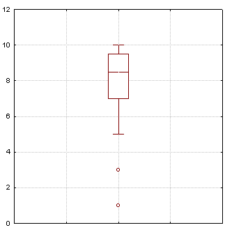
Image by Schlurcher, Wikimedia Commons
Here’s a refresher on reading these plots. We’re mainly interested here in the dots, which represent outliers. How can we know which data points should be defined as outliers and be shown as those lonely little dots? This identification gets trickier, too, when you have skewed data. Some methods for identifying outliers assume that you will have a nice, normally distributed dataset, but that may not be the case.

Image via GIPHY
Regardless of what your data’s distribution looks like, Data Health’s method of identifying outliers has you covered. It’s based on a measure of skewness called the “medcouple.” That measure is used to adjust the boxplot’s construction. This approach avoids unnecessarily flagging data points as outliers when they are in fact reasonably close to the center of the data’s distribution. As the researchers explain, “This makes the adjusted boxplot an interesting and fast tool for automatic outlier detection, without making any assumption about the distribution of the data.”
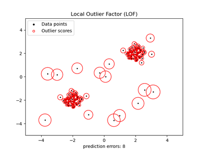
Looking for outliers without an automated tool is a bit more complicated. Some options in Designer are discussed in this thread. You can try using Python and pandas as explained here, calculating z-scores for the values in each column, then potentially eliminating rows that contain an outlier in one or more columns. Another Python option is to use the local outlier factor, available in sklearn. This approach, demonstrated here and shown in the plot below, is based on k-nearest neighbors and determines whether a data point is an outlier based on its isolation relative to the neighborhood around it. Poor lonely outliers!

Data points with the local outlier factor for each displayed by the diameter of the red circles. Plot from scikit-learn example.
So I Have Outliers … What’s the Treatment?
First, look closely at your outliers:
- Are they actually rare? There shouldn’t be a lot of wacky values. If there are, you might have other issues to address.
- Could they be typos? Maybe those values can be corrected.
- Could there be a measurement error? Maybe a sensor is recording data erroneously under certain conditions, for example.
- Is there a pattern to how the outliers occur? Maybe they co-occur with specific values of another variable. That might be an important pattern to observe.
- Did you have something or someone unusual in your sample that deserves further study? An outlier could be a clue that there’s a whole new area to investigate.
- If you have a small sample size: Could your outliers just be a first few data points showing up on that end of the distribution? If you collected more data, might you have many more data points there? This possibility may be hard to determine, but those outliers might just be hints of additional data that would emerge with further data collection.
This examination will shape your next steps. Your options for handling your outliers are simple, on the surface: ignore them, delete them, or modify them. Your choice may depend in part on your plans for the data. If you’re doing exploratory data analysis and generating visualizations, the outliers may be novelties and/or discussion starters, so leaving them in place may not be an issue. You might want to run analyses with and without the outliers to see how your results differ.
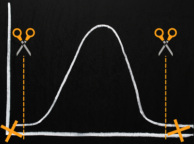
If you have lots of data, simply dropping outliers may be fine. This deletion is sometimes called “trimming” your data. Typically you’d drop the same percentage of the highest and lowest values from your data. Think of this as trimming off the tails of the bell curve of your data. However, you are pretty dramatically modifying your data, with all the questions that might raise, and you’ll want to have a good rationale for this approach.

Trimming outliers
Modifying your outliers is another strategy. Outliers can definitely affect machine learning models, some more than others. Yet you might want to keep every speck of data you have to use in training your model. Here are a few modification approaches you can consider:
- Transformation: log, square root, or inverse transformations are sometimes used in preprocessing to reduce the skewness of data (i.e., make it look like a more normal distribution) and to diminish the potential impact of outliers. The LOG(x) function in Designer’s Formula Tool can help with a log transformation.
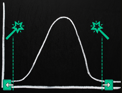
- Clipping, aka winsorization: This method places a limit on the values a variable can have. For example, a 90% winsorization of the data would take the top 10% and bottom 10% of the values and replace them with the values at the 90th percentile and 10th percentile respectively. In contrast to trimming, you aren’t deleting the data points; you’re replacing the furthest-out values on both tails of the curve — the former outliers — with values closer to the rest of your data.

Clipping or winsorization replaces outliers with more central values
- Mean or median replacement: Some references suggest replacing outliers with the mean or median for the variable, presumably calculated with only the non-outlier values. This probably isn’t a great idea, for the many reasons articulated in this discussion.
With the Data Health Tool, once your outliers are identified, it’s up to you how you prefer to proceed with handling them. You can find them in the tool's third output anchor and check them out further. You might add a field flagging them as outliers and join them back to your main dataset. You could plot your data and mark outliers with that flag by using a different color for identified outliers (e.g., on a scatter plot), or use the Data Investigation tools to probe further into these outliers and their relationship to other variables. You could also join the outlier output to your main data source, then exclude the outliers from your analysis. Whatever you choose to do, keep in mind the caveats above.
Overall, the Data Health Tool provides fast and extremely useful insights into the quality and readiness of your data for analysis and machine learning. With its help, you can quickly move on to those next steps with confidence that you’ve looked at the critical vital signs of your dataset.
I hope your data gets a great checkup with the Data Health Tool, and you’re now feeling equipped to contend with any outliers you find! Do you still have questions? Which other tools or data science concepts would you like to see addressed here on the blog? Let me know with a comment below, and subscribe to the blog to get future articles.
Additional Reading