Community Spring Cleaning week is here! Join your fellow Maveryx in digging through your old posts and marking comments on them as solved. Learn more here!

Data Science

Machine learning & data science for beginners and experts alike.
SusanCS
Alteryx Alumni (Retired)


Designer’s awesome tools offer lots of options for plots, tables, and images. But if you’re a pro with -- or just curious about! -- Python plotting tools like matplotlib or seaborn, it’s relatively easy to create your plots in the Python Tool, then extract images from the tool in Designer.


This capability adds even more flexibility to Designer’s already robust plotting options. While you can make many kinds of plots quickly and easily with built-in Designer tools, you can also customize plots as much as your heart desires by adding a bit of Python.


Create Your Plot


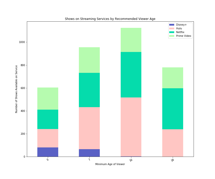
I’ve generated a quick example using a dataset from Kaggle of TV shows available on four popular streaming services. I explored the question: How many shows for different age groups does each streaming service offer? Maybe we’d like to know which service offers more shows for younger viewers ... or maybe we don’t care about kid-friendly content and just want the grittier, grown-up stuff! 


I made a stacked bar plot that displays the number of shows for each age group available from each streaming service.
 

SusanCS_0-1591118083511.png


Here’s the code that generated this plot, using the dataframe df3 as its source. In this case, I’m using pandas’ built-in plotting, which is a wrapper on matplotlib.


colors = ["#5a61c5", "#ffc6c3", "#05dcac", "#b6fbaf"] # choose custom colors
final_plot = df3.plot.bar(stacked=True, color=colors, figsize=(12, 10)) # create plot
plt.xticks(rotation=30) # rotate x-axis ticks
plt.title("Shows on Streaming Services by Recommended Viewer Age") # add plot title
plt.xlabel("Minimum Age of Viewer") # add label to x-axis
plt.ylabel("Number of Shows Available on Service") # add label to y-axis


Save the Plot and Retrieve in Your Workflow


Once you’ve customized your perfect plot, you’ll want to save it to a file. When you run a Designer workflow, a new temporary folder is created, and temporary files for that workflow are saved to that directory. There’s a workflow constant, Engine.TempFilePath, that contains that directory’s path. 


We can access that constant within the Python Tool to generate a file path to the plot’s new home, where it will be saved as plot.png. We’ll then put that file path into a super-simple dataframe -- just one column containing the text of the file path -- since the Python Tool has to output a dataframe.


# get Alteryx temporary folder and create file path to save plot, using file name plot.png
chart_path = Alteryx.getWorkflowConstant("Engine.TempFilePath") + 'plot.png'

# replace backslashes in file path with forward slashes; display path
chart_path = chart_path.replace('\\', '/')
print(chart_path)

# save plot to chart_path 
final_plot.figure.savefig(chart_path)

# write file path and file name as a dataframe to output anchor #1
# dataframe will have one column, chart_path, with type V_WString and length 999,999
Alteryx.write(pd.DataFrame([chart_path], columns = ['chart_path']), 1, 
              {'chart_path':{'type':'V_WString','length': 999999}})


Outside the Python Tool, we’ll use the Image Tool to grab the file path coming out of the Python Tool output, and add a Browse Tool to it so we can view our plot within Designer. 


SusanCS_1-1591118083536.png

 Image Tool settings


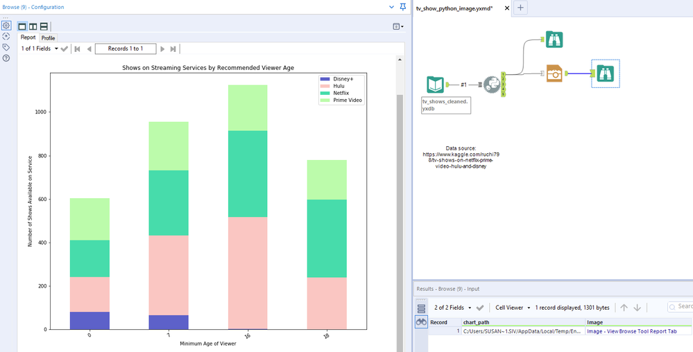
And voilà! The plot renders in the Browse Tool’s Report tab.


SusanCS_2-1591118083552.png

Plot on the left, visible in the Browse Tool’s Report tab; workflow at top right, with the tiny dataframe output from the Python Tool shown in the Results window at bottom right.


If you want to learn more about Python plotting libraries, check out more details on matplotlib (especially the gallery of sample plots and code). Built on top of matplotlibseaborn offers still more options, as shown by its gallery. R users wanting to experiment with some Python might especially appreciate plotnine, which uses a “grammar of graphics” approach similar to R's ggplot2.


Give this approach a try to expand your plotting options and customize your data visualizations even further.

Susan Currie Sivek
Senior Data Science Journalist

Susan Currie Sivek, Ph.D., is the data science journalist for the Alteryx Community. She explores data science concepts with a global audience through blog posts and the Data Science Mixer podcast. Her background in academia and social science informs her approach to investigating data and communicating complex ideas — with a dash of creativity from her training in journalism. Susan also loves getting outdoors with her dog and relaxing with some good science fiction. Twitter: @susansivek

Susan Currie Sivek, Ph.D., is the data science journalist for the Alteryx Community. She explores data science concepts with a global audience through blog posts and the Data Science Mixer podcast. Her background in academia and social science informs her approach to investigating data and communicating complex ideas — with a dash of creativity from her training in journalism. Susan also loves getting outdoors with her dog and relaxing with some good science fiction. Twitter: @susansivek

Comments
bm126
6 - Meteoroid

Great solution ; i hope similarly we can store interactive data in too

SgdPackard810
8 - Asteroid

Can't wait to start integrating my own python plots in workflows! Great way to get inspired to write code.

SusanCS
Alteryx Alumni (Retired)

@SgdPackard810, I'm delighted to hear it! Can't wait to see how it goes for you. Enjoy! 

Nick75
6 - Meteoroid

@SusanCS I can't seem to find the attached workflow that you mentioned in your video

SusanCS
Alteryx Alumni (Retired)

@Nick75 sorry about that! I've attached the package to the post now. Enjoy!

tarshu
5 - Atom

Hi Susan, thank you for this incredibly helpful tutorial! Do you have any tricks for making sure the legend isn't cut off from the image when the legend needs to be outside of the plot? I can't tell if this something I need to fix in my Python code or if it needs to be addressed within the Alteryx image/output tools.

SusanCS
Alteryx Alumni (Retired)

@tarshu you're most welcome! There aren't many configuration options in this use of the Render tool, so you'll likely want to tweak your Python code. You can try adjusting the figsize and the legend location, but you may not necessarily want a larger image or to change that location. Another possibility to try is adding bbox_inches='tight' to your savefig line at the end of your plotting process, right before you send the finished plot's image location to the Python Tool output. In this example/workflow, that line in the the final notebook cell would then be final_plot.figure.savefig(chart_path, bbox_inches='tight'). Here's the documentation; essentially, this removes the white space around your main plot to help the legend fit better. I tried out a couple of versions of this and was able to get the complete image, with legend and axis labels, out of the workflow. You might need to tinker with all of these settings to make your particular plot work! Hope that helps a bit. 🙂 

tarshu
5 - Atom

@SusanCS the bbox_inches='tight' worked beautifully! Thank you again so very much, I don't think I could've accomplished this without your post!

SusanCS
Alteryx Alumni (Retired)

Yay @tarshu, so glad to hear it! That makes my day. 🙂 Thank you for letting me know. 

ztriano
7 - Meteor

@SusanCS Great video...just one question, you mention in the post above being able to use seaborn, but when i try to import it, i get an error. Any tips for importing seaborn in python for alteryx?


ztriano_0-1640108985478.png


NeilR
Alteryx Alumni (Retired)

@ztriano you'll need to install the seaborn package first. First open Alteryx as an admin by right-clicking on the Alteryx windows shortcut and selecting Run as administrator:


NeilR_0-1640122412163.png


Then run the following code:


from ayx import Package
Package.installPackages(['seaborn'])
import seaborn as sns