How it all started
When the Alteryx for Good email describing the Department of Health and Human Services Opioid Code-a-Thon hit our inboxes, those of us on the Emerging Capabilities, Analytics Products, and Content Engineering teams in the Alteryx engineering group knew we had to participate in such an amazing event.
After a little shuffling and negotiation, we settled on a line-up for the creatively named Team 1: JP Kabler, Kuo Liu, Steve Wagner, and me, David Wilcox. Our track was prevention, with the official goal “...the aim of more effectively planning and deploying proactive public health interventions, use available data to create a means by which federal, state, and local stakeholders can predict and analyze the supply and movement of legal and illicit opioids.”
Who are we?
JP Kabler: Software Engineer from the Emerging Capabilities team, responsible for front-end development, as well as Spark and ML related work. For the code-a-thon, assisted with both data engineering and front-end integration around the Neo4j database.
Kuo Liu: Data Scientist on the Emerging Capabilities team. I have worked on multiple Alteryx predictive and prescriptive tools. Most recently, I’ve been working on bringing machine learning with Spark to Alteryx by leveraging our new Spark Direct capability. For the code-a-thon, I worked on our data models.
Steve Wagner: Senior Product Engineer on the Content Engineering team, primarily responsible for supporting the Alteryx developer community and rapid prototyping of future platform enhancements. Code-a-thon contributions consisted of front-end and data visualization work.
David Wilcox: Senior Software Engineer from the Emerging Capabilities team, working primarily on Spark and other Big Data projects. For the code-a-thon I worked as the data engineer with the Neo4j database and jack-of-all-trades to back up the other team members.
Our plan
We took the advice that HHS gave all teams and started our planning and preparation well in advance of the big event. The first task was to decide how to tackle the goal of the prevention track. Coming up with an idea for an application that could help guide public health stakeholders in predicting and analyzing the supply and movement of legal and illicit opioids was going to be a challenging task, and that's entirely why we picked that track. Easy projects aren't our style.
After several brainstorming sessions we settled on two ideas. The first was to use higher order Markov chains to predict the future movement of known opioid supplies and activity hotspots through a graph consisting of county-level nodes. The second was to create a simulation of opioids moving through that same graph.
Given that both ideas depended upon the data being loaded in a graph, we decided to use the Neo4j graph platform. If you aren't familiar with Neo4j, it is to graph databases what Alteryx is to self-service data analytics - i.e., awesome. With a graph database, the emphasis is placed on the relationships within the data; more importantly, a graph database can reveal relationships you might not have known were there.
Our plan was to take all of our data, prep and blend it in Alteryx, load it into Neo4j, and then build our project on top of that. Our resident data scientist, Kuo, would refine our data models in Alteryx, I'd use that to build the back-end of our simulation, and then JP and Steve would build the front-end and visualization components.
What data did we use?
HHS supplied all code-a-thon participants with a variety of public and proprietary datasets. In addition, one of our Alteryx ACEs, Patrick McAuliffe, generously provided us with an opioid-related dataset he had acquired through his own personal projects in this area. We also extensively used the datasets provided with Alteryx itself. Finally, HHS provided non-public datasets under a non-disclosure agreement, one of which we did use in our work. Unfortunately under the terms of the NDA we cannot disclose the nature, content, or origin of that dataset, and any and all references to it in the workflows, screenshots, and visualizations provided in association with this blog post have been removed. It was really cool, though.
Specifically, we used:
- Drug theft incidents, 2014 - 2016. This dataset was provided by ACE Patrick McAuliffe via a Freedom of Information Act request to the Department of Justice and lists all prescription opioid drug theft incidents from January 1, 2014, through June 30, 2016. Columns include the type of theft (employee pilferage, night break-in, armed robbery, etc.), specific drugs stolen and amount of each, date, and exact location of the incident.
- University of Wisconsin County Health Rankings - 2015: This is an annual measure of various health factors and demographic data for all counties in the United States. The columns in this dataset range from population counts to access to health care providers of different types to mortality rates due to different causes and many more. Additional information about this dataset can be found at the County Health Rankings & Roadmaps website.
- CDC WONDER Cause of Death, Underlying Cause, County, 2011 - 2015: This dataset from the Centers for Disease Control lists the total mortalities per underlying cause of death, per year, per county, and was pre-filtered by HHS to include only those causes of death related to opioid usage.
- Medicare Part D Opioid Prescriber Summary: This dataset includes the opioid prescription rate for Medicare Part D providers.
- US Census Bureau County Adjacency List: This dataset lists each county immediately adjacent to any given county and was used to define the geographic relationships in our graph.
- US Census Bureau ZCTA - County Relationship List: This dataset maps every US ZIP code to the county or counties it overlaps. The dataset was used to help map Medicare Part D prescriber opioid prescription rate data, which is only provided at the ZIP code level, to our county-level graph.
- Many, many Alteryx geospatial datasets: To build out many of the geographic relationships, map other datasets to our geographically-oriented graph, and even relate counties to one another using the US Interstate Highway system connectivity, we used the datasets provided with Alteryx.
What did we do?
As with all plans, ours didn't last long once we made it to the code-a-thon. Combining a grandiose idea with limited time and even more limited sleep is not a recipe for delivering on that idea. However, we still consider our code-a-thon journey a success because what we discovered in the process turned out to be as or even more important as the final result we had hoped to make.
The datasets we had were in several formats. The drug theft incident data is in Excel. The University of Wisconsin County Health Rankings and CDC Wonder Cause of Death datasets are CSV. The US Census Bureau County Adjacency List is a plain text file in a very odd format, while the US Census Bureau ZCTA - County is a tab-delimited text file. Alteryx allowed us to prep, blend, geocode, and then convert all of those formats to yxdb.
Our second challenge was moving that data into Neo4j. The challenge here wasn't in what Neo4j would accept - it is a very flexible platform - but in modeling the data in the most appropriate manner for a graph database. That meant thinking about the data differently than you might for a traditional relational database. Again, Alteryx allowed us to easily take the intermediate yxdb files we had created and slice and dice them to best fit a graph data model.
This is when the magic started to happen, because we were able to start loading the data into Neo4j and explore our graph. File-by-file, JP and I started pushing data into our Neo4j instance on AWS.
In a traditional relational database, a data scientist like Kuo building a model or a content engineer like Steve designing a visualization would have to have prior knowledge of the relationships between tables in the database prior to running their query. With Neo4j, having complete prior knowledge is not required. The relationships that may have been hidden before appear right away.

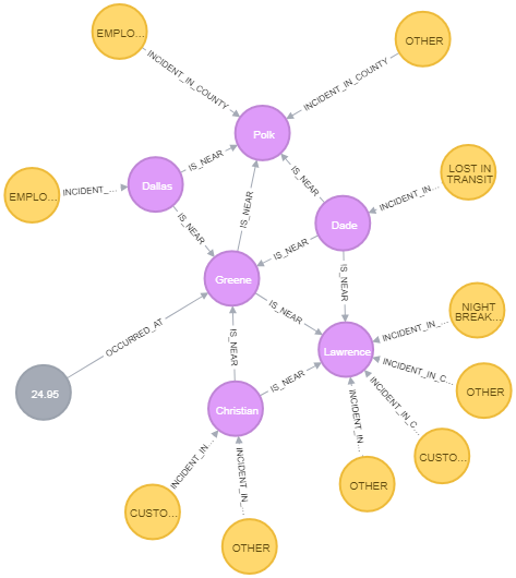
This is an example graph output from Neo4j showing all drug theft incidents (yellow nodes) and drug overdose mortality rates per 100,000 population (gray nodes) from 2014 - 2016 in Greene County, Missouri, with the same data for adjacent counties. Counties are purple nodes. This query provides an overview of three distinct datasets - drug theft incidents 2014 - 2016, CDC WONDER Cause of Death, and the US Census Bureau County Adjacency List - in a visual manner that represents both the geographic relationships within the data and the values of the data.
And the Neo4j query to create that graph?

For those not familiar with Cypher, the Neo4j query language, that query retrieves nodes of any type that have an “occurred at” relationship with Greene County, Missouri, and any other nodes that have an “is near” relationship with Greene County, Missouri, and drug theft incidents associated with them. In this, the results are limited to the first 25 nodes found.
Without having to know in advance what type of nodes might be associated with any particular node, or even which original dataset those nodes might have come from, a user could explore these hidden relationships to find insights they hadn't expected to find. We realized at that point the graph database itself, along with some cool visualizations, might be a better product than our original idea.
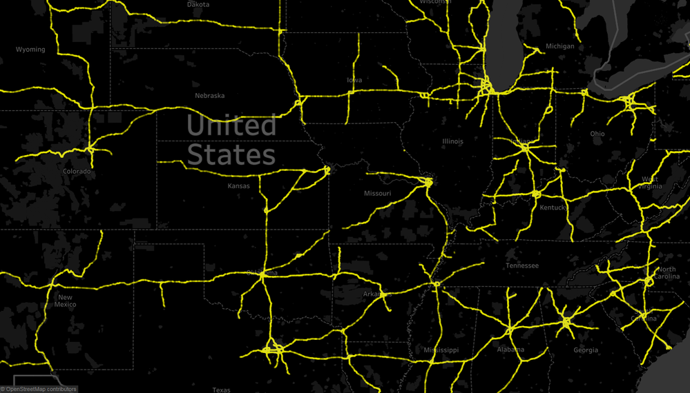
One visualization we worked on, although incomplete when the code-a-thon final buzzer sounded, was one that mapped drug theft incidents to the nearest interstate highway. This was an interesting problem to work on, as we had to develop an Alteryx workflow to geocode each drug theft incident location, take the latitude and longitude of that incident, find the nearest point in the US interstate highway geospatial data provided with Alteryx, then sum the number of incidents that occurred near any given point. Once we had that data, Steve was able to feed that to Tableau to get this colorful visualization (in this case, zoomed and centered on the Midwestern US).

Final thoughts
In the end, we didn't achieve our initial goal of building a higher order Markov chain driven simulation to predict opioid supply movements throughout the US. What we did achieve, though, was even better in the long run. Our team showed the value of using Alteryx to prep and blend a large number of disparate datasets in a variety of formats; using Alteryx to perform a powerful (and very cool) geospatial analysis of this data; using Alteryx to feed data into a Neo4j graph data model; and finally, the power of the Neo4j graph data platform to explore hidden relationships in the data.
The combination of Alteryx and Neo4j in the hands of a citizen data scientist in the public sector is a powerful tool to explore the hidden relationships in data and use the insights discovered to make decisions that will help fight the opioid crisis.