
This article is part of the Tool Mastery Series, a compilation of Knowledge Base contributions to introduce diverse working examples for Designer Tools. Here we’lldelve into uses of theInsight Tool on our way to mastering the Alteryx Designer:
As part of the 24.1 release of Designer & Server, the Insight tool has been deprecated in Designer and End of Life in Server.
Introduced in Alteryx Designer 2018.3, the Insight toolcan be used to build and combine multiple interactive charts into an interactive dashboard, allowing you to clearly communicate your analysis and data insights. This article will review many of the features of the Insight tool, and how to use them. With this article, I hope you feel empowered to take on yourVisualytics adventures head-first.
The first step to creating an insight is attaching an Insight tool (found in the Reportingcategory)to the end of your data stream, and running your workflow to populate the input data into the Insight tool. Once you have run your workflow, you can click the Configure Insight button in the Configuration window.

Clicking on Configure Insight will open a modal window. This is where you will build out your insight.
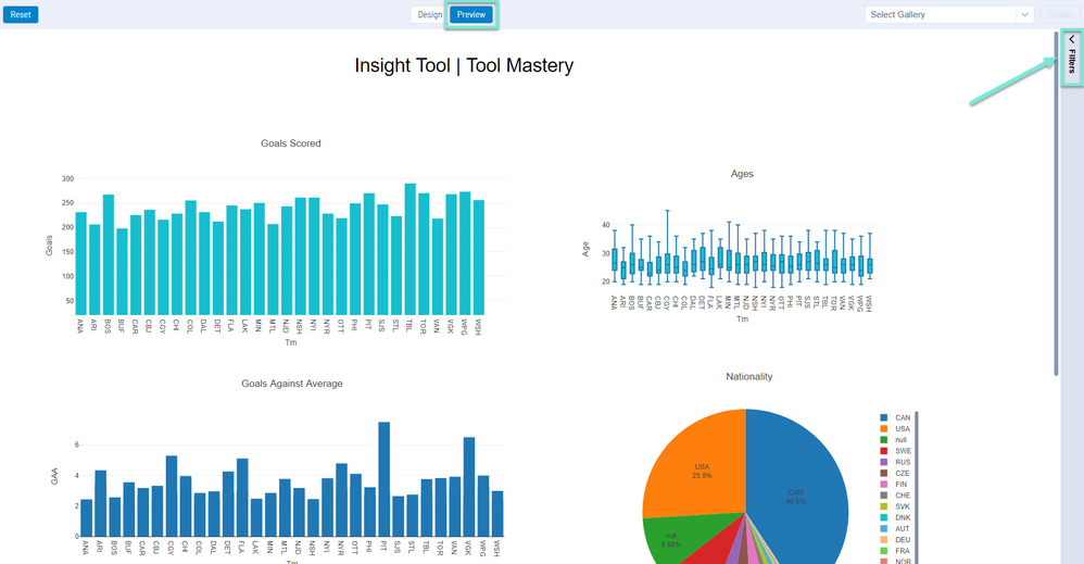
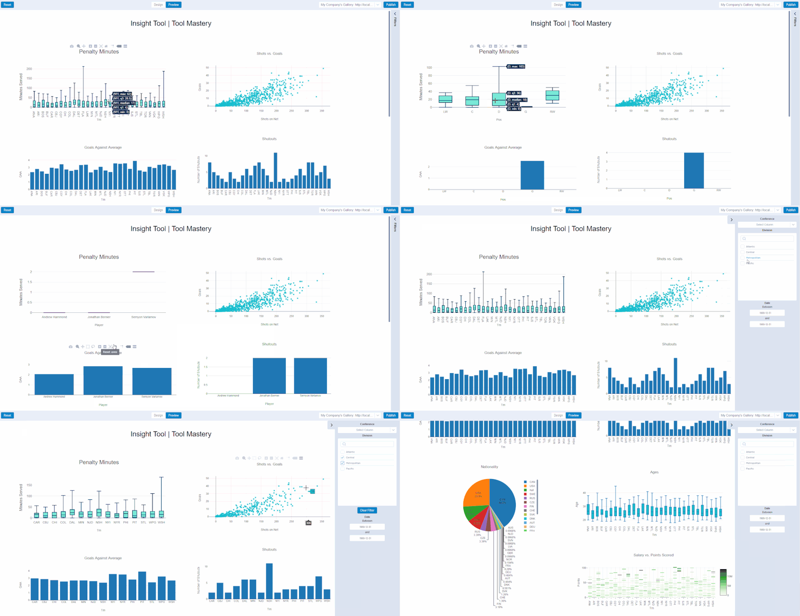
There are two modes in the Insight tool; DesignandPreview. The buttons to toggle between these two modes are in the middle of the top bar of the modal window. Design mode allows users to add, position, and resize chart elements on their insight dashboard, as well as create filters. Preview mode allows users to test the behavior of their dashboard, including interactions between charts, and filters. Interactions include zoom, hover information, chart-to-chart highlighting, drilldown, and updates from a filter. The preview mode is the same experience as an end-user would see after an insight has been published to a Gallery.
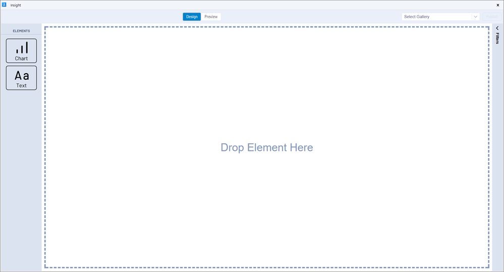
In Design mode, you can add text and chart elements to your insight dashboard by dragging and dropping elements from the left-hand ELEMENTS toolbar on to the canvas.
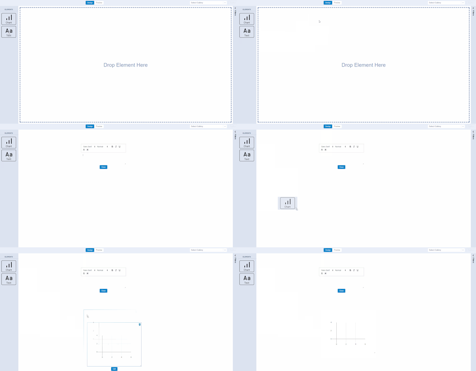
Adding and formattinga Text Element isn't too tricky - after adding it to the canvas, you can type in text, edit the text to your desired font and size, and then click the close button. You can then drag and resize your text element.
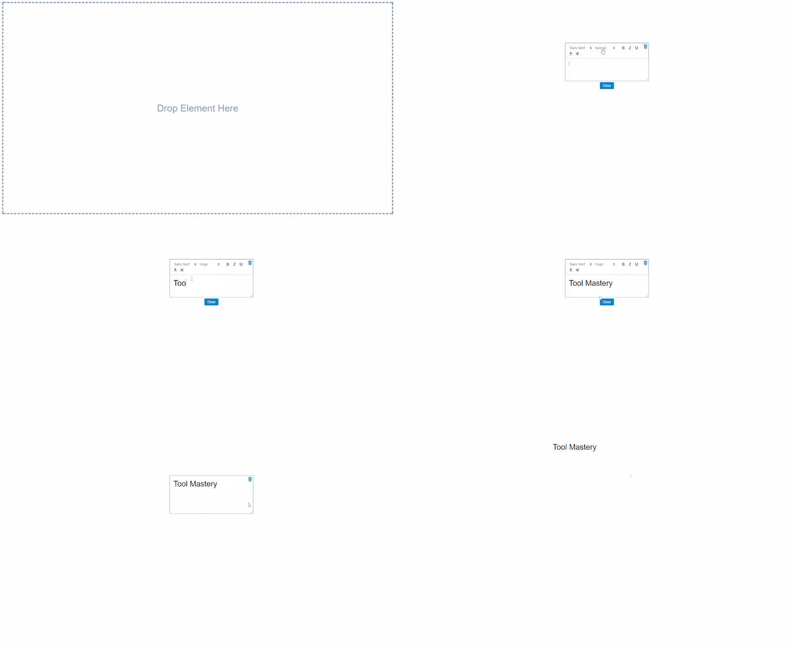
Adding a chart isn't tricky either - you just drag and drop! Configuring a chart is where the real fun starts. Note that you can resize your chart at this point by clicking and dragging the corners of your chart. The size of your chart in the Design view will impact the size of the chart you see while you are editing and developing.
After adding a chart to your insight dashboard, you can format and populate it with data by clicking edit.
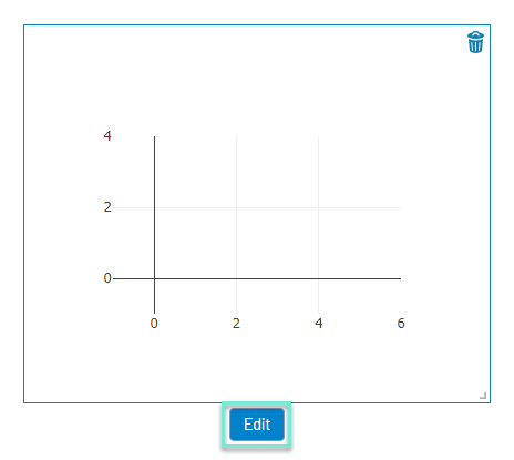
Clicking the edit button on a chart will open a new interface similar to that of the Interactive Chart tool. This is where you can create and customize your dashboard's charts, one chart at a time.
There are two categories included in the far-left toolbar; Create and Style. The Create options allow you to populate yourchart with data, configure the type of plot you are making, and develop drill downs, which are a special interactive feature only present in the Insight tool (we will get to it very soon). The options under Style allow you to make your charts beautiful by modifying the fonts and colors, adding notes, etc.
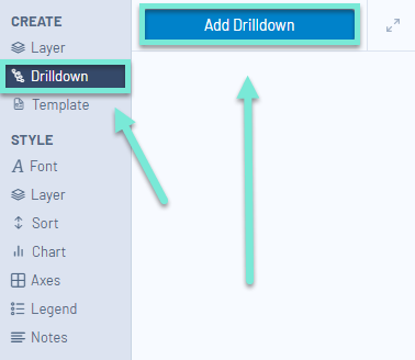
If you know that you would like to include a drilldownin the chart you are developing, your first step will be to create the drilldownlayer. To do this, click on the Drilldownsub-heading under the Create menu on the left-hand side, and click the button that says Add Drilldown.
A drilldown allows you to break down your visualization into layers. The top layer will be the most aggregated level of your data (e.g., year), and the bottom layer of your drilldown will be the finest resolution of your data you would like to include in your insight (e.g., day).
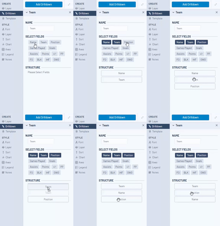
Give your drilldown field a name by typing into the text box under NAME, and then start clicking on the names of fields you would like to be used as layers for your drilldown under SELECT FIELDS. The fields you select will populate under STRUCTURE. The order of the fields under structure matters – for a drilldown to function as expected, you want your most broad layer as the first field under thestructure heading, and your most granular field as your final layer. If you selected things out of order, you can easily change the order of the fields under the structure menu by clicking and dragging the field boxes.
If this isn’t quite making sense to you, there is a great blog post with a video demonstrating a drilldown that you might find helpful here.
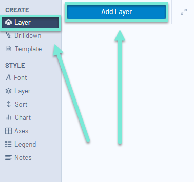
With the Drilldown created, we can start adding data to our chart with layers. To do this, navigate back to the Layersub-heading under CREATE. To start populating your chart with data, once you have navigated to the Create > Layer menu, click Add Layer. The first layer you add to your chart by default will be called layer 0.
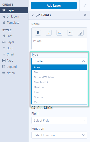
The type of plot you are creating for the data layer can be specified from the Type drop-down options.The current options for chart types areArea,Bar,Box and Whisker,Candlestick,Heatmap,Line,Scatter, andPie. Please see the tool'shelp pagefor additional definitions on each one of these chart types.
To add data to your layer, after selectinga chart type, select the data you would like to populate in the chart in the Data section of the Create > Layer menu. Your chart will then be populated with the values from your selected column(s). You can rename your layer by typing into the text box under Name, or by clicking layer 0 text in the Chart's legend.
The CALCULATION option allows you to add a calculation to your layer. This can be used to aggregate your data to find the Sum, Count, Min, Max, or Mean of one of your fields. Calculations make it easier for you to manipulateyour data from within the Insight tool, as opposed to going upstream in your workflow to perform simple calculations like total (sum) using a Summarize tool. When viewing the insight dashboard in Preview mode or from a Gallery an end-user will be able to see the calculation that is applied at each level ofadrilldown.
 Scatter Plot without a CalculationScatter Plot without a Calculation
 Scatter Plot with a CalculationScatter Plot with a Calculation
Once the layer has the appropriate data and chart type configured, you can start adding additional layers, labels, and modifying additional features of the chart.
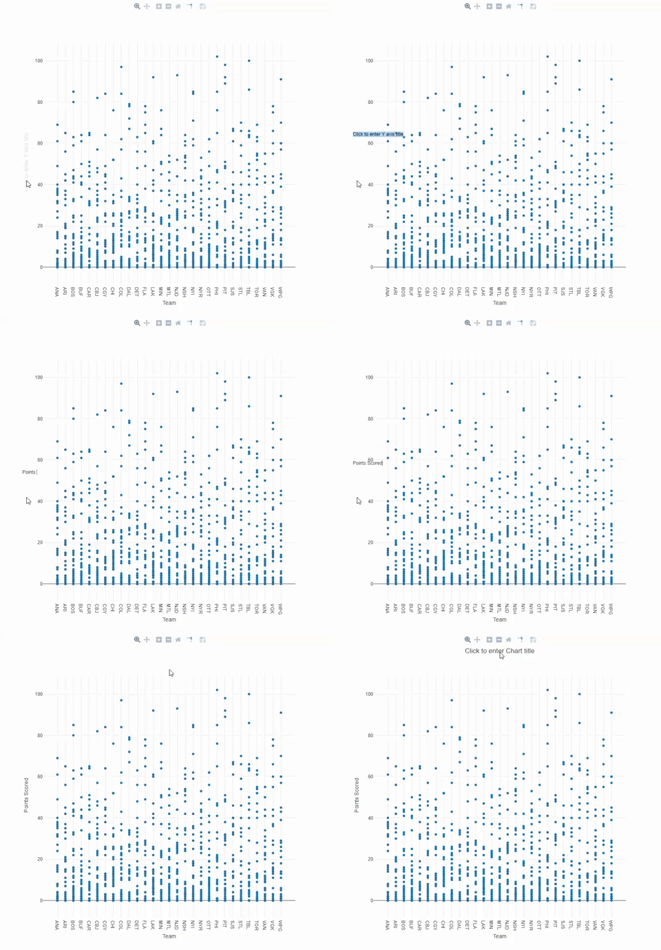
We can add a title and axes labels to our chart by clicking on the text boxes on the sides and top of the chart, and typing in text.
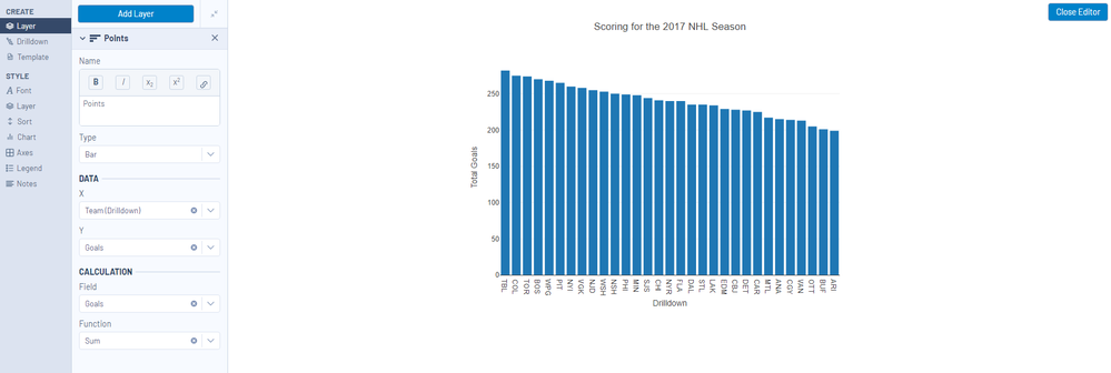
For the first chart in our insight, let’s create a drilldown bar chart, where the calculation is the total number (sum) of goals scored by each level of the drilldown (Team, Position, Player). We have already created the drilldown, and now it populates as an option under the DATA settings. We will set the X-axis values as our drilldown, the Y-axis as Goals, and the CALCULATION as the Sum (Function) of Goals (Field).
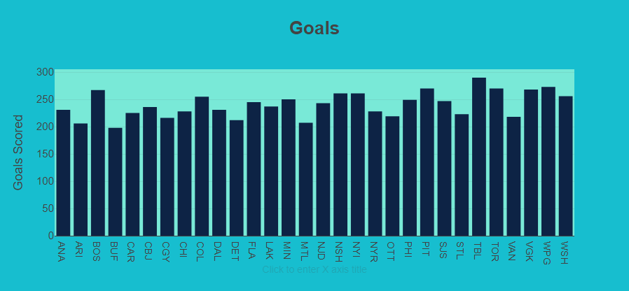
Once you have the data and chart type populated correctly, you can further modify the aesthetics of your chart with the menu options under STYLE. The Style options are pretty intuitive and update on the chart in real time. I suggest exploring these options on your own to make your perfect chart. You might also find the Interactive Chart Tool Mastery article helpful for explaining these options.
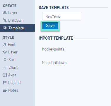
If after all of your tweaks, you have found you have made the perfect chart and want to be able to make this exact same chart with a different data set (e.g., the upcoming 18-19 NHL data), the Template functionality under the CREATE menu is exactly for you!You can save the setting of your current template so that they can all be loaded again at a later time by typing in a name for the template, and clicking save. When you are ready to use a template that has already been saved, you can also load a template from this menu by selecting a previously saved template from the options listed under IMPORT TEMPLATE.
If, alternatively, you find that the modifications you have made to your chart have caused it to irreparably fly off the rails, don't forget there is a little button in the bottom left corner of the editing interface that will reset everything in your chart for you, and return you to the default view.
Once you are finished working on your chart, you can click the Close Editor button in the top right corner of the chart editor view to return to your insight dashboard.

You can repeat this process for as many charts as you would like to be included in your final insight dashboard. Once you have added all of the charts you would like to have included in your insight, you can put the finishing touches on your insight by reorganizing the layout and resizing your elements in Design mode.
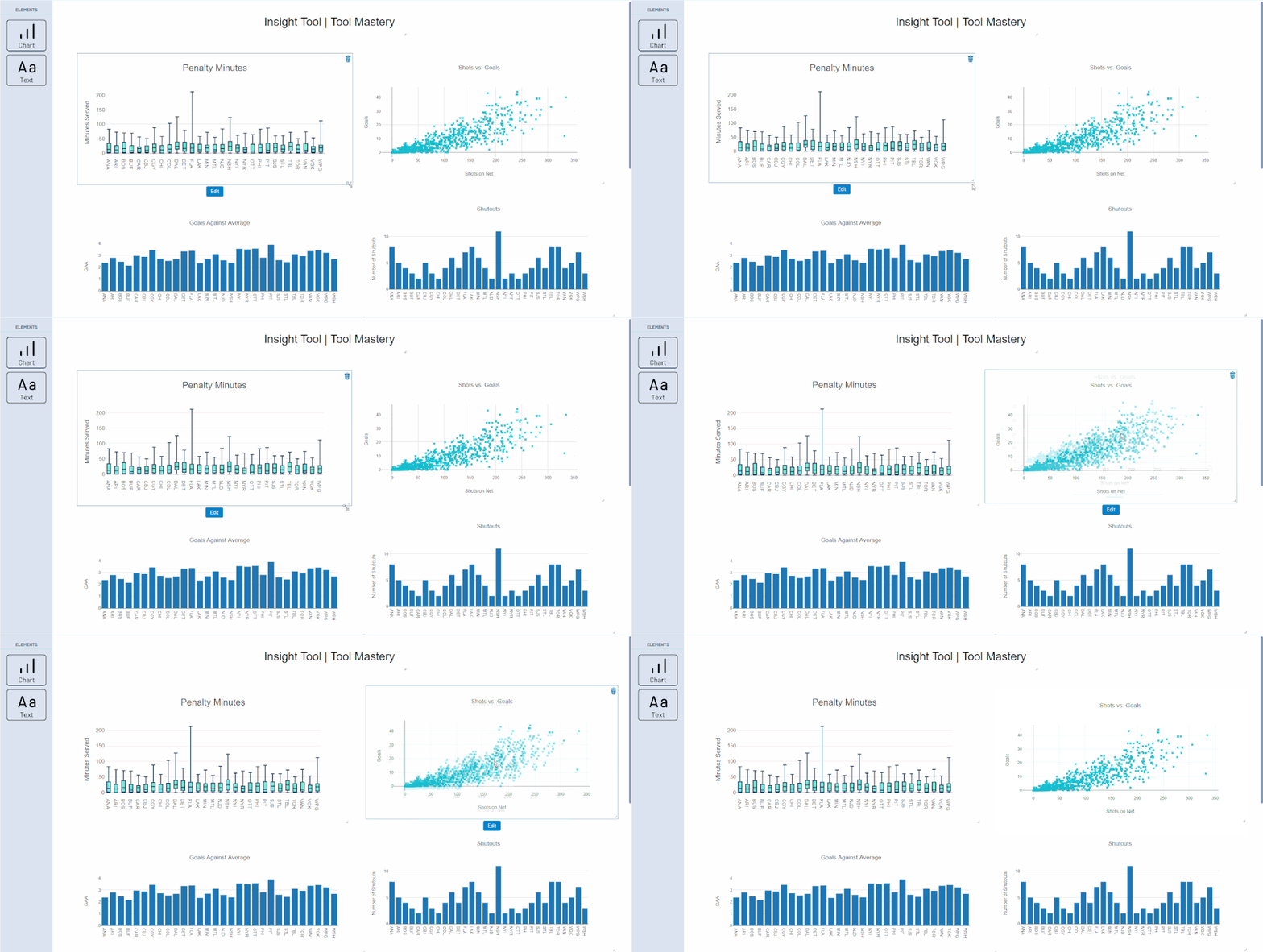
You can also add filters to your dashboard in Design mode. Filters allow you to dynamically limit the data that is displayed on your dashboard with a filtering criteria.
To add a Filter to your dashboard, first, you will need to open the filter palette on the right-hand side of the window.
Once this palette is open, click the Add Filter button to create your filter.
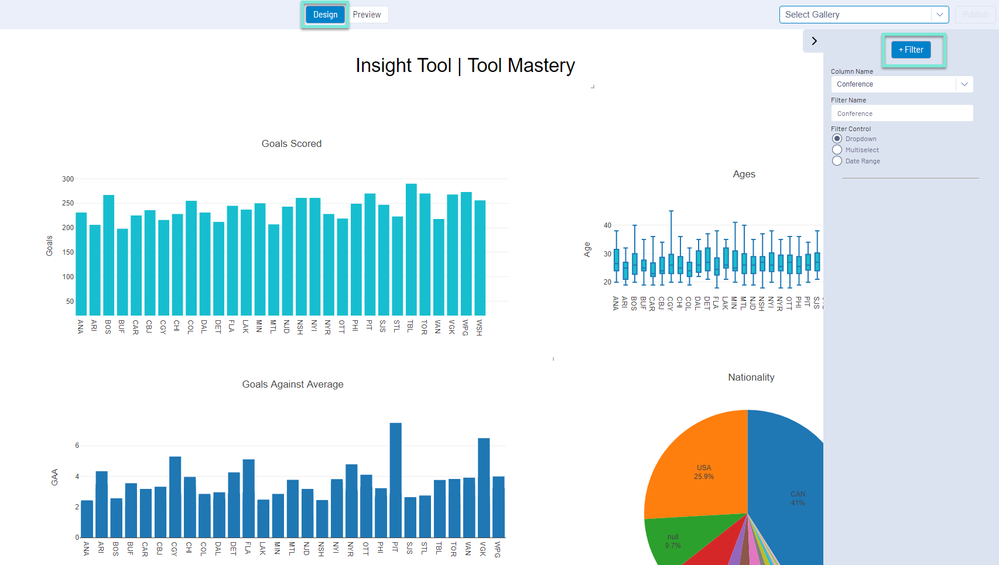
Configure your New Filter by selecting the Column you would like to filter on, naming your filter, and Selecting the filter control. The filter control is the interface that your end-user will interact with to apply a filter to the Insight dashboard. There are currently three types of filter controls; Dropdown, Multiselect, and Date Range.
A Dropdown filter will create a drop-down menu with the values of your field as the options to filter on. With a Dropdown filter, only one filter criteria for the column being filtered on will be displayed at a time.
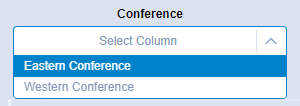
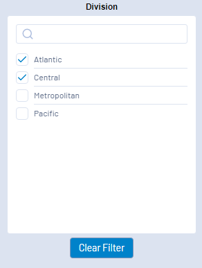
A Multiselect filter creates a checkbox list, where you can select one or more column values to filter your data with.
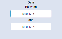
A Date Range filter lets you select two dates, and will filter for the records that occur between those dates. The Date Range filter should be applied to datetime data.
The Preview view of the Insight tool dashboard allows you to verify the behavior (hover/highlighting, drilldown, filter) of your dashboard before sharing.
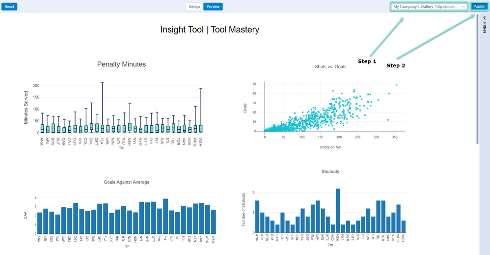
Once you have completed your masterpiece, you can publish it to an Alteryx Gallery hosted on an Alteryx Server. To do this, navigate back to Design mode in the Insights window, and in the top right corner of the screen, select the Gallery you would like to publish to, and click the publish button!
In order for published insights to appear as expected on your Gallery, you will need to make sure your Gallery is configured to accept them. For additional details on this Server configuration, please see the Community article Configuring Your Gallery for Insights.
For a detailed guide on publishing and sharing Insights on an Alteryx Gallery, please see the Community article Publishing and Sharing an Insight.
By now, you should have expert-level proficiency with theInsight Tool! If you can think of a use case we left out, feel free to use the comments section below! Consider yourself a Tool Master already? Let us know atcommunity@alteryx.comif you’d like your creative tool uses to be featured in the Tool Mastery Series.
Stay tuned with our latest posts everyTool Tuesdayby followingAlteryxon Twitter! If you want to master all the Designer tools, considersubscribingfor email notifications.