Alteryx Designer Desktop Discussions
Find answers, ask questions, and share expertise about Alteryx Designer Desktop and Intelligence Suite.- Community
- :
- Community
- :
- Participate
- :
- Discussions
- :
- Designer Desktop
- :
- Visualizing correlation in Alteryx
Visualizing correlation in Alteryx
- Subscribe to RSS Feed
- Mark Topic as New
- Mark Topic as Read
- Float this Topic for Current User
- Bookmark
- Subscribe
- Mute
- Printer Friendly Page
- Mark as New
- Bookmark
- Subscribe
- Mute
- Subscribe to RSS Feed
- Permalink
- Notify Moderator
As a new Alteryx user I am familiarizing with the toolkit.
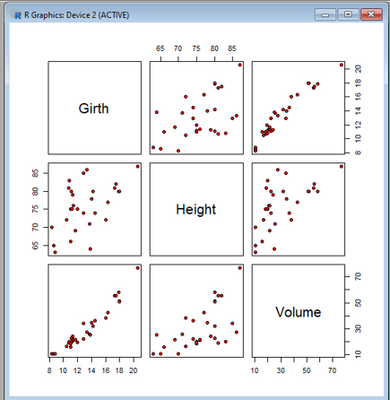
In R I have worked on a dataset with Girth, Height and Volume of trees and which was visualized to detect relationships.
Anyone who can help me "replicate" below in Alteryx? The Association Analysis tool comes closes but does not visualize the same way. Any suggestions?
Thanks and keep strong in the Covid-19 era.
Nico
Solved! Go to Solution.
- Labels:
-
Data Investigation
- Mark as New
- Bookmark
- Subscribe
- Mute
- Subscribe to RSS Feed
- Permalink
- Notify Moderator
Hi @nicobonnet,
if you want to exactly replicate it, I'd go with the R Tool. Do the preprocessing with an Alteryx Workflow and than pass the data into the R Tool for the right visualization.
If you want to avoid it and the Association Analysis isn't close enough, you probably need some combination from Interactive Chart, Report Text and other Report Tools like Layout or Visual Layout.
Hope this helps.
Alex
-
Academy
6 -
ADAPT
2 -
Adobe
204 -
Advent of Code
3 -
Alias Manager
78 -
Alteryx Copilot
25 -
Alteryx Designer
7 -
Alteryx Editions
94 -
Alteryx Practice
20 -
Amazon S3
149 -
AMP Engine
252 -
Announcement
1 -
API
1,208 -
App Builder
116 -
Apps
1,360 -
Assets | Wealth Management
1 -
Basic Creator
14 -
Batch Macro
1,558 -
Behavior Analysis
246 -
Best Practices
2,693 -
Bug
719 -
Bugs & Issues
1 -
Calgary
67 -
CASS
53 -
Chained App
268 -
Common Use Cases
3,823 -
Community
26 -
Computer Vision
85 -
Connectors
1,426 -
Conversation Starter
3 -
COVID-19
1 -
Custom Formula Function
1 -
Custom Tools
1,936 -
Data
1 -
Data Challenge
10 -
Data Investigation
3,486 -
Data Science
3 -
Database Connection
2,220 -
Datasets
5,221 -
Date Time
3,227 -
Demographic Analysis
186 -
Designer Cloud
740 -
Developer
4,368 -
Developer Tools
3,528 -
Documentation
526 -
Download
1,037 -
Dynamic Processing
2,937 -
Email
927 -
Engine
145 -
Enterprise (Edition)
1 -
Error Message
2,256 -
Events
198 -
Expression
1,868 -
Financial Services
1 -
Full Creator
2 -
Fun
2 -
Fuzzy Match
711 -
Gallery
666 -
GenAI Tools
3 -
General
2 -
Google Analytics
155 -
Help
4,705 -
In Database
966 -
Input
4,291 -
Installation
360 -
Interface Tools
1,900 -
Iterative Macro
1,094 -
Join
1,957 -
Licensing
252 -
Location Optimizer
60 -
Machine Learning
259 -
Macros
2,862 -
Marketo
12 -
Marketplace
23 -
MongoDB
82 -
Off-Topic
5 -
Optimization
750 -
Output
5,252 -
Parse
2,327 -
Power BI
228 -
Predictive Analysis
936 -
Preparation
5,167 -
Prescriptive Analytics
205 -
Professional (Edition)
4 -
Publish
257 -
Python
855 -
Qlik
39 -
Question
1 -
Questions
2 -
R Tool
476 -
Regex
2,339 -
Reporting
2,431 -
Resource
1 -
Run Command
575 -
Salesforce
277 -
Scheduler
411 -
Search Feedback
3 -
Server
629 -
Settings
933 -
Setup & Configuration
3 -
Sharepoint
626 -
Spatial Analysis
599 -
Starter (Edition)
1 -
Tableau
512 -
Tax & Audit
1 -
Text Mining
468 -
Thursday Thought
4 -
Time Series
431 -
Tips and Tricks
4,187 -
Topic of Interest
1,126 -
Transformation
3,726 -
Twitter
23 -
Udacity
84 -
Updates
1 -
Viewer
3 -
Workflow
9,974
- « Previous
- Next »


