Alteryx Designer Desktop Discussions
Find answers, ask questions, and share expertise about Alteryx Designer Desktop and Intelligence Suite.- Community
- :
- Community
- :
- Participate
- :
- Discussions
- :
- Designer Desktop
- :
- Scatter/Bubble Charts WITH data labels?
Scatter/Bubble Charts WITH data labels?
- Subscribe to RSS Feed
- Mark Topic as New
- Mark Topic as Read
- Float this Topic for Current User
- Bookmark
- Subscribe
- Mute
- Printer Friendly Page
- Mark as New
- Bookmark
- Subscribe
- Mute
- Subscribe to RSS Feed
- Permalink
- Notify Moderator
Has anyone figured out a way to create scatter (or preferably, bubble) charts that ALSO include a data label for each bubble? I have successfully created a bubble chart (with the standard X and Y dimensions, plus a 'Z' dimension by specifying a 3rd field in the point size settings).
So far so good, but I don't see any place where I can now insert data labels to each of the plotted data points. Basically I want the ability to hover over any bubble on the plot and see which of my 60+ records the plotted numbers numbers relate to. I was not able to find any existing Alteryx community discussions on this exact topic.
Thanks in advance!
Solved! Go to Solution.
- Labels:
-
Reporting
- Mark as New
- Bookmark
- Subscribe
- Mute
- Subscribe to RSS Feed
- Permalink
- Notify Moderator
Hi @dnomasur!
Are you ready for this? I have a hack for you!
If anyone knows a better way, PLEASE let us know.
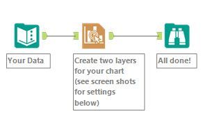
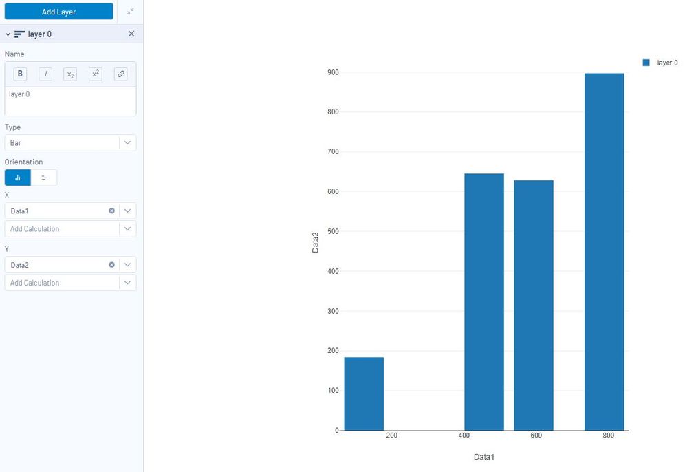
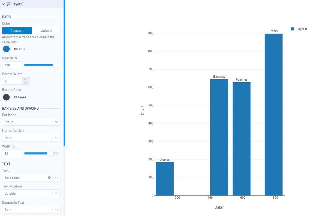
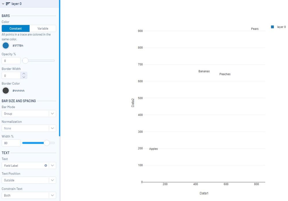
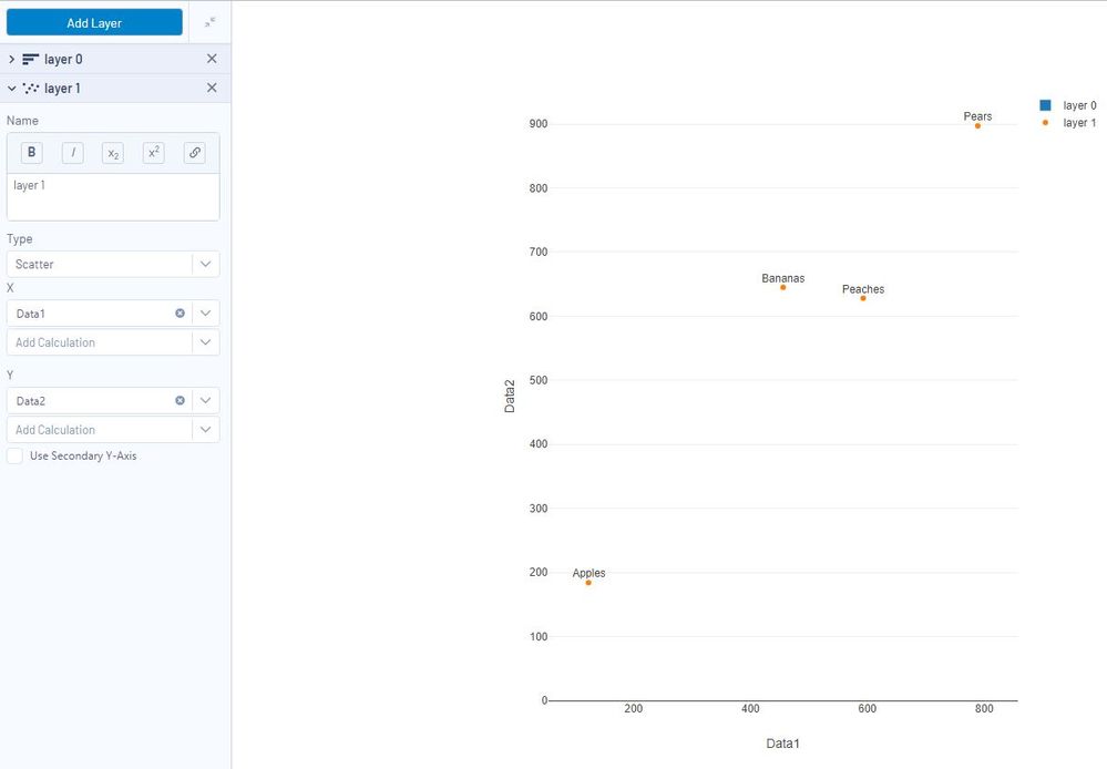
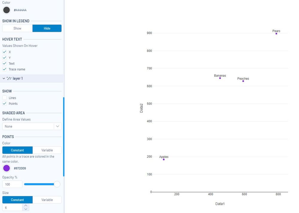
What you are going to do is create a transparent bar chart with labels and then create a second layer on top for the scatterplot. Here are the steps:
Create a new layer (layer 0) as a bar chart.
In Layer / Text, change "Text" to your field label and choose a text position.
In Layer / Color, change opacity to 0% to hide to bar charts.
Add a new layer (layer 1) to create the scatterplot.
Play with the formatting in layer settings until the chart has the appearance you want. You can also turn "Show in Legend" off for both layers.
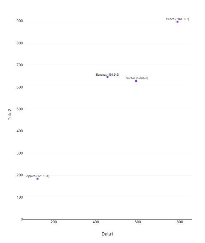
If you want the label to include values, use a formula tool before the Interactive Chart tool :
[Field Label]+" ("+tostring([Data1])+","+tostring([Data2])+")"
Let us know if this does the trick!
Thanks,
Deb
- Mark as New
- Bookmark
- Subscribe
- Mute
- Subscribe to RSS Feed
- Permalink
- Notify Moderator
Hi ddiesel, and thank you!
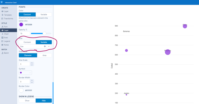
Fascinating solution you have here, and I look forward to studying further for implications elsewhere. But suffice to say this works great for me -- with one very small addition. My ultimate goal was to do this with a bubble chart, and following some previous community advice I was able to successfully add a Z dimension field to your sample workflow. It's as simple as changing the point size setting on your second layer from 'constant' to 'variable' and then selecting a third column of data from the source (after adding that data first, of course!). That tweak also worked like a charm, so I was very pleased to mark your response as 'solved'. So thank you again!
- Mark as New
- Bookmark
- Subscribe
- Mute
- Subscribe to RSS Feed
- Permalink
- Notify Moderator
Sometimes these tools are kind of fiddly, but there's almost always a way to make it work! Thanks for responding with the tip for the variable size. I will give that a try next time.
Thanks!
Deb
- Mark as New
- Bookmark
- Subscribe
- Mute
- Subscribe to RSS Feed
- Permalink
- Notify Moderator
Any suggestion on how to get the labels to be inside and confined to the bubbles? I have a horizontal chart where I want the labels to call within the bubbles of my scatter plot and they either fall out on the left or the right with the settings built into the Interactive Charting tool.
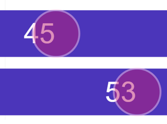
Additionally, I want the labels to sit on top of the scatterplot bubbles. I tried different order of the layers, but that didn't do it. I don't like the way the opacity works as I lose my corporate branding colors.
- Mark as New
- Bookmark
- Subscribe
- Mute
- Subscribe to RSS Feed
- Permalink
- Notify Moderator
Update: I was able to move the label by increasing the values of the invisible bar chart by a set value, pushing the label to the right.
I am still looking for best method to get the label to the front of the layering so the opacity is not required.
- Mark as New
- Bookmark
- Subscribe
- Mute
- Subscribe to RSS Feed
- Permalink
- Notify Moderator
I am trying this ingenious method (thank you) and I can see how it works well for non-repetitive values but I have data where a lot of the x-values and y-values are the same. Only one label appears in the bar chart -- e.g, the top/highest y-value for a given x value. All the y values below this one (for a given x value) remain unlabelled. I can't believe that Alteryx does not provide this functionality, especially for hover. It's pretty basic for anyone trying to understand their data.
-
Academy
6 -
ADAPT
2 -
Adobe
204 -
Advent of Code
3 -
Alias Manager
78 -
Alteryx Copilot
25 -
Alteryx Designer
7 -
Alteryx Editions
93 -
Alteryx Practice
20 -
Amazon S3
149 -
AMP Engine
252 -
Announcement
1 -
API
1,208 -
App Builder
116 -
Apps
1,360 -
Assets | Wealth Management
1 -
Basic Creator
14 -
Batch Macro
1,558 -
Behavior Analysis
246 -
Best Practices
2,693 -
Bug
719 -
Bugs & Issues
1 -
Calgary
67 -
CASS
53 -
Chained App
267 -
Common Use Cases
3,821 -
Community
26 -
Computer Vision
85 -
Connectors
1,425 -
Conversation Starter
3 -
COVID-19
1 -
Custom Formula Function
1 -
Custom Tools
1,936 -
Data
1 -
Data Challenge
10 -
Data Investigation
3,486 -
Data Science
3 -
Database Connection
2,218 -
Datasets
5,218 -
Date Time
3,227 -
Demographic Analysis
186 -
Designer Cloud
740 -
Developer
4,366 -
Developer Tools
3,527 -
Documentation
526 -
Download
1,036 -
Dynamic Processing
2,936 -
Email
927 -
Engine
145 -
Enterprise (Edition)
1 -
Error Message
2,255 -
Events
198 -
Expression
1,867 -
Financial Services
1 -
Full Creator
2 -
Fun
2 -
Fuzzy Match
711 -
Gallery
666 -
GenAI Tools
3 -
General
2 -
Google Analytics
155 -
Help
4,705 -
In Database
966 -
Input
4,291 -
Installation
360 -
Interface Tools
1,900 -
Iterative Macro
1,093 -
Join
1,957 -
Licensing
252 -
Location Optimizer
60 -
Machine Learning
259 -
Macros
2,861 -
Marketo
12 -
Marketplace
23 -
MongoDB
82 -
Off-Topic
5 -
Optimization
750 -
Output
5,251 -
Parse
2,327 -
Power BI
228 -
Predictive Analysis
936 -
Preparation
5,164 -
Prescriptive Analytics
205 -
Professional (Edition)
4 -
Publish
257 -
Python
853 -
Qlik
39 -
Question
1 -
Questions
2 -
R Tool
476 -
Regex
2,339 -
Reporting
2,430 -
Resource
1 -
Run Command
575 -
Salesforce
276 -
Scheduler
411 -
Search Feedback
3 -
Server
629 -
Settings
933 -
Setup & Configuration
3 -
Sharepoint
625 -
Spatial Analysis
599 -
Starter (Edition)
1 -
Tableau
512 -
Tax & Audit
1 -
Text Mining
468 -
Thursday Thought
4 -
Time Series
431 -
Tips and Tricks
4,186 -
Topic of Interest
1,126 -
Transformation
3,724 -
Twitter
23 -
Udacity
84 -
Updates
1 -
Viewer
3 -
Workflow
9,971
- « Previous
- Next »

