Search
Close
Start Free Trial
Turn on suggestions
Auto-suggest helps you quickly narrow down your search results by suggesting possible matches as you type.
Showing results for
Alteryx Designer Desktop Discussions
Find answers, ask questions, and share expertise about Alteryx Designer Desktop and Intelligence Suite.- Community
- :
- Community
- :
- Participate
- :
- Discussions
- :
- Designer Desktop
- :
- Graphs with 3 Variables/Parameters - How to make t...
Graphs with 3 Variables/Parameters - How to make this look better?
Options
- Subscribe to RSS Feed
- Mark Topic as New
- Mark Topic as Read
- Float this Topic for Current User
- Bookmark
- Subscribe
- Mute
- Printer Friendly Page
Joker_Hazard
11 - Bolide
04-27-2021
05:33 AM
- Mark as New
- Bookmark
- Subscribe
- Mute
- Subscribe to RSS Feed
- Permalink
- Notify Moderator
Hello everyone...
I am having a lot of trouble to make a few graphs. Basically I have three paraments:
- Weeks as Date
- Environment
- Quantity of Defects
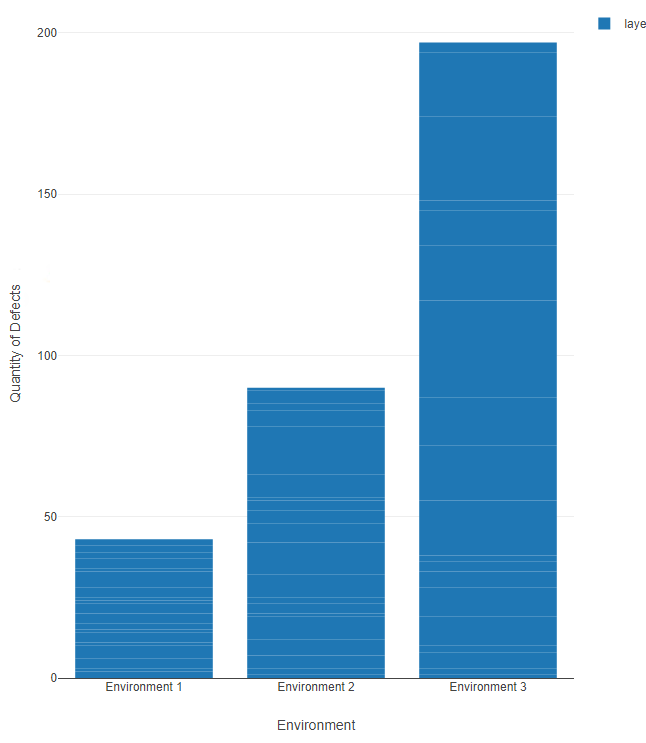
I need to show a few correlations between all three variables and I tried to make this by using a bar chart and didn't look good.
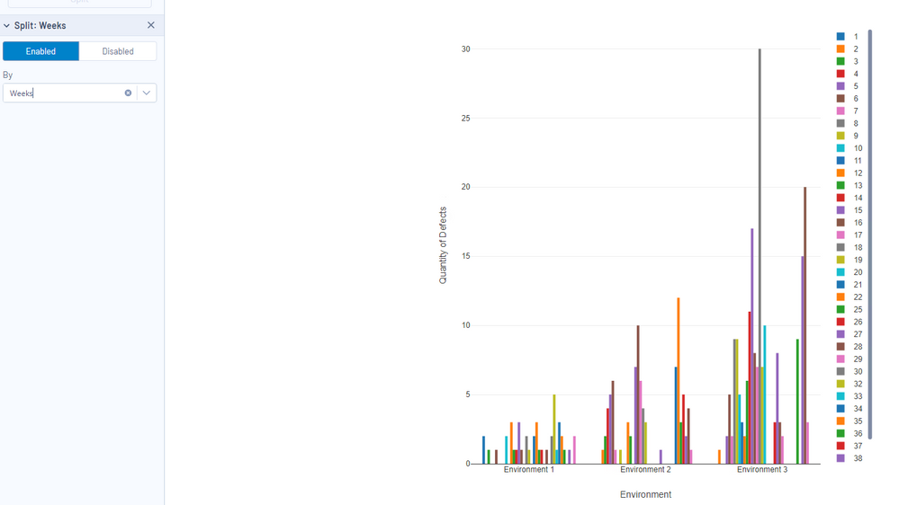
Next I tried to split by weeks (which is my objetive) and didnt look good either.
Is there any statistical tool of something that I am missing out to make this look better and be able to present this to a group of managers?
It would be much appreciate if someone could help me out with thinking of a range of possible correlations ..
Thank you very much!
Labels:
- Labels:
-
Workflow
1 REPLY 1
04-27-2021
11:51 AM
- Mark as New
- Bookmark
- Subscribe
- Mute
- Subscribe to RSS Feed
- Permalink
- Notify Moderator
Guys.. Really need help with this one. Thank you!
Labels
-
Academy
6 -
ADAPT
2 -
Adobe
203 -
Advent of Code
3 -
Alias Manager
77 -
Alteryx Copilot
23 -
Alteryx Designer
7 -
Alteryx Editions
86 -
Alteryx Practice
20 -
Amazon S3
149 -
AMP Engine
250 -
Announcement
1 -
API
1,205 -
App Builder
115 -
Apps
1,358 -
Assets | Wealth Management
1 -
Basic Creator
13 -
Batch Macro
1,550 -
Behavior Analysis
244 -
Best Practices
2,689 -
Bug
719 -
Bugs & Issues
1 -
Calgary
67 -
CASS
53 -
Chained App
267 -
Common Use Cases
3,817 -
Community
26 -
Computer Vision
85 -
Connectors
1,422 -
Conversation Starter
3 -
COVID-19
1 -
Custom Formula Function
1 -
Custom Tools
1,933 -
Data
1 -
Data Challenge
10 -
Data Investigation
3,484 -
Data Science
3 -
Database Connection
2,215 -
Datasets
5,212 -
Date Time
3,226 -
Demographic Analysis
185 -
Designer Cloud
736 -
Developer
4,355 -
Developer Tools
3,523 -
Documentation
525 -
Download
1,035 -
Dynamic Processing
2,932 -
Email
925 -
Engine
145 -
Enterprise (Edition)
1 -
Error Message
2,251 -
Events
196 -
Expression
1,867 -
Financial Services
1 -
Full Creator
2 -
Fun
2 -
Fuzzy Match
711 -
Gallery
666 -
GenAI Tools
2 -
General
2 -
Google Analytics
155 -
Help
4,701 -
In Database
965 -
Input
4,288 -
Installation
359 -
Interface Tools
1,895 -
Iterative Macro
1,090 -
Join
1,954 -
Licensing
250 -
Location Optimizer
60 -
Machine Learning
259 -
Macros
2,854 -
Marketo
12 -
Marketplace
23 -
MongoDB
82 -
Off-Topic
5 -
Optimization
749 -
Output
5,239 -
Parse
2,323 -
Power BI
227 -
Predictive Analysis
936 -
Preparation
5,157 -
Prescriptive Analytics
205 -
Professional (Edition)
4 -
Publish
257 -
Python
850 -
Qlik
39 -
Question
1 -
Questions
2 -
R Tool
476 -
Regex
2,338 -
Reporting
2,428 -
Resource
1 -
Run Command
572 -
Salesforce
276 -
Scheduler
410 -
Search Feedback
3 -
Server
627 -
Settings
931 -
Setup & Configuration
3 -
Sharepoint
624 -
Spatial Analysis
598 -
Starter (Edition)
1 -
Tableau
511 -
Tax & Audit
1 -
Text Mining
468 -
Thursday Thought
4 -
Time Series
430 -
Tips and Tricks
4,178 -
Topic of Interest
1,123 -
Transformation
3,719 -
Twitter
23 -
Udacity
84 -
Updates
1 -
Viewer
3 -
Workflow
9,955
- « Previous
- Next »


