Alteryx Designer Desktop Discussions
Find answers, ask questions, and share expertise about Alteryx Designer Desktop and Intelligence Suite.- Community
- :
- Community
- :
- Participate
- :
- Discussions
- :
- Designer Desktop
- :
- Re: Excel Pivot Chart like output
Excel Pivot Chart like output
- Subscribe to RSS Feed
- Mark Topic as New
- Mark Topic as Read
- Float this Topic for Current User
- Bookmark
- Subscribe
- Mute
- Printer Friendly Page
- Mark as New
- Bookmark
- Subscribe
- Mute
- Subscribe to RSS Feed
- Permalink
- Notify Moderator
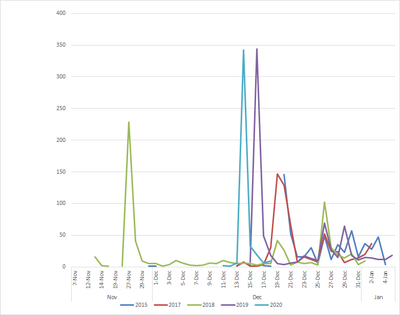
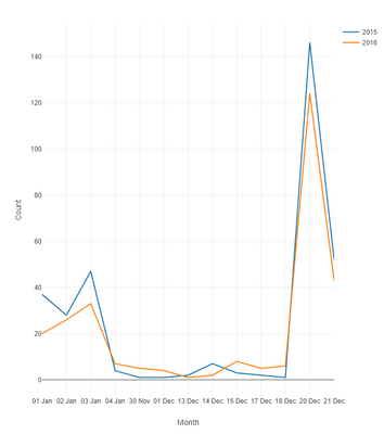
Is there any way to create a chart with multiple row/column group by functions like in Excel using the Interactive Chart tool. I want to show year over year results of responses received to a survey by date. as in the chart below.
My Source data looks like this:
| Date | Count |
| 1/1/2015 | 37 |
| 1/2/2015 | 28 |
| 1/3/2015 | 47 |
| 1/4/2015 | 4 |
| 11/30/2015 | 1 |
| 12/1/2015 | 1 |
| 12/13/2015 | 2 |
| 12/14/2015 | 7 |
| 12/15/2015 | 3 |
| 12/17/2015 | 2 |
| 12/18/2015 | 1 |
| 12/20/2015 | 146 |
| 12/21/2015 | 52 |
Solved! Go to Solution.
- Labels:
-
Data Investigation
- Mark as New
- Bookmark
- Subscribe
- Mute
- Subscribe to RSS Feed
- Permalink
- Notify Moderator
Hi @EricO
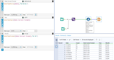
You can create that with the Interactive Chart tool, but you should do some data prep first. Use a formula tool to bring your date in a format that Alteryx can understand as a date, and then parse out the Year and the Month-day info.
The former will be used to colour your different lines and the latter as you x-axis.
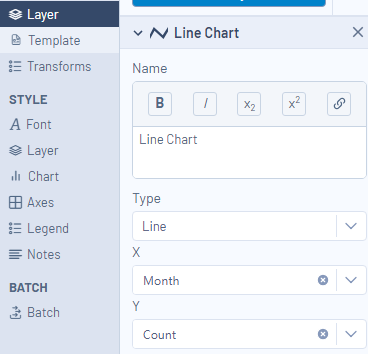
Then in your interactive chart tool, plot the line chart as shown below :
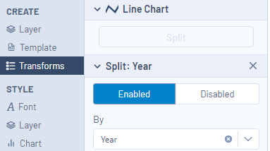
and under the transforms tab, select to split by year
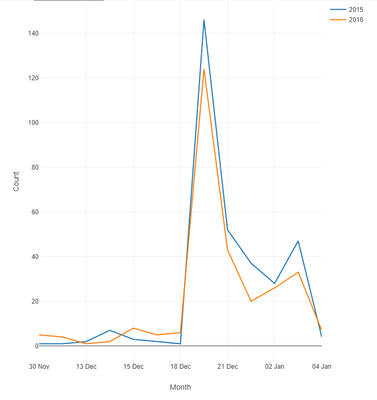
Then you should end up with something looking like that:
Hope that helps, let me know if you have any questions.
Regards,
Angelos
- Mark as New
- Bookmark
- Subscribe
- Mute
- Subscribe to RSS Feed
- Permalink
- Notify Moderator
Hi Angelos,
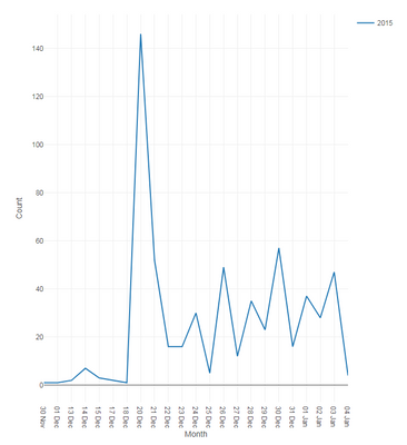
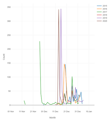
Thanks for your help. Your input has gotten me 90% of the way there. One small issue I am having though, is that my data for each series crosses the December/January boundary, and the Interactive chart tool can't figure out how to sort the x-axis. I played with presorting the data by using an artificial julian date were days < 100 get 366 added to them which fixed the individual plots,
When only one series is graphed, it works fine
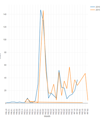
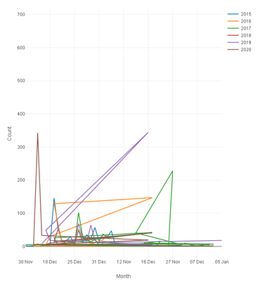
When more than one series is plotted however, the data starts to get scrambled.
Note the out-of-order Jan,Nov, Dec data points for the 2015 dataset in the graph above. Any idea on how to deal with this?
- Mark as New
- Bookmark
- Subscribe
- Mute
- Subscribe to RSS Feed
- Permalink
- Notify Moderator
Hi @EricO ,
So out of curiosity, the January shown in your graph coming after December, is it still 2015 or is it 2016?
- Mark as New
- Bookmark
- Subscribe
- Mute
- Subscribe to RSS Feed
- Permalink
- Notify Moderator
The date is really in 2016, but is part of the 2015 campaign, so 2015 is really the series name.
- Mark as New
- Bookmark
- Subscribe
- Mute
- Subscribe to RSS Feed
- Permalink
- Notify Moderator
Hi @EricO ,
I've made some small changes and amended the year in the date fields (so Jan in the 2016 campaign would be 2017).
Then, I've created a new field/flag called "campaign", which I've used to split and colour the different lines.
Then it was just a matter of parsing the date and sorting the fields as needed.
Hope that helps, let me know if it worked for you.
Regards,
Angelos
- Mark as New
- Bookmark
- Subscribe
- Mute
- Subscribe to RSS Feed
- Permalink
- Notify Moderator
Hi Angelos,
Thanks for your help. This was more complicated than just sorting the data properly. The underlying issue was that each "Campaign" or series as they are called in Excel needed to have all the same Range values (Date) present in order for the chart tool not to go crazy. In your examples, you used data points on all the same day-of-month, even if you skipped some days. However, in my actual data, not every series had the same calendar days. For example in 2015 there might have been a Nov 15, but in 2016-2020, there might not have been. Once I created a Cartesian table of dates, so that every series has the same number of range values, the chart sorted itself out. There is probably an easier way to do this, but it was what I came up with base on my limited experience with the tool. Thanks again for the help.
vs.
- Mark as New
- Bookmark
- Subscribe
- Mute
- Subscribe to RSS Feed
- Permalink
- Notify Moderator
Hi @EricO ,
Apologies for that, I did all I could with the data and knowledge of the problem you provided.
Glad you manage to sort it out on your own.
-
Academy
6 -
ADAPT
2 -
Adobe
204 -
Advent of Code
3 -
Alias Manager
78 -
Alteryx Copilot
26 -
Alteryx Designer
7 -
Alteryx Editions
95 -
Alteryx Practice
20 -
Amazon S3
149 -
AMP Engine
252 -
Announcement
1 -
API
1,208 -
App Builder
116 -
Apps
1,360 -
Assets | Wealth Management
1 -
Basic Creator
15 -
Batch Macro
1,559 -
Behavior Analysis
246 -
Best Practices
2,695 -
Bug
719 -
Bugs & Issues
1 -
Calgary
67 -
CASS
53 -
Chained App
268 -
Common Use Cases
3,825 -
Community
26 -
Computer Vision
86 -
Connectors
1,426 -
Conversation Starter
3 -
COVID-19
1 -
Custom Formula Function
1 -
Custom Tools
1,938 -
Data
1 -
Data Challenge
10 -
Data Investigation
3,487 -
Data Science
3 -
Database Connection
2,220 -
Datasets
5,222 -
Date Time
3,227 -
Demographic Analysis
186 -
Designer Cloud
742 -
Developer
4,372 -
Developer Tools
3,530 -
Documentation
527 -
Download
1,037 -
Dynamic Processing
2,939 -
Email
928 -
Engine
145 -
Enterprise (Edition)
1 -
Error Message
2,258 -
Events
198 -
Expression
1,868 -
Financial Services
1 -
Full Creator
2 -
Fun
2 -
Fuzzy Match
712 -
Gallery
666 -
GenAI Tools
3 -
General
2 -
Google Analytics
155 -
Help
4,708 -
In Database
966 -
Input
4,293 -
Installation
361 -
Interface Tools
1,901 -
Iterative Macro
1,094 -
Join
1,958 -
Licensing
252 -
Location Optimizer
60 -
Machine Learning
260 -
Macros
2,864 -
Marketo
12 -
Marketplace
23 -
MongoDB
82 -
Off-Topic
5 -
Optimization
751 -
Output
5,255 -
Parse
2,328 -
Power BI
228 -
Predictive Analysis
937 -
Preparation
5,169 -
Prescriptive Analytics
206 -
Professional (Edition)
4 -
Publish
257 -
Python
855 -
Qlik
39 -
Question
1 -
Questions
2 -
R Tool
476 -
Regex
2,339 -
Reporting
2,434 -
Resource
1 -
Run Command
575 -
Salesforce
277 -
Scheduler
411 -
Search Feedback
3 -
Server
630 -
Settings
935 -
Setup & Configuration
3 -
Sharepoint
627 -
Spatial Analysis
599 -
Starter (Edition)
1 -
Tableau
512 -
Tax & Audit
1 -
Text Mining
468 -
Thursday Thought
4 -
Time Series
431 -
Tips and Tricks
4,187 -
Topic of Interest
1,126 -
Transformation
3,730 -
Twitter
23 -
Udacity
84 -
Updates
1 -
Viewer
3 -
Workflow
9,980
- « Previous
- Next »
