Alteryx Designer Desktop Discussions
Find answers, ask questions, and share expertise about Alteryx Designer Desktop and Intelligence Suite.- Community
- :
- Community
- :
- Participate
- :
- Discussions
- :
- Designer Desktop
- :
- Re: Create Sparklines for Excel Reports
Create Sparklines for Excel Reports
- Subscribe to RSS Feed
- Mark Topic as New
- Mark Topic as Read
- Float this Topic for Current User
- Bookmark
- Subscribe
- Mute
- Printer Friendly Page
- Mark as New
- Bookmark
- Subscribe
- Mute
- Subscribe to RSS Feed
- Permalink
- Notify Moderator
Hi!
I am looking for a solution to build sparklines for a trend report in Excel. Given is what I am looking to build.
Is there a way to use the Reporting tools to visualize a trend over time for each category as below?
Reference: https://www.ablebits.com/office-addins-blog/2019/10/02/excel-sparklines-insert-change-use/
Appreciate any help!
Thank you.
Solved! Go to Solution.
- Mark as New
- Bookmark
- Subscribe
- Mute
- Subscribe to RSS Feed
- Permalink
- Notify Moderator
Hi @jineshnp31
Sparklines aren't built in to the Alteryx reporting tools, but you could leverage a VBA script that executes as an event "after workflow run" or from a run command tool after the Excel file has been created.
Example of sparklines VBA: https://myengineeringworld.net/2012/09/create-sparklines-automatically.html
Execute VBA from a workflow: https://community.alteryx.com/t5/Alteryx-Designer-Knowledge-Base/Alteryx-Run-Command-Executing-Excel...
- Mark as New
- Bookmark
- Subscribe
- Mute
- Subscribe to RSS Feed
- Permalink
- Notify Moderator
Hi @jineshnp31
Like @BrandonB said, Spark Lines are a native Excel function and there's no built in way to set up the formatting on the excel spreadsheet to have them appear automatically
There are 2 other ways you can make it work however.
1. Set up a template Excel file that already has the Spark lines defined and the Grades 1 to 5 columns defined in a named range. Configure the output tool to insert the data into the named range. Once a user opens the Excel file, the spark line will be regenerated automatically.
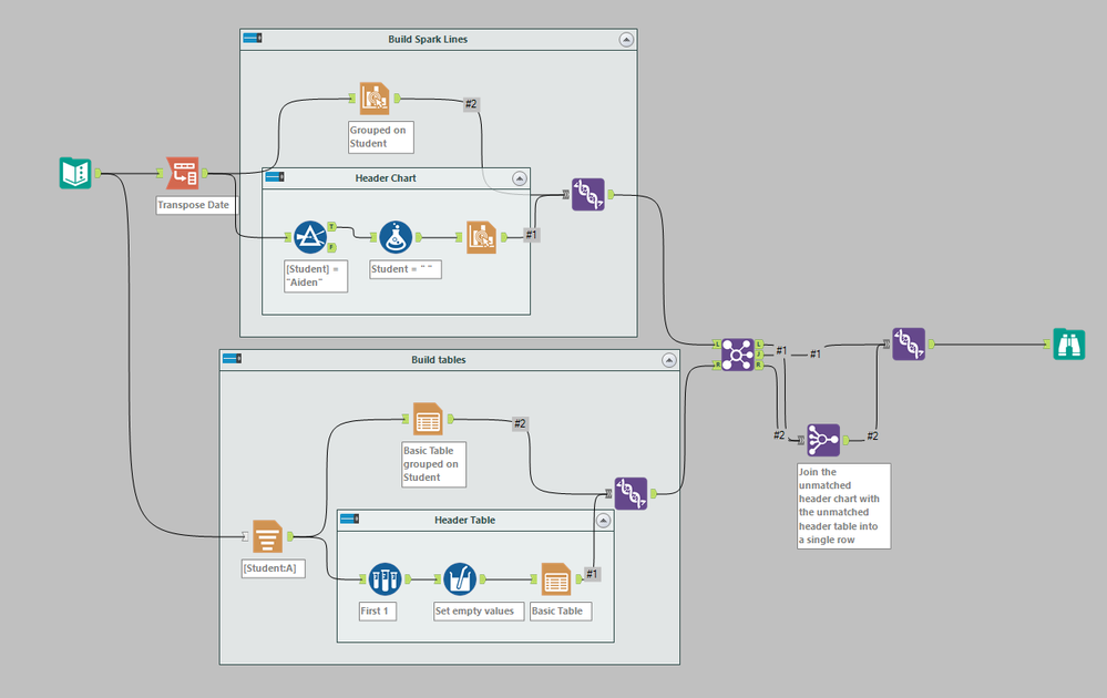
2. You can reproduce the Spark lines functionality using the Alteryx reporting tools(I was bored)

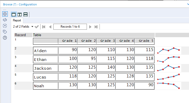
Tricky part here is that you only have the headers show up at the top of the table and you need to group the Interactive Chart and the Table tools by student to line them up in the output. To do this you need to build a dummy Header record with only headers as a table and a dummy chart with white data lines and points Once you union this header row with the actual data rows, you have something that looks like this.
Dan
- Mark as New
- Bookmark
- Subscribe
- Mute
- Subscribe to RSS Feed
- Permalink
- Notify Moderator
Thank you @BrandonB I will try this solution as well, it actually also helps me think about automating another process! Appreciate it! 🙂
- Mark as New
- Bookmark
- Subscribe
- Mute
- Subscribe to RSS Feed
- Permalink
- Notify Moderator
@danilang This is exactly what I was looking for, thanks a lot for your help! The second option fits my requirements better as we were looking to also have a brief snapshot to be sent out as email for the trend.
Appreciate your help! 🙂
- Mark as New
- Bookmark
- Subscribe
- Mute
- Subscribe to RSS Feed
- Permalink
- Notify Moderator
Usually, when working with a large data set, the numbers can be a bit overwhelming, to say the least. It is not easy to quickly grasp what the numbers, trends and slope represent. For example, if there is a chart of stock prices (which may contain many numbers), it may overwhelm you. You won’t be able to quickly tell if prices are going up or down.
Sparkline in Google Sheets| Visualize Data in 2 mins
-
Academy
6 -
ADAPT
2 -
Adobe
204 -
Advent of Code
3 -
Alias Manager
78 -
Alteryx Copilot
27 -
Alteryx Designer
7 -
Alteryx Editions
96 -
Alteryx Practice
20 -
Amazon S3
149 -
AMP Engine
252 -
Announcement
1 -
API
1,210 -
App Builder
116 -
Apps
1,360 -
Assets | Wealth Management
1 -
Basic Creator
15 -
Batch Macro
1,559 -
Behavior Analysis
246 -
Best Practices
2,696 -
Bug
720 -
Bugs & Issues
1 -
Calgary
67 -
CASS
53 -
Chained App
268 -
Common Use Cases
3,825 -
Community
26 -
Computer Vision
86 -
Connectors
1,426 -
Conversation Starter
3 -
COVID-19
1 -
Custom Formula Function
1 -
Custom Tools
1,939 -
Data
1 -
Data Challenge
10 -
Data Investigation
3,489 -
Data Science
3 -
Database Connection
2,221 -
Datasets
5,223 -
Date Time
3,229 -
Demographic Analysis
186 -
Designer Cloud
743 -
Developer
4,376 -
Developer Tools
3,534 -
Documentation
528 -
Download
1,038 -
Dynamic Processing
2,941 -
Email
929 -
Engine
145 -
Enterprise (Edition)
1 -
Error Message
2,262 -
Events
198 -
Expression
1,868 -
Financial Services
1 -
Full Creator
2 -
Fun
2 -
Fuzzy Match
714 -
Gallery
666 -
GenAI Tools
3 -
General
2 -
Google Analytics
155 -
Help
4,711 -
In Database
966 -
Input
4,296 -
Installation
361 -
Interface Tools
1,902 -
Iterative Macro
1,095 -
Join
1,960 -
Licensing
252 -
Location Optimizer
60 -
Machine Learning
260 -
Macros
2,866 -
Marketo
12 -
Marketplace
23 -
MongoDB
82 -
Off-Topic
5 -
Optimization
751 -
Output
5,259 -
Parse
2,328 -
Power BI
228 -
Predictive Analysis
937 -
Preparation
5,171 -
Prescriptive Analytics
206 -
Professional (Edition)
4 -
Publish
257 -
Python
855 -
Qlik
39 -
Question
1 -
Questions
2 -
R Tool
476 -
Regex
2,339 -
Reporting
2,434 -
Resource
1 -
Run Command
576 -
Salesforce
277 -
Scheduler
411 -
Search Feedback
3 -
Server
631 -
Settings
936 -
Setup & Configuration
3 -
Sharepoint
628 -
Spatial Analysis
599 -
Starter (Edition)
1 -
Tableau
512 -
Tax & Audit
1 -
Text Mining
468 -
Thursday Thought
4 -
Time Series
432 -
Tips and Tricks
4,187 -
Topic of Interest
1,126 -
Transformation
3,732 -
Twitter
23 -
Udacity
84 -
Updates
1 -
Viewer
3 -
Workflow
9,983
- « Previous
- Next »


