Analytics
News, events, thought leadership and more.- Subscribe to RSS Feed
- Mark as New
- Mark as Read
- Bookmark
- Subscribe
- Printer Friendly Page
- Notify Moderator
It is major party convention season for the 2016 presidential election, an event that could be very different from recent elections, given the candidates. As a result, we at Alteryx are in the process of launching a new predictive Presidential Election app that looks at political preferences for small geographic areas, such as ZIP Codes, and that will predict the winning 2016 presidential candidate within each area.
This is the first of several blog posts that we have planned surrounding the 2016 presidential election. In these posts, our goal is to go beyond the simple “who is winning” statistics that are becoming increasingly common, and provide a deeper context to the horse race numbers.
Our first post looks at the path the country has taken in the post World War II era with respect to changes in regional differences in partisan preferences. Typically, analyses of this type are done at the state level. However, there is a lot of potential insight that can be gained by looking at things at a more granular level. For example, Los Angeles and Modoc counties in California are very different places culturally, economically, and demographically, so may reflect large differences in how their partisanship has evolved through time. The smallest areas for which election returns are fairly readily available in the US are counties.1 Consequently, this analysis is based on county-level returns for every presidential election between 1948 and 2012.
In addition to displaying the regional patterns in political partisanship in the U.S. over time, we also examine which counties have experienced both the greatest and smallest shifts in partisanship through the post World War II era, and both the direction (Republican or Democratic) and consistency of those shifts. We also look at the level of polarization in voting patterns across counties in this time period. Recently, concern has been raised about increasing political polarization and that the "big sort" of the American electorate into like-minded conclaves of individuals has helped to fuel this polarization. While we find that there recently has been a large increase in partisanship polarization in voting patterns, a change that is very consistent with the idea of a "big sort", the current level of polarization is comparable to that found in the 1950s and early 1960s, and work by others suggests that the level of partisanship in voting patterns is shaping up to be lower in this presidential election than in the 2012 election.
In what follows, we first introduce the metric we use to measure the relative partisanship of a geographic area, and then use this measure to graphically examine how county-level partisanship has changed across the U.S. over the post World War II period. Following this, we introduce some additional measures, based on the original measure, that allow us to look at how volatile or stable relative political party preferences have been for particular counties, and the basic direction and consistency of any preference changes over time. In addition, we also introduce a measure of the variability in party preferences across counties in a presidential election year, which enables us to gain a sense of how political polarization in voting patterns has evolved over the post World War II period.
All of the data preparation and analysis was done in Alteryx, but to help visualize the results, we make use of technology from our partners CARTO and Tableau. Our belief is you will find what can be done by combining these three technologies is compelling. The original data comes from county-level presidential election returns obtained from Dave Leip's Atlas of American Elections.
Measuring A Geographic Area's Relative Partisanship
The most commonly used measure for assessing partisanship for a geographic area is known as Cook's Partisan Voting Index (PVI). The measure is based on taking the difference in the percentage of the major party vote (where the major part vote is the sum of the vote that went to the Democratic and Republican candidates) in the local area that went to a candidate and that candidate's percentage of the major party vote nationally. If the Republican candidate did better in the local area than in the national vote, the measure is constructed to indicate how much better the Republican candidate did in the local area relative to the nation as whole. If the reverse is true, the Democratic candidate did relatively better in the local area then in the nation as a whole, the measure is constructed to indicate how much better the Democratic candidate performed in the local area.
To make this more concrete, consider the following scenario shown by this table of vote counts:
| Local | National | |
|---|---|---|
| Democratic | 1,000 | 75,000,000 |
| Republican | 1,500 | 50,000,000 |
| Independent | 200 | 4,000,000 |
In this case, the Republican candidate received 1,500/(1,000 + 1,500) = 60% of the local area vote, while the Democratic candidate received 40% (notice that the third-party vote is not used in the calculations, meaning the PVI is focused on differences between Democratic and Republican candidates.) Identical calculations at the national level are also performed, resulting in the Democratic candidate receiving 60% of the majority party vote nationally, while the Republican candidate receives 40%.
Since the Republican candidate did better in the local area than nationally, the index is constructed based on the Republican candidate which in this case means the index is equal to 60% - 40% = 20%. This is commonly stated as R+20 and can be interpreted as meaning that the local area has a 20% skew in favor of Republican candidates than the nation as a whole. Rather than just use a single election, the PVI is based on taking a (weighted) average of the difference in the local area and national major party percentage in the past two Presidential elections. The original PVI gave both elections equal weight, while the adjusted PVI used in FiveThirtyEight forecasts gives 75% of the weight to the most recent Presidential election, and the remaining 25% to the prior election. This weighting scheme is consistent with the weights estimated in recent work by Hummel and Rothschild in so-called "fundamentals" election forecast models for predicting state level Presidential election results.2 One implication of this is that 1952 is the first year for which we can calculate PVI values, since the 1952 PVI values require results from both the 1948 and 1952 elections.
Examining the Changes in the PVI Across Counties and Overtime
In this analysis we will focus on the contiguous 48 U.S. states. There are two reasons for this:
- Alaska and Hawaii did not participate in presidential elections until the 1960 election, and given that the PVI is constructed for an election using data from that election and the prior one, the first data value that would be for the 1964 election.
- As stated earlier, county equivalent election returns data is not available for Alaska.
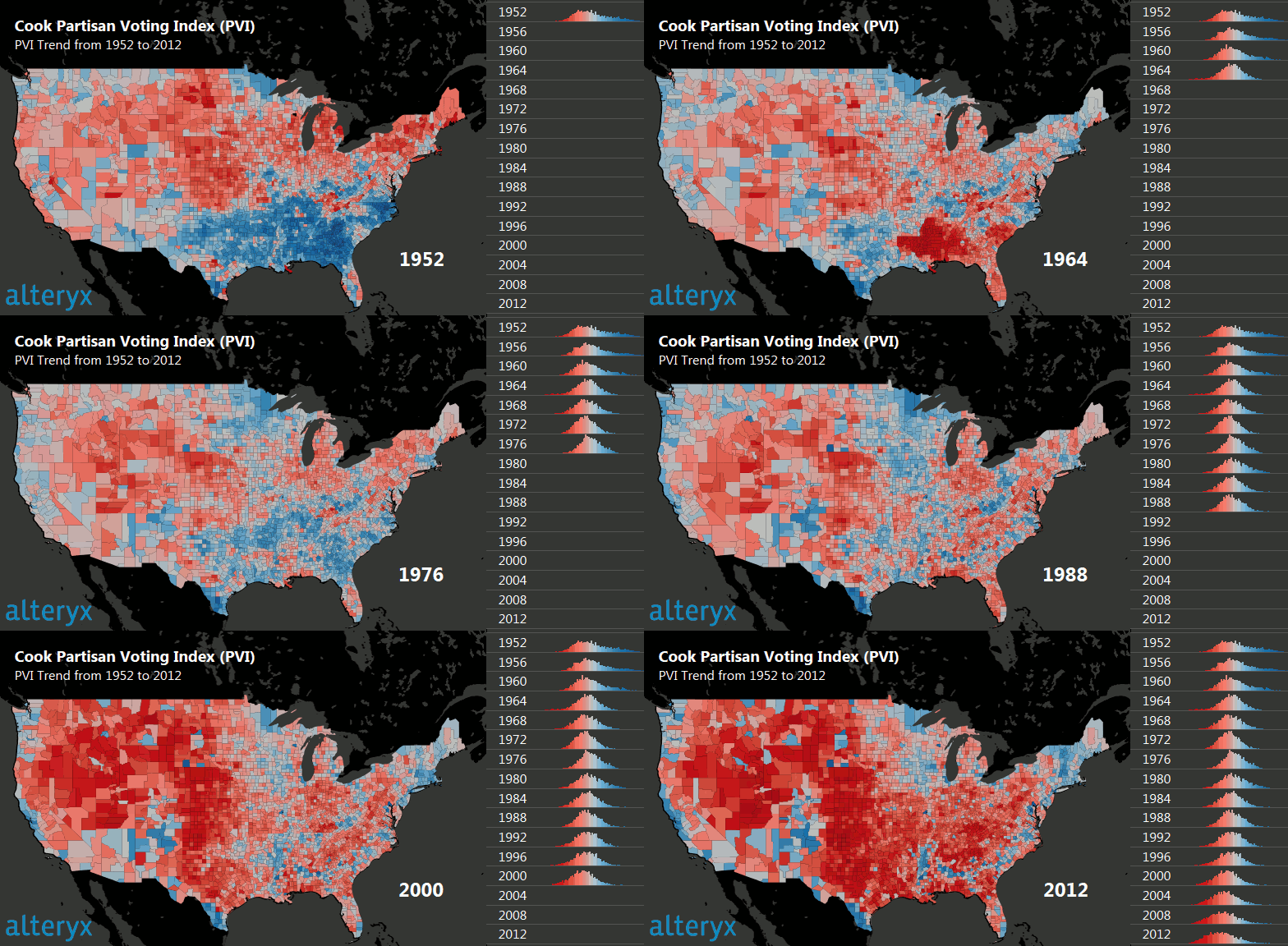
The analysis is presented as a set (one for each election) of choropleth maps, a map type commonly used to display state level presidential election results. The color scheme used is the common dark red (very Republican) to dark blue (very Democratic) one that is common for election maps in the US, with more saturated colors representing strongly Republican (Democratic) counties. Below is an animated GIF of the analytics results created using Alteryx to blend the various data sources, and calculate the PVI for each county over time; the results are then output to a Tableau workbook that can be explored interactively.
Looking at the animated map, it is apparent that there have been enormous shifts in most regions of the country. This includes the eastern portions of Washington and Oregon and much of the Intermountain West turning staunchly Republican; the shift from supporting the Republican Party to supporting the Democratic Party in New England, upstate New York, Michigan, and Wisconsin; and what is essentially a switch in the partisan leanings of most counties in California between 1952 and 2012 (a similar pattern is also found in Florida.) Probably the most well-known change in U.S. politics has been the shift from the Democratic to the Republican Party in the South. The maps reveal that this shift is a bit more complex than one would expect. In the 1964 election (following the passage of the Civil Rights Act of 1964, which was aggressively supported by President Lyndon Johnson), there was a strong, but very short-lived, initial shift toward the Republican Party in the Deep South. However, the historical realignment of the South appears to start in earnest in 1984, with the initial concentration of counties that become Republican being located in east-central Texas and the Florida panhandle.
While most regions have seen significant changes, some regions have remained fairly stable in their partisan leanings. In particular, the Great Plains region has consistently voted Republican, while western Washington and northeast Minnesota have consistently leaned Democratic.
The break points in the colors used to indicate the partisan leanings of a particular county are the same across time. As a result, changes in color saturation across time is an indicator of partisan leaning intensity. Except for the Deep South, the level of saturation has dramatically increased over time, particularly between 2000 and 2012. In the 2000 to 2012 period, the tendency was for red counties to get more red, and blue counties to become more blue, with the areas that leaned toward a particular Party being relatively stable. This pattern is consistent with the notion that a "great sort," which has produced conclaves of like-minded people, has occurred since 1952.
Interpreting the Trends in PVI with the Help of Summary Measures
To help provide some additional insights about the data using Alteryx, which is likely not to be readily apparent from visually inspecting the raw data itself, we calculated several summary measures using the full set of PVI values in Alteryx. Specifically, we look at the standard deviation of the PVI values within a county across time, the correlation coefficient between the PVI and a time trend for each county, and, finally, the standard deviation in the PVI across counties within each election year. In the 64 years our data spans, some counties (fewer than 50 out of a total of just over 3100 counties in the US) underwent boundary changes, typically by creating new counties, and these counties have been omitted from the analysis.
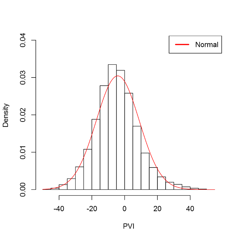
All three of these measures become more justifiable if the PVI values can be reasonably described by a normal distribution. Figure 2, which was created using Alteryx's Distribution Analysis tool, using the full set of PVI values included in the analysis, indicates that the PVI values are (approximately) normally distributed. Consequently, the three summary measures we use are appropriate for this data.
The standard deviation within a county provides a measure of how variable the partisanship patterns have been in a county relative to the nation as a whole. A larger within-county standard deviation is indicative of a greater shift in partisanship. These values are displayed in the choropleth map below. In the map, darker shades of purple indicate larger values of the standard deviation of PVI values for a county. This map was developed using Alteryx as the analytic engine and then outputting the results to CARTO, and is embedded below.
An examination of the map quickly reveals that the Deep South (South Carolina, northern Florida, Georgia, Alabama, Mississippi, and Louisiana) have experienced the greatest shifts in partisan preferences. However, the New England states and the Intermountain West region have also experienced very significant changes in partisan preferences since 1952. The area of the country that seems to have comparatively more stable political preferences runs from western New York state, through northern Ohio, and into the upper Midwest. Another region of relative stability in preferences is the western half of Washington state.
In a given county, the correlation of PVI values with a time trend indicates the general trend of partisan preferences in that county. The sign of the correlation coefficient indicates the general direction of any partisan shift. A positive correlation indicates that a county is becoming relatively more Democratic, and a negative value indicates that it is becoming relatively more Republican.
The magnitude (in absolute value terms) of a county-level correlation coefficient (a correlation coefficient can range from -1 to 1, with a value of 0 indicating absolutely now relationship) is indicative of the consistency of the shift in a county's partisan orientation. A correlation coefficient of -0.97 indicates that a county is consistently becoming more Republican over time, while a correlation coefficient of 0.11 indicates that its partisan preferences are skewing somewhat more Democratic, but likely not in a consistent fashion.
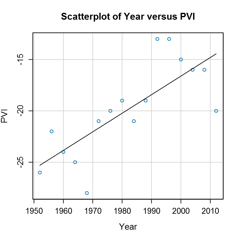
It is important to point out that the magnitude of the correlation coefficient does not indicate the rate of movement, or whether one party has overtaken another in partisan preference in a county, but just the consistency of the direction of that county's partisan movement. A good illustration of this point is Gasconade County, Missouri, which is one of the most reliably Republican counties in the nation for presidential elections (in every presidential election since before the Civil War, it has supported the Republican candidate for president, including voting a resounding 78% to 22% against Missouri's own native son, Harry Truman, in the 1948 presidential election). However, the within-county correlation coefficient between its PVI and a time trend is 0.77, indicating that the county is fairly consistently drifting towards becoming increasingly Democratic. However, this movement has not been very rapid. As shown in the figure below, the county has fairly consistently become more Democratic, going from being about +25 for Republican candidates to being +15 for Republican candidates in a span of 60 years. However, at its current rate, it will be a potential toss-up county between the two major parties by around 2092. In other words, it is a dark red county that is slowly, but fairly consistently, moving toward being an light red county.
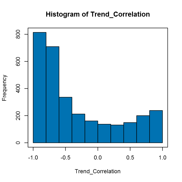
Below is an embedded CARTO choropleth map that displays the magnitude and direction of the correlation coefficient for each county. One thing that is striking is that the colors on the map tend to be very saturated for both parties. This can clearly be seen in the histogram of the across county correlation coefficients of the PVI and a time trend, which is given below. The histogram shows a bipolar pattern, with most values concentrated on one end of the scale or the other. In the histogram, created using Alteryx, negative values indicate a partisan lean toward the Republican Party, and positive values indicate a lean toward the Democratic Party.
Based on the choropleth plot, the areas with the most consistent movement toward the Republican Party over time are California's Central Valley, the Intermountian West, much of the Great Plains (including Oklahoma and northern Texas), Indiana, Kentucky, Alabama, northern Florida, and many areas of rural North Carolina. The most consistent movement toward the Democratic Party over time is seen in the coastal areas of California and Oregon; the Upper Midwest areas of Michigan, Wisconsin, and eastern Minnesota and Iowa; New England and Upstate New York; and the highly urbanized eastern regions of the Mid-Atlantic states (including Maryland and Delaware.)
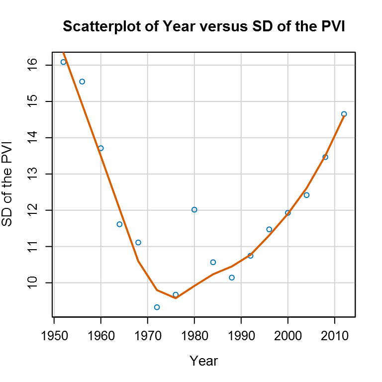
The final summary measure to be examined is the standard deviation in the PVI across counties in each election year, which provides a measure of how widely county-level partisan preferences differed for a county relative to the nation as a whole. The larger the standard deviation, the greater the variation in partisan preferences across counties, suggesting higher levels of political polarization in the country. The figure below plots the standard deviation in the PVI for each Presidential election since the end of World War II.
The figure indicates that the standard deviation in the PVI across counties fell precipitously from 1952 to 1972, remained fairly stable until the 1996 election, after which there has been a marked, and steady, increase in the standard deviation of the PVI across counties in an election year. This recent rise in the standard deviation of the PVI across counties is consistent with the concern over increased partisanship in US politics. This concern is even more relevant in light of the bipolar distribution found in the within county correlation between the PVI and time. However, while it is fairly high, it is comparable in magnitude to the situation in the 1950s. It may be the case that the period of reduced polarization that occurred from the early 1970s to the mid 1990s was a relative aberration in American politics. The basic dynamic at play in the level of polarization in the 1950s had been relevant since the end of Reconstruction in 1877, following the end of the Civil War. The antebellum period before the Civil War was also a period of polarized regional interests that was reflected in the partisanship of that era. Moreover, the apparent lower levels of partisanship seen in the early 1970s to mid-1990s period could be viewed as an artifact of the political realignment process that likely first started to happen in the mid-1960s.
There is More to Come
In this blog we have looked at the regional shifts in partisanship through the post World War II period in the U.S., however, we have not really looked at possible underlying factors that may help explain the observed political preferences in any detail. In a future post, we will examine in greater detail a number of possible factors that might begin to explain the observed PVI values.
There are a number of other political topics we are exploring as part of our development of the 2016 Presidential Election app, and we will release a number of blog posts to examine the most interesting of the insights we discover as we create the 2016 Presidential Election app. Stay up-to-date on the progress of our election app and blog topics by following the series.
- The exception to this rule is the state of Alaska, where much of the state's land area does not fall into a borough (Alaska's equivalent of a county.) As a result, only state level data is readily available for Alaska.
- For their probit model of the probability that the Democratic candidate will win the election, Hummel and Rothschild's model estimates correspond to a 78% weight for the most recent election, and a 22% weight for the next most recent election. For their model of the Democratic candidate's expected percentage of the major party vote, the comparable weights are 86% and 14%.

Chief Scientist
Dr. Dan Putler is the Chief Scientist at Alteryx, where he is responsible for developing and implementing the product road map for predictive analytics. He has over 30 years of experience in developing predictive analytics models for companies and organizations that cover a large number of industry verticals, ranging from the performing arts to B2B financial services. He is co-author of the book, “Customer and Business Analytics: Applied Data Mining for Business Decision Making Using R”, which is published by Chapman and Hall/CRC Press. Prior to joining Alteryx, Dan was a professor of marketing and marketing research at the University of British Columbia's Sauder School of Business and Purdue University’s Krannert School of Management.
Dr. Dan Putler is the Chief Scientist at Alteryx, where he is responsible for developing and implementing the product road map for predictive analytics. He has over 30 years of experience in developing predictive analytics models for companies and organizations that cover a large number of industry verticals, ranging from the performing arts to B2B financial services. He is co-author of the book, “Customer and Business Analytics: Applied Data Mining for Business Decision Making Using R”, which is published by Chapman and Hall/CRC Press. Prior to joining Alteryx, Dan was a professor of marketing and marketing research at the University of British Columbia's Sauder School of Business and Purdue University’s Krannert School of Management.
You must be a registered user to add a comment. If you've already registered, sign in. Otherwise, register and sign in.
