Alteryx Designer Desktop Discussions
Find answers, ask questions, and share expertise about Alteryx Designer Desktop and Intelligence Suite.- Community
- :
- Community
- :
- Participate
- :
- Discussions
- :
- Designer Desktop
- :
- Group & Count Values to Make Bar Graph
Group & Count Values to Make Bar Graph
- Subscribe to RSS Feed
- Mark Topic as New
- Mark Topic as Read
- Float this Topic for Current User
- Bookmark
- Subscribe
- Mute
- Printer Friendly Page
- Mark as New
- Bookmark
- Subscribe
- Mute
- Subscribe to RSS Feed
- Permalink
- Notify Moderator
Hello Alteryx Community,
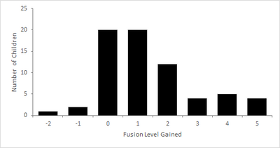
I have a new question for today, I will show you the data and what I am trying to create and explain the steps I have tried on alteryx (i think I am messing up the tile tool). This is the final graph I am trying to create:
The raw data:
| Last | Fusion Gained |
| 1 | 1 |
| 2 | 0 |
| 3 | 0 |
| 4 | 1 |
| 5 | 4 |
| 6 | 1 |
| 7 | 4 |
| 8 | -1 |
| 9 | -1 |
| 10 | 2 |
| 11 | 3 |
| 12 | 4 |
| 13 | 1 |
| 14 | 0 |
| 15 | -2 |
| 16 | 4 |
| 17 | 1 |
| 18 | 0 |
| 19 | 3 |
| 20 | 0 |
| 21 | 5 |
| 22 | 1 |
| 23 | 1 |
| 24 | 0 |
| 25 | 2 |
| 26 | 1 |
| 27 | 4 |
| 28 | 2 |
| 29 | 2 |
| 30 | 1 |
| 31 | 0 |
| 32 | 0 |
| 33 | 3 |
| 34 | 1 |
| 35 | 1 |
| 36 | 0 |
| 37 | 2 |
| 38 | 0 |
| 39 | 0 |
| 40 | 1 |
| 41 | 5 |
| 42 | 0 |
| 43 | 2 |
| 44 | 2 |
| 45 | 2 |
| 46 | 1 |
| 47 | 1 |
| 48 | 1 |
| 49 | 0 |
| 50 | 5 |
| 51 | 2 |
| 52 | 0 |
| 53 | 1 |
| 54 | 0 |
| 55 | 2 |
| 56 | 2 |
| 57 | 5 |
| 58 | 0 |
| 59 | 3 |
And this is the step I am having trouble creating to make the bar graph: I need alteryx to go through the fusion gained column of the raw data, group by cohorts (-2, -1, 0, 1, 2, 3, 4, 5) and count for those numbers to create a similar chart:
| Fusion Level Gained | Number of Children |
| -2 | 1 |
| -1 | 2 |
| 0 | 20 |
| 1 | 20 |
| 2 | 12 |
| 3 | 4 |
| 4 | 5 |
| 5 | 4 |
I have tried using the tile tool & summarize but I am not getting the correct counts. Always appreciate if you attach a workspace since it greatly helps me understand my mistakes. Thank you in advance as always!
Nick
Solved! Go to Solution.
- Labels:
-
Data Investigation
- Mark as New
- Bookmark
- Subscribe
- Mute
- Subscribe to RSS Feed
- Permalink
- Notify Moderator
Hello @Faronnj ,
You shared with us a table with 59 rows but the count summs 68.
Is there something I am missing?
Edit: I get the following
| -2 | 1 |
| -1 | 2 |
| 0 | 16 |
| 1 | 16 |
| 2 | 11 |
| 3 | 4 |
| 4 | 5 |
| 5 | 4 |
Regards
- Mark as New
- Bookmark
- Subscribe
- Mute
- Subscribe to RSS Feed
- Permalink
- Notify Moderator
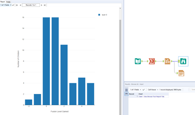
@Faronnj Attached is the workflow that uses the interactive tool to create the graph. You can use the summarize tool to aggregate the 'fusion gained' and then graph it. Does this help?
Alteryx
- Mark as New
- Bookmark
- Subscribe
- Mute
- Subscribe to RSS Feed
- Permalink
- Notify Moderator
I apologize, I was using the wrong summarized count: here is the correct number and chart that I am trying to make:
| Fusion Level Gained | Number of Children |
| -2 | 1 |
| -1 | 2 |
| 0 | 16 |
| 1 | 16 |
| 2 | 11 |
| 3 | 4 |
| 4 | 5 |
| 5 | 4 |
- Mark as New
- Bookmark
- Subscribe
- Mute
- Subscribe to RSS Feed
- Permalink
- Notify Moderator
Hello @Faronnj ,
Grouping by Fusion Level and doing a count of the Fusion Level values should give you the right number, like using a pivot table on excel
Regards
- Mark as New
- Bookmark
- Subscribe
- Mute
- Subscribe to RSS Feed
- Permalink
- Notify Moderator
- Mark as New
- Bookmark
- Subscribe
- Mute
- Subscribe to RSS Feed
- Permalink
- Notify Moderator
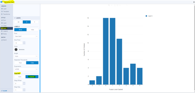
@DiganP when the chart is configuring on the x-axis it does not use all the values and skips some? Is there a way to make it post every value on the x-axis? so it doesnt skip -1, 1, 3, 5.
Thank you in advance,
Nick
- Mark as New
- Bookmark
- Subscribe
- Mute
- Subscribe to RSS Feed
- Permalink
- Notify Moderator
-
Academy
6 -
ADAPT
2 -
Adobe
204 -
Advent of Code
3 -
Alias Manager
78 -
Alteryx Copilot
27 -
Alteryx Designer
7 -
Alteryx Editions
96 -
Alteryx Practice
20 -
Amazon S3
149 -
AMP Engine
252 -
Announcement
1 -
API
1,210 -
App Builder
116 -
Apps
1,360 -
Assets | Wealth Management
1 -
Basic Creator
15 -
Batch Macro
1,559 -
Behavior Analysis
246 -
Best Practices
2,696 -
Bug
720 -
Bugs & Issues
1 -
Calgary
67 -
CASS
53 -
Chained App
268 -
Common Use Cases
3,825 -
Community
26 -
Computer Vision
86 -
Connectors
1,426 -
Conversation Starter
3 -
COVID-19
1 -
Custom Formula Function
1 -
Custom Tools
1,939 -
Data
1 -
Data Challenge
10 -
Data Investigation
3,489 -
Data Science
3 -
Database Connection
2,221 -
Datasets
5,223 -
Date Time
3,229 -
Demographic Analysis
186 -
Designer Cloud
743 -
Developer
4,377 -
Developer Tools
3,534 -
Documentation
528 -
Download
1,038 -
Dynamic Processing
2,941 -
Email
929 -
Engine
145 -
Enterprise (Edition)
1 -
Error Message
2,262 -
Events
198 -
Expression
1,868 -
Financial Services
1 -
Full Creator
2 -
Fun
2 -
Fuzzy Match
714 -
Gallery
666 -
GenAI Tools
3 -
General
2 -
Google Analytics
155 -
Help
4,711 -
In Database
966 -
Input
4,296 -
Installation
361 -
Interface Tools
1,902 -
Iterative Macro
1,095 -
Join
1,960 -
Licensing
252 -
Location Optimizer
60 -
Machine Learning
260 -
Macros
2,866 -
Marketo
12 -
Marketplace
23 -
MongoDB
82 -
Off-Topic
5 -
Optimization
751 -
Output
5,259 -
Parse
2,328 -
Power BI
228 -
Predictive Analysis
937 -
Preparation
5,171 -
Prescriptive Analytics
206 -
Professional (Edition)
4 -
Publish
257 -
Python
855 -
Qlik
39 -
Question
1 -
Questions
2 -
R Tool
476 -
Regex
2,339 -
Reporting
2,434 -
Resource
1 -
Run Command
576 -
Salesforce
277 -
Scheduler
411 -
Search Feedback
3 -
Server
631 -
Settings
936 -
Setup & Configuration
3 -
Sharepoint
628 -
Spatial Analysis
599 -
Starter (Edition)
1 -
Tableau
512 -
Tax & Audit
1 -
Text Mining
468 -
Thursday Thought
4 -
Time Series
432 -
Tips and Tricks
4,187 -
Topic of Interest
1,126 -
Transformation
3,732 -
Twitter
23 -
Udacity
84 -
Updates
1 -
Viewer
3 -
Workflow
9,983
- « Previous
- Next »


