Alteryx Designer Desktop Discussions
Find answers, ask questions, and share expertise about Alteryx Designer Desktop and Intelligence Suite.- Community
- :
- Community
- :
- Participate
- :
- Discussions
- :
- Designer Desktop
- :
- Creating 'dashed' lines between points
Creating 'dashed' lines between points
- Subscribe to RSS Feed
- Mark Topic as New
- Mark Topic as Read
- Float this Topic for Current User
- Bookmark
- Subscribe
- Mute
- Printer Friendly Page
- Mark as New
- Bookmark
- Subscribe
- Mute
- Subscribe to RSS Feed
- Permalink
- Notify Moderator
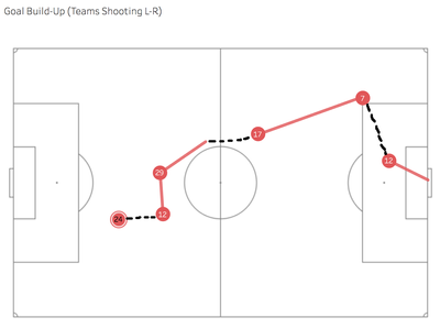
I'm creating goal build-up charts in Tableau and have encountered one issue with the data that I can't quite work out how to overcome.
I've got a number of rows for each part of the build up, representing the players and their involvement in the goal. Currently my data has the position from where they play a pass/cross or take a shot in the form of start position x and y and end position x and y. I've split the two parts and stacked on top of each other and created a path so that I can draw the lines, as seen below.
The issue I have is that after receiving a pass, some players move with the ball before passing it on and this isn't captured in the data. I can get round this by calculating a rolling path id for each of the points to connect all of them (i.e. point 1 is path 1, point 5 is path 5 and so on) but the visualisation is confusing and I'd like to be able to better draw attention to the players movement.
The way I thought of to get round this is to draw lines between the previous XY and the new XY and then split them into numerous lines to create a dashed line effect. However, I can't work out how I would be able to do this, as it would involve creating new rows and inserting them between the existing rows.
Does anyone have any ideas about the best approach for 1) creating these additional rows and 2) splitting the newly created lines? Much obliged!
Solved! Go to Solution.
- Labels:
-
Preparation
-
Spatial Analysis
- Mark as New
- Bookmark
- Subscribe
- Mute
- Subscribe to RSS Feed
- Permalink
- Notify Moderator
Hi @robsuddaby, interesting visualisation!
Do you have any sample data that you could share?
- Mark as New
- Bookmark
- Subscribe
- Mute
- Subscribe to RSS Feed
- Permalink
- Notify Moderator
Thanks! Yes of course, apologies I should have included in the first place. Let me know if it isn't clear.
| Event ID | Player ID | X | Y | Path |
| 1 | 24 | 25.4 | 36.3 | 1 |
| 2 | 12 | 36 | 38.2 | 1 |
| 2 | 12 | 35.3 | 53.7 | 2 |
| 3 | 29 | 35.3 | 53.7 | 1 |
| 3 | 29 | 46.3 | 65.4 | 2 |
| 4 | 17 | 59 | 68.1 | 1 |
| 4 | 17 | 83.5 | 81.7 | 2 |
| 5 | 7 | 84.3 | 81.5 | 1 |
| 6 | 12 | 90.7 | 58.2 | 1 |
| 6 | 12 | 100 | 51.1 | 2 |
- Mark as New
- Bookmark
- Subscribe
- Mute
- Subscribe to RSS Feed
- Permalink
- Notify Moderator
Hi @robsuddaby
I've attached a workflow of how you might go about creating the new legs for each event. I've also introduced a new field to act as a flag for when the player is dribbling. My initial thought was that this could be the dimension to use as colour in Tableau.
However, I actually think that this is a query to be solved within Tableau rather than Alteryx as I don't think you can colour (or display as dotted) the pathlines according to a dimension in Tableau? Therefore, the output of my workflow above will give you a continuous line in Tableau, but you won't be able to distinguish between dribbles and passes.
A quick bit of research led me to Jonathan Drummey's blog post on drawing dotted lines.. you may wish to take a look there and following the padding technique in Tableau.
In any event I'm interested to hear other people's thoughts on the matter and also how you proceed!
- Mark as New
- Bookmark
- Subscribe
- Mute
- Subscribe to RSS Feed
- Permalink
- Notify Moderator
Thank you very much for that, just trying to work out how you've done what you've done but I think this may work... there's some unnecessary rows where the x and y are the same as the following row but I think I can now use this to draw the lines in Alteryx and then where the flag exists, try to break the line into several pieces. Do you think that's possible?
Unfortunately I don't think doing this in Tableau is realistic, primarlily because it requires dual axis and I need the second axis (nevermind not really udnerstanding how Jonathan or Bora Beran have done it!)
- Mark as New
- Bookmark
- Subscribe
- Mute
- Subscribe to RSS Feed
- Permalink
- Notify Moderator
Hi @robsuddaby,
@DataBlender is on the right track, however the dribble portion would have to be a dataline for start point and a dataline for end point, so then it is it's own segment. It you then wanted it to be dotted, you could break that segment up into 10-15 smaller segments and then drop every second one.
In order to break it into smaller segments, I find it is sometimes easiest to work out Max(X)-Min(X)/(Number of Segments) and then use a generate rows, same for Y.
Kane
- Mark as New
- Bookmark
- Subscribe
- Mute
- Subscribe to RSS Feed
- Permalink
- Notify Moderator
Hi @robsuddaby, @KaneG's approach is a good one and matched the workflow that I've created to generate the new points.
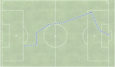
These get generated as dotted lines in Tableau:
- Mark as New
- Bookmark
- Subscribe
- Mute
- Subscribe to RSS Feed
- Permalink
- Notify Moderator
See below!
- Mark as New
- Bookmark
- Subscribe
- Mute
- Subscribe to RSS Feed
- Permalink
- Notify Moderator
@KaneG @DataBlender, thank you both so much! I really appreciate your help in figuring this out, I'm still trying to understand exactly what you've done but the theory all makes sense to me. Just one question if I may, I'm getting some issues with one match in particular, where the Generate Rows tools are both saying 'Error: The value did not change after the Loop Expression' and I can't work out what is causing the issue. Would you be so kind as to have a quick look, the new data is attached. Many thanks!
- Mark as New
- Bookmark
- Subscribe
- Mute
- Subscribe to RSS Feed
- Permalink
- Notify Moderator
Hi @robsuddaby, the issue is caused by some instances where the increment to be added is 0, i.e. where the X or Y coordinate doesn't need to be changed. Because the increment is 0, it thinks it would never reach the end of the loop.
An example of this is for the score of 0-3, between events 1 and 2.
Since the join immediately after the generate rows is joining by position, we currently have to generate the same number of rows for both the x and the y outputs of the generate rows.
Don't have much time to think of a solution at the moment but will try tomorrow unless @KaneG has any bright ideas?
-
Academy
6 -
ADAPT
2 -
Adobe
204 -
Advent of Code
3 -
Alias Manager
78 -
Alteryx Copilot
26 -
Alteryx Designer
7 -
Alteryx Editions
95 -
Alteryx Practice
20 -
Amazon S3
149 -
AMP Engine
252 -
Announcement
1 -
API
1,210 -
App Builder
116 -
Apps
1,360 -
Assets | Wealth Management
1 -
Basic Creator
15 -
Batch Macro
1,559 -
Behavior Analysis
246 -
Best Practices
2,696 -
Bug
720 -
Bugs & Issues
1 -
Calgary
67 -
CASS
53 -
Chained App
268 -
Common Use Cases
3,825 -
Community
26 -
Computer Vision
86 -
Connectors
1,426 -
Conversation Starter
3 -
COVID-19
1 -
Custom Formula Function
1 -
Custom Tools
1,939 -
Data
1 -
Data Challenge
10 -
Data Investigation
3,489 -
Data Science
3 -
Database Connection
2,221 -
Datasets
5,223 -
Date Time
3,229 -
Demographic Analysis
186 -
Designer Cloud
743 -
Developer
4,376 -
Developer Tools
3,534 -
Documentation
528 -
Download
1,038 -
Dynamic Processing
2,941 -
Email
928 -
Engine
145 -
Enterprise (Edition)
1 -
Error Message
2,262 -
Events
198 -
Expression
1,868 -
Financial Services
1 -
Full Creator
2 -
Fun
2 -
Fuzzy Match
714 -
Gallery
666 -
GenAI Tools
3 -
General
2 -
Google Analytics
155 -
Help
4,711 -
In Database
966 -
Input
4,296 -
Installation
361 -
Interface Tools
1,902 -
Iterative Macro
1,095 -
Join
1,960 -
Licensing
252 -
Location Optimizer
60 -
Machine Learning
260 -
Macros
2,866 -
Marketo
12 -
Marketplace
23 -
MongoDB
82 -
Off-Topic
5 -
Optimization
751 -
Output
5,258 -
Parse
2,328 -
Power BI
228 -
Predictive Analysis
937 -
Preparation
5,171 -
Prescriptive Analytics
206 -
Professional (Edition)
4 -
Publish
257 -
Python
855 -
Qlik
39 -
Question
1 -
Questions
2 -
R Tool
476 -
Regex
2,339 -
Reporting
2,434 -
Resource
1 -
Run Command
576 -
Salesforce
277 -
Scheduler
411 -
Search Feedback
3 -
Server
631 -
Settings
936 -
Setup & Configuration
3 -
Sharepoint
628 -
Spatial Analysis
599 -
Starter (Edition)
1 -
Tableau
512 -
Tax & Audit
1 -
Text Mining
468 -
Thursday Thought
4 -
Time Series
432 -
Tips and Tricks
4,187 -
Topic of Interest
1,126 -
Transformation
3,732 -
Twitter
23 -
Udacity
84 -
Updates
1 -
Viewer
3 -
Workflow
9,982
- « Previous
- Next »


