Alteryx Designer Desktop Discussions
Find answers, ask questions, and share expertise about Alteryx Designer Desktop and Intelligence Suite.- Community
- :
- Community
- :
- Participate
- :
- Discussions
- :
- Designer Desktop
- :
- Re: Can the scatterplot tool plot two sets of data...
Can the scatterplot tool plot two sets of data?
- Subscribe to RSS Feed
- Mark Topic as New
- Mark Topic as Read
- Float this Topic for Current User
- Bookmark
- Subscribe
- Mute
- Printer Friendly Page
- Mark as New
- Bookmark
- Subscribe
- Mute
- Subscribe to RSS Feed
- Permalink
- Notify Moderator
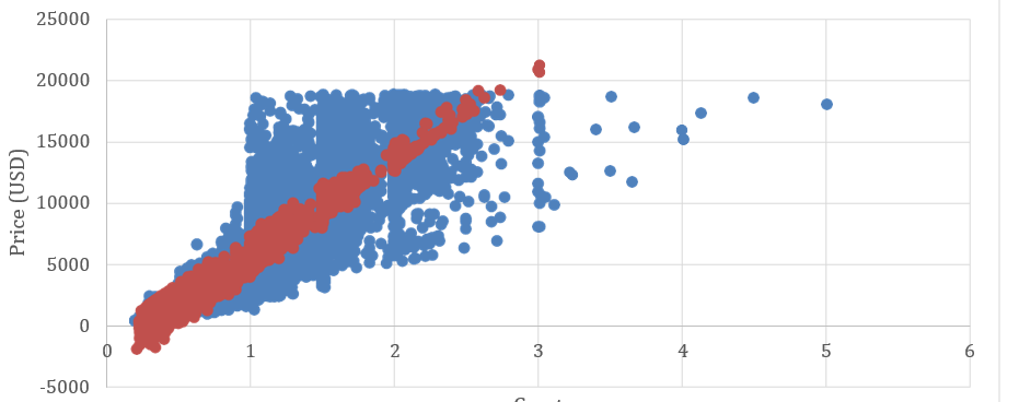
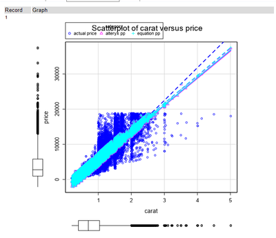
like this :
I can only import one set of data as the configuration only allows me to enter one:
Thanks
Solved! Go to Solution.
- Labels:
-
Data Investigation
- Mark as New
- Bookmark
- Subscribe
- Mute
- Subscribe to RSS Feed
- Permalink
- Notify Moderator
You can combine the data using union tool.
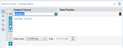
First use a formula tool to give label to each data and then plot them. And use configuration to set color by labels.
You can set the data order in union tool to choose which points be front and which should be back
Hope this helps 🙂
- Mark as New
- Bookmark
- Subscribe
- Mute
- Subscribe to RSS Feed
- Permalink
- Notify Moderator
Hi@atcodedog05 ,
Thank you for your reply.
I followed your instructions. I am not sure if I got your points.
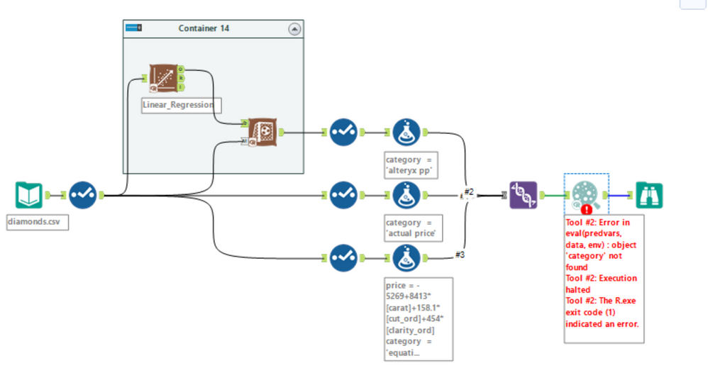
I got error messages when I ran the workflow.
I have attached my workflow if you don't mind taking a look at it.
Thanks again.
- Mark as New
- Bookmark
- Subscribe
- Mute
- Subscribe to RSS Feed
- Permalink
- Notify Moderator
Hi @Gualigee
This scenario kind of seems familiar. This is from Udacity nanodegree I presume.
Use interactive chart from render tool to plot the scatter plot.
I am currently away. I will try to build a solution as soon as I am back.
- Mark as New
- Bookmark
- Subscribe
- Mute
- Subscribe to RSS Feed
- Permalink
- Notify Moderator
dear lord, you know everything
- Mark as New
- Bookmark
- Subscribe
- Mute
- Subscribe to RSS Feed
- Permalink
- Notify Moderator
Please check category name that have space character.
You have to delete space at field name and re-select Grouping field at Scatterplot tool.
But it's hard to found if there's a blank at the end of the field name.
Please see this solution.
https://community.alteryx.com/t5/Alteryx-Designer-Discussions/Scatter-Plot-Error-Message/td-p/58334
- Mark as New
- Bookmark
- Subscribe
- Mute
- Subscribe to RSS Feed
- Permalink
- Notify Moderator
- Mark as New
- Bookmark
- Subscribe
- Mute
- Subscribe to RSS Feed
- Permalink
- Notify Moderator
Hi @atcodedog05 ,
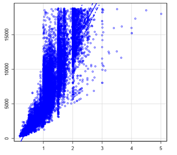
I am trying the interactive chart tool you mentioned as the color of the scatterplot created by scatterplot tool looks ugly. I add two layers, but only one layer is displayed:(
- Mark as New
- Bookmark
- Subscribe
- Mute
- Subscribe to RSS Feed
- Permalink
- Notify Moderator
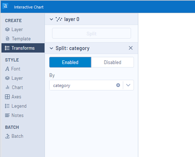
When you want to use a grouping field, you can use Split by Category field at Transforms tab.
It needs one layer.
- Mark as New
- Bookmark
- Subscribe
- Mute
- Subscribe to RSS Feed
- Permalink
- Notify Moderator
Hi @Gualigee
As suggested by @AkimasaKajitani you can split by category on this tab

you change the colors here

I have taken up and completed the course. On a personal note if you have a 1 month subscription. I would highly suggest you to complete the course as soon as possible because the section at the end are pretty though and will take time. Anyways once you have completed the course the content gets unlocked as free and you are free to do experimentation.
Hope this helps 🙂
If this post helps you please mark it as solution. And give a like if you dont mind 😀👍
-
Academy
6 -
ADAPT
2 -
Adobe
204 -
Advent of Code
3 -
Alias Manager
78 -
Alteryx Copilot
26 -
Alteryx Designer
7 -
Alteryx Editions
95 -
Alteryx Practice
20 -
Amazon S3
149 -
AMP Engine
252 -
Announcement
1 -
API
1,209 -
App Builder
116 -
Apps
1,360 -
Assets | Wealth Management
1 -
Basic Creator
15 -
Batch Macro
1,559 -
Behavior Analysis
246 -
Best Practices
2,695 -
Bug
719 -
Bugs & Issues
1 -
Calgary
67 -
CASS
53 -
Chained App
268 -
Common Use Cases
3,825 -
Community
26 -
Computer Vision
86 -
Connectors
1,426 -
Conversation Starter
3 -
COVID-19
1 -
Custom Formula Function
1 -
Custom Tools
1,939 -
Data
1 -
Data Challenge
10 -
Data Investigation
3,488 -
Data Science
3 -
Database Connection
2,221 -
Datasets
5,223 -
Date Time
3,229 -
Demographic Analysis
186 -
Designer Cloud
742 -
Developer
4,373 -
Developer Tools
3,531 -
Documentation
528 -
Download
1,037 -
Dynamic Processing
2,940 -
Email
928 -
Engine
145 -
Enterprise (Edition)
1 -
Error Message
2,259 -
Events
198 -
Expression
1,868 -
Financial Services
1 -
Full Creator
2 -
Fun
2 -
Fuzzy Match
713 -
Gallery
666 -
GenAI Tools
3 -
General
2 -
Google Analytics
155 -
Help
4,710 -
In Database
966 -
Input
4,295 -
Installation
361 -
Interface Tools
1,901 -
Iterative Macro
1,095 -
Join
1,959 -
Licensing
252 -
Location Optimizer
60 -
Machine Learning
260 -
Macros
2,864 -
Marketo
12 -
Marketplace
23 -
MongoDB
82 -
Off-Topic
5 -
Optimization
751 -
Output
5,258 -
Parse
2,328 -
Power BI
228 -
Predictive Analysis
937 -
Preparation
5,171 -
Prescriptive Analytics
206 -
Professional (Edition)
4 -
Publish
257 -
Python
855 -
Qlik
39 -
Question
1 -
Questions
2 -
R Tool
476 -
Regex
2,339 -
Reporting
2,434 -
Resource
1 -
Run Command
575 -
Salesforce
277 -
Scheduler
411 -
Search Feedback
3 -
Server
631 -
Settings
936 -
Setup & Configuration
3 -
Sharepoint
628 -
Spatial Analysis
599 -
Starter (Edition)
1 -
Tableau
512 -
Tax & Audit
1 -
Text Mining
468 -
Thursday Thought
4 -
Time Series
432 -
Tips and Tricks
4,187 -
Topic of Interest
1,126 -
Transformation
3,731 -
Twitter
23 -
Udacity
84 -
Updates
1 -
Viewer
3 -
Workflow
9,982
- « Previous
- Next »
