Engine Works
Under the hood of Alteryx: tips, tricks and how-tos.- Community
- :
- Community
- :
- Learn
- :
- Blogs
- :
- Engine Works
- :
- Using Alteryx to Scaffold Your Data
- Subscribe to RSS Feed
- Mark as New
- Mark as Read
- Bookmark
- Subscribe
- Printer Friendly Page
- Notify Moderator
Background information
Data scaffolding is a method of filling in missing data in order to help with analysis, particularly when building out certain types of visualizations. It’s important to note that this isn’t for scenarios where you have all the records you would expect, but some values are empty or null. This is for when a dataset itself is incomplete in the sense that entire records are missing.
We’ll break down a couple of examples below that should lay out the concept and help you understand what’s going on. That said, there are a whole host of additional cases where you’d want to scaffold your data, so when you next come across one, hopefully this will help!
As its name suggests, the Generate Rows tool is the star of the show here and will soon become your best friend for plugging gaps in your data!
Example 1 - Live ‘current month’ sales tracker
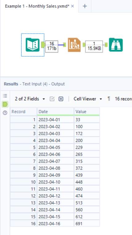
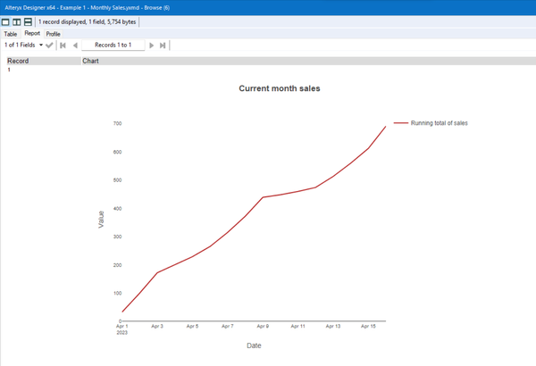
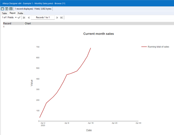
First up, let’s say we want to produce a report, once daily, that shows how our sales figures are looking throughout the current month. We can do that very easily with the Interactive Chart tool (assuming, for simplicity, that we’re keeping things within Alteryx), and it would look like this:
However, what happens if we want this same view, but show the entire month, so we can easily see how far through we are? Well, in that case - you guessed it - we need to scaffold our data in order to add the rest of the month! There may be some of you out there thinking, ‘Well I can just set a custom range on my [Date] axis,’ but this isn’t dynamic - there’s no ‘end of month’ option, so you would need to manually change this each month. Let’s look at how we can achieve this.
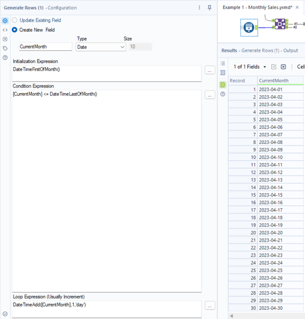
For this particular case, we’ll use the DateTimeFirstOfMonth() & DateTimeLastOfMonth() functions in a Generate Rows tool in order to create a record for every day of the current month. That looks something like this:
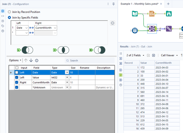
We then conduct a join with our original/main dataset:
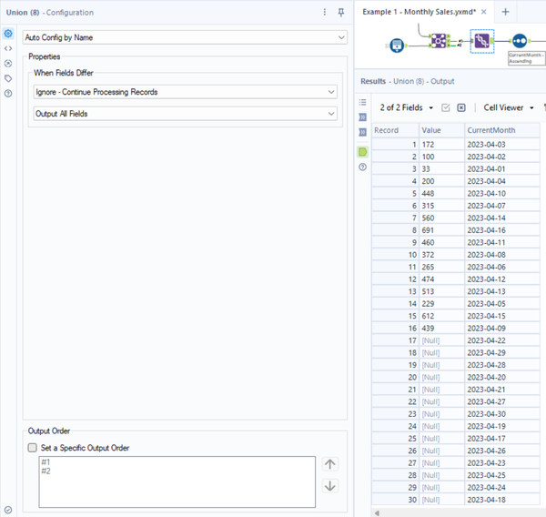
Now, as our full month structure is going into the R (right) input anchor, we need to conduct a right join here, as we know we won’t find a match for the dates that aren’t in our original data, and we’re trying to fill in. As Alteryx will always execute an inner join by default, we need to Union together the results coming out of the J and R output anchors in order to recreate the right join functionality (more info on that is linked at the bottom of this blog):
As you can see - we now have the full month structure, even if there aren’t values assigned to every day. We then just sort this by our date field in Ascending (earliest to latest) order. This time when we re-run our workflow, we’ll see our monthly tracker as before, but now at its relative point in the month:
Example 2 - The ‘hospital beds’ analysis
Special thanks to Alteryx ACE Ollie Clarke (@OllieClarke) for providing the scenario for this example!
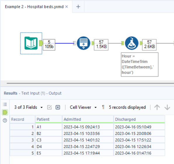
In this next use case of data scaffolding, we get a good idea of how we can expand our data to pick out insights that we can’t readily identify at first glance. So let’s say we have a group of hospital patients and their admission/discharge times, like so:
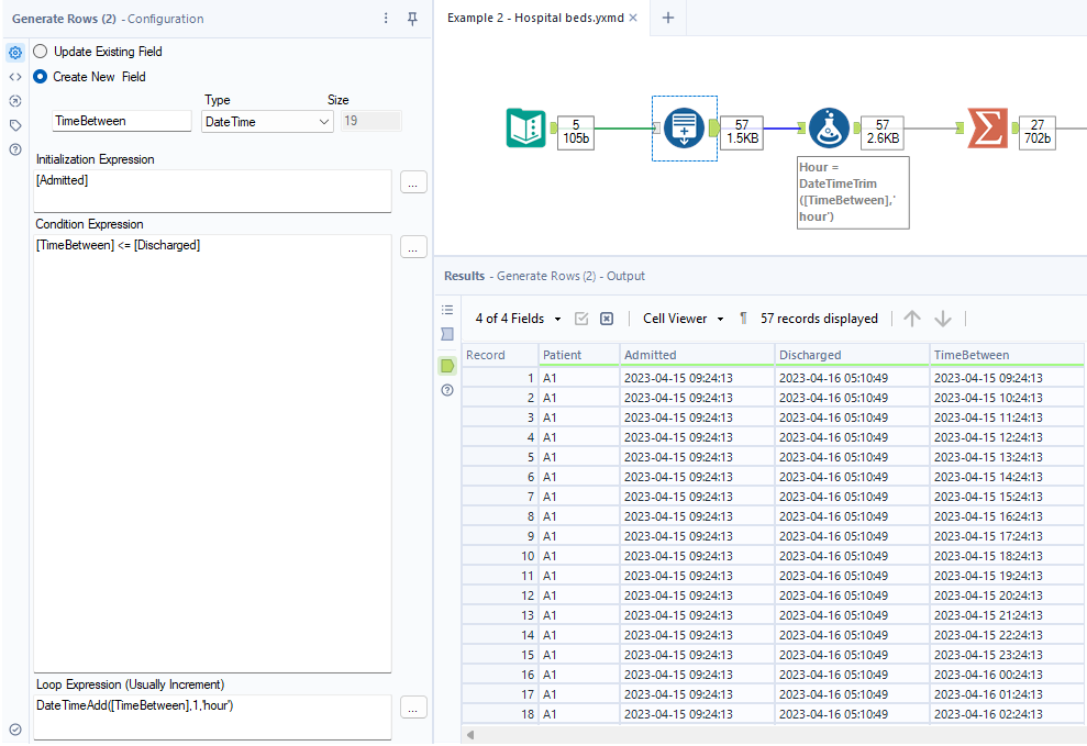
If somebody were to come along and ask us which hour was busiest within the hospital, we’d have a hard time picking that out from just manually looking over the above. Sure, it may be possible here if you take a bit of time, but what if this list was for 100 patients? Or 1,000? You can soon see why we’d turn to Alteryx for help! So, we can start off by ‘blowing up’ our data to show every hour between a patient’s admittance and discharge. Once again, we turn to our good friend Generate Rows and can use something like the following:
At times, the Generate Rows configuration can be a little bit confusing, especially for those who haven’t used the tool so much. All we’re saying in the above setup is, starting with the original [Admitted] value, keep adding rows, an hour at a time, as long as these remain less than or equal to the [Discharged] time.
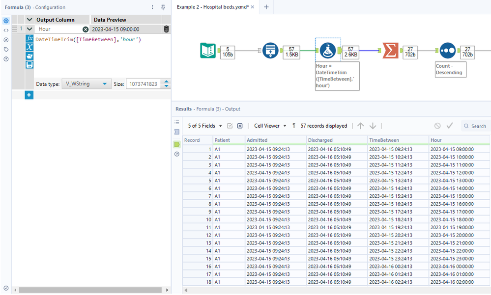
With the whole aim of this example being to find the busiest hour, we then need to truncate our DateTime values to their hour. For SQL users, you may be used to TRUNC() or even HOUR() for those familiar with Snowflake. However, in Alteryx, the function we need is DateTimeTrim(), using the ‘hour’ argument as shown here:
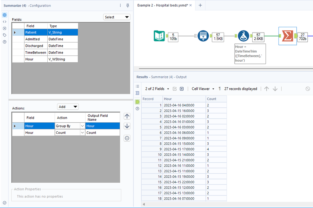
After this, the final steps are very simple. We start off by using a Summarize tool to group by each hour and perform a count of records:
Following this, we then just sort these counts in Descending order (largest to smallest):
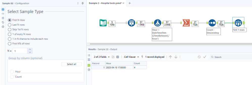
We could of course leave things here and keep the entire list. However, if we just want the single busiest hour on its own, then we can use a Sample tool to just take the first N records, where N = 1 in this case:
And there you have it! Hopefully, you’ve found this blog useful and can resort back to this when you next need to plug missing data or expand what you have in front of you to pick out different insights. Please feel free to check out the additional resources below that help to supplement this blog.
Other useful resources:
Alteryx Designer Join Tool Help Documentation
Alteryx Designer Generate Rows Tool Help Documentation

Tableau/Alteryx Consultant
Co-founder @ Databasyx.com | Community Top Contributor | Consultant | Continuous learner | I like building and breaking stuff
Co-founder @ Databasyx.com | Community Top Contributor | Consultant | Continuous learner | I like building and breaking stuff
You must be a registered user to add a comment. If you've already registered, sign in. Otherwise, register and sign in.
