I have been using the Reporting tools a lot lately as I have been working on a Consumer Profiling wizard for Demographics Now. I have become pretty handy with them and figured I’d blog about a little tip I picked up creating my own legends for charts and maps using the Reporting Table tool.
I was tasked with creating Scatter and Bubble charts to show my target clusters. The problem is, to display up to 72 points on a chart is kinda tricky to be able to decipher what’s what. Being that I am developing a Wizard, I really do not know how many points are going to be displayed, either. Labeling is not an option, because the points are clustered, and these chart types do not have a legend (not in version 6.2 anyway), so I set out to create my own legend using the Reporting Table tool and was very pleased with the results.
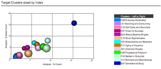
So let’s look at the first chart I made. It’s a Bubble chart where Clusters are sized by their index.

I encountered 3 challenges while creating the legend for this chart:
- getting the color scheme from the palette to the legend
- getting the order of the colors to match the legend
- getting the color to display in the legend
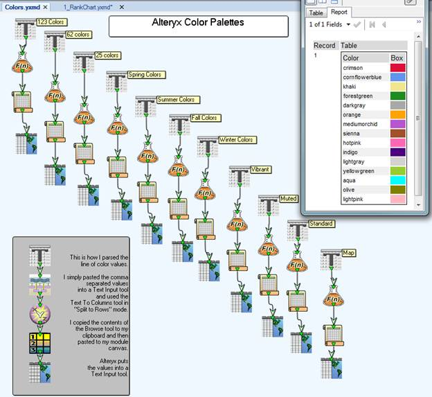
The first challenge was actually quite easy, so I went ahead and did it for each palette (I tend to change my mind a lot). Color palettes are stored in an xml file that installs with Alteryx (\Program Files\Alteryx\2011\Engine\RuntimeData\ReportSettings.xml). I simply just copied the comma separated values for each palette, parsed them, then threw them into a Browse tool so I could use it as a Text Input.

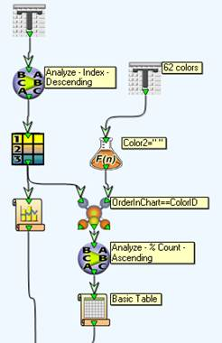
The second challenge (getting the order of the chart to match the legend) was a little trickier and I had to actually ask the developer how the chart was picking its colors. The Charting tool plots its points in the order they come in, so that is the order the legend colors must match. I did have to do an additional sort for my legend on the X axis value, so they read in my list from top to bottom and matched the points on the chart from left to right.

The third challenge of getting the color to display in the legend was also pretty easy with specifying a column rule in the Reporting Table tool, but again I had to ask someone what the syntax for Background Color was (rest assured, I am back-filling the Alteryx Help with some more useful formula examples).
"Background-Color: "+[Color]+";"
The benefit of creating a legend with a table tool is that you can utilize it for Charts and Maps – a single legend to use throughout your report. The other plus is that you can be flexible with how you display the legend - such as breaking it up into different parts so that it fits on the page.
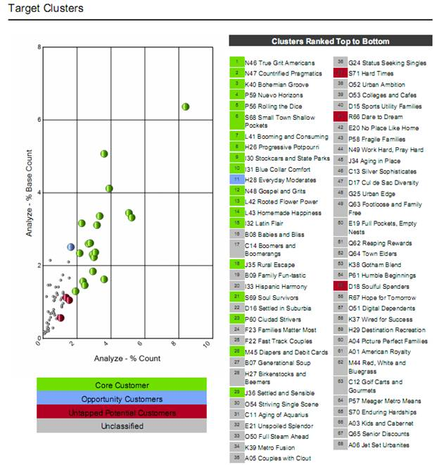
The image below shows a similar chart that displays 68 points:

All of the modules can be found below.
