Weekly Challenges
Solve the challenge, share your solution and summit the ranks of our Community!Also available in | Français | Português | Español | 日本語
IDEAS WANTED
Want to get involved? We're always looking for ideas and content for Weekly Challenges.
SUBMIT YOUR IDEA- Community
- :
- Community
- :
- Learn
- :
- Academy
- :
- Challenges & Quests
- :
- Weekly Challenges
- :
- Re: Challenge #107: Plot Employment Rates by Gende...
Challenge #107: Plot Employment Rates by Gender in the US
- Subscribe to RSS Feed
- Mark Topic as New
- Mark Topic as Read
- Float this Topic for Current User
- Bookmark
- Subscribe
- Mute
- Printer Friendly Page
- Mark as New
- Bookmark
- Subscribe
- Mute
- Subscribe to RSS Feed
- Permalink
- Notify Moderator
In honor of the new roll-out of the Women of Analytics group, we decided to theme this week's challenge!
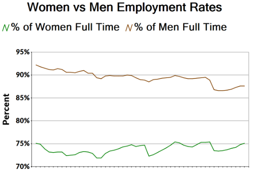
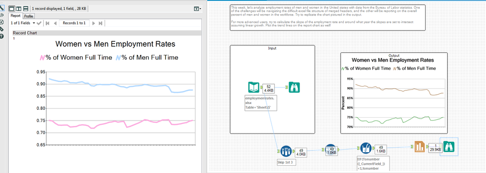
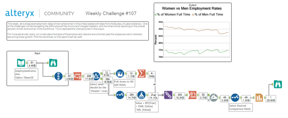
This women's history month, let's analyze employment rates of men and women in the United states with data from the Bureau of Labor statistics. One of the challenges will be navigating the difficult excel file structure of merged headers, and the other will be reporting on the overall percent of men and women in the workforce. Try to replicate the chart pictured in the output.
For more advanced users, try to calculate the slope of the employment rate and around what year the slopes are set to intersect assuming linear growth. Plot the trend lines on the report chart as well!
- Mark as New
- Bookmark
- Subscribe
- Mute
- Subscribe to RSS Feed
- Permalink
- Notify Moderator
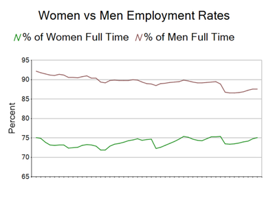
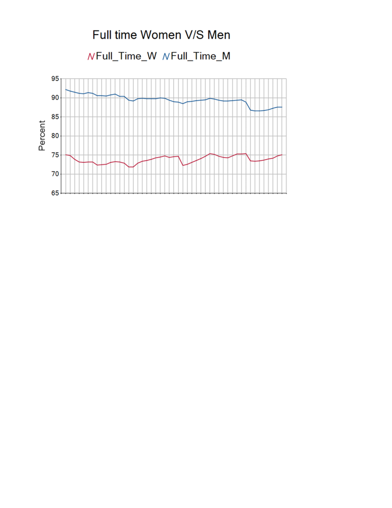
Here's my solution. Nice to play around with the charting tool, as I use it so infrequently. Had to resort to a slight hack to hide the horizontal axis labels.
- Mark as New
- Bookmark
- Subscribe
- Mute
- Subscribe to RSS Feed
- Permalink
- Notify Moderator
Wow @jamielaird that's got to be one of the quickest submissions ever!
Part time Tableau, Part Time Alteryx. Full Time Awesome

- Mark as New
- Bookmark
- Subscribe
- Mute
- Subscribe to RSS Feed
- Permalink
- Notify Moderator
I’ve got my email notifications finely tuned ;-)
- Mark as New
- Bookmark
- Subscribe
- Mute
- Subscribe to RSS Feed
- Permalink
- Notify Moderator
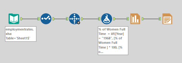
OK, six tools total. I got a weird error trying to figure out the trends and don't have time to work on it.
- Mark as New
- Bookmark
- Subscribe
- Mute
- Subscribe to RSS Feed
- Permalink
- Notify Moderator
- Mark as New
- Bookmark
- Subscribe
- Mute
- Subscribe to RSS Feed
- Permalink
- Notify Moderator
- Mark as New
- Bookmark
- Subscribe
- Mute
- Subscribe to RSS Feed
- Permalink
- Notify Moderator
- Mark as New
- Bookmark
- Subscribe
- Mute
- Subscribe to RSS Feed
- Permalink
- Notify Moderator
- Mark as New
- Bookmark
- Subscribe
- Mute
- Subscribe to RSS Feed
- Permalink
- Notify Moderator
-
Advanced
275 -
Apps
24 -
Basic
128 -
Calgary
1 -
Core
112 -
Data Analysis
171 -
Data Cleansing
4 -
Data Investigation
7 -
Data Parsing
9 -
Data Preparation
195 -
Developer
35 -
Difficult
71 -
Expert
14 -
Foundation
13 -
Interface
39 -
Intermediate
237 -
Join
206 -
Macros
53 -
Parse
138 -
Predictive
20 -
Predictive Analysis
12 -
Preparation
271 -
Reporting
53 -
Reporting and Visualization
17 -
Spatial
60 -
Spatial Analysis
49 -
Time Series
1 -
Transform
214
- « Previous
- Next »
