Alteryx Success Stories
Learn how Alteryx customers transform their organizations using data and analytics.STORIES WANTED
Showcase your achievements in the Maveryx Community by submitting a Success Story now!
SUBMISSION INSTRUCTIONS- Community
- :
- Community
- :
- Learn
- :
- Success Stories
- :
- Using Alteryx to help get employees back to work p...
Using Alteryx to help get employees back to work post Covid-19
- Subscribe to RSS Feed
- Mark as New
- Mark as Read
- Bookmark
- Subscribe
- Printer Friendly Page
- Notify Moderator
Covid-19 lockdown restrictions have led to an unprecedented level of 'working from home' all around the world. As restrictions begin to be lifted over the months ahead, both employers and employees will face new challenges related to commuting safely and risk minimization.
In this use case we outline some of the ways in which Alteryx can be used to help answer these questions, and support safe 'back to work' strategies, whatever they may look like. To do this we will use the imaginary example of Acme Corp, that employs around 1,000 employees across Greater London, and operates 5 London offices.
The workflows used here include a range of macros from TravelTime which can be found in the Alteryx Gallery here.
- What commute options are available for our employees if they wish to avoid using public transport?
- How can we efficiently allocate our employees between our multiple offices?
- How can we help employees avoid particularly busy stations or train lines?
- Now that we have more office real estate than we need, how should we best consolidate the number of sites that we operate to minimise the impact of employees?
The first question we want to answer is what are the options for our employees to commute to these various offices, particularly for different transport modes? There are two main reasons for this:
- Before Covid-19, the majority of our employees commuted by public transport, but we would like to promote alternative commute options wherever possible in order to reduce the risk of exposure
- For those employees who still want to commute by public transport, we’d like to encourage them to use the office with the shortest public transport commute time, for a similar risk reduction rationale
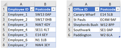
Our data is in two simple Excel spreadsheets, one containing the employee postcodes, and one the offices:
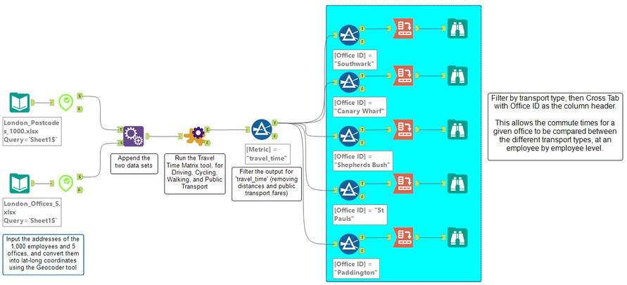
Here is the first workflow we need to run in Alteryx:
The steps in the workflow are as follows:
- Use the Geocoder tool to convert the employee and office postcodes into lat-long coordinates
- Use the Append Fields tool to combine the two data sets
- Use the Travel Time Matrix tool to calculate the journey times. In the configuration of the tool we select all the methods of transport we want the journey times for – Cycling, Driving, Public Transport, and Walking. The tool will calculate the time for each employee to each office by each transport type – almost 20,000 individual routes
- Use the Filter tool to select just the travel times. The Travel Time matrix tool can also be used to return distances and public transport fares
- Use the Filter tool a second time to separate out the results for each Office ID
- Use the Cross Tab tool to create the matrices, with Employee ID as the rows, Transport Method as the columns, and Travel Time as the metric
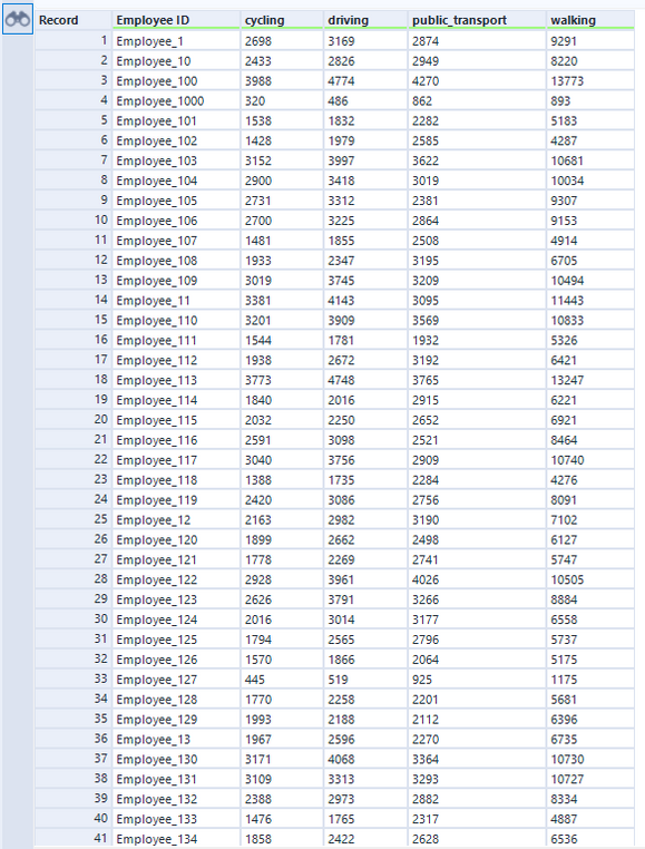
We now have a separate matrix for each office, with the travel time for each employee via the four different transport options. The output below shows the first few entries of the matrix for the Southwark office.
We can now use this data to spot sensible opportunities for employees to commute to one of the five different offices by a method of transport other than public transport. For example at the Southwark office, Employee 107 faces a 42 minute commute by public transport, but only a 25 minute cycle.
To assess the second point of allocating those employees who still wish to commute by public transport to the nearest office, we run an almost identical workflow as before:
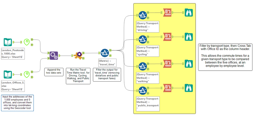
The only change here is in the final Filter and Cross Tab tools. This time we separate out the results by transport type instead of office, and set the columns in the matrix as the Office ID.
We now have a separate matrix for each method of transport, and examining the public transport matrix allows us to establish which is the best office for each employee in terms of shortest commute time:
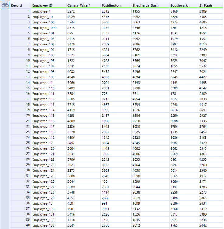
For example with Employee 132, if we wanted to encourage public transport commute times of no more than 30 minutes, they could use either the Paddington office (24 minutes) or even better the Shepherd’s Bush office (17 minutes).
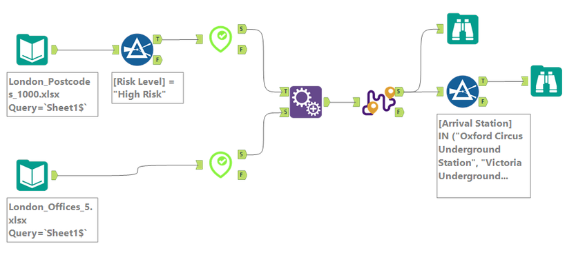
Another aspect of our plan for employees returning to the office safely is to try reduce the need for particularly high risk individuals to travel through the busiest underground stations. To do this we add a third column to our employee data called ‘Risk Level’ and then run the following workflow:
The steps in the workflow are as follows:
- Use the Filter tool to select only the 15 individuals that have been identified as High Risk
- Use the Geocoder tool to convert the employee and office postcodes into lat-long coordinates
- Use the Append Fields tool to combine the two data sets
- Use the Routes tool configured with the Transport Method as Public Transport, and the Output Type as Detailed. This Output Type will return a separate line for each leg of the routes, with the turn-by-turn directions for the leg
-
Use the Filter tool with a custom filter to select any route legs that involve one of the five busiest underground stations that we want to highlight, as shown below

The first output we can use is the Browse tool directly from the Routes tool:
Using this visual output we can investigate which routes run through the stations we are looking to avoid. We can do even better than this though, by using the output from the second Filter tool:
This is a list of all of the combinations of high risk employees and offices which involve a route passing through one of the five busiest stations.
We can use this output to ensure that if they need to travel using public transport, we can allocate high risk employees to offices which at the very least avoid public transport routes that involve changing at busy stations.
A similar approach could be used to avoid whole tube lines by filtering the ‘Instructions’ field in the Routes tool output for the name(s) of the lines to be avoided.
Having assessed the travel options for our employees returning to one of the five offices, we decide that it would be sensible to reduce our real estate portfolio by closing one of the offices.
Going forwards, we want to encourage walking and cycling to work as much as possible, so we want to take accessibility by these modes into account when deciding which office to shut.
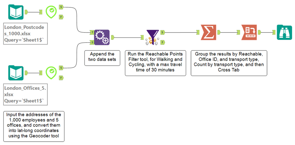
Below is the workflow we run for this analysis:
The steps in the workflow are as follows:
- Use the Geocoder tool to convert the employee and office postcodes into lat-long coordinates
- Use the Append Fields tool to combine the two data sets
- Use the Reachable Points Filter tool configured with both Walking and Cycling selected, and an Isochrone Time of 30 minutes. This will return the journey from each employee address to each office as Reachable or Unreachable based on a 30 minute cut-off, for both cycling and walking
- Use the Summarize tool to group the results by Reachable?, Office ID, and Transport Method, as well as to count by Transport method
- Use the Cross Tab tool to create a matrix, with Office ID and Transport Method both as rows, Reachable? as the columns, and Count as the metric
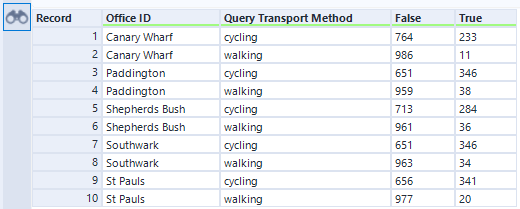
The resulting matrix allows us to compare how many employees can walk or cycle to each office within 30 minutes. The True column is the count of how many employees can make the journey in under 30 minutes, while the False column is the count of those who can’t.
Using this analysis we can see which office provides the worst access for our current employees based on walking and cycling.
Canary Wharf turns out to be the least accessible of the offices for both options:
- Only 233 of our 997 employees can reach the office within a 30 minute cycle
- Only 11 of our 997 employees can reach the office within a 30 minute walk
Based on where our current employees live, Canary Wharf is clearly the best option for an office to be closed, in terms of accessibility by walking and cycling. However, taking a more long-term perspective, we also need to consider two additional factors:
- Public transport is likely to return as the primary commute of choice in the years to come
- We are looking to expand our workforce, and we are particularly keen to attract new talent from outside of London
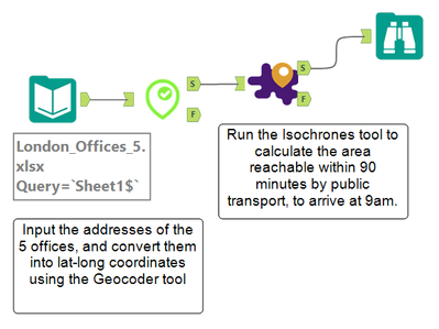
To assess the impact of potentially closing the Canary Wharf office given these two additional considerations, we run the following workflow:
The steps in the workflow are as follows:
- Use the Geocoder tool to convert the office postcodes into lat-long coordinates
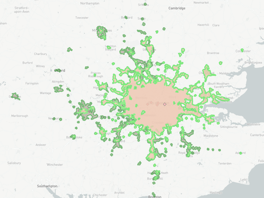
- Use the Isochrones tool to calculate the reachable area (‘isochrone’ or ‘trade area’) around each office by public transport, for a 90 minute maximum journey time, arriving at the office at 9am on a weekday morning
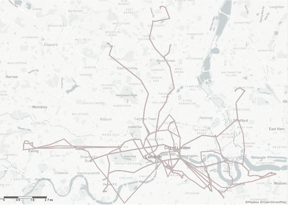
The results of this workflow are below:
The highlighted isochrone here corresponds to the reachable area for the Canary Wharf office. Comparing this to the reachable areas covered by the other offices we can see that by closing the Canary Wharf office we will lose some accessibility to the East of London.
However, the majority of the area served by the Canary Wharf office is also served by one of the four other offices, so we can be confident that closing it will not have too detrimental an impact on our ability to attract talent from outside of London, who want to commute by public transport.
To explore these isochrones in more detail, they can be easily exported into Tableau.
- Mark as Read
- Mark as New
- Bookmark
- Permalink
- Notify Moderator
Good case study and nice presentation.
- Mark as Read
- Mark as New
- Bookmark
- Permalink
- Notify Moderator
Awesomeness!
-
Adobe
2 -
Alteryx Connect
5 -
Alteryx Designer
202 -
Alteryx for Good
1 -
Alteryx Promote
2 -
Alteryx Server
66 -
Alteryx using Alteryx
29 -
Americas
158 -
Analyst
108 -
Analytics Leader
54 -
Asia Pacific
29 -
AWS
9 -
BI + Analytics + Data Science
100 -
Business Leader
37 -
C-Leader
18 -
Data Prep + Analytics
230 -
Data Science + Machine Learning
113 -
Data Scientist
14 -
Department: Other
14 -
Education
18 -
Energy + Utilities
5 -
Europe + Middle East + Africa
58 -
Experian
2 -
finance
29 -
Financial Services
33 -
Healthcare + Insurance
21 -
Human Resources
19 -
Information Technology
25 -
IT
31 -
Life Sciences + Pharmaceuticals
3 -
Manufacturing
20 -
Marketing
16 -
Media + Entertainment
12 -
Microsoft
52 -
Operations
38 -
Other
10 -
Process Automation
60 -
Professional Services
69 -
Public Sector
15 -
Qlik
1 -
Retail + CPG
32 -
Sales and Service
24 -
Salesforce
9 -
SAP
11 -
Snowflake
6 -
Tableau
71 -
Tech Partner: Other
86 -
Technology
34 -
Telecommunications
5 -
Teradata
5 -
Thomson Reuters
1 -
Transportation + Logistics
25 -
Travel + Hospitality
4 -
UiPath
1
- « Previous
- Next »
