Alteryx Designer Desktop Discussions
Find answers, ask questions, and share expertise about Alteryx Designer Desktop and Intelligence Suite.- Community
- :
- Community
- :
- Participate
- :
- Discussions
- :
- Designer Desktop
- :
- Adding a section break in a chart
Adding a section break in a chart
- Subscribe to RSS Feed
- Mark Topic as New
- Mark Topic as Read
- Float this Topic for Current User
- Bookmark
- Subscribe
- Mute
- Printer Friendly Page
- Mark as New
- Bookmark
- Subscribe
- Mute
- Subscribe to RSS Feed
- Permalink
- Notify Moderator
Hi everyone!
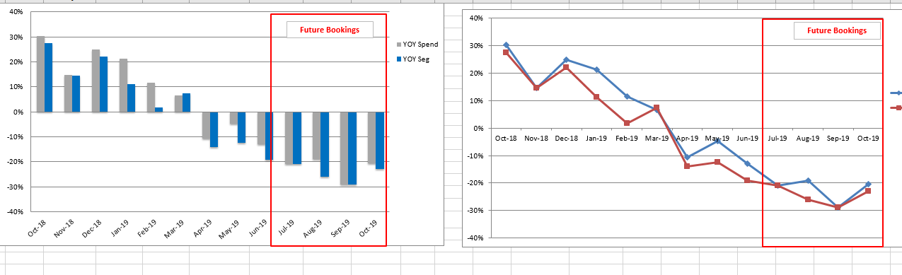
I'm trying to make a bar chart or line chart that contain past booking and future predicted booking. I would like to add something to make the reader aware of the fact that this is just an estimate and not past data. In excel I can just add a line in or a box surrounding that area (attached picture) but I don't know if Alteryx has something like that.
It doesn't have to be a line/box. Anything that can separate the two part (color.. etc) will be great.
Thank you!
Solved! Go to Solution.
- Labels:
-
Reporting

- Mark as New
- Bookmark
- Subscribe
- Mute
- Subscribe to RSS Feed
- Permalink
- Notify Moderator
- Mark as New
- Bookmark
- Subscribe
- Mute
- Subscribe to RSS Feed
- Permalink
- Notify Moderator
Attached here is the picture. Thank you!
- Mark as New
- Bookmark
- Subscribe
- Mute
- Subscribe to RSS Feed
- Permalink
- Notify Moderator
Within the Interactive Chart tool you are able to add a note to help users understand what they're looking at. You will not be able to draw a rectangle just add an arrow and a piece of text.

An alternative would be to create a new variable which we can use to differentiate between the past and future bookings - you can use the Formula tool to create it

You build the chart as you normally would and then use the Category within Transforms to split the data

You add a note and hide the arrow

And get a chart like the below. You can also change the colours used for the Categories within Style > Layer.

- Mark as New
- Bookmark
- Subscribe
- Mute
- Subscribe to RSS Feed
- Permalink
- Notify Moderator
Hi @MichalM ,
Thank you. I would love to create the type and transform the chart, but my interactive chart tool doesn't have the transform tab. Is it something in a newer version of Alteryx?
- Mark as New
- Bookmark
- Subscribe
- Mute
- Subscribe to RSS Feed
- Permalink
- Notify Moderator
You're right. The Transform functionality has been introduced in version 2019.2. Are you able to update to the latest version @LinhNguyen?
- Mark as New
- Bookmark
- Subscribe
- Mute
- Subscribe to RSS Feed
- Permalink
- Notify Moderator
I'm afraid I'll have to give this app to other people after building it and most people in my company has the same 2018 version. Is there any way I can accomplish this in the 2018 version?
If possible I want to stick to the line chart because I think there's a bug in the bar chart. It's not shown in the graph even though when I hover over the chart, a point appear. I created a simple workflow to test the bar chart with negative values and it doesn't work in my computer but worked for another person from this forum. Probably the problem with this version again.
- Mark as New
- Bookmark
- Subscribe
- Mute
- Subscribe to RSS Feed
- Permalink
- Notify Moderator
The only other option would be to use the deprecated Charting tool - to enable it, right-click anywhere on your tool palette and click Show Deprecated Tools - Charting tool will appear in the Reporting category.


You will then need to pivot your data so that you end up with two columns - "Past" values and "Future" values. The Crosstab tool will help you with that.

Once you have the data in the correct format, configure the Charting tool with "Past" as Series 1 and "Future" as Series 2 to get the result you need.


-
AAH
1 -
AAH Welcome
2 -
Academy
24 -
ADAPT
82 -
Add column
1 -
Administration
20 -
Adobe
178 -
Advanced Analytics
1 -
Advent of Code
5 -
Alias Manager
70 -
Alteryx
1 -
Alteryx 2020.1
3 -
Alteryx Academy
3 -
Alteryx Analytics
1 -
Alteryx Analytics Hub
2 -
Alteryx Community Introduction - MSA student at CSUF
1 -
Alteryx Connect
1 -
Alteryx Designer
44 -
Alteryx Engine
1 -
Alteryx Gallery
1 -
Alteryx Hub
1 -
alteryx open source
1 -
Alteryx Post response
1 -
Alteryx Practice
134 -
Alteryx team
1 -
Alteryx Tools
1 -
AlteryxForGood
1 -
Amazon s3
138 -
AMP Engine
194 -
ANALYSTE INNOVATEUR
1 -
Analytic App Support
1 -
Analytic Apps
17 -
Analytic Apps ACT
1 -
Analytics
2 -
Analyzer
17 -
Announcement
4 -
API
1,049 -
App
1 -
App Builder
44 -
Append Fields
1 -
Apps
1,171 -
Archiving process
1 -
ARIMA
1 -
Assigning metadata to CSV
1 -
Authentication
4 -
Automatic Update
1 -
Automating
3 -
Banking
1 -
Base64Encoding
1 -
Basic Table Reporting
1 -
Batch Macro
1,283 -
Beginner
1 -
Behavior Analysis
220 -
Best Practices
2,430 -
BI + Analytics + Data Science
1 -
Book Worm
2 -
Bug
629 -
Bugs & Issues
2 -
Calgary
59 -
CASS
46 -
Cat Person
1 -
Category Documentation
1 -
Category Input Output
2 -
Certification
4 -
Chained App
238 -
Challenge
7 -
Charting
1 -
Clients
3 -
Clustering
1 -
Common Use Cases
3,413 -
Communications
1 -
Community
188 -
Computer Vision
47 -
Concatenate
1 -
Conditional Column
1 -
Conditional statement
1 -
CONNECT AND SOLVE
1 -
Connecting
6 -
Connectors
1,192 -
Content Management
8 -
Contest
6 -
Conversation Starter
17 -
copy
1 -
COVID-19
4 -
Create a new spreadsheet by using exising data set
1 -
Credential Management
3 -
Curious*Little
1 -
Custom Formula Function
1 -
Custom Tools
1,738 -
Dash Board Creation
1 -
Data Analyse
1 -
Data Analysis
2 -
Data Analytics
1 -
Data Challenge
83 -
Data Cleansing
4 -
Data Connection
1 -
Data Investigation
3,089 -
Data Load
1 -
Data Science
38 -
Database Connection
1,912 -
Database Connections
5 -
Datasets
4,625 -
Date
3 -
Date and Time
3 -
date format
2 -
Date selection
2 -
Date Time
2,908 -
Dateformat
1 -
dates
1 -
datetimeparse
2 -
Defect
2 -
Demographic Analysis
173 -
Designer
1 -
Designer Cloud
494 -
Designer Integration
60 -
Developer
3,685 -
Developer Tools
2,969 -
Discussion
2 -
Documentation
457 -
Dog Person
4 -
Download
910 -
Duplicates rows
1 -
Duplicating rows
1 -
Dynamic
1 -
Dynamic Input
1 -
Dynamic Name
1 -
Dynamic Processing
2,565 -
dynamic replace
1 -
dynamically create tables for input files
1 -
Dynamically select column from excel
1 -
Email
757 -
Email Notification
1 -
Email Tool
2 -
Embed
1 -
embedded
1 -
Engine
129 -
Enhancement
3 -
Enhancements
2 -
Error Message
1,991 -
Error Messages
6 -
ETS
1 -
Events
179 -
Excel
1 -
Excel dynamically merge
1 -
Excel Macro
1 -
Excel Users
1 -
Explorer
2 -
Expression
1,705 -
extract data
1 -
Feature Request
1 -
Filter
1 -
filter join
1 -
Financial Services
1 -
Foodie
2 -
Formula
2 -
formula or filter
1 -
Formula Tool
4 -
Formulas
2 -
Fun
4 -
Fuzzy Match
621 -
Fuzzy Matching
1 -
Gallery
596 -
General
93 -
General Suggestion
1 -
Generate Row and Multi-Row Formulas
1 -
Generate Rows
1 -
Getting Started
1 -
Google Analytics
140 -
grouping
1 -
Guidelines
11 -
Hello Everyone !
2 -
Help
4,150 -
How do I colour fields in a row based on a value in another column
1 -
How-To
1 -
Hub 20.4
2 -
I am new to Alteryx.
1 -
identifier
1 -
In Database
861 -
In-Database
1 -
Input
3,742 -
Input data
2 -
Inserting New Rows
1 -
Install
3 -
Installation
307 -
Interface
2 -
Interface Tools
1,659 -
Introduction
5 -
Iterative Macro
954 -
Jira connector
1 -
Join
1,750 -
knowledge base
1 -
Licenses
1 -
Licensing
212 -
List Runner
1 -
Loaders
12 -
Loaders SDK
1 -
Location Optimizer
53 -
Lookup
1 -
Machine Learning
232 -
Macro
2 -
Macros
2,515 -
Mapping
1 -
Marketo
12 -
Marketplace
5 -
matching
1 -
Merging
1 -
MongoDB
67 -
Multiple variable creation
1 -
MultiRowFormula
1 -
Need assistance
1 -
need help :How find a specific string in the all the column of excel and return that clmn
1 -
Need help on Formula Tool
1 -
network
1 -
News
1 -
None of your Business
1 -
Numeric values not appearing
1 -
ODBC
1 -
Off-Topic
14 -
Office of Finance
1 -
Oil & Gas
1 -
Optimization
654 -
Output
4,552 -
Output Data
1 -
package
1 -
Parse
2,113 -
Pattern Matching
1 -
People Person
6 -
percentiles
1 -
Power BI
198 -
practice exercises
1 -
Predictive
2 -
Predictive Analysis
828 -
Predictive Analytics
1 -
Preparation
4,666 -
Prescriptive Analytics
186 -
Publish
230 -
Publishing
2 -
Python
733 -
Qlik
36 -
quartiles
1 -
query editor
1 -
Question
18 -
Questions
1 -
R Tool
455 -
refresh issue
1 -
RegEx
2,125 -
Remove column
1 -
Reporting
2,134 -
Resource
15 -
RestAPI
1 -
Role Management
3 -
Run Command
502 -
Run Workflows
10 -
Runtime
1 -
Salesforce
245 -
Sampling
1 -
Schedule Workflows
3 -
Scheduler
374 -
Scientist
1 -
Search
3 -
Search Feedback
20 -
Server
530 -
Settings
762 -
Setup & Configuration
47 -
Sharepoint
470 -
Sharing
2 -
Sharing & Reuse
1 -
Snowflake
1 -
Spatial
1 -
Spatial Analysis
562 -
Student
9 -
Styling Issue
1 -
Subtotal
1 -
System Administration
1 -
Tableau
469 -
Tables
1 -
Technology
1 -
Text Mining
416 -
Thumbnail
1 -
Thursday Thought
10 -
Time Series
398 -
Time Series Forecasting
1 -
Tips and Tricks
3,810 -
Tool Improvement
1 -
Topic of Interest
40 -
Transformation
3,258 -
Transforming
3 -
Transpose
1 -
Truncating number from a string
1 -
Twitter
24 -
Udacity
85 -
Unique
2 -
Unsure on approach
1 -
Update
1 -
Updates
2 -
Upgrades
1 -
URL
1 -
Use Cases
1 -
User Interface
21 -
User Management
4 -
Video
2 -
VideoID
1 -
Vlookup
1 -
Weekly Challenge
1 -
Weibull Distribution Weibull.Dist
1 -
Word count
1 -
Workflow
8,543 -
Workflows
1 -
YearFrac
1 -
YouTube
1 -
YTD and QTD
1
- « Previous
- Next »