Community Spring Cleaning week is here! Join your fellow Maveryx in digging through your old posts and marking comments on them as solved. Learn more here!
The Product Idea boards have gotten an update to better integrate them within our Product team's idea cycle! However this update does have a few unique behaviors, if you have any questions about them check out our FAQ.

Alteryx Community Ideas

What can we do to make your Alteryx Community experience better? Let us know!

1 Review

Our submission guidelines & status definitions before getting started

2 Search

The community for a solution or existing idea before posting

3 Vote

By clicking the like in the top left corner of an idea you support

4 Submit

A new idea to suggest a new community feature or improvement

Suggest an idea

In navigating the site, I've slowly become aware of the sidebar boxes and their content.


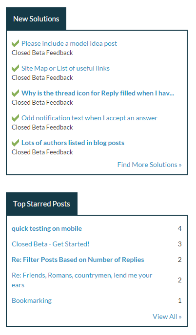
It was only today that I realized that those boxes contain content that is only relevant in the context of the current area (e.g. discussions, ides, blogs, etc.). For example, in the image below the New Solutions and Top Starred Posts only reflect the content in the Closed Beta Feedback.


Suggestion: I think it would be helpful to signify to the user either by color or by text that the sidebox content is area specific. This would also serve to orient the user as to their current top level content area (discussion, ideas, blogs, etc). 


As is, the only way I know 'where I am' is to look at the top in the COMMUNITY > AREA 51 - TEST & FEEDBACK > CLOSED BETA FEEDBACK text line.


Capture.PNG

Top Liked Authors