Want to get involved? We're always looking for ideas and content for Weekly Challenges.
SUBMIT YOUR IDEAA solution to last week’s challenge can be found here.
This week's challenge was submitted by @wwatson - Thanks for your submission!
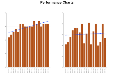
Two sets of performance data are provided below. Plot that data on bar charts, calculate a trendline for each graph, and export the charts to a single Powerpoint slide.
The method for calculating the trend line can be found on various websites. The author used this one.
Not your average challenge!
(edit 8/17 9:53 CT) video of solution overview:
The trend line calculation was driven by the core logic from this Macro in the gallery - https://gallery.alteryx.com/#!app/Least-Squares-Regression--Slope--Intercept-/5ab4ff0f8a9337138c471a...
Not Base Alteryx compliant, but...
@Aaron_Harter Great to know about the macro.
Extra points for those not using the macro though 🙂