Weekly Challenges
Solve the challenge, share your solution and summit the ranks of our Community!Also available in | Français | Português | Español | 日本語
IDEAS WANTED
Want to get involved? We're always looking for ideas and content for Weekly Challenges.
SUBMIT YOUR IDEA- Community
- :
- Community
- :
- Learn
- :
- Academy
- :
- Challenges & Quests
- :
- Weekly Challenges
- :
- Re: Challenge #201: Wage Ain't Nothin' but a Numbe...
Challenge #201: Wage Ain't Nothin' but a Number
- Subscribe to RSS Feed
- Mark Topic as New
- Mark Topic as Read
- Float this Topic for Current User
- Bookmark
- Subscribe
- Mute
- Printer Friendly Page
- Mark as New
- Bookmark
- Subscribe
- Mute
- Subscribe to RSS Feed
- Permalink
- Notify Moderator
- Mark as New
- Bookmark
- Subscribe
- Mute
- Subscribe to RSS Feed
- Permalink
- Notify Moderator
Nice practice with the Interactive Chart, which I, hanging head in shame, had never used before.
- Mark as New
- Bookmark
- Subscribe
- Mute
- Subscribe to RSS Feed
- Permalink
- Notify Moderator
Check out my video solution here: https://www.dataprepsolutions.com/2020/02/alteryx-weekly-challenge-201.html
- Mark as New
- Bookmark
- Subscribe
- Mute
- Subscribe to RSS Feed
- Permalink
- Notify Moderator
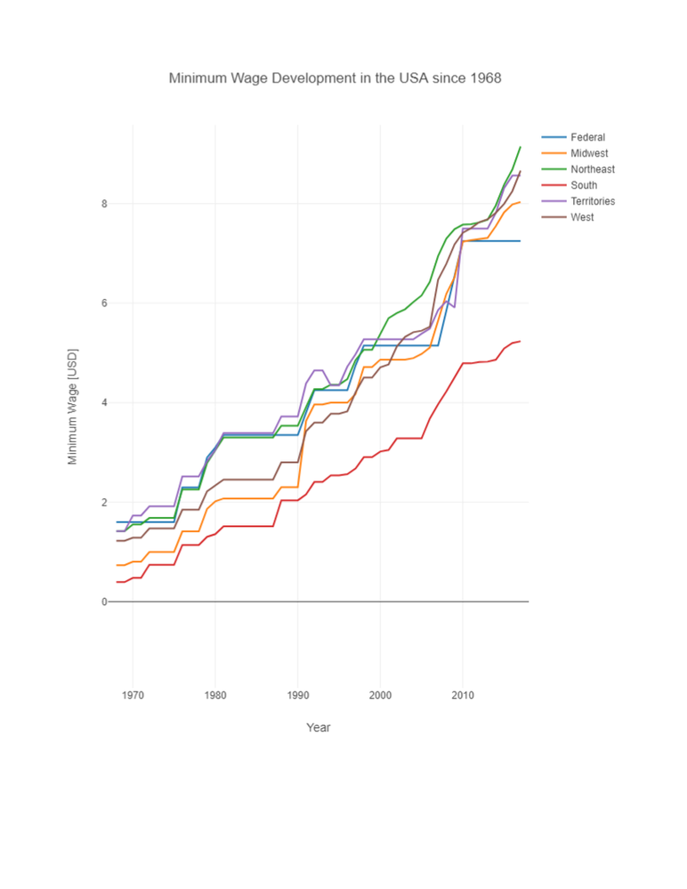
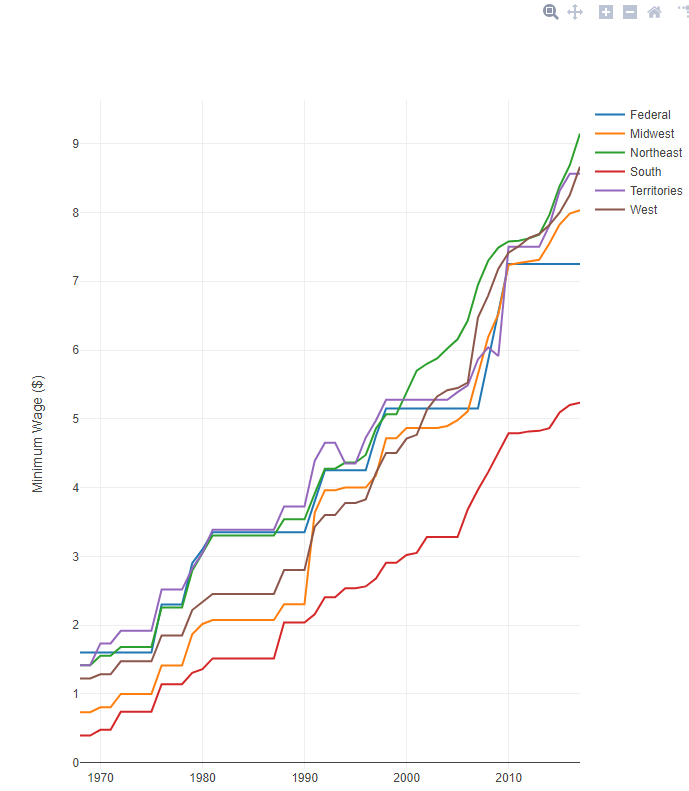
Good concept, but I think I would push for more background information and a cleaner data set before making any type of decision based on these graphs. I also think that it would be more applicable to see the effective rate per region (the greater of Federal or Local).
- Mark as New
- Bookmark
- Subscribe
- Mute
- Subscribe to RSS Feed
- Permalink
- Notify Moderator
- Mark as New
- Bookmark
- Subscribe
- Mute
- Subscribe to RSS Feed
- Permalink
- Notify Moderator
It took me longer than I'd like to remember/work out how to colour the lines 😞
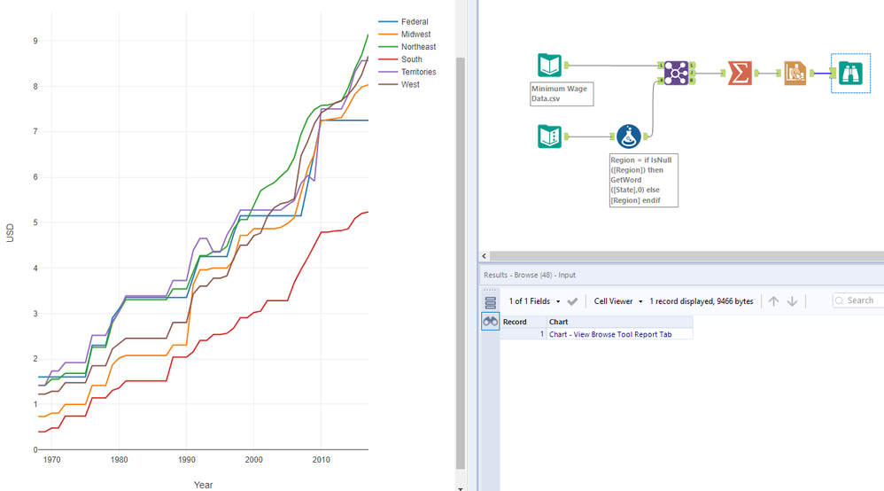
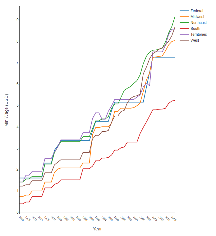 Output
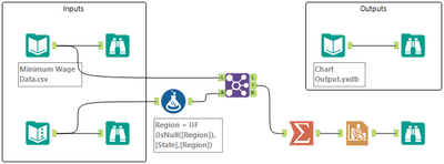
 workflow
- Mark as New
- Bookmark
- Subscribe
- Mute
- Subscribe to RSS Feed
- Permalink
- Notify Moderator
- Mark as New
- Bookmark
- Subscribe
- Mute
- Subscribe to RSS Feed
- Permalink
- Notify Moderator
- Mark as New
- Bookmark
- Subscribe
- Mute
- Subscribe to RSS Feed
- Permalink
- Notify Moderator
Hey there,
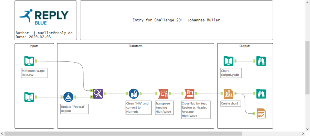
this is my first challenge, so I hope there are no rules that I violated.
Have a nice day!
Best,
Johannes
- Mark as New
- Bookmark
- Subscribe
- Mute
- Subscribe to RSS Feed
- Permalink
- Notify Moderator
Took a little bit of investigation and frustration to realize that I had to transpose the data to add the individual layers because I work on an old version of Alteryx (2018.3) that doesn't have the layer split functionality yet.
-
Advanced
273 -
Apps
24 -
Basic
128 -
Calgary
1 -
Core
112 -
Data Analysis
170 -
Data Cleansing
4 -
Data Investigation
7 -
Data Parsing
9 -
Data Preparation
195 -
Developer
35 -
Difficult
69 -
Expert
14 -
Foundation
13 -
Interface
39 -
Intermediate
237 -
Join
206 -
Macros
53 -
Parse
138 -
Predictive
20 -
Predictive Analysis
12 -
Preparation
271 -
Reporting
53 -
Reporting and Visualization
17 -
Spatial
59 -
Spatial Analysis
49 -
Time Series
1 -
Transform
214
- « Previous
- Next »
