Get Inspire insights from former attendees in our AMA discussion thread on Inspire Buzz. ACEs and other community members are on call all week to answer!
Search
Close
Free Trial
Turn on suggestions
Auto-suggest helps you quickly narrow down your search results by suggesting possible matches as you type.
Showing results for
Weekly Challenges
Solve the challenge, share your solution and summit the ranks of our Community!Also available in | Français | Português | Español | 日本語
IDEAS WANTED
Want to get involved? We're always looking for ideas and content for Weekly Challenges.
SUBMIT YOUR IDEA- Community
- :
- Community
- :
- Learn
- :
- Academy
- :
- Challenges & Quests
- :
- Weekly Challenges
- :
- Challenge #107: Plot Employment Rates by Gender in...
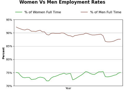
Challenge #107: Plot Employment Rates by Gender in the US
Options
- Subscribe to RSS Feed
- Mark Topic as New
- Mark Topic as Read
- Float this Topic for Current User
- Bookmark
- Subscribe
- Mute
- Printer Friendly Page
binuacs
20 - Arcturus
05-08-2022
02:48 PM
- Mark as New
- Bookmark
- Subscribe
- Mute
- Subscribe to RSS Feed
- Permalink
- Notify Moderator
JamesCharnley
13 - Pulsar
07-14-2022
08:56 AM
- Mark as New
- Bookmark
- Subscribe
- Mute
- Subscribe to RSS Feed
- Permalink
- Notify Moderator
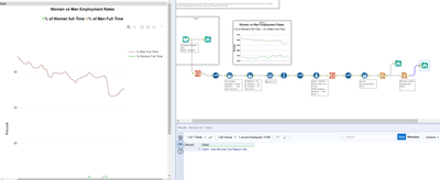
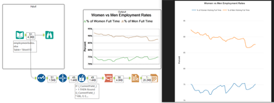
Not sure if it's possible to do a lot of the formatting now in the interactive chart tool to match output with title etc. If it is, I have absolutely no idea where it is! Think it looks better now anyway.
sgreenough
8 - Asteroid
07-20-2022
06:23 AM
- Mark as New
- Bookmark
- Subscribe
- Mute
- Subscribe to RSS Feed
- Permalink
- Notify Moderator
16 - Nebula
07-24-2022
12:04 PM
- Mark as New
- Bookmark
- Subscribe
- Mute
- Subscribe to RSS Feed
- Permalink
- Notify Moderator
MilindG
12 - Quasar
08-03-2022
10:58 AM
- Mark as New
- Bookmark
- Subscribe
- Mute
- Subscribe to RSS Feed
- Permalink
- Notify Moderator
aiahwieder
8 - Asteroid
08-16-2022
01:25 PM
- Mark as New
- Bookmark
- Subscribe
- Mute
- Subscribe to RSS Feed
- Permalink
- Notify Moderator
grazitti_sapna
17 - Castor
09-04-2022
11:36 PM
- Mark as New
- Bookmark
- Subscribe
- Mute
- Subscribe to RSS Feed
- Permalink
- Notify Moderator
Brian32
8 - Asteroid
09-06-2022
10:24 AM
- Mark as New
- Bookmark
- Subscribe
- Mute
- Subscribe to RSS Feed
- Permalink
- Notify Moderator
CodeMonkey
8 - Asteroid
09-19-2022
09:09 AM
- Mark as New
- Bookmark
- Subscribe
- Mute
- Subscribe to RSS Feed
- Permalink
- Notify Moderator
acarter881
12 - Quasar
10-03-2022
10:03 AM
- Mark as New
- Bookmark
- Subscribe
- Mute
- Subscribe to RSS Feed
- Permalink
- Notify Moderator
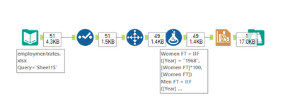
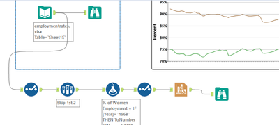
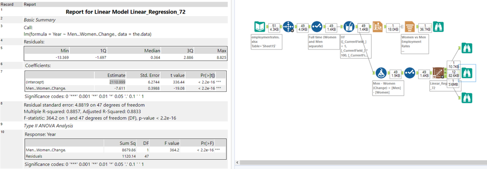
Here's my solution. I used the Linear Regression tool to estimate the year where the values converge (or at least that's what I believe the intercept to be).
Labels
-
Advanced
274 -
Apps
24 -
Basic
128 -
Calgary
1 -
Core
112 -
Data Analysis
170 -
Data Cleansing
4 -
Data Investigation
7 -
Data Parsing
9 -
Data Preparation
195 -
Developer
35 -
Difficult
70 -
Expert
14 -
Foundation
13 -
Interface
39 -
Intermediate
237 -
Join
206 -
Macros
53 -
Parse
138 -
Predictive
20 -
Predictive Analysis
12 -
Preparation
271 -
Reporting
53 -
Reporting and Visualization
17 -
Spatial
60 -
Spatial Analysis
49 -
Time Series
1 -
Transform
214
- « Previous
- Next »
