 This article is part of the Tool Mastery Series, a compilation of Knowledge Base contributions to introduce diverse working examples for Designer Tools. Here we’lldelve into uses of theInteractive Chart Tool on our way to mastering the Alteryx Designer:
 I’m proud to show off some of the great features of the Interactive Chart tool.It is a huge step forward from the deprecated Charting tool. Using the new Interactive Chart tool, users can immediately validate the configuration options selected to ensure the desired chart is created. There is no longer a need to re-run the workflow to see changes reflected in the chart.
The purpose of this article is to give you exposure to the Interactive Chart tool, and help you get up and running on your pursuit of visualizing the story of yourdata in style!
To get started with you’ll need to run the workflow to feed data into the Interactive Chart tool.This needs to happen before you can begin configuring the chart. After running your workflow, you can click the Configure Insight button in the Insight tool's configuration window to start your Visualytics adventure.
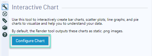
After you click this button, a second modal window will pop up. It might take a second or two to load, but once it does you will see a blank chart on the canvas with an Edit Chart menu on the left-hand side, a button that says Add Layer, and a blank chart.
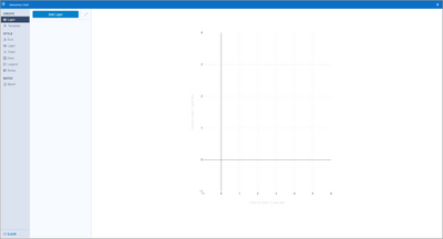
One of the key concepts for this tool is that you have the ability to layer the data you are presenting. You’ll want to think about your end goal as you begin creating your chart. The layer you add first will be your "bottom" layer, and any layers you add later on have the potential to eclipse the layers you've added previously. Like in cartography, the best practice with the Interactive Chart tool will be to layer polygon-typedata first (e.g., a bar chart), then lines (e.g., line charts) and then points (e.g., scatter plots).
To get started adding data to your interactive chart, click the blue button that says Add Layer. This is how you will select which columns of your input data are displayed on your chart. Once you click this button, a series of options for "layer 0" will populate in the second configuration panel on the left side. You can then edit your chart with the categories in the left-hand menu: Create, Style, and Batch.
Create
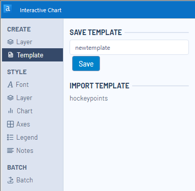
The menu options under the Create heading allow you to define your layers and the data that makes up each of your layers. This is also where you can import a preexisting template for the Interactive Chart tool, as well as save your current settings as a template for future use.
After adding your first layer, you can rename the layer by adding text to the Name setting. You can define the type of chart you want your data to be displayed as using the drop-down options of the Type setting. The current options for chart types are Area, Bar, Box and Whisker, Candlestick, Heatmap, Line, Scatter, and Pie. Please see the tool'shelp pagefor definitions on each one of these.
To define the data included in a layer, select columns from your input data in the Y and X fields under the DATA header. The values of the column you select for Y will be populated on the Y (vertical) axis, and related to the column values plotted on the X (horizontal) axis.
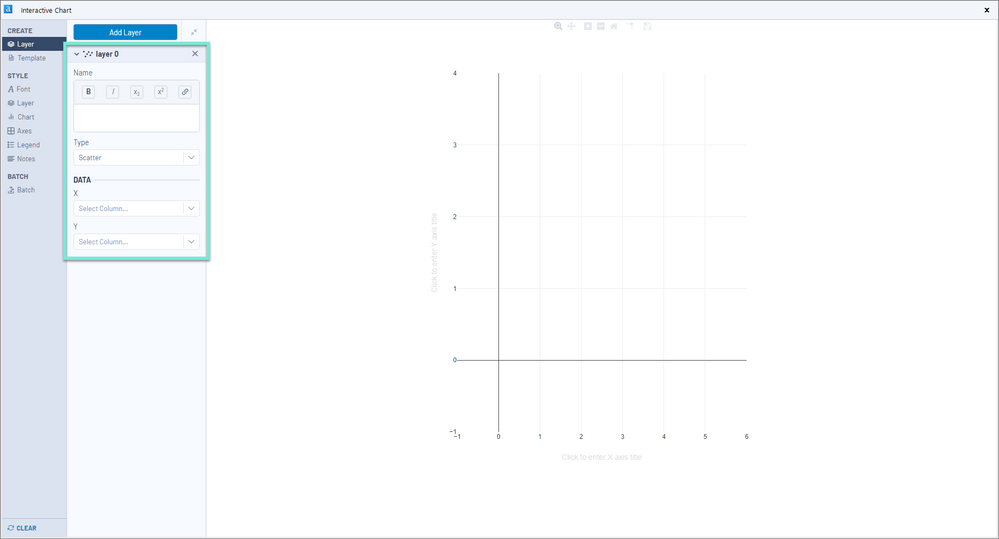
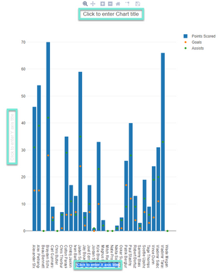
As an example, I am going to visualize some statistical data for the St. Louis Blueshockey team. The first layer I want to create is a bar chart showing the number of goals each player scored in the 2017 season, with players on the x-axis and points on the y-axis. Note how each component in the Layer configuration options populates in the chart.
Next, I want to show additional information for each player- goals and assists. To do this, I create two layers, each using the Scatter Type option.
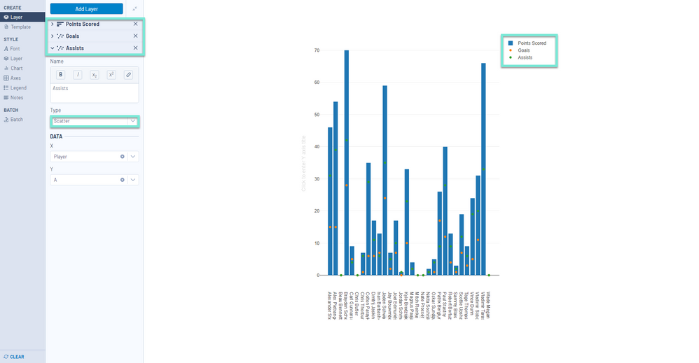
Finally, I want to add a title and axis labels to the chart. To do this, I click on the blank text holders (i.e., Click to enter Y-axis title) and type the desired label. Similarly, this can be performed in the configuration panel on the left side under the Chart or Axes sub-headings.
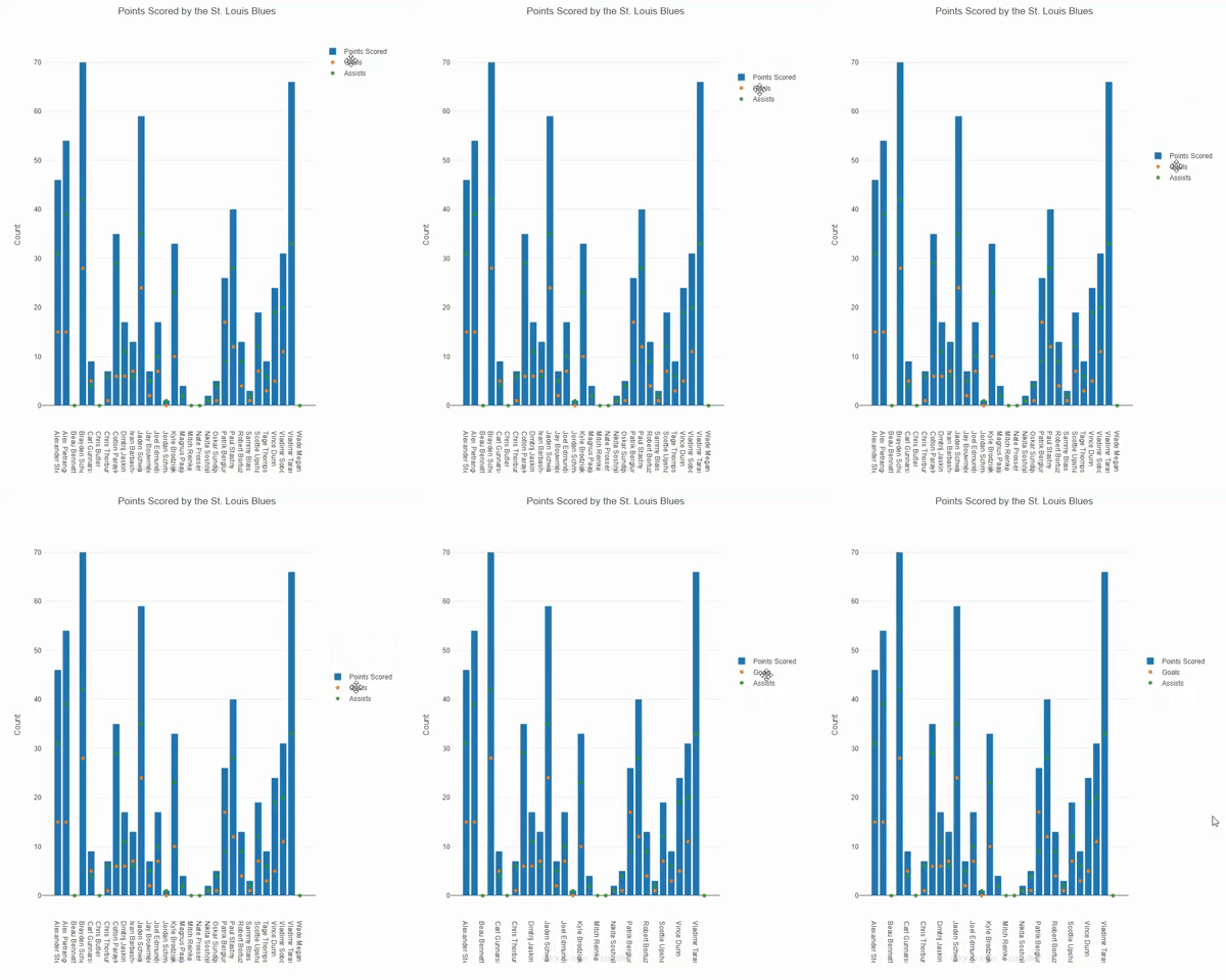
You can move around elements of your interactive chart (such as the legend) by clicking, holding, and dragging the element to a new location.
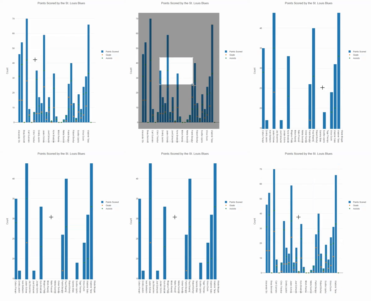
I can zoom in or out of my chart by clicking and dragging or using the mode bar which appears by hovering above the title. The default zoom can be restored by clicking the home button, in the mode bar, or double-clicking the center of the chart. The zoom used in chart creation will be used to display the output.
If your use case requires groups of your data set be plotted with different colors, you can leverage the layers of a chart to do so. For a detailed example of this process, please see the Community article How to Group Data by Color in an Interactive Chart.
For a more interactive experience, you can also dynamically zoom into the chart using your mouse wheel or mode bar . The chart, the data, and axis will all interactively resize.You can hit the Home button here ordouble-click to get back to your standard view.The zoom feature carries through the workflow and the output as well.
The Template option under the Create heading allows the current chart configuration options to be saved and reused in another chart or load a template you have previously saved.
Style
The options under the Style heading allow you to customize the look of your chart, including the font, layer, chart, axes, legend, and notes. This is also where you can resize the chart itself.The Style sections are dynamic inthe sensethat the options you change will automatically be updated in your working Interactive Chart.
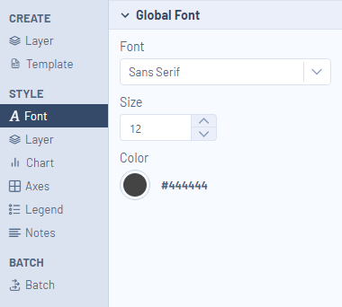
The first sub-heading under the Style heading is Font - this is the global font setting and allows you to change your font type, size, and color for all fonts in your chart at once.
The Layer sub-heading allows you to further tweak each of your charted layers. Each layer will appear as a collapsiblebar, and under each expandedlayer you can modify the traits for that layer.
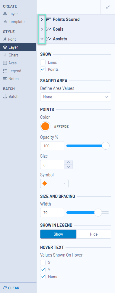
The specific options in the Layer heading will change depending on what chart type your layer is. You will be able to see any changes that you make to your layers populate on the fly in your chart, so I recommend playing with these settings to determine how they work and to get your chart to a point of perfection.
The options under the Style > Chart sub-heading allow you to update the size, background color, and margins of the chart.
The Style > Chart > Display > Size settings update the plotted chart area without considering the labels, titles or legend.

The Style > Chart >Display > Background settings update the background color of the plotted chart area.
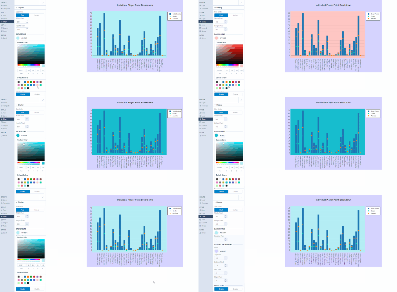
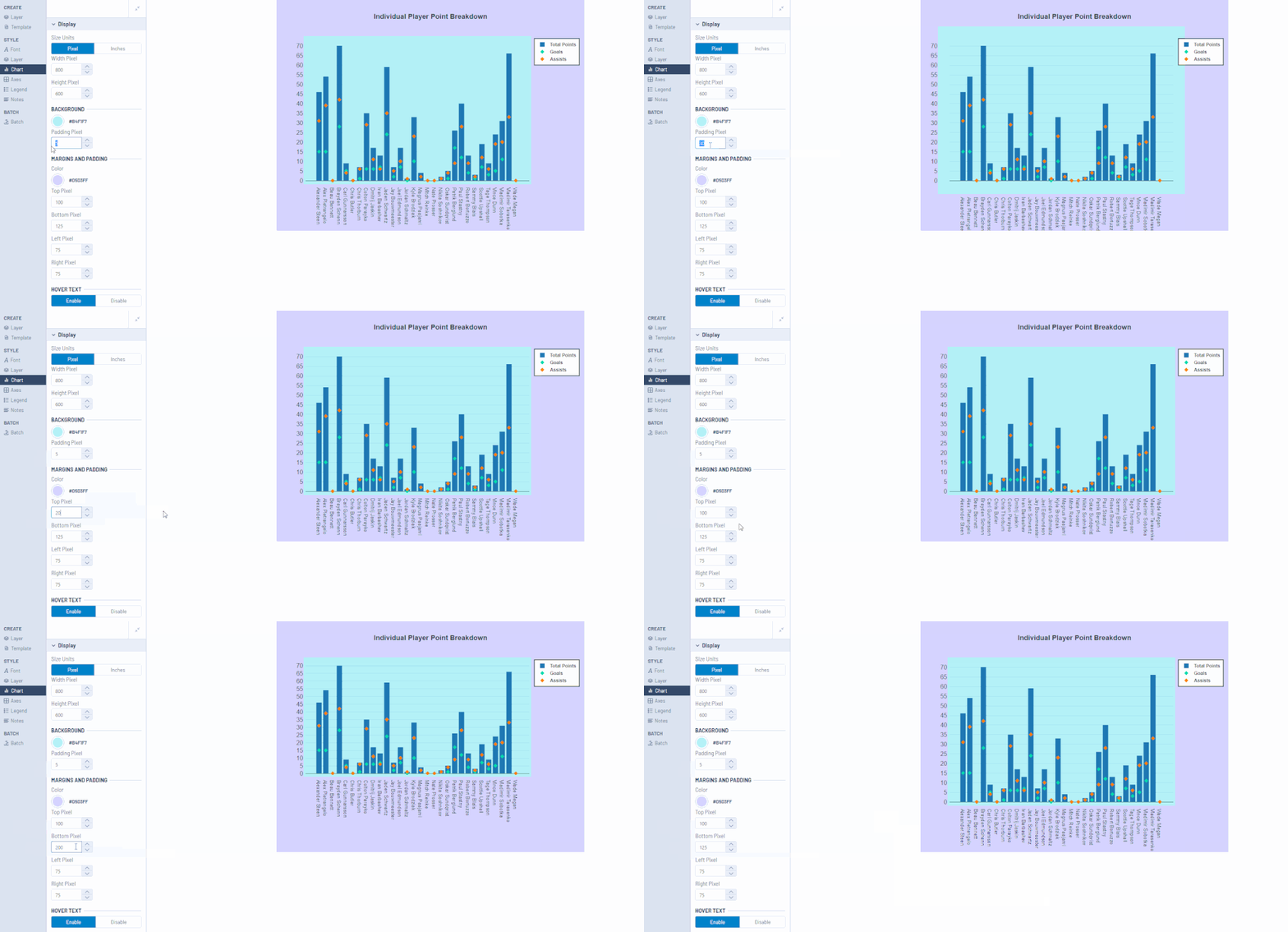
The Style > Chart >Margins and Padding settings update the background color and size of the area surrounding the plotted chart (apart from the legend). These are most useful to adjust to accommodate long labels that may not fit in the standard margin size.
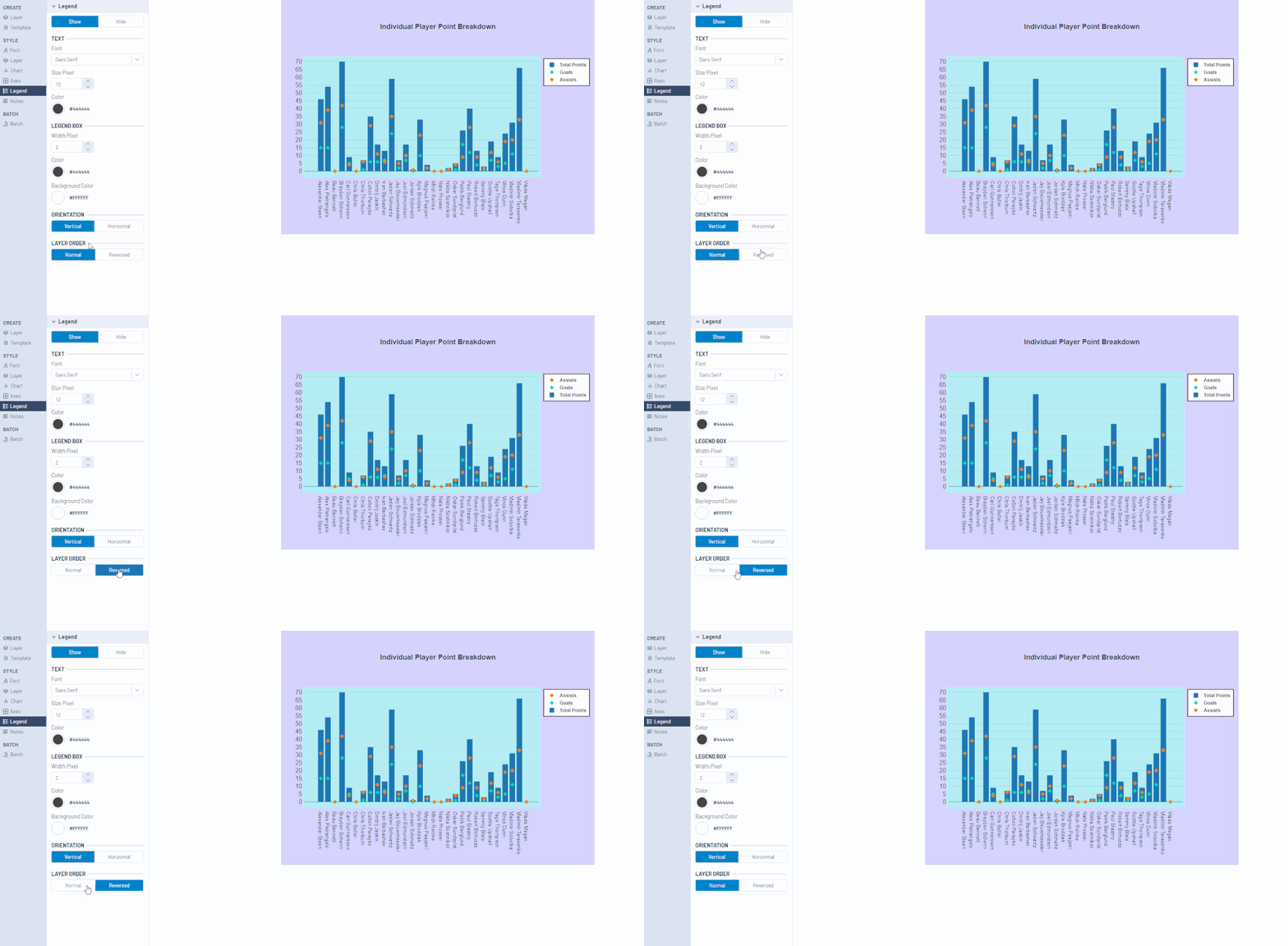
The Style >Axes and Legend options allow you to modify your chart title and axes labels and your legend, respectively. Options like size, font, placement, orientation, color, etc. can all be adjusted with these menus.
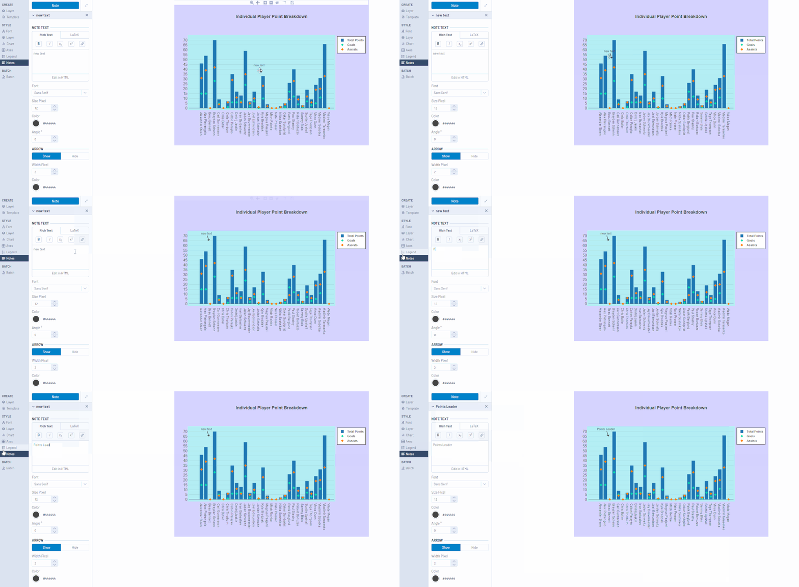
The Style > Notes section allows you to annotate your charts with arrows and text. It allows you to specifically point out anomalies in the data, important events, trends, and so on. After clicking the Note button at the top of the menu, a blank note will populate on your chart. You can drag this new note to its appropriate destination, and modify the text.
Batch
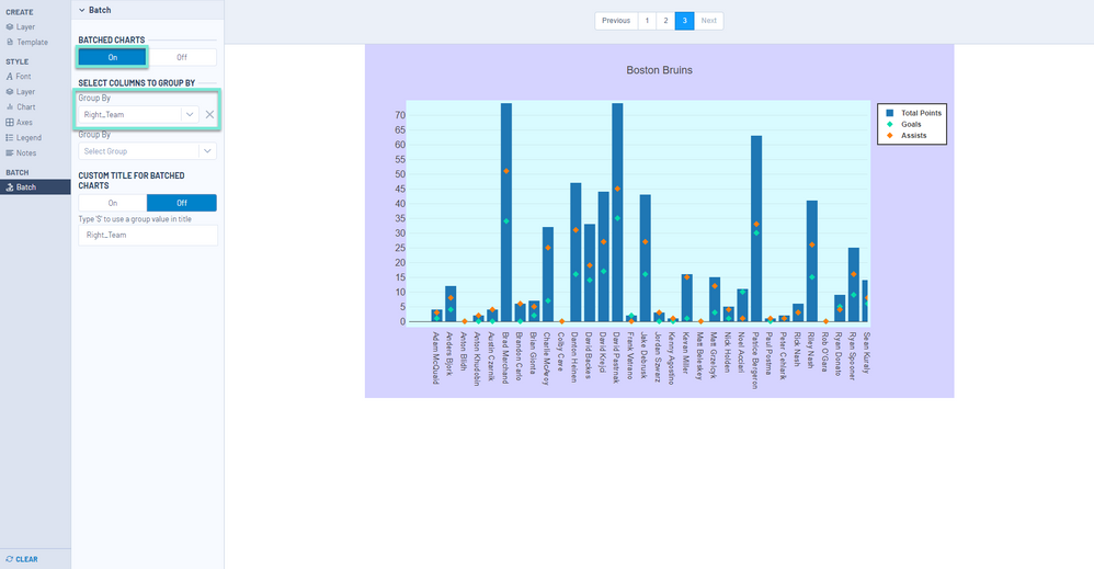
You may need to create an identical chart broken out by a column within your dataset. Continuing our previous example, if you had the necessary data for every NHL team, you could create a single report for the St. Louis Blues and then automatically generate the same report for each team in the league with their points, goals, and assists for each player. To do this, use the Batch functionality.
Turn on the Batch functionality with the On/Off toggle button. The Group By selection determines the column in your dataset for which a chart will be created for each unique value.
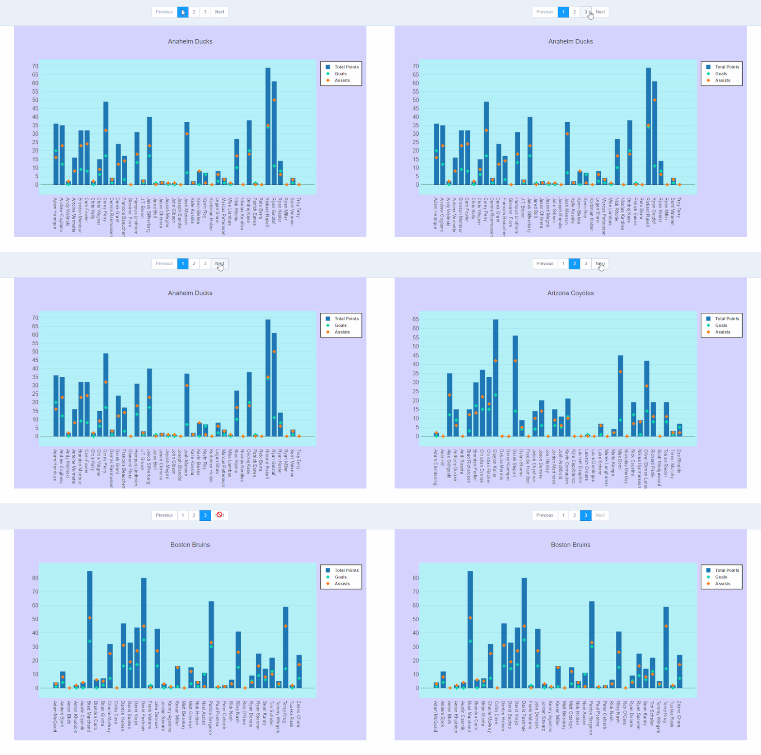
The Batch will display the first 3 examples in the preview, but all will be produced when you run your workflow.
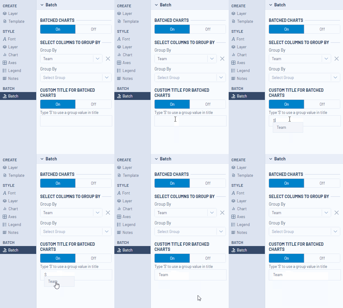
You can make your batch chart titles dynamic by typing "$" which will bring up the reference group field and display the data for use in the chart title.
Once you have worked through the configuration of your chart, you can output your chart with a Render tool. The interactive quality of the interactive charts will be preserved when they are output as PCXML or HTML. The other formats available in the Render tool will create static outputs.
By now, you should have expert-level proficiency with theInteractive Chart Tool! If you can think of a use case we left out, feel free to use the comments section below! Consider yourself a Tool Master already? Let us know atcommunity@alteryx.comif you’d like your creative tool uses to be featured in the Tool Mastery Series.
Stay tuned with our latest posts everyTool Tuesdayby followingAlteryxon Twitter! If you want to master all the Designer tools, considersubscribingfor email notifications.