
You may be aware that Alteryx provides inline Visualytics that let you immediately visualize traditional, statistical and spatial data throughout your workflow to instantly validate your data. If not, I highly suggest you check out this webinar to learn more. With our latest release, 2018.3, you can now try our extended Visualytics capabilities with our Interactive Chart and Insight tools within the Reporting Suite. In this article, we will focus on the Interactive Chart tool but search our Community to find helpful hints on our Insight tool.
What can I do with Interactive Charts?
With the new Interactive Chart tool you can effectively communicate your analysis to people of all levels in your organization by creating visually appealing and easy to comprehend charts. The resulting charts can be output to interactive formats such as embedding or viewing in an HTML site, viewing through the Alteryx Server or with interactive dashboards via the Insight tool. Charts can alternatively be included in a static reporting format such as PDF or Excel.
Using this new capability, you can create a worldwide sales chart and embed into an HTML site so your stakeholders can zoom in to the regions or details that are important to them
With the Interactive Chart tool, you can easily build out the following types of charts:
- Area
- Bar
- Box & Whisker
- Candlestick
- Heatmap
- Line
- Scatter
- Pie
How do I use the Interactive Chart tool?
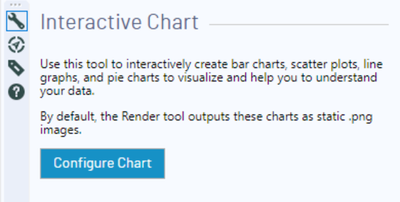
The Interactive Chart tool is a simple to use feature that lets you build multiple layers and customize the look and feel of your chart to meet your needs.
- From the Reporting suite of tools, simply drop the Interactive Chart
 tool into your workflow
- Configure your chart by choosing the chart type, adding layers, changing fonts, colors and much more
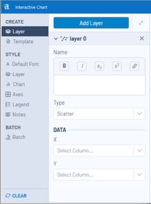
- Add Layer by giving it a name, choosing which type of chart and the data you want to visualize. If you want more than one layer to add dimensions to your charts, simply click add layer within the interactive chart tool. Please note that you can add different chart types (ex. line and bar graph)
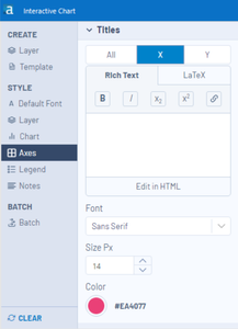
- Customize the look and feel of your chart by adding labels, changing colors, fonts, size, gridlines and more to create the chart you need. You can also edit the text directly in the chart itself by clicking the chart title or axes titles and typing your desired text.
- As you build your chart you can explore the data interactively to ensure the data is showing in the way you expect. You can turn layers on/off from the chart legend, zoom in to specific parts of the data or rescale the axes.

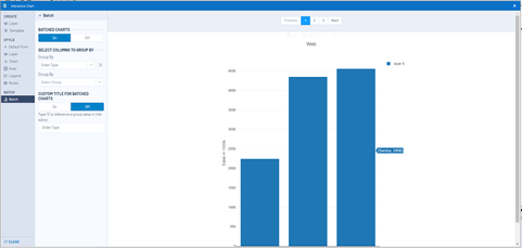
- If you need to create a similar chart for multiple audiences, you can use our powerful batching capabilities found in the reporting tools. This feature will create a new chart for each value in the group by field. (ex. One chart for each country in a region)
- Often we need charts in similar formats and you can create a template to re-use the formatting or for faster chart creation in the Insight tool.

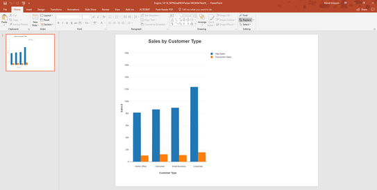
- It’s time to share your beautiful analysis! Output your chart by adding a browse tool to explore your chart, or another reporting tool such as Render to create your interactive HTML or static format like PowerPoint.
Ready to take our new Visualytics Interactive Charts experience for a spin?
Watch our hands-on Visualytics webinar to see it in action or try it for yourself by downloading our free trial or upgrading to 2018.3 today!