We have a special audio treat this week: a bonus episode of the Data [in the] Sandbox podcast miniseries! We explain what “artificial intelligence” and “machine learning” mean in a way kids can understand, using everyday examples like TV show recommendations, robot vacuums and math homework.
Those everyday examples have made “artificial intelligence” and “machine learning” familiar concepts not just to data experts, but also to the general public. But how familiar? And to whom?
Google Trends data can show us with a bit more precision how popular these terms are, how their use has changed over time, and even where they are more or less popular. And, of course, this is an analytic approach you could use with all kinds of keywords or phrases, for whatever topic interests you most.
AI/ML Interest Over Time
Google Trends helps you explore how much people are searching for certain terms. You can compare up to five terms at once, and you can see geographic details as well (i.e., data for the entire world or a specific country, and for the U.S., state, metro area or city-level data).
Reading the trend data is a little tricky. The data are normalized to reflect the popularity of the search term, and the values for each time period plotted will range from 1 to 100, with 100 reflecting the highest popularity of that term. Additionally, hovering over a map location will provide a value from 1 to 100, with the location from which that term was most frequently searched scoring 100. (Google provides in-depth lessons if you want to learn more about Trends.)
As shown below, Google Trends’ web interface provides a nice way to initially view the data, with relative search interest plotted over time and maps automatically displayed.

However, you’ll want to dig deeper using your favorite software, right? 😉 As you might guess, that little down arrow at the top right of the plot will download the data as a CSV file, ready for further analysis. The same is true of the map displays. I downloaded the data for U.S. metro areas from 2004 to the present.
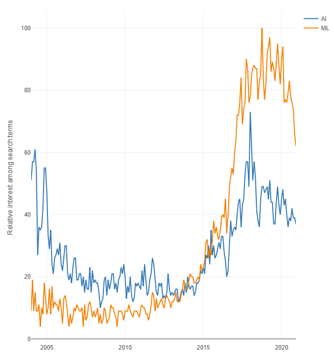
Here’s how my line chart looks in Designer — a bit more dramatic due to its narrower layout:

It’s interesting to see that in October 2013, U.S. search interest in “machine learning” surpassed interest in “artificial intelligence,” despite the broader meaning of AI and its pop culture familiarity. What made ML take the lead then and keep it nearly every month after?
One possible cause for the change might be the growth of Coursera, founded in 2012, which featured the now-famous machine learning course taught by Andrew Ng, one of the site’s founders. It remains the most popular course on Coursera today, having enrolled 3.8 million.
Geographic Comparisons
Bringing these data into Designer makes it possible to combine the trend data with other data, including U.S. Census data included with Designer. For example, this allows me to use the metro areas’ names to add spatial information and generate more specific, informative maps.
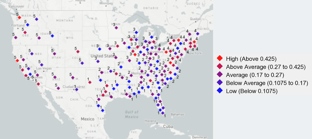
I matched Google Trends’ metro names to the names used in the data from the Allocate Input tool, then added some basic demographic information and spatial data to the Trends data. I created a new variable, a ratio of the search interest in ML to interest in AI. It could be interesting to identify places with a greater relative search interest in machine learning versus the perhaps less technical term “artificial intelligence.” That ratio ranged from a high of 0.69 in the San Francisco-Oakland-San Jose metro area to a low of 0.07 in Wilmington, N.C. (setting aside cities with no recorded search interest in one or both terms).
I also used the latitude and longitude of the metro areas to generate geographic clusters with the K-Centroids Cluster Analysis tool. This tool, combined with the Append Cluster tool, assigned the cities to groups. Having a “cluster” variable allowed me to look for geographic patterns in the data without relying on latitude and longitude. This approach generated the map below, with cities color-coded by their ML-to-AI search interest ratio; cities with diamonds that are more red had higher ratios, and diamonds that are more blue represented the opposite. Numbers on cities identify their geographic clusters.

The northeast U.S. has the highest average ML-to-AI search interest ratio across its metro areas at 0.29, with the western U.S. coming in second at 0.27. While we might expect a lot more “machine learning” searches in major U.S. tech hubs like the San Francisco area and Seattle, it’s also intriguing to see the cities that stand out in their geographic clusters, like Charlottesville, Va., Pittsburgh, Pa., and Syracuse, N.Y. Major universities probably also provide a boost to this ML-to-AI ratio as students research data science topics.
Continuing to Learn
Those folks searching for AI/ML are just like our Data [in the] Sandbox listeners, and, well, like all of us — just trying to keep up with this rapidly growing and changing field! Key terms and concepts of interest will change, but having a data-driven and curious mindset helps us all stay on top of the trends.
Check out the Data [in the] Sandbox bonus episode and share the intrigue of AI/ML with a young person you know!
Blog teaser photo by Jorge Flores on Unsplash.