Data Science
Machine learning & data science for beginners and experts alike.- Community
- :
- Community
- :
- Learn
- :
- Blogs
- :
- Data Science
- :
- Ugly or Nice? Classifying Christmas Sweaters with ...
- Subscribe to RSS Feed
- Mark as New
- Mark as Read
- Bookmark
- Subscribe
- Printer Friendly Page
- Notify Moderator
If you’ve been invited to an “ugly Christmas sweater” themed party, you might wonder: Is this sweater I picked actually ugly, or am I just a poor judge of fashion? Or maybe you just wear what you think is a “nice” holiday sweater. What if you then get compliments on your “ugly” choice?
Fortunately, we have the data science tools to address this dilemma! After all, it’s just a binary classification problem — “ugly” or “nice.”

With the Computer Vision tools in the Alteryx Intelligence Suite and a tiny bit of Python, we’ll see if we can classify sweaters correctly, and then explore whether we can quantify any characteristics that might define an “ugly Christmas sweater.” It’s timely news you can use — not just for your data science projects, but also for your festive fashion choices. (Be sure to follow along in the attached workflow!)
Scraping for Sweaters
To build an ugly/nice sweater image classification model, we need many images of sweaters fitting both categories. Quickly gathering images was easy with a Python image-scraping package called jmd_imagescraper, which collects images from the DuckDuckGo search engine based on your chosen search terms.
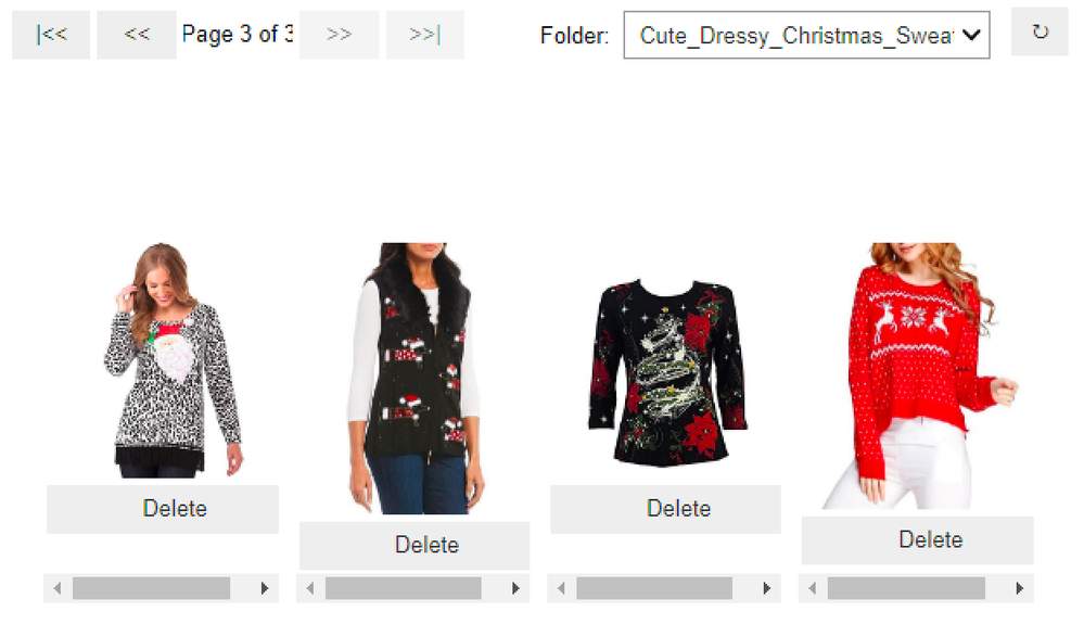
After some experimentation, I landed on “cute dressy Christmas sweater” as a reliable search term for more normal-looking holiday garb. Though potentially biased toward more typically feminine styles, the sample did include more masculine sweaters as well.
A sample of the allegedly “cute” sweaters as shown in the image cleaning interface
With just a few lines of code in the Python Tool, I quickly had 900 images of sweaters. The jmd_imagescraper package also includes a convenient little utility that allows you to preview and delete duplicated or inappropriate images, which in this case included the occasional clip art images or illustrations. After some cleanup, I ended up with 752 images, almost evenly divided between the “ugly” and “nice” labels (avoiding the problem of imbalanced data).
Image via GIPHY
Making the Data Pretty
With the images in hand, I was able to quickly parse their labels from the directory names generated in the scraping process, and then brought the images into the workflow through the Image Input Tool. (As a whole, the model-building process is similar to what I described in this blog post recently.)
I used the Image Processing Tool to make sure the images were a consistent size, though it can do more than just resize images. The Create Samples Tool tidily divided the images into evaluation, validation and holdout sets, and I fed the first two into the Image Recognition Tool.
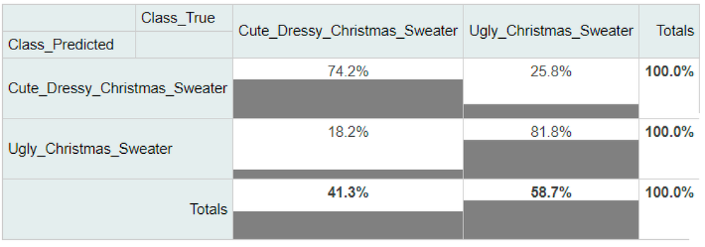
After experimenting with the pre-trained model options in the Image Recognition Tool, I settled on the VGG16 option as the best performer overall. I saved the model, then used the Predict Tool to assign labels for the holdout set. The Contingency Table Tool helped me sum up the model’s performance on that holdout set, shown in what’s basically a confusion matrix below. The model classified the sweaters as “ugly” or “nice” with about 79% accuracy across the board. Interestingly, it did a little bit better with the ugly sweaters.
Using a Contingency Table Tool to evaluate the performance of the model on the holdout images
For my personal fashion choices, I’d be pretty happy if I managed to correctly choose the “cute” option about 8 out of 10 times. Your standards may be higher.
Image via GIPHY
Quantifying the Ugly Christmas Sweater
It’s hard to know what aspects of the images most influenced the model’s predictions. However, we can review the images’ characteristics with the Image Profile Tool to see if there are any interesting differences that might have shaped the original labeling of these sweaters as ugly or cute (i.e., on the websites where they were originally found). In other words, can we analyze these images quantitatively to see what characteristics correlate with considering the sweaters ugly or not?
The Image Profile Tool provides a number of characteristics for each image, such as the most frequently appearing color (as demonstrated in this post) and the number of bright and dark pixels.
If you picture a black-to-gray-to-white gradient, “bright pixels” are those that lean more toward the white end of the scale; brightness doesn’t refer to the specific color. However, if you think of Santa Claus’s suit and the darker red of mulled wine, the Santa suit is a brighter red. In terms of the value assigned to a specific pixel of an image, red pixels in a photo of Santa will have higher numeric values than those in a photo of mulled wine.
As it turns out, one difference between the ugly and nice sweaters is that the ugly sweater images have a statistically significant higher number of bright pixels in them, according to a quick check with the Test of Means Tool. So if you’re looking for an ugly Christmas sweater for a party, going brighter is probably better (worse?).
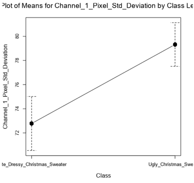
And when we look at the standard deviation for each of the “channels” of red, green and blue pixels in the images, we can see that the standard deviation (SD) of values for the red channel was significantly higher for the ugly sweater images (p < 0.001), though not for green or blue.
Generated by the Plot of Means Tool to show the difference in Channel 1 Pixel Standard Deviation
That significant difference means there was more variation in the display of red in those images — or in other words, either a lot of red and a little of some other color (as on the left below, with a low SD for channel 1) ... or a little red and a lot of something else (as on the right below, with a high SD).
With apologies to the chemists and cat lovers: two ugly Christmas sweaters in the image dataset.
Image sources: chemistry, cats
So perhaps one aspect of an ugly Christmas sweater is that striking use of red — either going full-on Santa red all over, or using strategic pops of red minimally for a maximally disturbing effect.
Holiday Fashion Issues Resolved
Fashion advice informed by data science? It’s fun to have a bit of algorithmic insight to inform your festive garb selection, whether you opt for “ugly” or “nice”! And, of course, you can try this approach with all sorts of image classification problems, which is something to celebrate.
Blog teaser photo by Philafrenzy on Wikimedia Commons

Senior Data Science Journalist
Susan Currie Sivek, Ph.D., is the data science journalist for the Alteryx Community. She explores data science concepts with a global audience through blog posts and the Data Science Mixer podcast. Her background in academia and social science informs her approach to investigating data and communicating complex ideas — with a dash of creativity from her training in journalism. Susan also loves getting outdoors with her dog and relaxing with some good science fiction. Twitter: @susansivek
Susan Currie Sivek, Ph.D., is the data science journalist for the Alteryx Community. She explores data science concepts with a global audience through blog posts and the Data Science Mixer podcast. Her background in academia and social science informs her approach to investigating data and communicating complex ideas — with a dash of creativity from her training in journalism. Susan also loves getting outdoors with her dog and relaxing with some good science fiction. Twitter: @susansivek
You must be a registered user to add a comment. If you've already registered, sign in. Otherwise, register and sign in.
