Data Science
Machine learning & data science for beginners and experts alike.- Community
- :
- Community
- :
- Learn
- :
- Blogs
- :
- Data Science
- :
- Market Basket Analysis 102: Alteryx Designer + Pyt...
- Subscribe to RSS Feed
- Mark as New
- Mark as Read
- Bookmark
- Subscribe
- Printer Friendly Page
- Notify Moderator
Have you ever abandoned a shopping cart in an online store and gotten a reminder email about it later? Your poor digital cart was stranded on a lonely server somewhere. But fear not, readers — we’re not abandoning you! Welcome to the second half of our introduction to market basket analysis.
In the first post, we covered some of the essential concepts behind market basket analysis, so check that out first if you’re not familiar with the basics. This post will show how to use this approach in Designer. I’ll throw in some ways to visualize your results using Python.
Image from GIPHY
The Market Basket Tools in Designer
There are two market basket tools in the Predictive Grouping palette in Designer: MB Rules and MB Inspect.
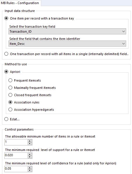
The MB Rules tool has quite a few configuration options.
- Input data structure: Your dataset may be organized such that transaction IDs are repeated and one item is included with that ID per record; alternatively, you might have one transaction in each record, with an ID in one field and a list of items for that transaction in another field with a delimiter (like a comma or space). Pick the option that fits your data and tell the tool where to look for the necessary information.
- Method to use: As discussed in the last post, there are different ways to construct itemsets and association rules from your transaction data. Designer lets you choose either the Apriori or Eclat algorithm.
- Control parameters: First, tell the tool how many items to put in the itemsets and rules it constructs. If you want to know about relationships between even single items (e.g., {milk} -> {eggs}), you can leave the default of 1 here. Then, set threshold values for the “interestingness” you want to seek in your transactions, using the support and confidence metrics. Itemsets and rules not fulfilling these values will be pruned (discarded). Part 1 has you covered if these terms are new to you.
Putting a Browse tool on the R output anchor of the MB Rules tool will display a report of facts about your transactions. You’ll see the most frequently occurring items and the number of times people purchased a certain number of items (e.g., people bought five items on 10 occasions), plus a distribution of the latter.
If you selected association rules as shown in the image above, you’ll also get an overall summary of the rules constructed for your transactions, including a table of descriptive statistics for your rules’ support, confidence and lift.
Image from GIPHY
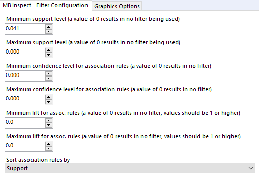
But what are the actual rules? That’s where the MB Inspect tool comes into play. Connect it to the O output anchor of your MB Rules tool, and its configuration options are shown below:
These options give you a chance to set threshold values for support, confidence and lift. Although you may have set support and confidence thresholds in the MB Rules tool, you have another chance here to narrow down your association rules or itemsets, whichever you decided to generate. Sorting will also ensure that your preferred metric will determine the order in the list in your “inspection report.”
Obtain the report by putting a Browse tool on the R output anchor of the MB Inspect tool. The report shows all the association rules or itemsets that made it past your pruning. The columns “LHS” and “RHS” refer to the left- and right-hand sides of your association rules, showing how the antecedents and consequences co-occur (as in the example {milk} ➡️ {eggs}). Support, confidence and lift are shown for each rule.
For association rules, you’ll also see two visualizations. The first is a matrix that shows how items and itemsets co-occurred, with color-coded dots showing support and lift; the second is a network graph displaying the connections among items, also color-coded for support and lift. Only the second visualization will be generated if you are looking at itemsets instead of association rules. (More details of these visualizations are available in the vignette from the developers of the underlying arulesViz R package, which is used within the MB Inspect tool/macro.)
Image from GIPHY
Additional Visualization Options
If you would like to see your itemsets or association rules and their metrics in a different form, you can feed the output from your MB Inspect tool into Designer’s visualization tools. You can also explore different options available to you in Python with the Python tool. Below I’ll show three different plots you can generate using pandas and seaborn. All of the code is in the attached workflow, where you can find a full example of using a real retail dataset with the market basket tools and these plot styles. The dataset contains over a half million items from 1,165 separate transactions.
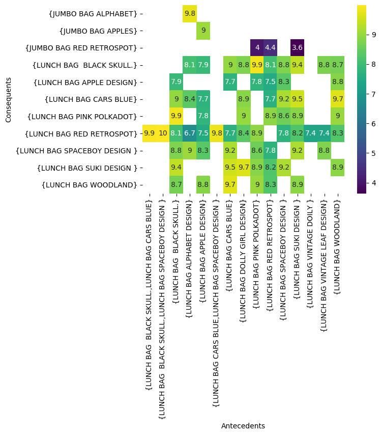
One visualization you might like to create for your association rules is a heatmap of how antecedents and consequents interact, based on the interestingness metric of your choice. The retail dataset and tool configurations in the example workflow attached here resulted in 227 association rules. In order to create usable visualizations, I narrowed the data included to only the 71 association rules with “lunch bag” in the antecedent, imagining we are interested only in the items that tend to co-occur with our retailer's lunch bag selection. I then pivoted the data so that the antecedents were the columns, consequents became the index, and the cells were filled by the lift values previously calculated in Designer.
The heatmap below, generated with the seaborn package, compares those antecedents to the related consequents, with the color of the cells in the heatmap reflecting the lift for that association rule.
heatmap = sns.heatmap(lift_table, # data to use
                      annot=True, # show values on cells of heatmap
                      cmap='viridis') # set color palette
These rules all have very high lift values between 1 and 10, as I specified in the MB Inspect tool. It turns out people who buy lunch bags also tend to buy other lunch bags … but they also buy two of this retailer’s jumbo bags, with a lift of 9 and 9.8 for the lunch and jumbo apple and alphabet bags in particular. In other words, there is a very high likelihood that someone who buys the apple lunch bag will also buy the jumbo apple bag.
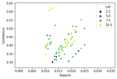
It can be somewhat tricky to know which values of the various metrics to use as you sort through the association rules your analysis generates. To get a better sense of the right values to use, generating a scatter plot may be helpful. You can do this with the Scatterplot tool on your Designer canvas, or you can do it in Python as I’ve done here.
Although the scatter plot below is based on only the smaller set of rules for lunch bags, one important benefit of the scatter plot is that you can display all your rules in it, whereas other visualizations may become too cluttered with so many rules. You can then see the range and distribution of the selected metrics for all your rules.
scatter = sns.scatterplot(x="Support", y="Confidence",
                            hue="Lift", # color dots by lift value
                            palette="viridis", # set color preference
                            data=lunch_bag_rules) # data to use
The scatter plot below, also generated with seaborn, shows the lunch bag rules’ support and confidence, with the points color-coded by lift.
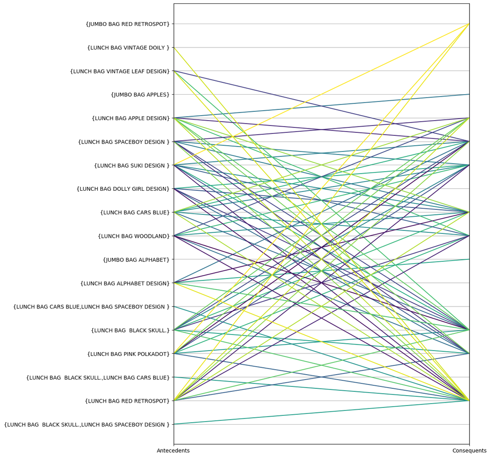
Finally, another cool way to visualize your association rules is to use a parallel coordinates plot. This plot style is one of the pandas plotting options. This plot shows the relationships among your items as they co-occur in the antecedents and consequents of your association rules.
plt.figure(figsize=(10,15)) # set plot size

parallel = pd.plotting.parallel_coordinates(
                                 lunch_bag_rules[["Antecedents", "Consequents", "Rule"]],
                                 "Rule", # set column containing rule number
                                 colormap='viridis', # set color palette
                                 sort_labels=True)

plt.gca().legend_.remove() # remove legend blocking plot
Parallel coordinates plots can become very hard to interpret if there are too many lines, so use this plot style with caution. Still, it can be an interesting way to view how your items interrelate — which items have a high likelihood of leading to many other items, and which items are frequent consequents for others.
The colors of the lines are assigned in the order that pandas encounters the items, but you can do more color-coding and clustering among the items to show categories, or you can sort the dataframe in advance to show items in a specific order. This example shows more of the customization that’s possible.
These two posts should give you the basics for starting out with market basket analysis. Find out which items customers drop into those shopping carts together, and make the most of the intriguing patterns in your data.

Senior Data Science Journalist
Susan Currie Sivek, Ph.D., is the data science journalist for the Alteryx Community. She explores data science concepts with a global audience through blog posts and the Data Science Mixer podcast. Her background in academia and social science informs her approach to investigating data and communicating complex ideas — with a dash of creativity from her training in journalism. Susan also loves getting outdoors with her dog and relaxing with some good science fiction. Twitter: @susansivek
Susan Currie Sivek, Ph.D., is the data science journalist for the Alteryx Community. She explores data science concepts with a global audience through blog posts and the Data Science Mixer podcast. Her background in academia and social science informs her approach to investigating data and communicating complex ideas — with a dash of creativity from her training in journalism. Susan also loves getting outdoors with her dog and relaxing with some good science fiction. Twitter: @susansivek
You must be a registered user to add a comment. If you've already registered, sign in. Otherwise, register and sign in.
