Data Science
Machine learning & data science for beginners and experts alike.- Community
- :
- Community
- :
- Learn
- :
- Blogs
- :
- Data Science
- :
- Inside the Model Construction Zone with Automatic ...
- Subscribe to RSS Feed
- Mark as New
- Mark as Read
- Bookmark
- Subscribe
- Printer Friendly Page
- Notify Moderator
Featured on the Data Science Portal.
“Your model is under construction.” What an exciting phrase!
If you’re reading this, you, too, probably find that moment pretty exciting: You’ve gotten your data ready to roll, and you’ve launched your automatic modeling process with the Intelligence Suite, without writing any code and with just a few tools on your Designer canvas. You’re just seconds away from seeing the results and moving your machine learning project forward.
(Wait, you have heard about this, right? The one-click automatic modeling mode in the Intelligence Suite? If not, check this out to learn when you might use it and to see the essentials, then come back here to read the details.)
What’s really awesome about this automatic mode is that while it’s an easy, streamlined process, you can still see how decisions were made about model selection. Information about those decisions is readily available and shareable with others, too. As recently discussed on the blog, this ability to interpret your model and explain it to others is important. Yet even though automated modeling is quick and simple, you can still see how your model has been constructed, and you can continue customizing it after its initial setup.
Automatic but not Opaque
The Intelligence Suite has made creating predictive models incredibly easy, even if you’ve never created a model before. You can choose between the “step-by-step” approach that asks for your input along the way, or the “automatic” approach that just gets the job done for you.
Let’s dig into the automatic process and see where and how it offers insights into the model’s construction. (If you’d like a walkthrough of the step-by-step approach, check out this blog post.)
For this workflow, I’m going to use the good old iris dataset, with almost no prep required. I drop the Assisted Modeling tool on the canvas, connect it to the data, and hit run to send the data into Assisted Modeling. Once it’s been introduced to my data, I’m ready to start the process.
There’s just one piece of information it needs to get started: which variable in the dataset I want to predict. In this case, it’s the iris species. (This is a classification task, but Assisted Modeling can also handle regression, of course.)
I’m going to take the easiest route possible to build this model and let Assisted Modeling take the wheel in automatic mode.
I then get that exciting notification that my model is under construction, and after I wait (im)patiently for a few seconds, the next steps display the details of the model that's been selected as my best option.
This tool doesn’t just plop a model into my workflow and expect me to naively accept its construction and evaluation. The model’s workings are visible in a few important ways.
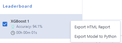
On the first screen shown, I find out which algorithm has been chosen — XGBoost, in this case — and how it has performed, according to a few measures. Its overall accuracy is 94.1%, as is its balanced accuracy, which means the model is generally performing well across classes.
Depending on the kind of task you’re carrying out — classification or regression — you’ll see other performance measures provided here. Definitions are provided in the right sidebar on each screen, and you can refer to this handy Machine Learning Glossary to review them anytime.
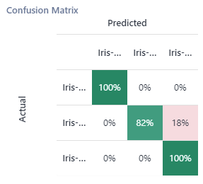
Things are looking pretty good, but it’s worth checking out the results under the other tabs, too. I can see overall accuracy and a confusion matrix to help me identify where the model’s predictions may have gone awry.
It’s good to know which classes (again, iris species here) the model has tended to confuse. Hovering over the column names in the matrix shows me the full field names. It looks like the model has a little trouble distinguishing between Iris versicolor and Iris virginica. If this distinction was especially important to my planned applications of this model, I might want to delve more deeply into why those two species are hard for the model to tell apart, given these data, and develop ways to help improve the model’s predictions for those two species.
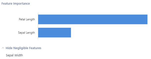
The Interpretation tab tells me how the various features in my dataset played a role (or not) in the model. As the sidebar information in this screen says, these features’ importance is determined according to a measure called permutation importance. That’s calculated by shuffling the values for that feature, which temporarily disrupts any relationship the feature may have with other features; then the effect of the shuffling on the model’s performance is assessed. If there’s a lot of change in performance, then the model is relying on that feature to perform well, so that feature is more important to the model. If there’s not much change in performance, the feature is less important.
Here I can see that one feature, Petal Length, was most important in helping the model make accurate predictions, and the feature Sepal Width was of only minor importance.
On the configuration screen, I can view the data types assigned by automatic modeling and see which features had missing values (if any, and if there were some, how they were handled). I can also get more insight into the features used in the model.
Here I learn that the Petal Width feature was dropped entirely. This is likely because the Petal Width and Petal Length variables are collinear (in fact, the Association Analysis Tool shows me that the Pearson correlation between the two is 0.96, a near-perfect correlation). Including both features in the model would be redundant, adding more complexity to the model than necessary and possibly causing the model to generalize poorly to new data. In the case of a regression model, collinear features can especially negatively affect a model’s performance. But we don’t need to worry, as automatic modeling has taken care of this issue for us, curating the right set of features for this model.
Accessing and Sharing Model Information
Now that we’ve seen what went into the model, we’ve come a long way to understanding how it is making its decisions, even though we haven’t hand-coded a thing. With an XGBoost model, we’d have to take some additional steps to gain deeper understanding of the model’s predictive process. But as far as interpreting and explaining the model goes, this is a great start.
At this point, it just takes one more click to add the model to your workflow. But wait: Before you leave these menus, there’s a super cool feature that can help you share and build upon the information about your model’s workings that you’ve just reviewed.
If you click on the vertical ellipsis menu icon next to the model at top left, you get options to export an HTML report or to export to Python. The HTML report neatly displays most the information we’ve just reviewed about the model and is a shareable document that others can also use to learn about the model. The option to export to Python adds a Python Tool to your workflow that contains the code behind your model, as well as explanatory text that describes in general terms what the code in each cell of the notebook does. And, of course, your workflow will now contain a pipeline of tools from the Machine Learning palette, some with additional configuration possibilities if you want to continue customizing your model.
Finishing Construction with a Guided Tour
Sometimes buildings under construction are obscured behind a temporary wall or curtain, which for me only causes intense curiosity: What’s going on back there? What’s it going to look like when it’s done?
It’s just like that “Your model is under construction” moment. After hitting that button to start the automatic mode, I’m standing outside the building (for only a few seconds), waiting for the finished product to be revealed. But this process is even better, because when construction is complete, I get a guided tour of how it all came together and can even continue to tinker with what's been built for me.
Want to give this a try? Assisted Modeling, with both step-by-step and automatic modes, is part of the Alteryx Intelligence Suite. Read more about it and find out about the Starter Kit that introduces its capabilities in this blog post.
Want to learn more about how these tools developed? Check out this week’s Alter Everything podcast episode! @MaxKanter, vice president for data science engineering at Alteryx, and Clara Duffy, software engineering intern first at Feature Labs and now again at the Alteryx Innovation Labs, talk about this work in a conversation with Community's own @NeilR:
And, if you haven’t seen it yet, be sure to visit the Alteryx Data Science Portal and subscribe to receive our blog posts and podcasts in your inbox.

Senior Data Science Journalist
Susan Currie Sivek, Ph.D., is the data science journalist for the Alteryx Community. She explores data science concepts with a global audience through blog posts and the Data Science Mixer podcast. Her background in academia and social science informs her approach to investigating data and communicating complex ideas — with a dash of creativity from her training in journalism. Susan also loves getting outdoors with her dog and relaxing with some good science fiction. Twitter: @susansivek
Susan Currie Sivek, Ph.D., is the data science journalist for the Alteryx Community. She explores data science concepts with a global audience through blog posts and the Data Science Mixer podcast. Her background in academia and social science informs her approach to investigating data and communicating complex ideas — with a dash of creativity from her training in journalism. Susan also loves getting outdoors with her dog and relaxing with some good science fiction. Twitter: @susansivek
You must be a registered user to add a comment. If you've already registered, sign in. Otherwise, register and sign in.


