You could make a data visualization that you think is the most beautiful thing ever -- but it could be mostly useless for many viewers.
This week’s Alter Everything podcast episode features a fascinating discussion of accessibility and universal design with Steve Tomasak, Jeremy Likes and Kyle Waterworth here at Alteryx. They share personal experiences and offer insights into how assistive technologies make software development and data analytics accessible for people with disabilities.
Something many readers of this blog probably do just about every day is create data visualizations of different types. Yet we might not always stop to think about whether people with different disabilities will find those visualizations accessible and useful.
To learn more about this important issue, I sought out some resources from experts on the topic to share with you here. They’re well worth your time to read in full. I’ll also highlight some ways you can use these authors’ top tips in your own work.
Recommended read 1: “An intro to designing accessible data visualizations,” by developer and designer Sarah L. Fossheim
Top tip: “When visualizing any data, it's important to use labels and legends. Try to add the labels in context, if possible. … seeing the values written out also means that: users don't have to guess, hover or do calculations to get the exact numbers [and] don't have to fully grasp the visuals to understand what's going on.”
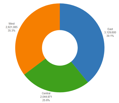
Use it: In Designer’s Interactive Chart tool, you can add labels to pieces of your chart to display actual values and/or labels for the individual bars in a bar chart or pieces of a pie chart.
For example, in the chart below, I’ve added region labels to the pieces of the pie chart and hidden the legend, as it becomes redundant. Now the region information is immediately available instead of asking the viewer to look back and forth to see what the colors mean. Even if someone can’t perceive the chart, they can still obtain the numerical information.

Recommended read 2: “Accessible Data Viz is Better Data Viz,” guest post by Amy Cesal on the blog of Cole Nussbaumer Knaflic, founder and CEO of Storytelling with Data
Top tip: “White space is your friend. When information is too densely packed, the graphic can feel overwhelming and unreadable. It can be helpful to leave a gap between sections of a chart. Judicious use of white space increases the legibility by helping to demarcate and distinguish between different sections without relying only on color. This can also supplement accessible color choices by helping users distinguish the difference between colors that identify separate sections.”
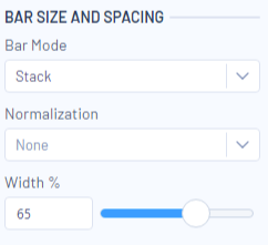
Use it: White space isn’t wasted space if it helps your viewer gain value from your visualization! One way you can do this in Designer is to add more white space to a bar chart that might become more readable with a little more empty area inside it.
The default is that each bar will be at 80% of its potential width; increasing that number to 100% pushes the bars right up against each other, with zero gap between them. Decreasing the bar width could make some charts a bit more readable. The chart below has bars set at 65% width.

 This chart also uses a subtitle that summarizes its creator’s main takeaway message, which helps people quickly gain key information from the visualization.
It’s always tempting to pack a few more details into your visualization or report, but white space and simplicity make your information more accessible.
Recommended Read 3: “Five Ways to Design For Red-Green Colour-Blindness,” Andy Kirk
Top tip: “Colour connotations are long-established and widely used, especially in financial or corporate contexts, but whilst they provide a certain immediacy in their meaning for many viewers, around 4.5% of the population are colour-blind (8% of men) with the red-green colour deficiency deuteranopia being the most common form. This means a significant proportion of viewers may not be able to perceive important such visual encodings.”
Use it: Kirk’s article provides interesting insight into the cultural significance of certain color combinations. For example, the red-yellow-green colors of traffic lights suggest stop-caution-go meanings for people from some cultures.
But even though those meanings seem useful to apply to our data visualizations, we might inadvertently prevent some people from experiencing the visualization. We have to use caution in our color choices to make sure they are clearly visible to people with the various forms of color blindness. More importantly, be sure that color alone isn’t the only way you are communicating meaning in your data visualization.
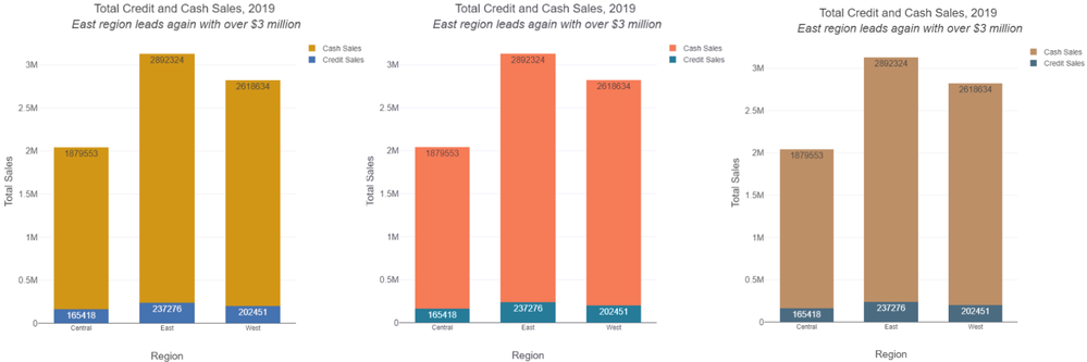
If you’ve opted for your own custom palette or your company colors instead of the provided palettes, you can check your finished graphics’ ease of interpretation using an online simulator like Coblis.

Three views of the same chart shown in the section above, simulated for different types of colorblindness by Coblis.
There is far more to know about this topic, and I definitely recommend checking out all of these articles in full … as well as the podcast episode, of course! Give it a listen below.