Maveryx Success Stories
Learn how Alteryx customers transform their organizations using data and analytics.STORIES WANTED
Showcase your achievements in the Maveryx Community by submitting a Success Story now!
SUBMISSION INSTRUCTIONS- Community
- :
- Community
- :
- Learn
- :
- Success Stories
- :
- Automatic Charting of Weekly Covid-19 Hunger Data ...
Automatic Charting of Weekly Covid-19 Hunger Data from the Census Bureau
- Subscribe to RSS Feed
- Mark as New
- Mark as Read
- Bookmark
- Subscribe
- Printer Friendly Page
- Notify Moderator

The U.S. Census is publishing real-time data on the impact of Covid-19, unlike their core products that lag a year or more behind their collection date. Food banks, United Ways, governments and foundations can tap this unusually rapid data flow to plan and execute aid programs to counter the pandemic. The following analysis focused on people who had sufficient food prior to pandemic, but were tipped into hunger after it struck, as well as hunger impacts by race and age.
On May 20, 2020, the Census Bureau began publishing more than 20 Excel-format workbooks on Covid-19’s impact on employment, hunger, health, education, and housing. As of this writing, 11 weeks are available, enabling charting of data with trend lines over time. This is hugely useful to understanding the changing levels of pandemic-induced disruptions.
While regular Census tables usually have column labels for population counts in each field and rows labeled with geographic units (states, census tracts, or census blocks), in the Covid-19 case each geographic unit is a separate sheet within the workbook. There are 51 sheets for states and the District of Columbia, another 15 sheets for the largest Metropolitan Statistical Areas (MSAs), and one sheet for the U.S. as a whole. The sheets have columns with the population counts, and the rows describe various characteristics being counted. As one reads down the rows, different situations are addressed, and some row labels such as “Did Not Respond” will show up multiple times. The sheets have to be parsed very precisely to avoid this issue.
To demonstrate the power of Alteryx to quickly ingest each week’s new batch of data and incorporate it into the analytical framework, Precision Analytics Group created two types of workflows and tested them on the 15 MSAs. One calculated the absolute number of people impacted by hunger to quantify the need, and the other showed the percentage of hungry people by race and by age to help guide where aid should be targeted.

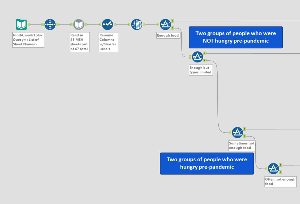
Chained Filters looking for specific wording of a row label plucked out just the rows desired, as shown below:
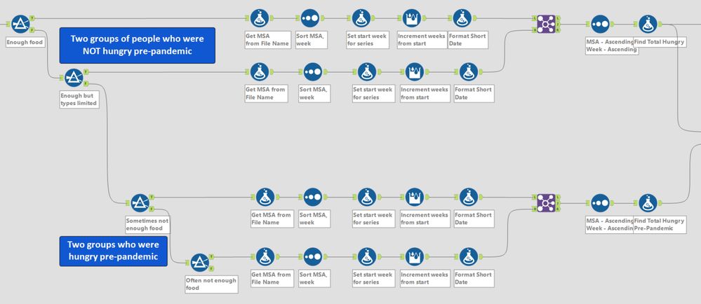
People who reported that pre-pandemic they had “Enough Food” or “Enough but not the types desired” were combined into a group for “not hungry before the pandemic, but hungry now.” People who were hungry prior to the pandemic – “Sometimes” or “Often” – were combined into a second group:
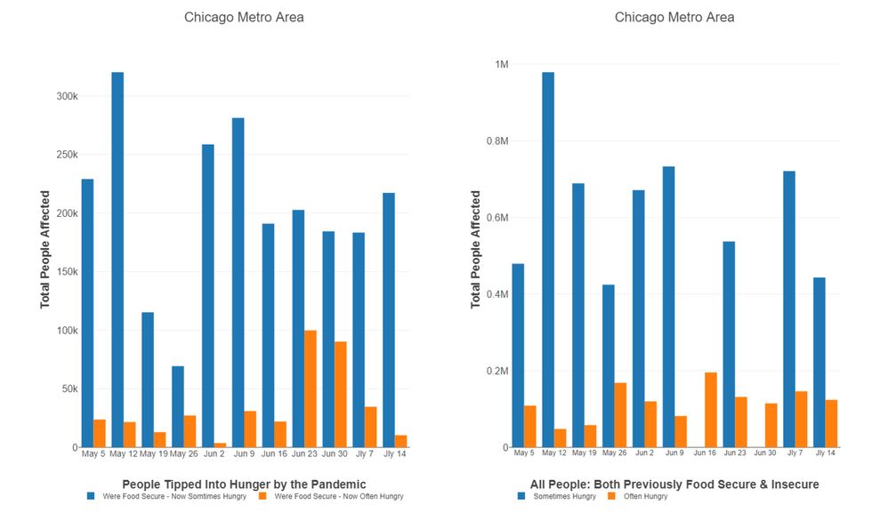
The Interactive charts for the top row (formerly food secure) had two layers, one for people “sometimes hungry” and another for “often hungry.” The bars revealed the total number of people hungry in each MSA, as they rose and fell over time:

The data for each city appears pretty noisy, with very large changes from week to week:
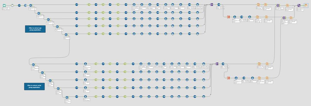
The second workflow “Hunger by age and race.yxmd” also uses a dynamic input, but based on a file of sheet names extracted earlier.
Unlike the previous workflow that broke apart the file name using substring functions in a Formula tool, this one extracts the week number and the MSA name primarily through a series of text-to-column tools (Alteryx often has multiple ways to achieve the same result). Each text-to-column exploits a different delimiter, such as a backslash or the three pipes that precede an Excel worksheet name:

After creating the week numbers and MSAs, the workflow then adds a field that matches week numbers with actual calendar dates for easier understanding by end users.
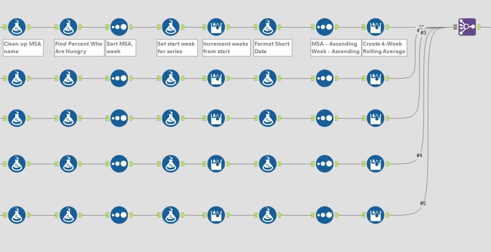
This workflow also creates a four-week rolling average for the percent hungry among age groups and racial categories. Each report’s data is so chaotic from week-to-week that discerning trends or even basic relationships was nearly impossible without the rolling average:
Then the joined age data was input to the Interactive Chart tool, in Batch mode so that each MSA had its own chart. Each race or age group had its own Layer for the line charts. A Summarize tool created an average for all 15 MSAs. A Formula tool put “Composite of 15 MSAs” into the column for MSA name; with all the other charts, the MSA names were extracted from the tables’ file names.
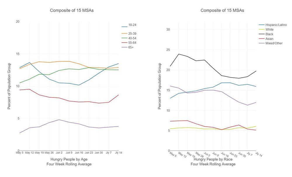
The final steps joined the age and race line charts for side-by-side views for each MSA city, as well as side-by-side charts for the composite of all MSAs:

In almost all cities, the 55-64 and 65+ age groups actually were the least hungry; younger people had greater needs. Black and Hispanic/Latino populations were the most hungry among racial categories. Here’s what the composite shows:
Describe the benefits you have achieved
The two workflows can ingest new weekly data without changing any portions. New workbooks that are dropped into the directory are automatically included in the output. Leaders in charge of raising funds for food assistance, income security and other needs will have the ability to rapidly show funders the charted needs as soon as new workbooks are issued every Wednesday.
-
Adobe
2 -
Alteryx Connect
5 -
Alteryx Designer
202 -
Alteryx for Good
1 -
Alteryx Promote
2 -
Alteryx Server
66 -
Alteryx using Alteryx
29 -
Americas
158 -
Analyst
108 -
Analytics Leader
54 -
Asia Pacific
29 -
AWS
9 -
BI + Analytics + Data Science
100 -
Business Leader
37 -
C-Leader
18 -
Data Prep + Analytics
230 -
Data Science + Machine Learning
113 -
Data Scientist
14 -
Department: Other
14 -
Education
18 -
Energy + Utilities
5 -
Europe + Middle East + Africa
58 -
Experian
2 -
finance
29 -
Financial Services
33 -
Healthcare + Insurance
21 -
Human Resources
19 -
Information Technology
25 -
IT
31 -
Life Sciences + Pharmaceuticals
3 -
Manufacturing
20 -
Marketing
16 -
Media + Entertainment
12 -
Microsoft
52 -
Operations
38 -
Other
10 -
Process Automation
59 -
Professional Services
69 -
Public Sector
15 -
Qlik
1 -
Retail + CPG
32 -
Sales and Service
24 -
Salesforce
9 -
SAP
11 -
Snowflake
6 -
Tableau
71 -
Tech Partner: Other
86 -
Technology
34 -
Telecommunications
5 -
Teradata
5 -
Thomson Reuters
1 -
Transportation + Logistics
25 -
Travel + Hospitality
4 -
UiPath
1
- « Previous
- Next »
