Alteryx Designer Desktop Ideas
Share your Designer Desktop product ideas - we're listening!Submitting an Idea?
Be sure to review our Idea Submission Guidelines for more information!
Submission Guidelines- Community
- :
- Community
- :
- Participate
- :
- Ideas
- :
- Designer Desktop
- :
- Charting/Insight Enhancements
- Subscribe to RSS Feed
- Mark as New
- Mark as Read
- Bookmark
- Subscribe
- Printer Friendly Page
- Notify Moderator
Charting/Insight Enhancements
- Subscribe to RSS Feed
- Mark as New
- Mark as Read
- Bookmark
- Subscribe
- Printer Friendly Page
- Notify Moderator
Hello Product Management,
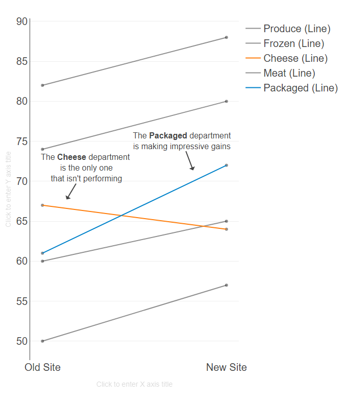
I'm trying to emulate a graph from the book, Effective Data Visualization by Dr. Stephanie Evergreen. Here's what I have so far:
This was a little bit of work to create and while it isn't what I exactly had hoped for, it does approximate my attempt. Ideally, I would do the following to complete the exercise:
- Have a Y-Axis (none) line on for both Old/New Sites (dual-axis)
- Replace the Y-Axis number with the Label for the departments
- Remove the (line) from the label
As observations, in order to add carriage returns to NOTES, i had to use HTML tags <br>. The settings for points and lines required me to do lots of configuration. Maybe a format painter would help to copy the format from one set of point/lines to the next. Once I completed a chart/insight it would be "nice" to be able to copy and configure the other. If you have an insight and wish to create a chart, you have to reconfigure the new element from scratch.
I do have an error in the creation of the chart that says, "Error parsing configuration." I have no idea what error exists. I submitted a ticket on that issue.
I haven't created this chart via Excel, but the textbook shows you how to create the result in Excel. The graph is easy for me to see and to understand. I like it and think that it could be a valuable way to demonstrate the potential for Alteryx visualizations.
Cheers,
Mark
You must be a registered user to add a comment. If you've already registered, sign in. Otherwise, register and sign in.
- New Idea 205
- Accepting Votes 1,838
- Comments Requested 25
- Under Review 149
- Accepted 55
- Ongoing 7
- Coming Soon 8
- Implemented 473
- Not Planned 123
- Revisit 68
- Partner Dependent 4
- Inactive 674
-
Admin Settings
19 -
AMP Engine
27 -
API
11 -
API SDK
217 -
Category Address
13 -
Category Apps
111 -
Category Behavior Analysis
5 -
Category Calgary
21 -
Category Connectors
239 -
Category Data Investigation
75 -
Category Demographic Analysis
2 -
Category Developer
206 -
Category Documentation
77 -
Category In Database
212 -
Category Input Output
631 -
Category Interface
236 -
Category Join
101 -
Category Machine Learning
3 -
Category Macros
153 -
Category Parse
74 -
Category Predictive
76 -
Category Preparation
384 -
Category Prescriptive
1 -
Category Reporting
198 -
Category Spatial
80 -
Category Text Mining
23 -
Category Time Series
22 -
Category Transform
87 -
Configuration
1 -
Data Connectors
948 -
Desktop Experience
1,491 -
Documentation
64 -
Engine
121 -
Enhancement
274 -
Feature Request
212 -
General
307 -
General Suggestion
4 -
Insights Dataset
2 -
Installation
24 -
Licenses and Activation
15 -
Licensing
10 -
Localization
8 -
Location Intelligence
79 -
Machine Learning
13 -
New Request
175 -
New Tool
32 -
Permissions
1 -
Runtime
28 -
Scheduler
21 -
SDK
10 -
Setup & Configuration
58 -
Tool Improvement
210 -
User Experience Design
165 -
User Settings
73 -
UX
220 -
XML
7
- « Previous
- Next »
