Alteryx Designer Desktop Knowledge Base
Definitive answers from Designer Desktop experts.- Community
- :
- Community
- :
- Support
- :
- Knowledge
- :
- Designer Desktop
- :
- Alteryx for Excel Users: Create a bar chart in a c...
Alteryx for Excel Users: Create a bar chart in a column
- Subscribe to RSS Feed
- Mark as New
- Mark as Read
- Bookmark
- Subscribe
- Printer Friendly Page
- Notify Moderator
11-15-2016 02:25 PM - edited 08-03-2021 04:07 PM
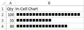
There's a nifty little trick in Excel using the =REPT function that creates an in-cell bar chart. Let's start with a simple set of numerical data:
Using the expression:
produces an in-cell chart that looks like this if you change the B2:B4 to a Wingdings font:
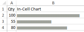
I divided the numerical data in A2:A4 by 5 to avoid getting a chart that was too big. Alternatively, we can use the expression:
And used an 8-pt Arial font to produce a bar chart without dividing Qty.
Neat-o! I wonder how I can do this using Alteryx.
To make a chart that looks like the one with the Wingdings font above, we'll have to refer to a unicode character table. We can't change the font to Wingdings, so we'll have to find the '■' character in the unicode character table. We have to scroll WAY DOWN to find it (it's Unicode number U+25A0).
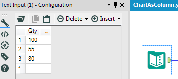
Let's bring in our data using a Text Input Tool:
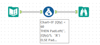
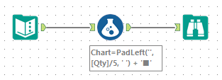
and connect a Formula Tool followed by a Browse:
Where the formula expression uses the function PADLEFT:
Our result looks like the one from Excel:
Of course, we didn't have use a Unicode character. We could have used '|', similar the Excel example using the 8-pt Arial font.
Let's elaborate on this a bit. In our example, we would like to have a quick visual that stands out if [Qty] < 60. In the Formula tool expression, we'll use a conditional statement so a quantity less than 60 will appear as '▣' (U+25A3):
The results look like this:
Let's take one final we could create a visual, one where the chart only has a single '■' positioned relatively. In other words, '■' for a quantity of 100 would appear further to the right than the row with a quantity of 55.
This gives a chart column that looks like this:
- Mark as Read
- Mark as New
- Bookmark
- Permalink
- Notify Moderator
How can i create a bar chart with a multi row&column excel data?
Thank you.
-
2018.3
17 -
2018.4
13 -
2019.1
18 -
2019.2
7 -
2019.3
9 -
2019.4
13 -
2020.1
22 -
2020.2
30 -
2020.3
29 -
2020.4
35 -
2021.2
52 -
2021.3
25 -
2021.4
38 -
2022.1
33 -
Alteryx Designer
9 -
Alteryx Gallery
1 -
Alteryx Server
3 -
API
29 -
Apps
40 -
AWS
11 -
Computer Vision
6 -
Configuration
108 -
Connector
136 -
Connectors
1 -
Data Investigation
14 -
Database Connection
196 -
Date Time
30 -
Designer
204 -
Desktop Automation
22 -
Developer
72 -
Documentation
27 -
Dynamic Processing
31 -
Dynamics CRM
5 -
Error
267 -
Excel
52 -
Expression
40 -
FIPS Designer
1 -
FIPS Licensing
1 -
FIPS Supportability
1 -
FTP
4 -
Fuzzy Match
6 -
Gallery Data Connections
5 -
Google
20 -
In-DB
71 -
Input
185 -
Installation
55 -
Interface
25 -
Join
25 -
Licensing
22 -
Logs
4 -
Machine Learning
4 -
Macros
93 -
Oracle
38 -
Output
110 -
Parse
23 -
Power BI
16 -
Predictive
63 -
Preparation
59 -
Prescriptive
6 -
Python
68 -
R
39 -
RegEx
14 -
Reporting
53 -
Run Command
24 -
Salesforce
25 -
Setup & Installation
1 -
Sharepoint
17 -
Spatial
53 -
SQL
48 -
Tableau
25 -
Text Mining
2 -
Tips + Tricks
94 -
Transformation
15 -
Troubleshooting
3 -
Visualytics
1
- « Previous
- Next »


