Alteryx Designer Desktop Ideas
Share your Designer Desktop product ideas - we're listening!Submitting an Idea?
Be sure to review our Idea Submission Guidelines for more information!
Submission Guidelines- Community
- :
- Community
- :
- Participate
- :
- Ideas
- :
- Designer Desktop
Featured Ideas
Hello,
After used the new "Image Recognition Tool" a few days, I think you could improve it :
> by adding the dimensional constraints in front of each of the pre-trained models,
> by adding a true tool to divide the training data correctly (in order to have an equivalent number of images for each of the labels)
> at least, allow the tool to use black & white images (I wanted to test it on the MNIST, but the tool tells me that it necessarily needs RGB images) ?
Question : do you in the future allow the user to choose between CPU or GPU usage ?
In any case, thank you again for this new tool, it is certainly perfectible, but very simple to use, and I sincerely think that it will allow a greater number of people to understand the many use cases made possible thanks to image recognition.
Thank you again
Kévin VANCAPPEL (France ;-))
Thank you again.
Kévin VANCAPPEL
Hi,
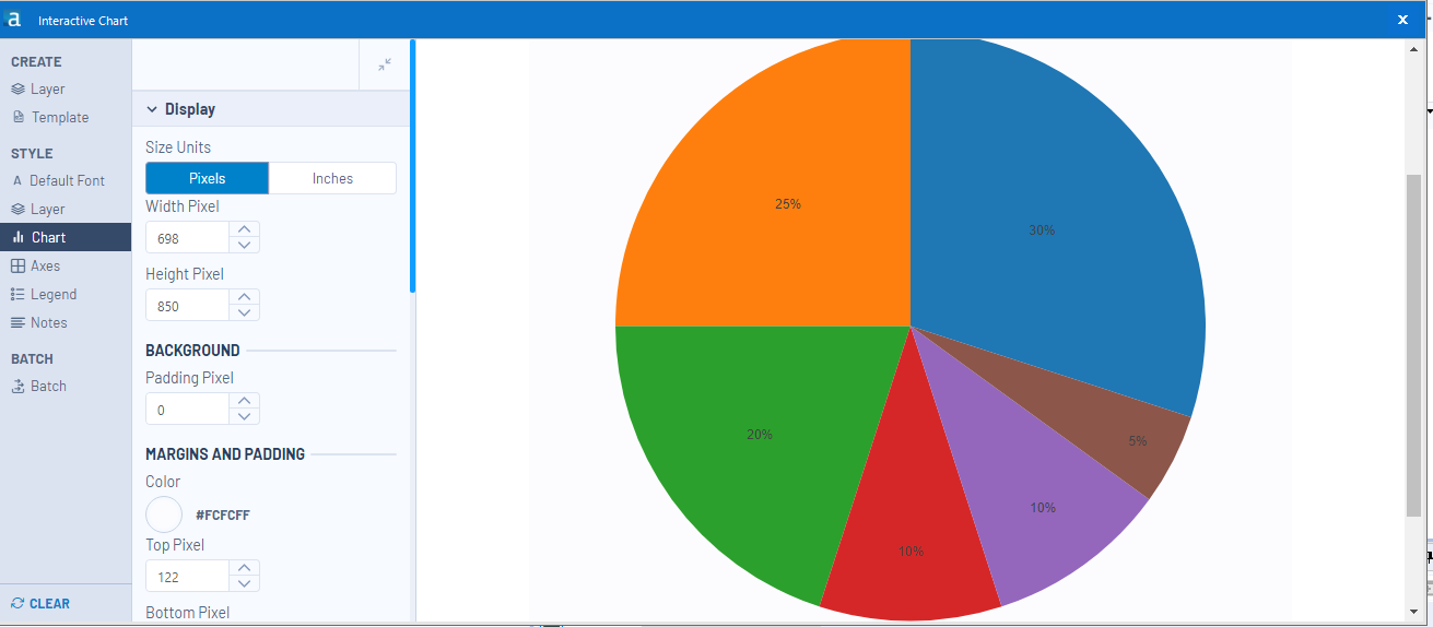
I am using the Interactive Chart to create a line-chart, but I would like to have values of (X,Y AND Trace Name)
I cannot display it for the différent regions, when we move the mouse over the curve the parameter is applied only for one region.
FI: it works if i modify the xml code by adding the following code to each region:
<value>
<hoverinfo>x+y+name</hoverinfo>
</value>
Is it possible to add it directly in interactive chart ?
Thank you.
-
Category Reporting
-
Desktop Experience
I would like to be able to have the Map Tool to change the Reference Base Map to Tom Tom CA if there is a Country column in the incoming data stream that reads "CAN". Or change the Expand Extent from the default 10(%) to the number that's in a column called "Extent".
Right now I can only do it using the Macro interface tool, but I still have to make my selection after I select which data point(s) I'm using.
I want it to generate specific-format maps based on the input data I provide, so it could run automatically.
I guess, aside from the Spatial Field, Grouping Field, Thematic Field, and Label Fields, I'd love a Configurations Field(s).
-
Category Interface
-
Category Macros
-
Category Reporting
-
Desktop Experience
For example, allowing the letters in front of the column titles to be formatted differently to make them stand out on a report.
-
Category Macros
-
Category Reporting
-
Category Transform
-
Desktop Experience
I would love to see an optional output anker for the render tool.
This would allow us to push a pdf/png into the python module. We could then build twitter/social media 'add ons' using python and fully automize the process.
-
Category Reporting
-
Desktop Experience
Hi,
It would be very useful for me If I could consolidate in the same output two different inputs: 1- the whole output flow; 2- The summarize from the output. That would save some time from doing pivot table analysis for instance.
Thanks
-
Category Input Output
-
Category Reporting
-
Data Connectors
-
Desktop Experience
I like the concept of the Interactive charts tool but it seems overtly cumbersome to use when you are trying to perform simple changes to a line graph. The chart tool was much easier. I like the direction the interactive tool is going but I should not have to edit the tools xml to display point values on a line graph.
-
Category Reporting
-
Desktop Experience
I have a process that sends out about 1,500 emails. Every once in a while, it will get stuck at some Percentage and I will have to eventually cancel the workflow, figure out how many emails were sent, and then skip that many emails in order to avoid sending duplicate emails. The process of figuring out how many were sent is currently taking the % of the tool at cancellation minus 50%(since that is where it starts), Multiplying it by 2, and then multiplying that % by the number of lines to get the approximate line of data where it froze up, and then reaching out to individuals to see if they received the email to narrow down exactly where the error occurred.
Example: 60% - 50%= 10% * 2 = 20% * 1249 = 249.8.
This has been pretty accurate in the past, but obviously is not ideal. Is there no way for it to show us how many were sent even if we cancelled the workflow mid processing of the tool?
-
Category Reporting
-
Desktop Experience
-
General
-
Tool Improvement
Our company is loving the Insight's Tool, but I am constantly being asked by users if they can export the data behind the graphs that is feeding in. For example we have an inventory dashboard for vehicles that starts at a Corporate level, but is drillable down to a "Regional" and then even more focused "Managed Area" level. Once users get down to the "Managed Area" level they want to export the line level data that is feeding into the Insight chart to actually view, work, and action the data at a vehicle level.
Essentially an option to export the data feeding into the graphs.
-
Category Reporting
-
Desktop Experience
-
Category Reporting
-
Desktop Experience
Hi,
I am sure that I can't be the only person that would be interested in an output tool that allows categorical fields on both axes. THis would allow you to visualise the following example and I would suggest that this was either similar to the heatmap with boxes or the colour / size of the entry was determined by a third numerical value - such as 'Confidence' from the table below. THere might be ways to extend the idea as well as having a fourth parameter that puts text in the box or another number but it would be useful and not too hard I am sure.
LHS | RHS | Support | Confidence | Lift | NA |
{Carrots Winter} | {Onion} | 5.01E-02 | 0.707070707 | 1.298568507 | 210 |
{Onion} | {Carrots Winter} | 5.01E-02 | 9.20E-02 | 1.298568507 | 210 |
{Carrots} | {Onion} | 4.39E-02 | 0.713178295 | 1.309785378 | 184 |
{Onion} | {Carrots} | 4.39E-02 | 8.06E-02 | 1.309785378 | 184 |
{Peas} | {Onion} | 3.20E-02 | 0.428115016 | 0.786253301 | 134 |
{Onion} | {Peas} | 3.20E-02 | 5.87E-02 | 0.786253301 | 134 |
{Bean} | {Onion} | 2.20E-02 | 0.372469636 | 0.68405795 | 92 |
{Carrots Nantaise} | {Onion} | 2.08E-02 | 0.483333333 | 0.88766433 | 87 |
Many thanks in advance for considering this,
Peter
-
Category Input Output
-
Category Reporting
-
Data Connectors
-
Desktop Experience
The chart tool is really nice to create quick graphics efficiently, especially when using a batch macro, but the biggest problem I have with it is the inability to replace the legend icon (the squiggle line) with just a square or circle to represent the color of the line. The squiggly line is confusing and I think the legend would look crisper with a solid square, or circle, or even a customized icon!
Thank You!!!!
-
Category Preparation
-
Category Reporting
-
Desktop Experience
Recently, I posted one problem regarding on merging a column with same value using the table tool. I do have a hard time to make a solution until @HenrietteH helped on how to do it. What she showed was helped me a lot to do what I want in my module, however it would be more easier if we are going to add this feature on the table tool itself.
Thank you
-
Category Reporting
-
Desktop Experience
Hi,
Would it be possible to simplify some of the workaround processes that are needed for generating Chart Titles when using grouping by adding the potential for using the grouping variable in the Title string so that accurate descriptions can be generated. At the moment it requires the use of a Report Text tool which is not as neat if considering the output that is necessarily generated by grouping.
Only a thought,
Peter
-
Category Reporting
-
Desktop Experience
Hi,
As it is so important to be able to calculate and present time related concepts in modern businesses, it is not possible to have a better output choice? I have seen the reporting chart tool, I have looked at the TS Plot tool and even noticed that the Laboratory Charting tool has disappeared. So can you please provide an output tool that provides some focused functionality on this lacking part?
Kind regards,
Peter
-
Category Reporting
-
Category Time Series
-
Desktop Experience
Currently, there is a setting in the table tool to control the decimal places of all values by column. This is not only unnecessary, but it actually screws up any data that comes in where the ROWS may have different number of decimals. The only way around it is to convert everything into strings, which is annoying. Please just get rid of that column setting! Or enable the same setting inside the row rules.
-
Category Reporting
-
Desktop Experience
I keep making the same changes to the table tool rules, using the same formulas when I build new reports. For example, Row Rule 1: Font, bold; Background Color, green; Row Rule 2; Font, bold; Background Color, blue; Row Rule 3; Font, bold; Background Color, yellow. Each is based on a formula: IsEmpty([Column Name]). I do this over and over and over again. The only thing that changes is the column name. It would be nice to have the Row Style Rules saved so they can be browsed to" or inserted.
Still waiting for the Default Table Settings to include "CENTER" in the header tab.
-
Category Reporting
-
Desktop Experience
Hi,
As per our project, we need to publish the image into a PDF file which will be downloaded from web URL. when we download the image from web URL that will be saved as TIF format in our local machine. This TIF format is not being supported by Alteryx.
The tool needs an enhancement (to support TIFF) which can be used for converting tiff format to other format OR directly tiff image should be usable in the report.
Thanks,
Raju Miyapuram
-
Category Reporting
-
Desktop Experience
Alteryx crashed when I attempted to use a custom OTF font in Report Text. I thought it was supported because font options was not greyed out and preview window looked correct and I was able to resize. I clicked 'Apply' and Alteryx popup window appeared saying "only TTF font is supported". Then Alteryx crashed.
Please add OTF font support. Tableau and other packages already support it.
-
Category Reporting
-
Desktop Experience
- New Idea 208
- Accepting Votes 1,837
- Comments Requested 25
- Under Review 150
- Accepted 55
- Ongoing 7
- Coming Soon 8
- Implemented 473
- Not Planned 123
- Revisit 68
- Partner Dependent 4
- Inactive 674
-
Admin Settings
19 -
AMP Engine
27 -
API
11 -
API SDK
217 -
Category Address
13 -
Category Apps
111 -
Category Behavior Analysis
5 -
Category Calgary
21 -
Category Connectors
239 -
Category Data Investigation
75 -
Category Demographic Analysis
2 -
Category Developer
206 -
Category Documentation
77 -
Category In Database
212 -
Category Input Output
632 -
Category Interface
236 -
Category Join
101 -
Category Machine Learning
3 -
Category Macros
153 -
Category Parse
75 -
Category Predictive
76 -
Category Preparation
384 -
Category Prescriptive
1 -
Category Reporting
198 -
Category Spatial
80 -
Category Text Mining
23 -
Category Time Series
22 -
Category Transform
87 -
Configuration
1 -
Data Connectors
948 -
Desktop Experience
1,493 -
Documentation
64 -
Engine
122 -
Enhancement
275 -
Feature Request
212 -
General
307 -
General Suggestion
4 -
Insights Dataset
2 -
Installation
24 -
Licenses and Activation
15 -
Licensing
10 -
Localization
8 -
Location Intelligence
79 -
Machine Learning
13 -
New Request
177 -
New Tool
32 -
Permissions
1 -
Runtime
28 -
Scheduler
21 -
SDK
10 -
Setup & Configuration
58 -
Tool Improvement
210 -
User Experience Design
165 -
User Settings
73 -
UX
220 -
XML
7
- « Previous
- Next »
- vijayguru on: YXDB SQL Tool to fetch the required data
- Fabrice_P on: Hide/Unhide password button
- cjaneczko on: Adjustable Delay for Control Containers
-
 Watermark
on:
Dynamic Input: Check box to include a field with D...
Watermark
on:
Dynamic Input: Check box to include a field with D...
- aatalai on: cross tab special characters
- KamenRider on: Expand Character Limit of Email Fields to >254
- TimN on: When activate license key, display more informatio...
- simonaubert_bd on: Supporting QVDs
- simonaubert_bd on: In database : documentation for SQL field types ve...
- guth05 on: Search for Tool ID within a workflow