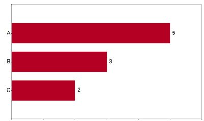
Is it possible to add data labels to a bar chart in the Interactive Chart Tool? This was possible in the deprecated Charting Tool, but I can't figure out how to add labels in the new Interactive Chart Tool.
I see that there is an option to add labels for a pie chart, but can't find that option for a bar chart.
The chart I'd like to replicate is something like this:
Thanks!
Solved! Go to Solution.
Has there been an update to this functionality? This is an incredibly frustrating shortcoming of the tool!
Hi John,
I'm sorry this is so frustrating for you and we recognize the lack of functionality and it's usefulness/necessity. This is a high priority for us and I will update you when we are able to make this feature available.
Thanks,
Alex
Add my vote to this as well. This seems like a pretty basic/ obvious reporting need.
Hi, Apologies I did not update this thread. We updated a number of threads that had this request but missed this one. Sorry for that.
Now in 19.3 Designer release, you are able to add labels to charts. Please download the latest release and let us know how you like this functionality. You will find it on the Style>Layer page.
That's awesome news! I look forward to playing with it. Thanks for the update!
@mlehar this has been corrected in 2019.3 designer version. You can define labels in the Interactive Chart configuration.
-Klaudia
I am a little frustrated the functionality.
Attempting to have outside labels and an automatic chart width for repeat ability's sake. And it keeps cutting off my labels. Any insight in how to solve this issue? I don't like the look of auto labels because some of them are flipping sideways and are difficult to read
@efurlow I will mess around with the auto-labeling when the bars at different widths and work with the engineering team to understand what options we have available to us. I'm sorry for this frustration and will look into this experience. Please reach out with additional thoughts.
@efurlow - I know this is a late response, but in case it's helpful to you or someone else... We're still on 2019.2 in my org, so I can't try out the new labels yet, sadly... I can't wait!
However, we do sometimes want to add some horizontal buffer to a chart for aesthetic reasons. Maybe this work-around would help give your labels enough space?
I add a second layer to the chart, using a value that is larger than the largest bar. That forces the x-axis to accommodate the new, larger value, and creates space between the largest bar and the right side of the chart.
Without buffer
With buffer